
The design of this interior seems built on paradoxes: Open studio planning is combined with feminine intonations, strict contemporaries - with elements of Art Deco and Fusion, bright gloss is adjacent to the manual warmth of friezes, contrasts in the finish - with the omse of lace patterns
The design of this interior seems built on paradoxes: Open studio planning is combined with feminine intonations, strict contemporaries - with elements of Art Deco and Fusion, bright gloss is adjacent to the manual warmth of friezes, contrasts in the finish - with the omse of lace patterns
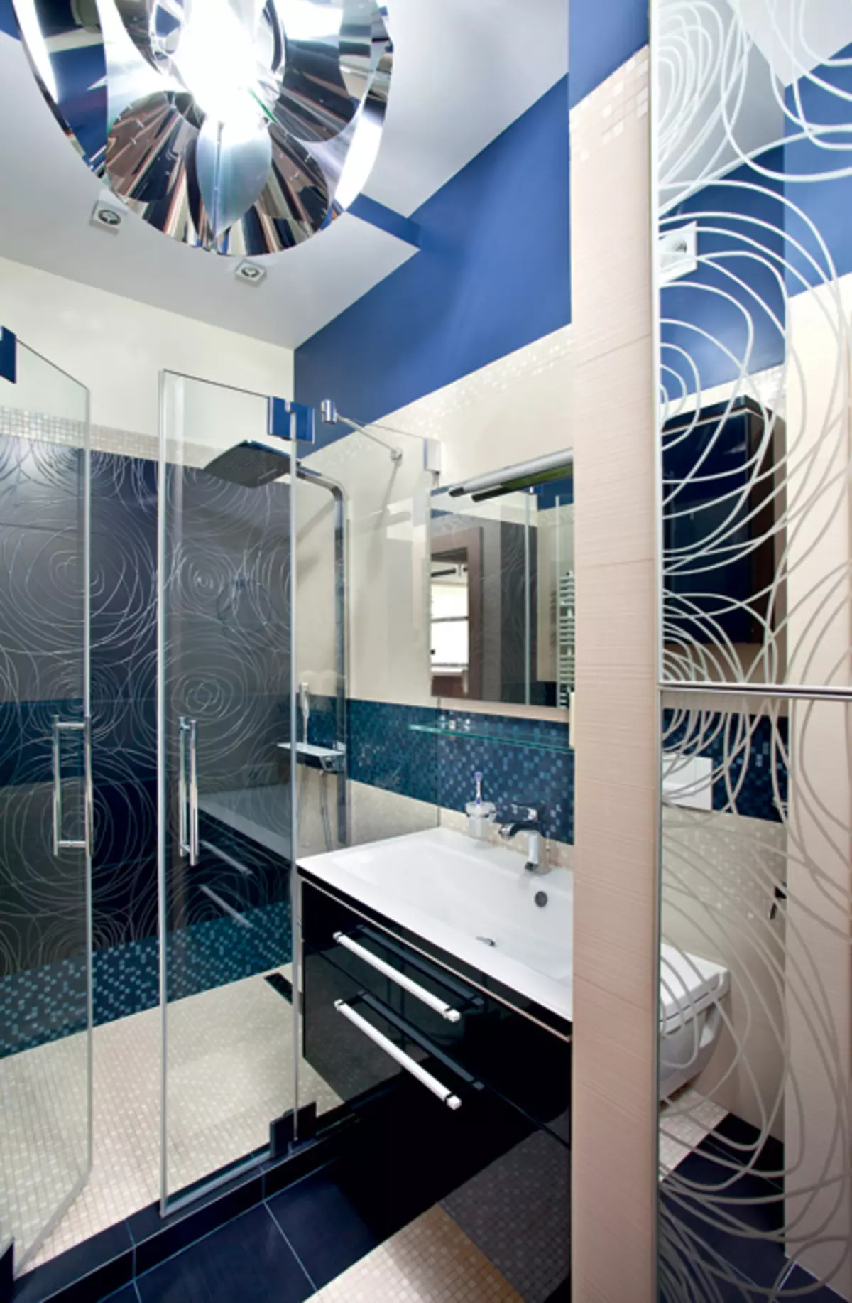
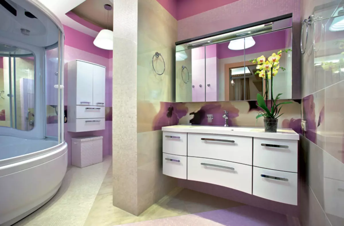
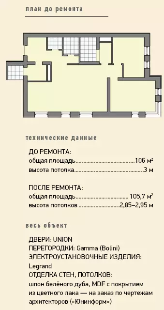
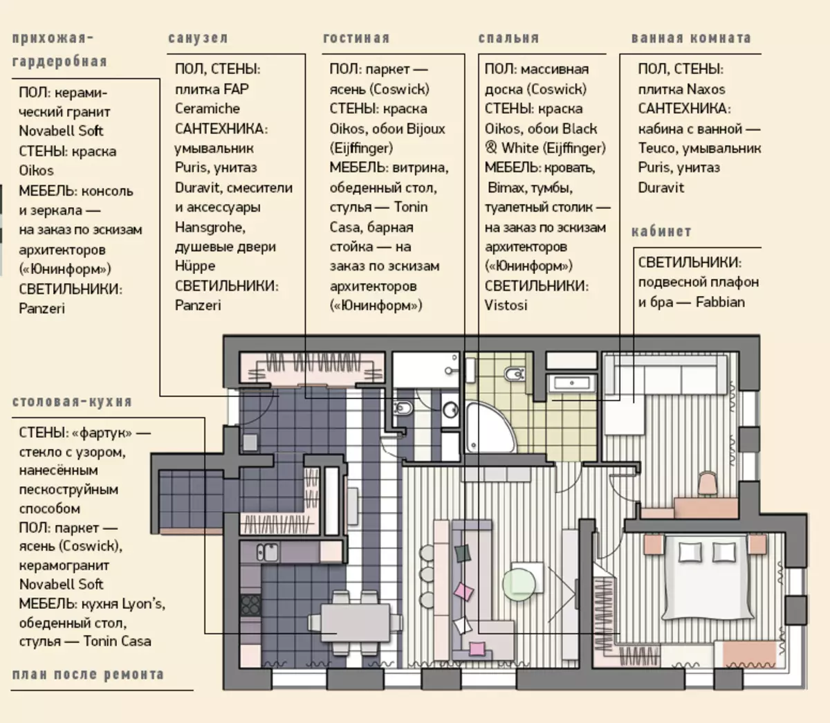
The existing layout was changed minimally: the authors refused to distinguish between the input zone on the hallway and the dressing room, moved the front door to the office and due to a small "dead-end" compartment of the corridor increased the guest bathroom. The main premises of the apartment is the studio, as well as the bedroom remained in their former borders.
Picturesque pragmatics
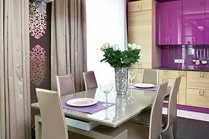
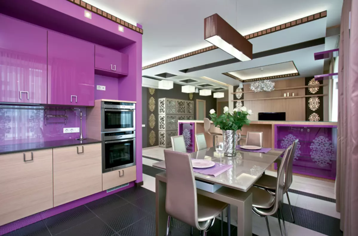
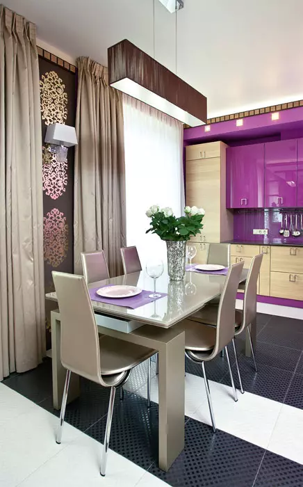
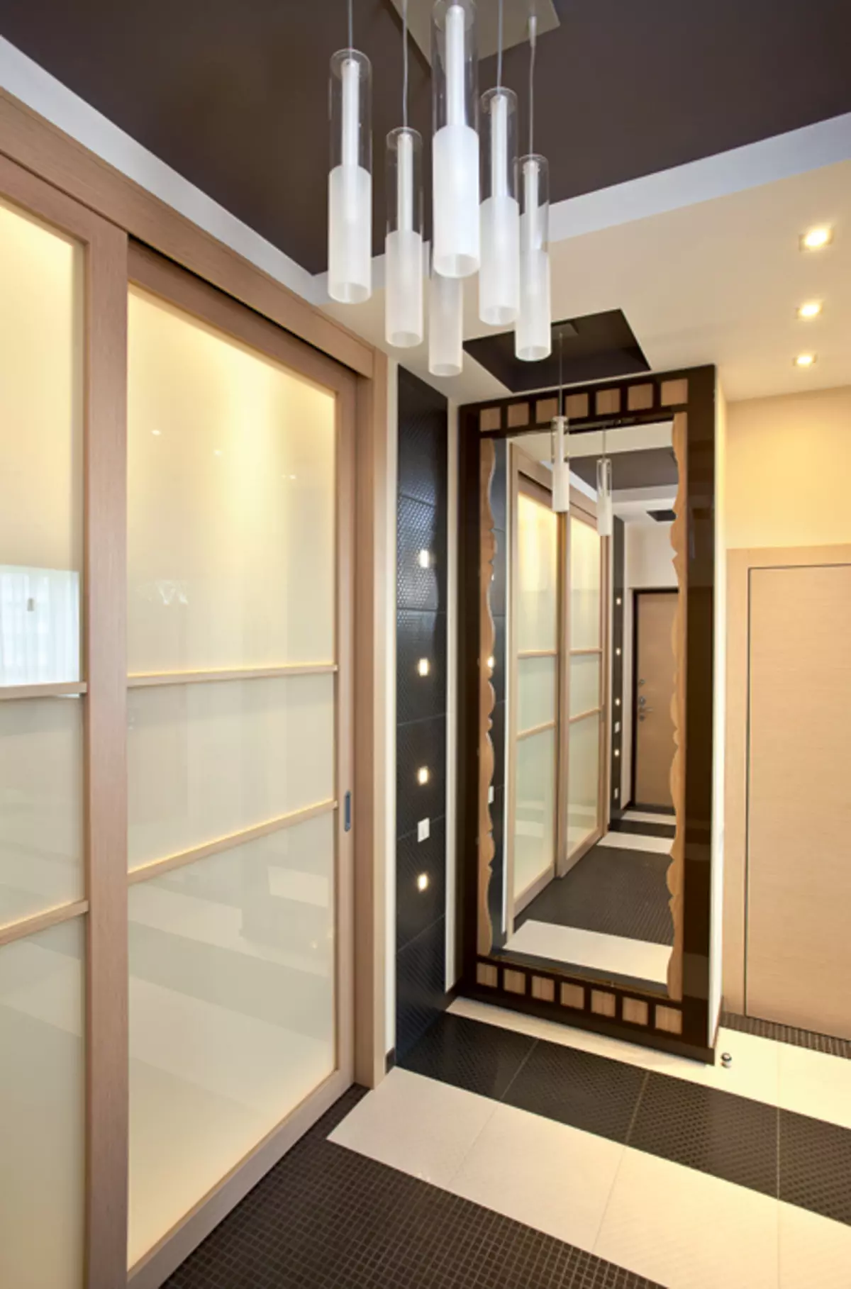
The kitchen looks fresh and smartest thanks to interesting decorative techniques, which allowed to support the overall festive studio atmosphere and shook the prose food of the cooking zone. Glossy facades of kitchen modules, a wall behind a glass "apron", the base, framing both niches under the ceiling are painted in the chosen architects on the RAL scale intensive lilac tone. The glare texture of facades gives even such a "dense" color solution to air lightness. Aerial gap is specifically left over the mounted modules for ease of cleaning. A narrow frieze of a white oak veneer and MDF, covered with color varnish (from the same materials, such details are made in the rest of the rooms), frames the "mirror" of the ceiling. It is hidden a surplus backlight, visually lifting the upper boundary of the walls. Rectangular built-in luminaires add light. Details of the kitchen are crossped the parts of the bar counter.Despite the elongated form, the hallway looks harmonious and seems spacious. It is promoted by its design: three doors of the wardrobe, due to which the width of the room is significantly reduced, as well as the door, located opposite the dressing room, are made of matte glass in light wood frames. Contrast transverse floor bands, a large mirror in the simpleness near the entrance door creates an impression of an expanding space.
Easier snowpad
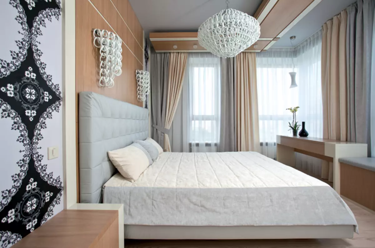
Gentle airiness in the nature of the bedroom is achieved by a well-thought decor. The light gray color in which the walls and the ceiling are painted and to which the curtains are accurately selected, has become a good background for decoring the place of recreation and furnishings of the room as a whole. Due to this shade, a feeling of sprouting the space of soft coolness is created and as if retreating boundaries. Upgraded with light gray leather under the color of the walls and the ceiling. The scent of the bed rises against the background of a gentle-cream, trimmed with a veneer panels behind the headboard. Elements of strict bedside tables, a table and a soft bench under the window are erected. The same tones made a ceiling composition. Adjacent to the wall behind the headboard wide embossed "panel" above the sleep zone graphically decorately combined with white lacquer inserts. There is a dot backlight. It complements the main sources of artificial light: a large ceiling and a couple of sconce consisting of plexus glass white rings.
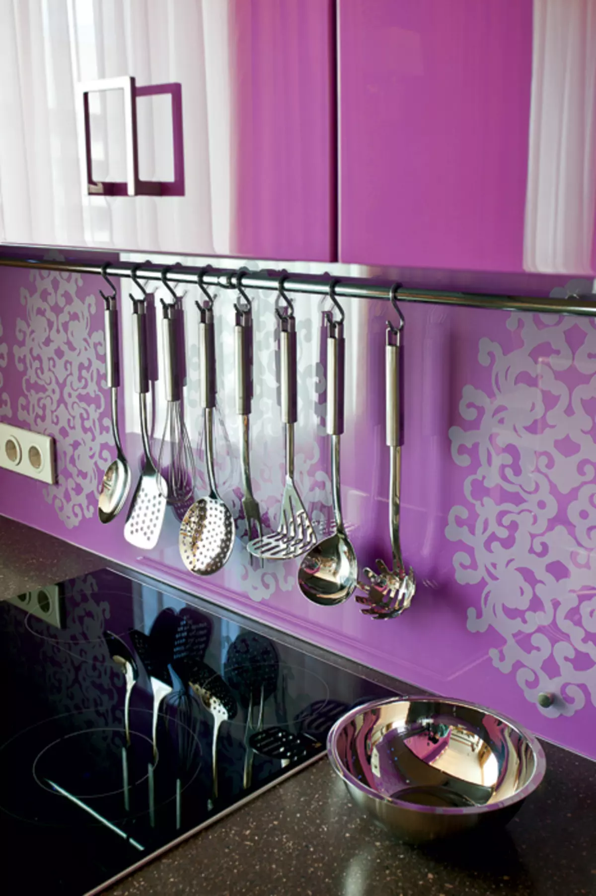
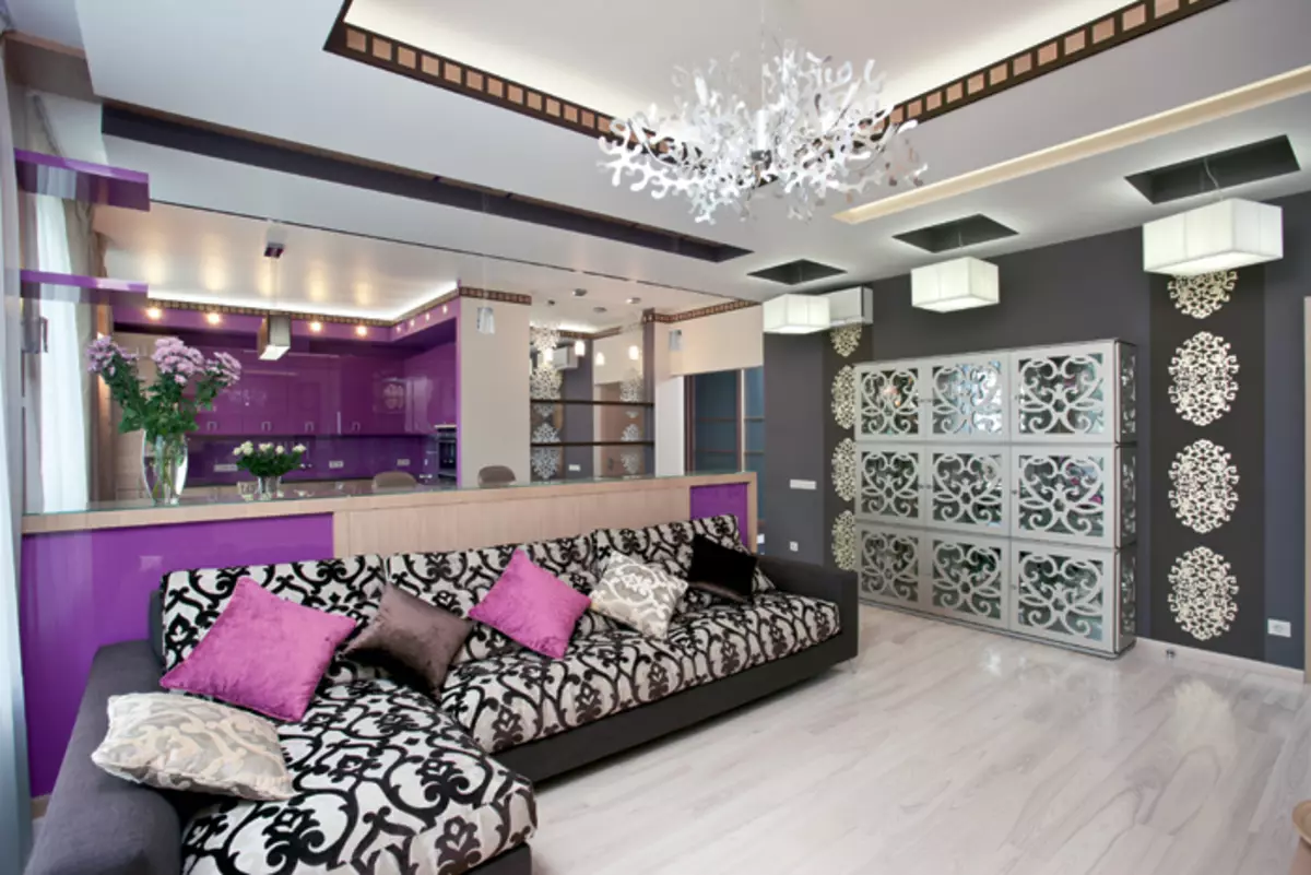
The zone of receptions looks bright and unusually due to the decoration and features of the color gamma. Dominance in her lilac-lilac, dark brown, beige-golden, various shades of gray. The major liner of golden patterns on the wallpaper and the doors of the cabinet (slit), almost black on the coupling of the sofa, as well as the fancy silhouette of the chandeliers, adjacent to the simple geometry of furniture, the linear decor of the ceiling and floor, cause association with the Baroque style with the contrast style. The inventive decor of the ceiling is though built on strict geometry, its guide also inclines to historical parallels. They are supported by an open plan with interesting, picturesque angles. Thus, there is a wide opening between the inlet zone and the studio, which strengthened the panoramic view of the recreation corner and the dining room with a sliding table, which are maximum shifted to the windows. Along the opposite wall left the free passage zone, decorated diverse and solemnly. It looks like a part of the social half, at the same time brings to the bathroom and private rooms, a bedroom and a cabinet. The bulk composition with the angular sofa and the bar counter with the built-in cabinets is deployed to the outer wall so that light from the windows almost freely penetrates the room. Intelligence of the interior, opposite the living room zone, light flows are reflected in the mirror wall of the cabinet-showcase and the mirror, which is saved by a side wall niche near the entrance to the hallway. The cozy "bay" of the kitchen, with L-shaped placed along the walls by modules, is perceived as an autonomous zone, and as a continuation of an elegantly decorated living room. Quickly certainly dominates the lilac. Watot Color Painted glossy facades of mounted modules, wall between them (it is imposed on it "Apron" with a pattern applied by sandblasting), framing niches. Incores of the studio, this active tone is presented very locally, which is why the overall composition looks balanced and harmonious.
Decorative rhythms
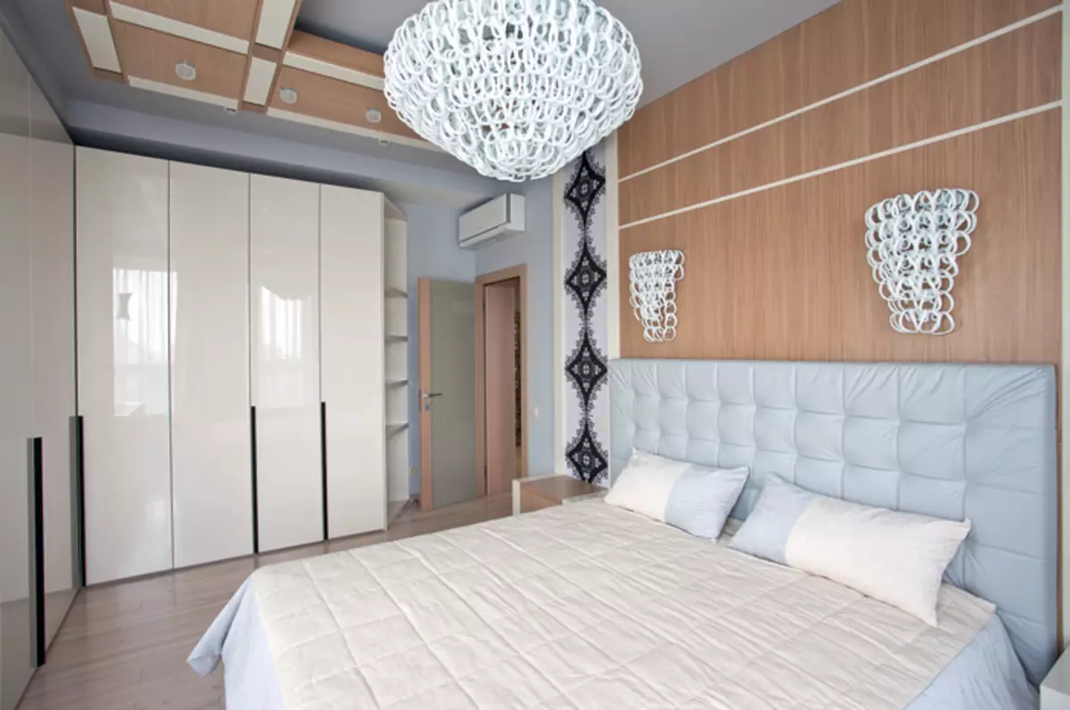
The bedroom is decorated in a different scheme, built on soft overflows of light gray, ecru, white and beige. The composition of the windows is unusual - a large angular and two framing narrow openings. Moving light through a cheek of white organza curtains, they fill the interior with scattered light.
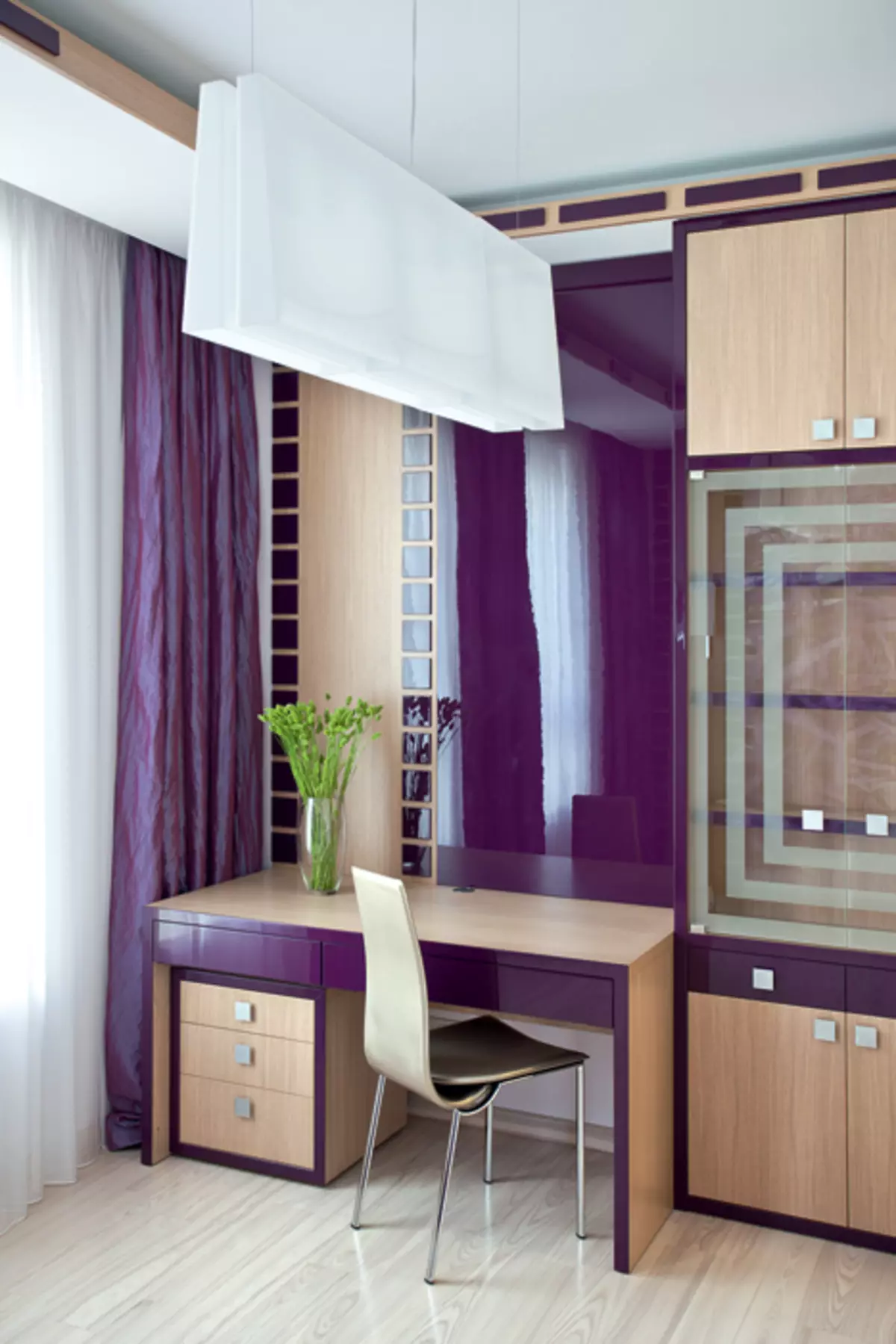
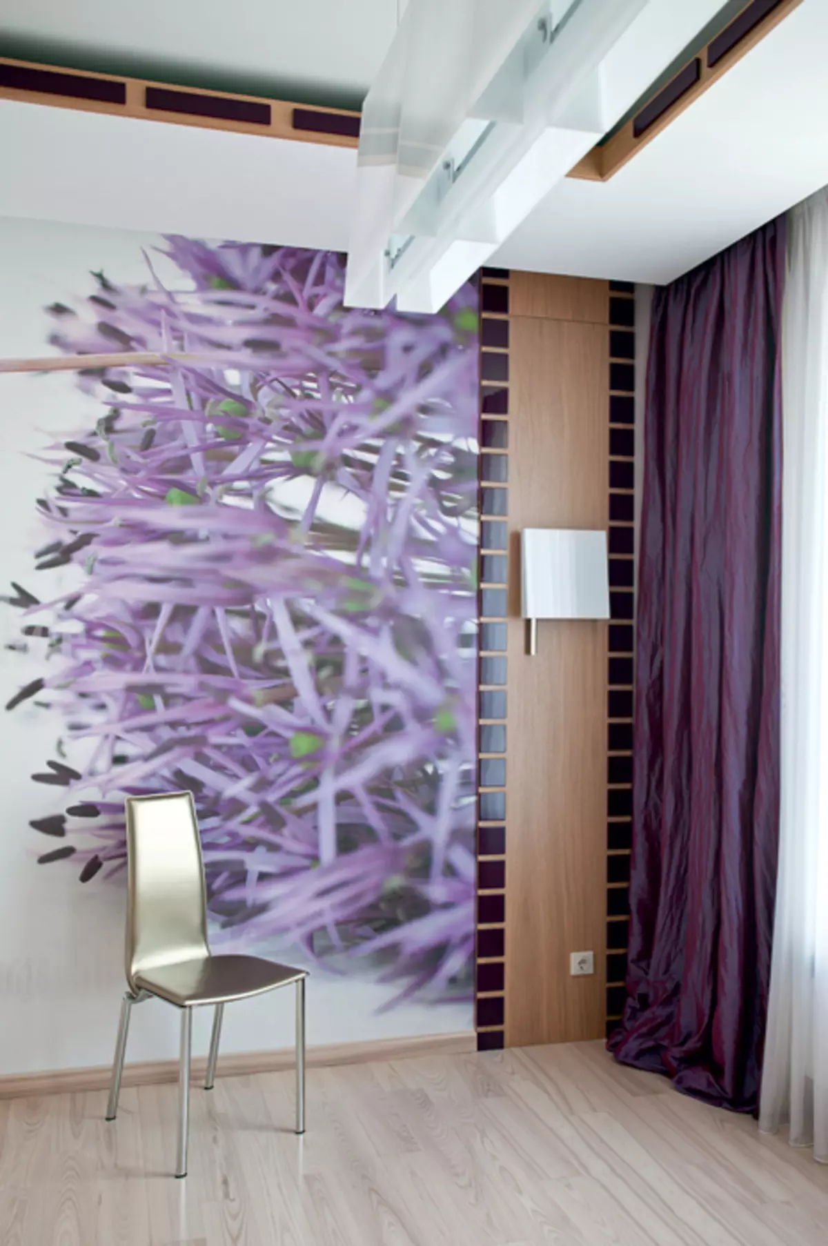
Equipped, which is intended and for the arrival of adult son, the colors of the finish are echoing with the tones of the front zone. Only a purple is thickened to purple (this shade was set to the photo wallpaper, to which the curtains were selected, the lacquered panel from MDF in a simple writing desk, insertion on furniture). The functional component of the interior is successfully consistent with the existing room layout: next to the window - built into the niche furniture composition with a work desk, rack and decorative panels, on the contrary - a large corner sofa.
Color union
The project is distinguished by a combination of pragmatism and an unusual decor. WeTE manifests itself one of the characteristic trends of modern domestic design: even the most successful interior "scenario" in terms of ergonomics requires an exclusive shaped solution.
The authors of the project are told
Architects Inna Volvak, Julia Pokrovskaya