
Four options for well-known planning solutions for the kitchen, skillful use of architectural elements, successful working with color
Kitchen regardless of size always plays an important role in creating a home coat. We bring to your attention four examples of thoughtful planning solutions, skillful use of architectural elements, successful working with color.
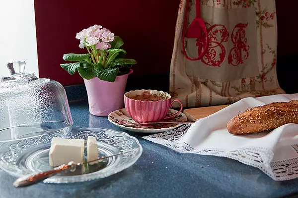
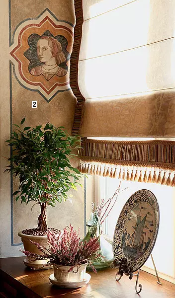
Wine and white bread
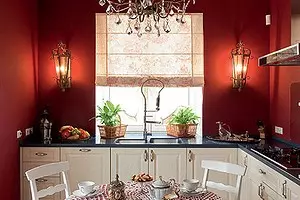
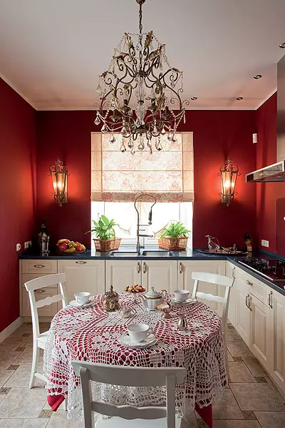
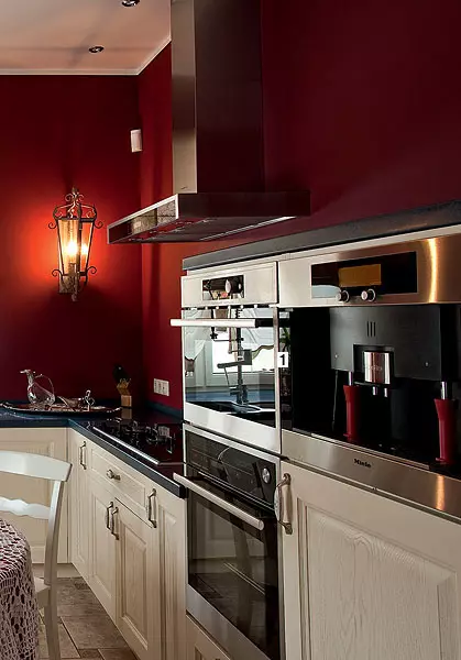
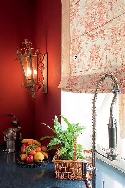
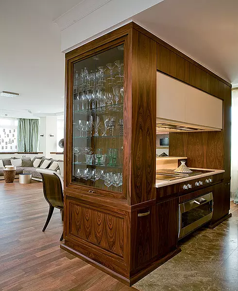
The bright image of this small kitchen (14m2) has developed due to several components: layout, color and selection of things. Let's start with the main thing: fortunately, the room has a proper form, and the doorway is located on one, central axis. Symmetry contributed to solemn stylistics. To strengthen it, the designer left the top of the walls as free as possible. So, instead of mounted lockers, which initially planned to place on the left and right from the window, two Belgian lamps appeared, brought by the project by the project from the Paris exhibition. The magnificent wine color of the walls, who asked the tone in the literal and figurative sense, was not found immediately: I had to face it pretty, until one of the shades of the Oikos palette (Italy) were trying. Its beauty emphasizes the contrast of the dairy facades of kitchen furniture.1. Household appliances are grouped into two columns to the right of the KPPERSBUSCH cooking panel (Germany) and raised above the floor slightly higher than usual. It is very convenient because it does not have to be tilted to the oven, nor to the microwave oven (both - kppersbusch), nor to the Miele coffee machine (Germany).
2. Roman curtains sewn from two types of fabric. Monochrome zhui, the pattern of which by tone is combined with walls, framed on the sides of the flax strips of natural shade.
Tell the author of the project
From the traditional "apron" from the ceramic tile, I decided to abandon not to crush the space and not disturb the solemn atmosphere asked the color of the walls. However, the wall near the stove had to be protected from spray. We applied tempered glass. This is a very beautiful solution that is difficult to find an alternative. But the hostess should be aware that from time to time, every six months or less (depending on how intensively use the kitchen), the glass must be removed to wipe its surface from the inside. Even with the most accurate operation, the dirt still falls inside.
Designer Julia Tsvetkov
Hide everything in the closet
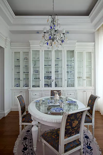
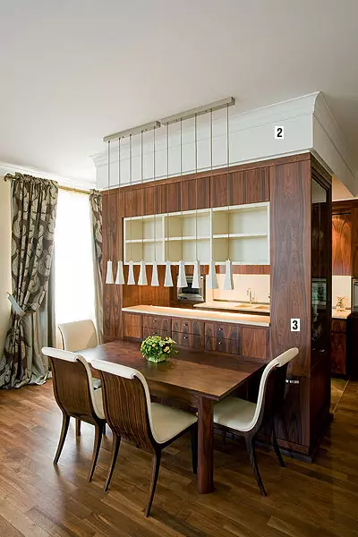
Fresh solution allowed a new one to combine the front and household zone. The fact that this kitchen is the most likely furniture composition than the room, emphasizes the buffet built into the end. Furniture designed and manufactured in the workshop of Andrei Zranbatsky, thought out to the smallest detail. There are practically no dead zones. Each square centimeter of the cabinet or drawer here is a useful area. For example, the sinks are shallow shelves (30cm) closed by sliding doors. The latter replace the familiar "apron". Shelves are very comfortable: cooking food, the hostess can quickly and easily remove dishes on them and products. So the mess will not prevent a solemn dinner in the living room.1. Vaeta kitchen Rakovin is greater than usual, because they cook like a hostess and her spouse. For the hood: one over the cooking panel, the other above the grill (all-Miele) do not allow kitchen flavors to penetrate the living room.
2. The initial height of the ceiling is saved, and in the kitchen it had to lower it to hide the ventilation air ducts behind it. The difference in the ceiling level is invisible due to the eaves width 30cm framing the kitchen.
3. The kitchen is perfectly combined with furniture in the living room. Ita and the other are made to order and differ in the unity of style, colors and materials. Landing with a veneer of a rosewoman with a beautiful large pattern and white varnish. Spectacular contrast resembles the style of Art Deco.
Tell the author of the project
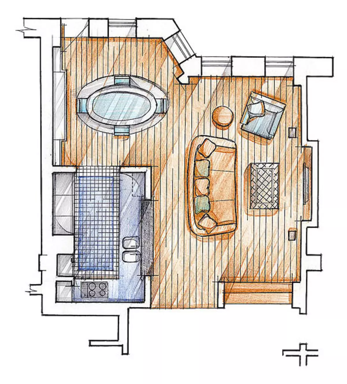
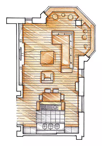
The idea of this space is somewhat unexpected: the kitchen is not quite a kitchen, but to a greater extent, the furniture composition. One of the most important advantages of the latter is that the furniture requires a smaller area than a separate room intended for the kitchen. It is not even in the missing walls that have a certain thickness. The case is in psychological comfort: if the place that is now reserved under this equipped kitchen, turn into a closed volume, it will seem catastrophically small.
Anna Yarovikov architect
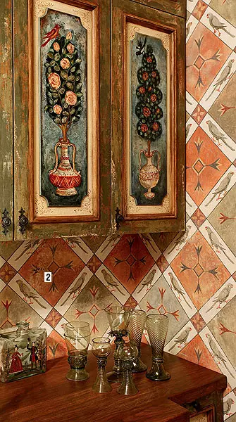
Museum-apartment
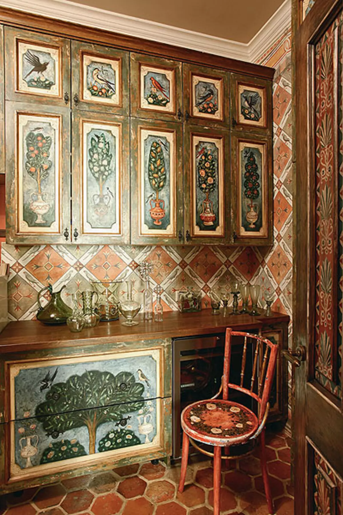
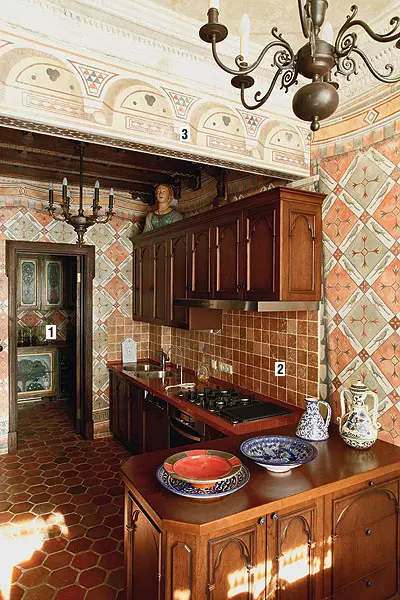
Kitchen furniture is made of tinted oak in the workshop of the Veniamine Znocknik. The facades are covered with a carved decor, inspired by the Renaissance architecture.
1. Will be visible to the pantry, where additional lockers are installed for utensils, a modern wine cabinet and refrigerators. This is a utility room, but it is decorated as thoroughly as the kitchen itself.
2. "Apron" is laid out with a stone tile made of travertine.
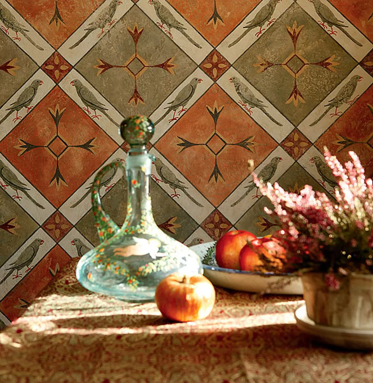
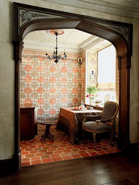
3. Both rooms are painted in a technique that imitating the fresco. The idea of painting covering the entire surface of the walls arose after visiting the magnificent Florentine Palazzo.
Tell the author of the project
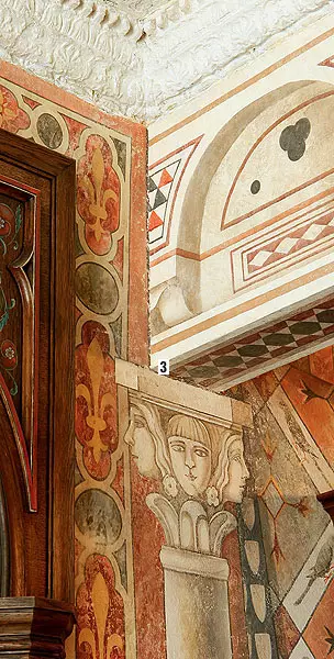
When the ceiling was cleared during the repair process, it turned out that it was covered with picturesque cracks and sublifting (people living above, more than once poured this kitchen). Time and neighbors got rid of the need to give the interior patina: it was already, besides real. The ceiling was only covered with a transparent primer layer so that nothing fell on the head. They did not touch and the magnificent powerful stucco from the gypsum was only slightly freshened by whitewash. The huge arched portal is also preserved. He gives everything solemnity.
Designer Anastasia Neloeva
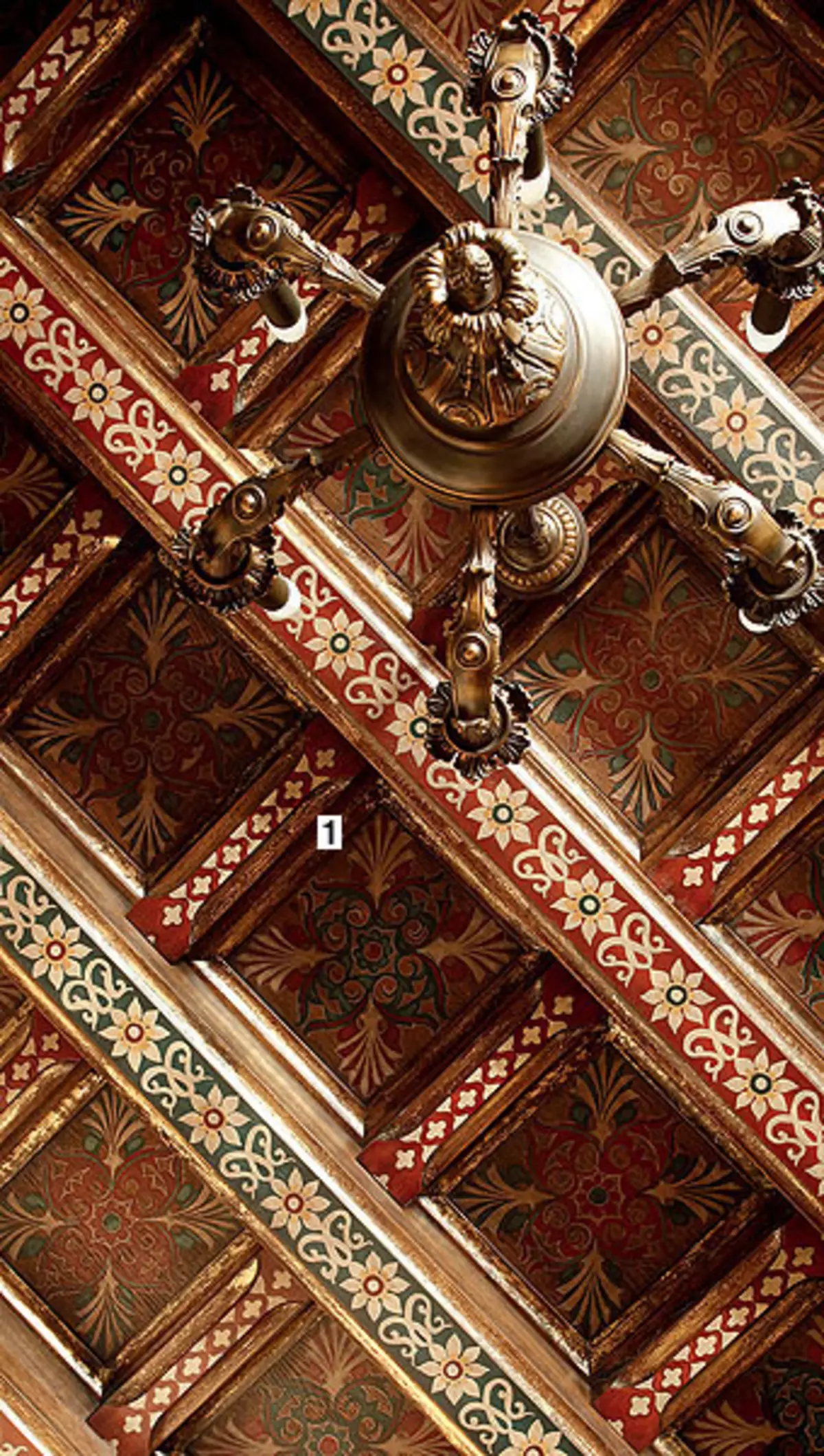
1. Floral patterns emphasize the depth of a wooden caissonated ceiling. Similar paintings are decorated with ancient Italian palaces.
2. Window slopes are decorated with stylized portraits in medallions. They successfully complement the geometric motif, repeatedly repeated on the walls of the kitchen and pantry.
3. Colorful "columns" seem to support the carrier beam in the Stalin's house. She, like the walls, is completely painted, but in the style of architectural deception. The illusion is created that there are deaf lines in the beam.
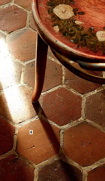
4. The floor in the kitchen is laid out with an antique tiled brought from France. She is at least 100 years old. Veverops old houses do not destroy, but carefully disassemble and then sell everything that you managed to save and what can be given a new life: thick floorboards, wrought-iron handles, fireplace portals, stone balustrades ... Perhaps this tile has been covered with a stable or courtyard. As a stone-solar heat, it retains authenticity and beauty, which makes it easy to enter a scattered material in the interior of the Moscow House.
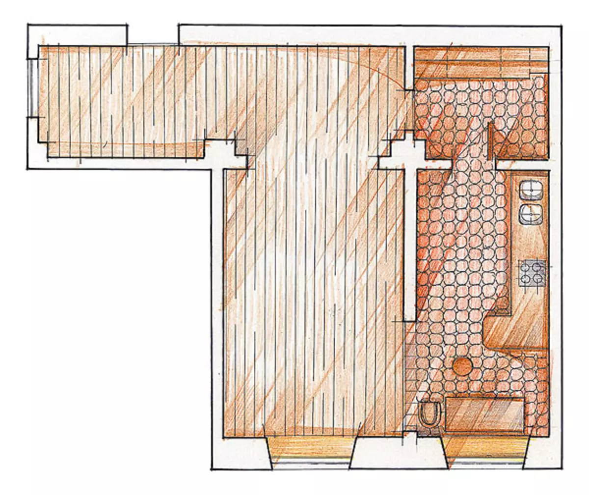
Cobalt grid
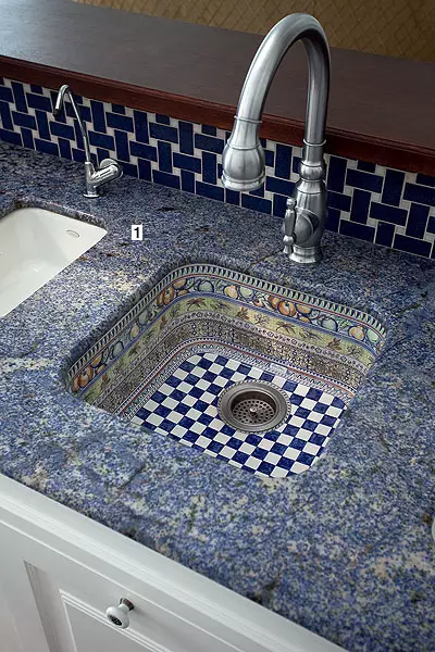
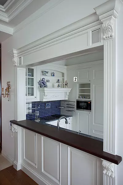
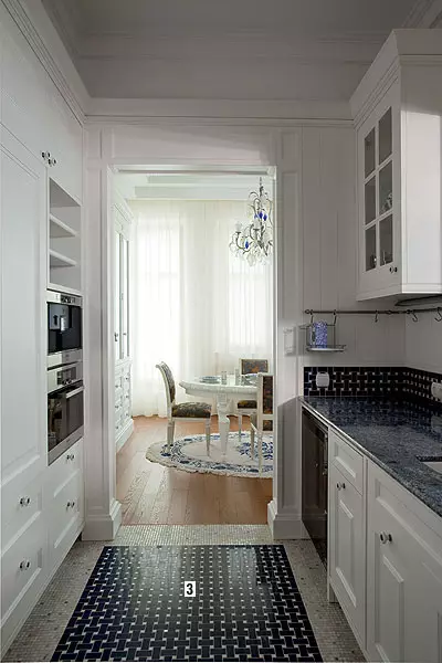
The favorite porcelain service of the hostess inspired the architect to create charming cuisine. Cobalt pattern on a white background - a colorful combination, tested by centuries in small forms. But it turned out to be unusually advantageous and on the scale of the interior. This project is notable for the fact that even a very compact kitchen (9.1m2) may look surprisingly elegant. This was achieved through the classical style of the use of symmetric compositions, decorative elements (wide eaves, carved columns and consoles, panels). Thanks to the decor, the built-in furniture looks like a single architectural volume. On a small area organized all the necessary functional zones. There was a place even for a parade dining room.1. Work surfaces are made of stone. I had to work a lot to find the granite of the desired shade of blue.
2. Built-in furniture is made in the workshop of Andrei Zrancatsky from painted MDF. Carved parts are manually made.
3. "Apron" and the floor are lined with a sicis mosaic (Italy), the laying of which somewhat resembles the so-called cobalt grid, known throughout the world. This pattern was first created on the Leningrad Porcelain Factory in 1946.
Tell the author of the project
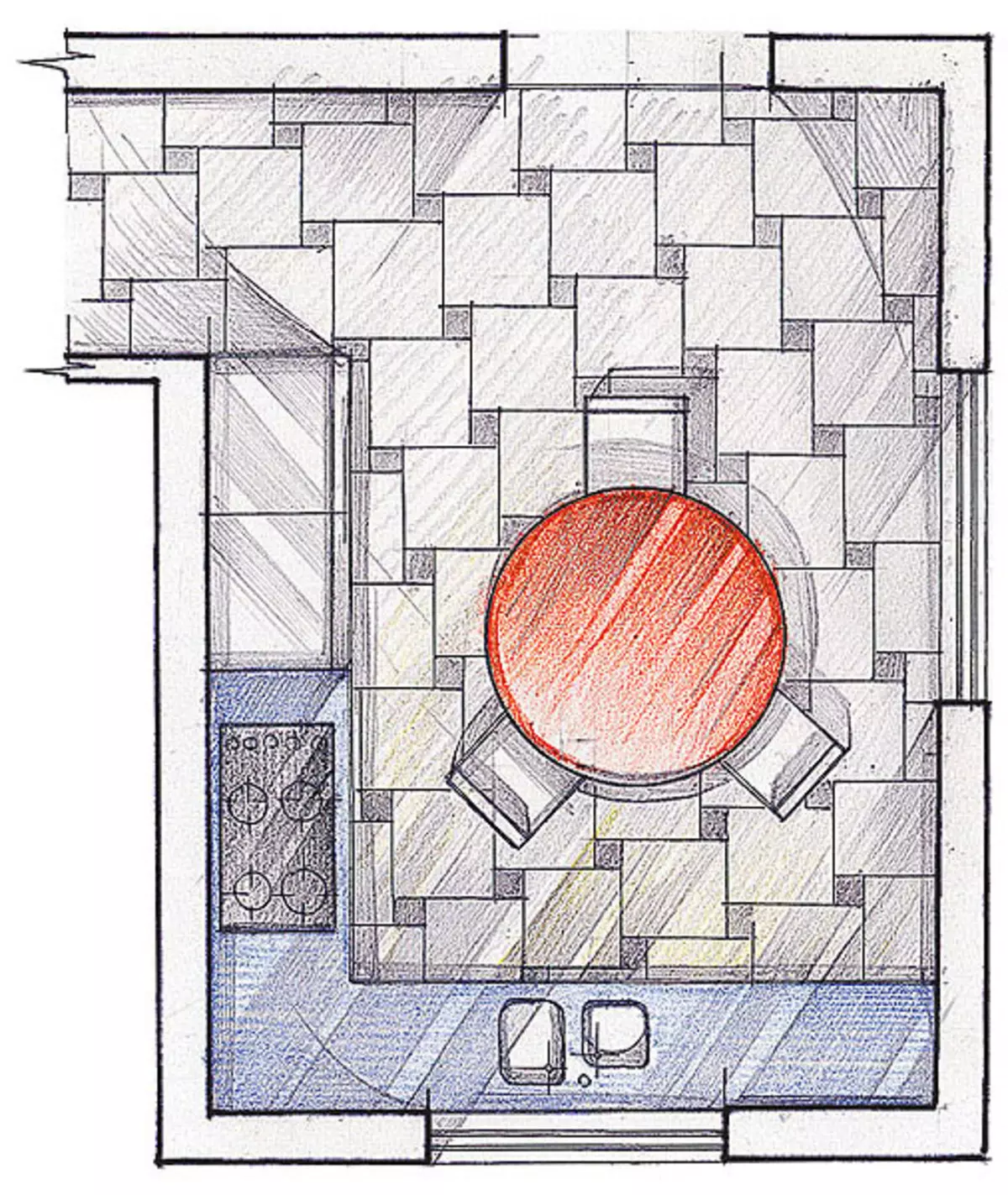
This small kitchen is very ergonomic in part thanks to its size. As they say, there is no humus without good. Here everything is literally at the distance of an elongated hand. The working surface is located only on the one hand - the one that is closer to the living room. The central part is built into the sink, and directly opposite the last, behind the hostess, the refrigerator is installed. You can cook on the right and to the left of the washing. Opposite these sites, the microwave and kit from the oven and coffee machines are placed. In the middle of the end wall of a kitchen, which has a P-shaped layout, is a large stove.
Anna Yarovikov architect