
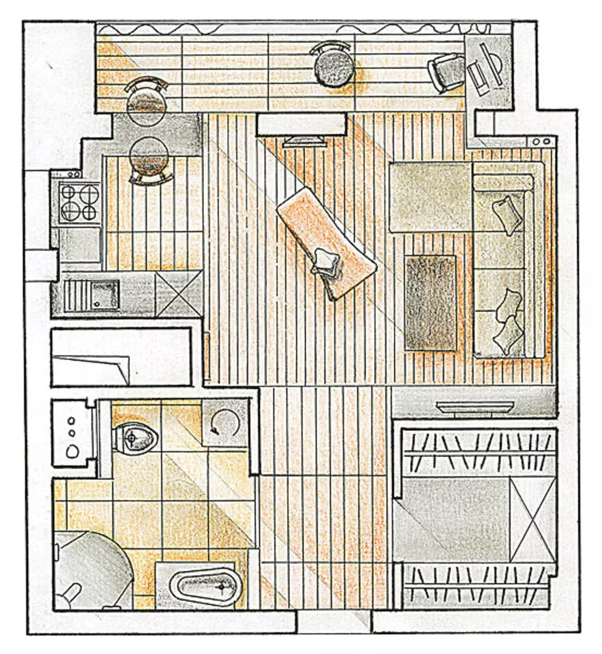
One-bedroom apartment with an area of 48 m2. The interior solution is built on a contrasting flower combination of wood-brown and creamy white
The house where this small apartment is located in a wonderful place. From the windows of miniature "odnushki" there is a magnificent panorama of the capital with all seven Stalinist heights, and it was this circumstance that became decisive when choosing housing. However, the owner dreamed of completely different intonations in interior-connected and peaceful, reminiscent of life in nature. These associations became a leitmotif of the main decorative reception-contrast color combination of wood-brown and creamy white.
Work on the project was quickly: Architect Tatyana Zabivuopeova was for Alexey, the owner of the apartment, several sketches of redevelopment, and the option chosen by it was finalized in a total of 2 weeks. The main wishes of the owner: housing should be spacious, certainly need a large bathroom and a separate dressing room. What aesthetics concerned, Alexey was inclined to minimalism: strict lines, functional feasibility, two colors - brown and white. Understanding between the owner and architect arose quickly - only one amendment was made to the approved project: an additional outlet in the kitchen.
Loggia: Additional features
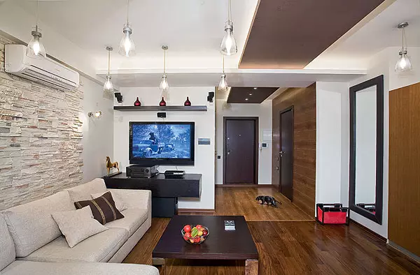
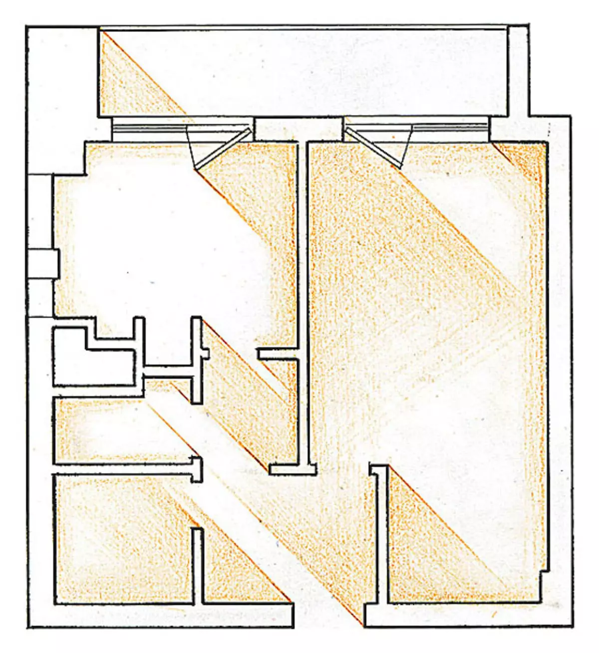
Integration of the expansion of modest space (the total area of the apartment is only 48m2), the bottomroom block disassembled, attaching the loggia, and demolished the non-intercommunal partition. To visually increase the room, the architect has successfully used the principle of contrast. The windows of the apartment are south, and the housing insolation is very intense, which visually makes a small volume "flat". Therefore, individual zones, especially remote from the windows, being decorated with dark materials, as if departed deep into, the interior becomes more cozy, and small dark details on the background of light walls make a variety.
Decor on the ceiling
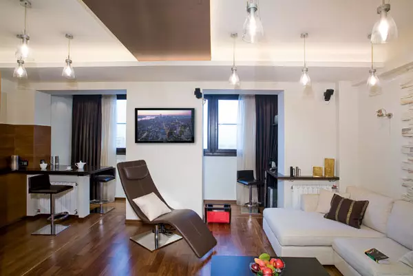
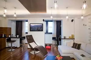
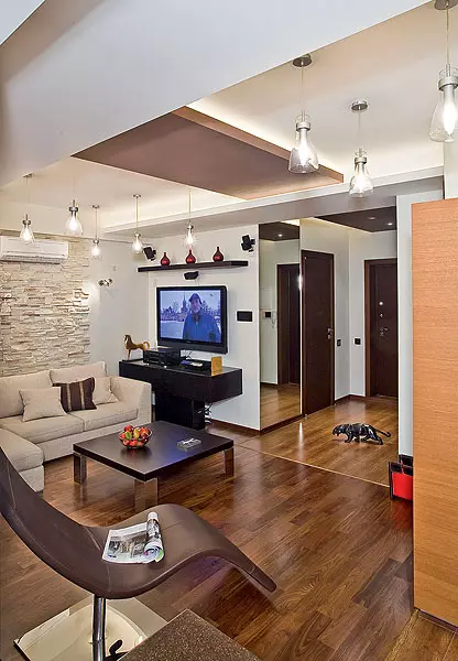
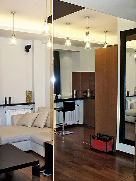
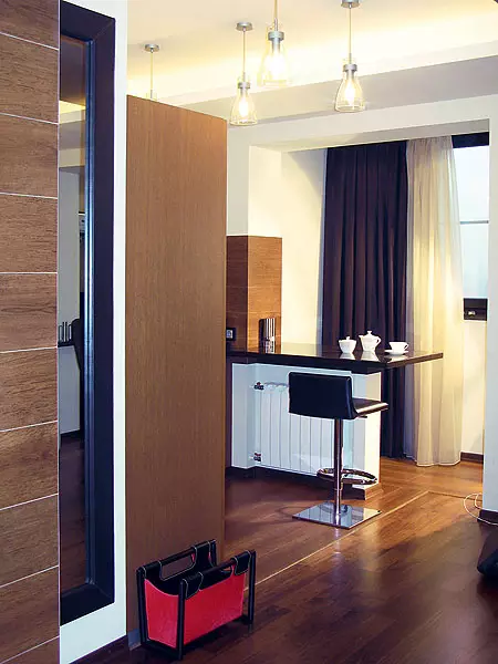
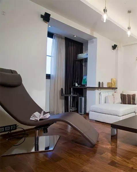
The planning of the updated housing is characterized by logical clarity and on axial symmetry. The movement line, passing from the entrance door to the rustle in front of the loggia, separates the square in terms of the apartment to almost equal halves. On one side of the hallway is the square room of the bathroom (6.2m2), on the other, the same form of a dressing room (4,4 m2). Their walls are given the boundaries of the input zone, which overlooks the entire studio space, which combines the living room (its corner sofa also serves as a sleeping place); Cabinet located on the loggia (right); and kitchen-dining room (left). These pairs of grouped zone shares a wide spatial "cesura", which allows you to save "light breathing".
The axial construction of the composition is focused by the ceiling decor: from the entrance door to the rustle between two inputs on the loggia stretched painted in a dark brown-colored "track" from plasterboard. She divided the space above his head into two halves, decorated with ceiling lights ceiling lamps.
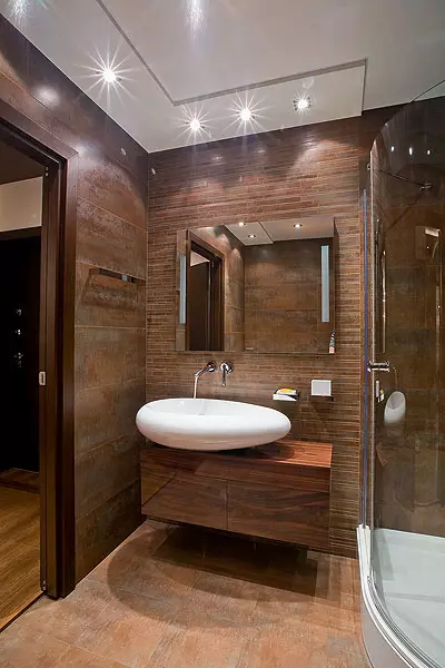
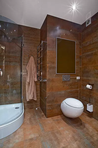
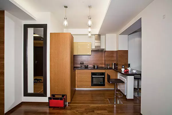
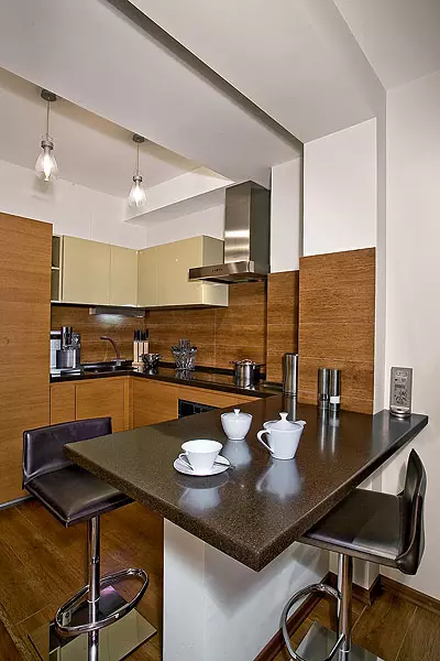
Kitchen modules in the form of the letter "L" are inscribed in the boundaries set by the width of the ventilation box (1.9 m) and the size of the simpleness between this box and the protrusion of the carrier element next to the window opening (2.3m). The contrast of only two colors in the decoration of the apartment gave wholeness in the interior. An unusual porcelain tile (12019.3cm) imitating wooden boards with a characteristic texture, the floor and walls of the hallway are lined, floor of the loggia, a kitchen "apron". Golden brown veneer on kitchen facades softens this contrast slightly. The same key is decorated and bathroom. Facing the walls and floor as the same tile, as in the hallway, made an organic transition from one room to another. The selected material became the optimal background for snow-white plumbers of exquisite forms: resembling a huge pebble washbasin and egg-shaped toilet.
Thus, the competent architectural approach in limited expressive means allowed to create a comfortable and extraordinary space.
Tell the author of the project
The apartment, which was to turn into modern comfortable accommodation, was in a deplorable state: uneven walls and "killed" floors, chaotic built-in furniture, cluttering and without tight space, is a typical "grandmother's apartment", which has not repaired not one ten years. All partitions we dismantled and during these works found that the ventilation shaft was partially built up with previous tenants. Therefore, during the repair, the technical channel was given the sizes provided for by the initial plan of BTI. All internal partitions were performed from oxide blocks. Walls leveled plasterboard plaster cuts would reduce the useful area. Bar rack is resting on a folded puzzle block of a support, to which the base frame is attached. One of the radiators is suspended by the same support, the second is located in the softenness of the sofa. When the repair was in the stage of finishing, the owner was lit up: Is it too monotonous to look like an apartment? To dispel his doubts, I added a few details into the interior: a mirror in a ram of dark brown skin and the same color shelf for souvenirs above the chest.
Architect Tatyana Zaglavupav
The editors warns that in accordance with the Housing Code of the Russian Federation, the coordination of the conducted reorganization and redevelopment is required.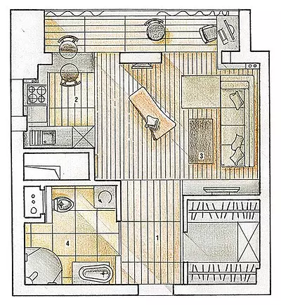
Architect: Tatyana Zagivuopeova
Watch overpower