
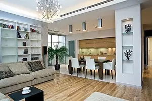
Four-room apartment with a total area of 149 m2. The apartment is dominated by a spacious studio that combines living room, dining room and kitchen

When, with the arrangement of a new apartment, such criteria are published as convenience and harmony, everything turns out to be aesthetic and durable. The wisdom of the hostess and the professionalism of the architect was the key to the creation of a stylisticly weathered, responding to the spirit of the interior time.
Housing owners have found the architect Natalia Shmelev on publication in our journal. The concept of an apartment entry answered their ideas about modern housing: the expressiveness of parts in combination with comfort and limit functionalism; They were also conquered elements of the aesthetics of the loft in the form of an open brick masonry.
Hidden reserves
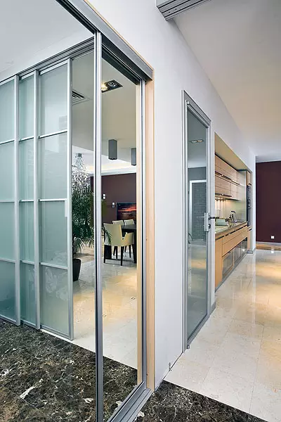
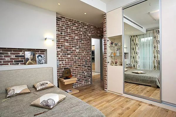
The hallway carries the spatial intrigue, gradually solving practical tasks. The trim tile under the "aged" brick creates the impression of the depth and eliminates the feeling of "newly model", which is unprofitable with most modern interiors. The depth of the niche for the chest is calculated so as to hide the carrier column. Behind the wardrobe - almost inconspicuous entrance to the dressing room-storage room. The mirror doors of the cabinet, the translucent partition visually increase the room. When the partition is spread, the look opens a breathtaking game with a perspective.
The sizes of the apartment in the new building were sufficient to make a large family in modern standards comfortably accommodated in it. Uyana and Vyacheslav Three children who needed separate rooms. I wanted to combine the dining room, living room and kitchen so that the children would not feel more stronger, and the parents could adequately receive guests. In addition, additional economic premises were needed.
We still repeat: "How comfortable everything!"
The mistress of the Yana apartment tells.
A nubetsky psychologist and know how important the child has its private territory. Therefore, for each of the children there is a separate room. We love to spend the evening together with the TV, but in the old apartment for seats on the sofas there was a battle. Ana new sofa we can not only get comfortable with comfort, but even to stick to the instext, everything is enough. Textile upholstery - removable, it is very easy to clean, and our dachshund crucian feels well at ease. I am convinced that the interior design should be engaged in a specialist. I, probably, would choose solutions that would be bored in me in a week. The architect coped with his task perfectly! And at first, many of her suggestions I did not like. For example, the bathrooms in which you can go through the wardrobe. But Natalia managed to convince me. The layout turned out to be so practical and psychologically comfortable that we still repeat each other: "How comfortable!"
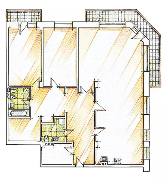
At the stage of delivery of the house, the developer inside the circuit of the walls was only three separate bearing supports and three boxes of technical mines. The apartment in the plan is almost square, with windows on the boulevard and a couple of comfortable balconies. It is noteworthy that the owners abandoned the temptation to expand the area of residential premises during their account and only conducted finishing work with insulation and the replacement of floor coverings.
Cozy texture
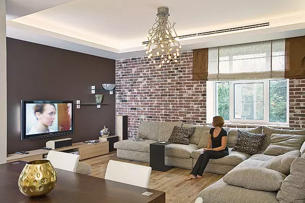
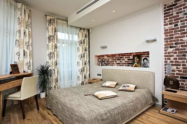
The zone of receptions and residential rooms gave an original sound due to the trim tile under the "aged" brick (Decorative stone EUROKAM, Russia). She made several brutal, but at the same time cozy intonation into the cold-blooded aesthetics of the functional interior. So, the entire external wall of the living room acquired a picturesque self-sufficient texture and roughness, mitigating uncompromising straight lines.
The main task facing the architect is the search for an optimal location in the interior of four "nodes": the entrance area, the studio (combining living room, dining room and the kitchen), private rooms (parents and children's bedroom) and the shopping area (postponic and wardrobe, as well as bathroom Room and bathroom). Part of the premises inevitably got into the zone of weak insolation due to the too long distance from the windows.
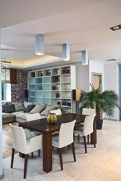
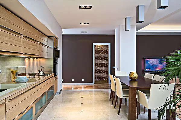
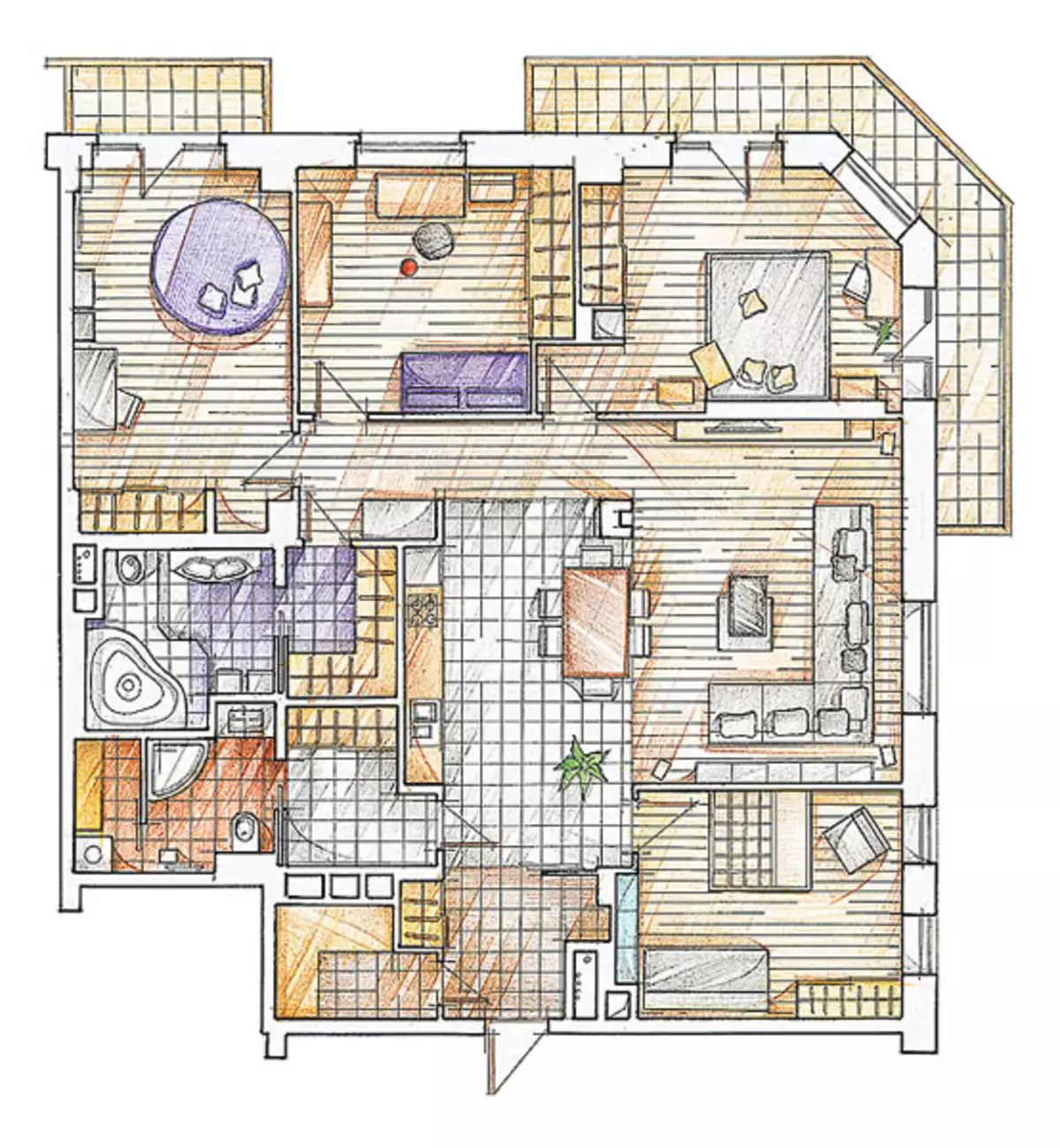
The initial "cutting" on residential premises with the corridor system, proposed by the developer plan, could not satisfy any of the requirements of the owners, so the project was created, according to which there are no corridors, the space of the studio is not divided by partitions, and natural lighting from the living room has enough for the whole area A significant part of the cabinet furniture is in specially designed niches. All these techniques have allowed to significantly increase the free space. Carefully calculated dimensions and precisely chosen finish made the presence of furniture natural and small: it is convenient to move around the apartment, you dominate calm clear lines, no sticking angles and random fractional forms. Wide color planes, their mutual arrangement and proportion visually supported the strict clarity of the overall structure, revealed the open character of large spaces and warm un local zones.
Kitchen "At the level"
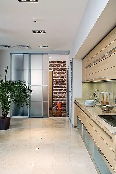
The kitchen became part of the reception zone. Therefore, all equipment and equipment are hidden behind veneered facades. SCIC kitchen furniture (Italy), located with a single front with a length of 3.9m and exactly inscribed in a niche, creates a neutral background for the living-dining room. Over its upper border, the duct of the drawing was hidden, the refrigerator was moved to the corridor, the scissors in the niche. Apron, a tabletop and the floor are made of Marble Crema Marfil (Spain), which creates a feeling of game gentle sunlight in any weather. An exquisite addition of the composition of the facade-tempered matte glass of fillets of floor modules, giving the kitchen weightlessness. This material eliminates the possibility of damage.
It is worth noting that Yana actively participated in the discussion of all nuances of redevelopment and the implementation of aesthetic program. Alice the mistress architect has found an ally, on understanding and intuition of which could be reeded when choosing the best solution.
Light divertiment
Only one window accounts for the whole studio, and the architect, following the wishes of the hostess, created additional lighting here. Vitoga daylight turned out to be quite enough, but the "light theater" decorated the apartment. To hide the air ducts of the supply and exhaust ventilation, the ceiling level in the kitchen area and the dining room around the perimeter of the living room itself downgraded by 28cm. This made it possible to make a surplus backlight in the living room zone and embed point lights. All lighting devices have strict orthogonal forms, except for a chandelier in the form of a beam of stems with inflorescences-bulbs. The light accent came to the area between the kitchen and the dining room, he first opens the view of the incoming apartment. Along the trajectory of movement in the ceiling, paired lamps were built, adding the triple chord of prismatic "pipes" with lamps in the ends. Like the chandelier, they are connected through dimmers to regulate the intensity of light. Ceiling light duplicate light sources, mounted directly to the floor: their beautiful bluish dotted machine helps to navigate in the dark, like the squares of the lamps at the bottom of the wall next to the bedroom inlet.
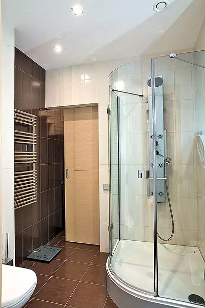
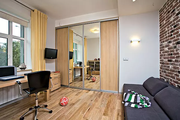
The spacious studio dominates in the apartment. Next to the exit to the hallway, the door to the room of the youngest son. The bedroom of parents and the rooms of older children are located one after another in the far from the entrance to the end of the apartment. Economic premises are removed from the windows, so that the natural lighting of residential areas does not interfere. Wardrobe, bathrooms and beacon made up square in terms of volume, discharged into four parts, and combined in pairs. The bathroom precesses a large wardrobe from the side of private zones. Gostosheskaya bathroom can be passed through the door between the hallway and the kitchen, the passage of the wardrobe. The same "culisy" principle is partly applied in the bedroom. He allowed to solve a very important task, reduce the number of doors in the central zone of the apartment.
Movement from the entrance door is organized so that the look slides into the depth of the housing along the reflecting surfaces and instead of the deaf barriers, the mirror doors of the wardrobe at the entrance, a three-grated glass door-partition, leading to the living room, and a polished marble plane. Contrasting light and dark decoration elements are a harmonious composition and visually spread the boundaries.
Tell the author of the project
The apartment is located in a monolithic house-new building. The owners wanted their new accommodation to be comfortable for each family member. The initial layout answered not to all the requirements of the owners of housing: the plan of the developer provided for the corridor system and a very large non-suitable hall. From the corridor system, they refused to fully expand the living room and organized the kitchen-dining area.
The inner partitions were erected from the puzzle blocks, with the exception of the bathrooms where the brickwork was made. Looking, the kitchen-dining room and the bathrooms are equipped with warm floors.
The entire apartment is divided into two zones. The large central part, devoid of partitions, is convenient for relaxing and receiving guests. Bedrooms and bathrooms are completely separated from the central guest zone of the dwelling. Elements of lofty aesthetics are most clearly visible in the living-dining room: furniture built into the niche, "brick" laying of walls, metal plinths, modern, "almost industrial" lamps. The rooms seem even more spacious, since we sought to think through the accommodation and number of furniture. There is nothing superfluous and far-fetched, all objects are extremely functional. It seems to me that the apartment turned out because the wishes of the owners proposed by me the layout and the qualitative execution of the project by the builders were coincided.
Architect Natalia Shmelev
Now that all work on arrangement remained behind, the owners fully enjoy the result achieved. It can be briefly formulated as absolute comfort and in utilitarian, and in the aesthetic sense. A convenient and well-thought-out structure is created in which new decorative additions can be made. The "open scenario" is another indisputable bonus from the author of the project.
The editors thanks the Boconcept salon for the accessories provided for shooting.
The editors warns that in accordance with the Housing Code of the Russian Federation, the coordination of the conducted reorganization and redevelopment is required.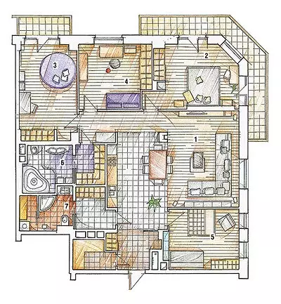
Architect: Natalia Shmelev
Watch overpower