
One-bedroom apartment with a total area of 59.3 m2: minimalism in black and white gamma with elegant designer techniques

The noise of a big city, the motley metropolitan weekdays, everything remains outside the walls of this sophisticated and refreshing as the breath of the winter night, the interior. Restraint of expressive agents has rest and thought. There are only two achromatic colors, but who would have thought that their combinations could be so expressive and fascinating!
Forwards for a long time, when the sake of the self-affirmation of the author of the project or the passion of the hosts to the experiments of the apartment was cut along and across, and the head was spinning on the square meter on the quantity of creative ideas. It turned out that it is difficult to live in such houses. Today, another principle is triumph: balanced intonations, careful attitude towards the already existing space, the ability to transform it with minimal, but carefully verified means.
Lolita Ontikkule convincingly demonstrated the advantages of this approach. The owner of the apartment-business successful young man is not only looking for a functional solution, but also wanted to gain psychological comfort, get the opportunity to relax peacefully (in solitude or in the company of friends). After posting in the service, he did not want to continue the working day at home and sought to avoid any associations with office aesthetics. At the same time, his tastes are touched by restrained contemporaries. The author of the project was able to find decisions that take into account the needs of the owner of the housing and at the same time give the interior with sophistication and originality.
"Frost patterns"
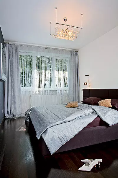
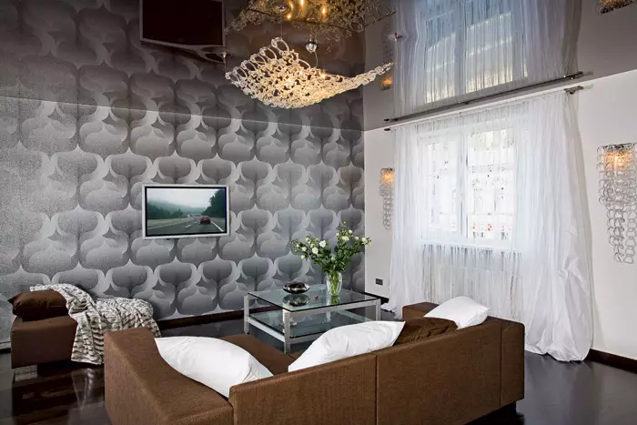
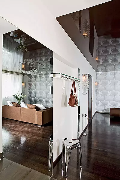
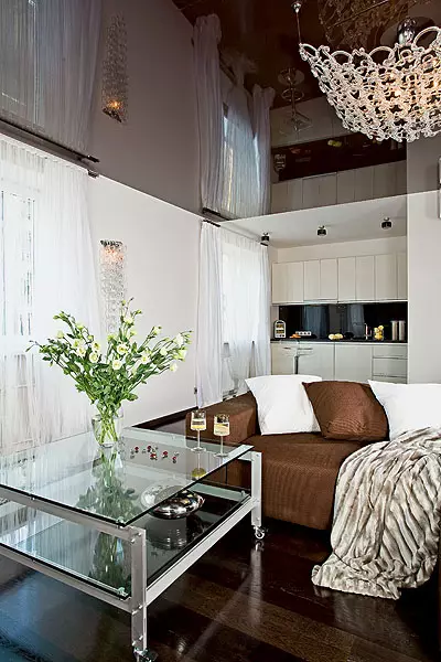
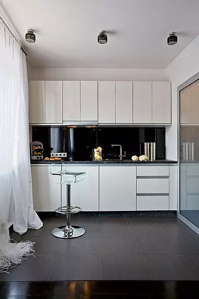
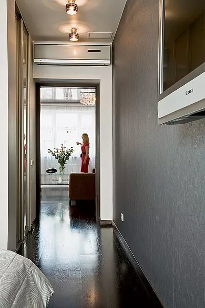
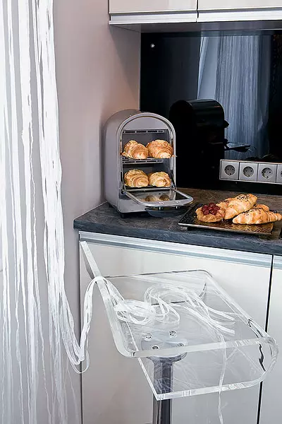
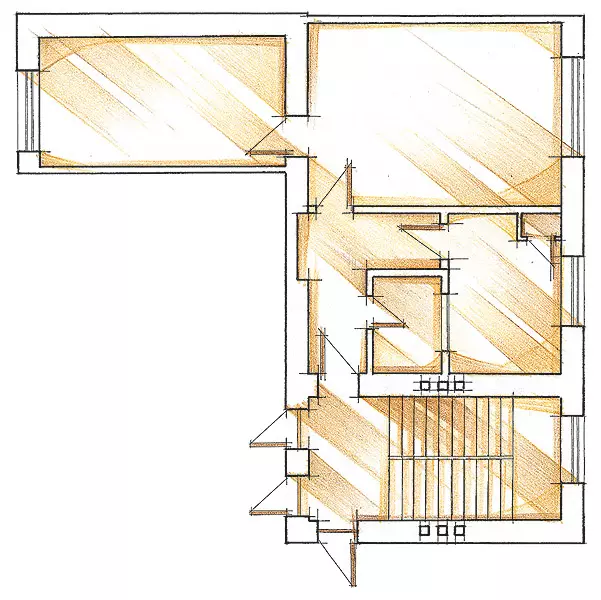
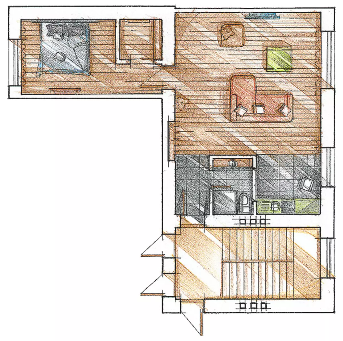
The initial layout of the apartment is mainly preserved: all functional zones remained in their places. Working on redevelopment, the designer fulfilled the wishes of the owner: "Minimum furniture is a maximum of space." Now the interior has a clear convenient structure: a small hallway-corridor with an entrance to the combined bathroom, then the living room, the setting of which makes up a massive corner sofa, coffee table and pouf. The living room and kitchen are combined, but the kitchen furniture is maximally removed from the reception areas and is placed along the wall, so that the kitchen zone itself is visually shrinking almost to the size of the kitchen edge. Opposite the window and soft corner of the living room, also a small corridor, in one of his side walls, leading to a separate dressing room, and at the end - entrance to the bedroom. The bedroom windows and the living room are located almost on one axis, and the doorways of these premises freely skip the daylight in the corridor, this successful nuance of the initial planning was emphasized by the decor.
Since the total area of the apartment is small - 59.3m2 (including utility rooms), I wanted to visually push the walls and lift the ceiling, the height of which is 2.7 m. The young owner insisted on the ascetic black and white gamma inherent in minimalism. The designer brought some kind of grace into this dry "men's" program, however, in the well-willed manners, which the owner was first afraid.
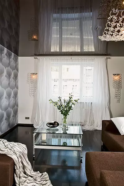
Preference was given to the gloss, reflecting the light of materials. Thus, the longest wall of the living room The author of the project proposed to be saved by wallpaper with a large black and white ornament, casting noble silver. The LCD TV panel is the only detail that disturbs the decorative self-sufficiency of this wall. All other vertical surfaces in the apartment (with the exception of the dark wall in the bedroom opposite the headboard) painted white paint. The white glossy front of minimalist cuisine has become a kind of variation on the topic of white wall. All this in combination with large windows did not allow the interior to turn into a gloomy cave.
Light window
Another very winble designer technique is a glossy stretch ceiling in the public zone. As a rule, in residential interiors, stretch ceilings of light tones are used. Here, an unexpected black "mirror" not only adjusted the proportions, but also made the space, deprived of his everyday simplicity. Dark floors are attached to the depth of the room: reflected in the ceiling, they quench the light glare.
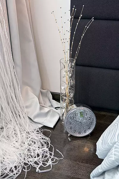
Extracted the image of the exquisite salon with the intonations of the deco is wide and long, to the floor, curtains made of cheese silk of pearl color and white curtains from thin translucent tapes, through which the sun's rays make their way. White fabrics on high windows fill the space with light. The collection of Vistosi lamps, similar to thin lace ice floes, perfectly fit into the concept of the interior. Chandelier from the same collection and similar curtains decorated the bedroom.
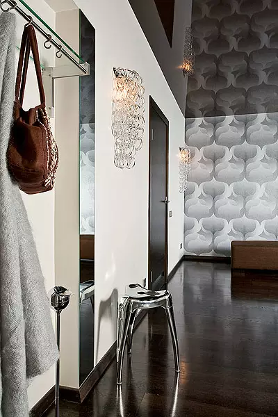
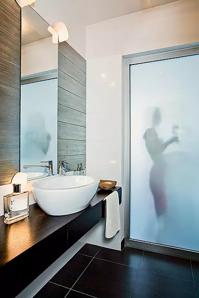
The mirror in the hallway is located so that a person, entering the apartment, sees in front of him as a doubted interior of the living room, and a narrow-in-room hallway acquires completely different proportions. But the mirror does not "pursue" the included, as often happens when studio planning. It is worth a few steps forward - and this imaginary "window" decreases to the size of a relatively small opening. There is a mirror and another function: it enhances effectability lighting, reflecting the present window. Another window- "cheating" made it possible to visually increase the bathroom (4.1m2): part of the wall between it and the kitchen made of matte glass.
According to the owner, he did not expect that in his humble bachelor apartment you can create so many impressive theater effects. The reorganization presented comfort and expanded the ideas about the possibilities of the compound of aesthetics and functionalism.
| 
|
Tell the author of the project
The apartment is located in the brick house of the late 40s. Xx in. As a whole, the construction has been preserved well, especially since we left all the communications in previous places. At the same time, the bearing walls and open ceilings had to align. Old window frames were replaced by new, plastic, with double-chamber windows: the owner wanted the budget to remain reasonable.
Redevelopment touched the kitchen and the living room, I decided to remove the partition between them to give the apartment more modern look and visually increase it. In addition, tiny toilet and bathroom combined, and instead of the bath installed a spacious shower room, the young man prefers a shower. The room for the dressing room was carved at the expense of the bedroom, improving the proportion of the latter. Since the house is located in the city center and the windows of the public housing zone go to the noisy prospect, the rooms are equipped with air conditioning. When making the interior, I wanted to create the illusion of silence and disgrace from the fuss. This was the main wishes of the owner. It dictated and the choice of aesthetics, although I personally have no favorite and unloved styles, on the contrary, I love every time creating a new image.
Designer Lolita Ontykkule
The editors warns that in accordance with the Housing Code of the Russian Federation, the coordination of the conducted reorganization and redevelopment is required.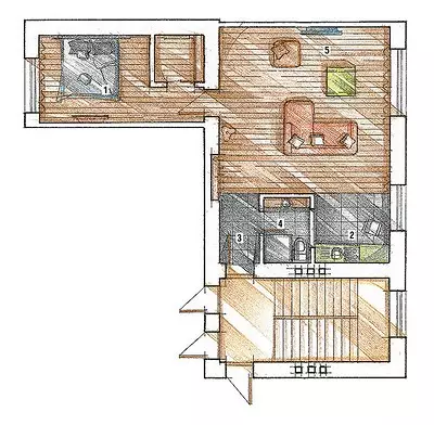
Designer: Lolita Onting
Watch overpower