
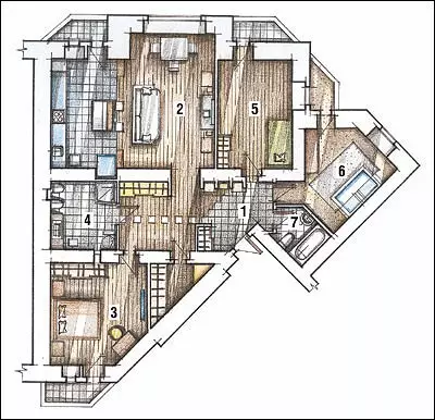
The birth of the interior of the four-room apartment (123.2 m2) occurred gradually. The result is a comfortable accommodation for a young couple with two children.
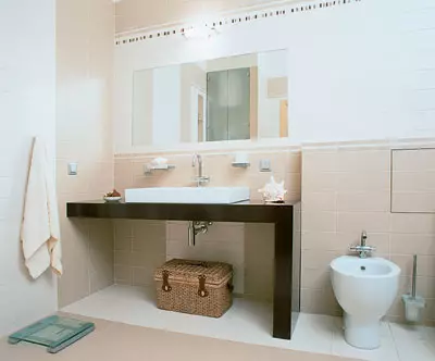
Bidet, washing machine. The designer's find began
Mr. Washbasin Table Top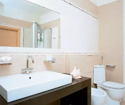
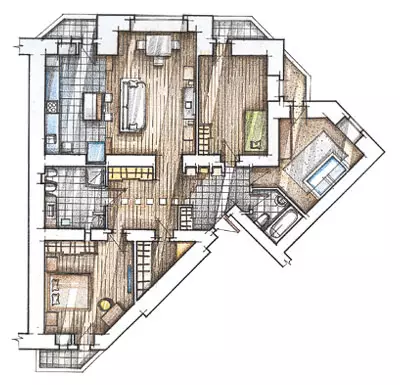
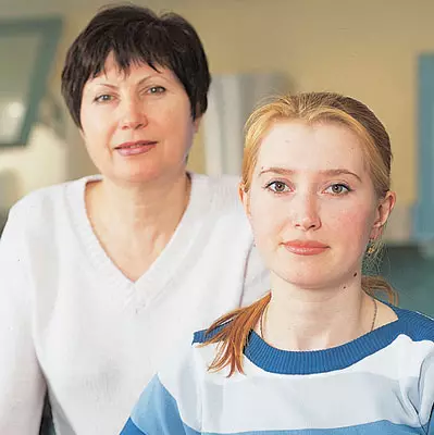
New apartment in Novosibirsk Young spouse Sergey and Maria purchased after the birth of the second child. It was no longer their first separate housing, so the hostess with the knowledge of the case was included in the discussion of the project to reorganize the interior. Especially she was worried about the issue of stylistics, because psychological comfort in the family depended on the right choice.
Mary, tired of the style of Modern, in which the old apartment was framed, intended to radically change the design of the new home. The results of the discussion gradually developed a completely different appearance of the future house-rational, with elements of constructivism and clear concise forms. A strict situation is somewhat revived beige-pink accents and a nonsense decor.
Birth of the image
Maria says, the owner of the apartment.
My husband with my husband Sergey revised dozens of rooms of various interior magazines and hundreds of sites on the Internet to find some ideas that we would like to embody in our new apartment. (For example, the concept of painting of children's walls in different colors we borrowed in the worldwide web.)
I decided that our new housing would be issued either in the spirit of Japanese minimalism, or in the spirit of the Arab ethnic. However, this did not find support from the designer. According to Natalia Sobolev, we did not have serious grounds for this choice. This is also understandable, no one in our family is an expert on the East, and we did not collect the collection of ethnic souvenirs. The designer presented us with a lot of sketches, especially concerning the design of children's rooms. We liked some of her proposals immediately, and from something for different reasons to refuse the birth of the interior and its further development was gradually.
For example, Natalia originally planned to arrange the original backlight in the drywall design with narrow niches only over the headboard in the bedroom. But, seeing the game of light on the edges of the plasterboard niches effectively, I literally fell in love with this designer reception and asked to repeat it over the bar and above the dining room.
A co-work of the collaboration was a cozy apartment, every corner of which to us really roads. It matters, it also has the fact that many of our ideas managed to embody here.
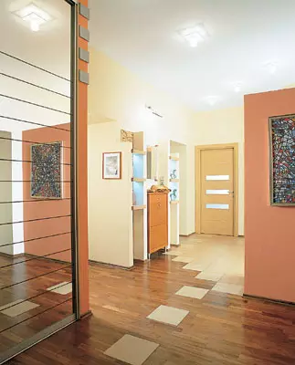
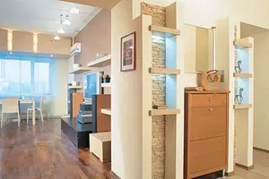
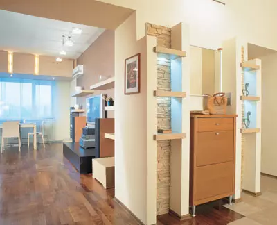
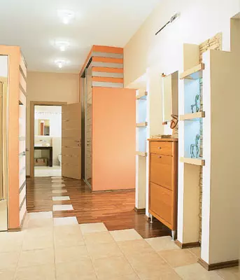
The wall opposite the entrance is decorated with artificial stone. On its background, a high drawer with a mirror, surrounded by two open racks, is spectacular, - they are made of plasterboard and veneered MDF. To the left of the entrance, perpendicular to the wardrobe wall, in a specially built "pocket" from drywall, a built-in wardrobe is located. Thus, it turned out a peculiar scene, separating the area of the hallway from the rest of the corridor. The band's "Kulisa" is decorated with a picturesque web. Suddenly simpleness, between the dressing room and the bedroom, the open book rack is installed; Opposite it is located a wardrobe for clothes with mirror doors. This small part of the corridor looks like a spacious hall.
Interestingly, the corridor, which, which, with many pieces of furniture, did not turn into a sad warehouse, and looks elegant and sideways. In general, it is a complete composition, which has become a business card of the apartment, - the motifs present in this room in one form or another are repeated in other parts of the home. Not a latter role in the design of the corridor plays a flooring. The half of the shower is echoing, which leads the dotted lane from separate ceramic tiles embedded into parquet.
Furniture Variations
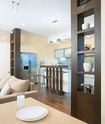
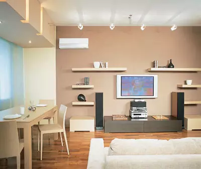
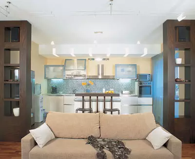
Restrained, almost minimal, solved living area: simple furniture geometry, lack of small decor elements. The design is built on a combination of light (milky-white plaster and upholstery of upholstered furniture, a lowered dining group oak) and dark (veneer Color Wenge in the furniture completed to order). It is the color that organizes this combined space, it highlights the functional zones in it. The bright gamut of the kitchen makes it almost weighty against the background of a darker living room. Additionally, two zones are separated by cross-cutting racks - "scenes".
Home Theater is installed on the background of a wall painted for contrast with the rest in color coffee with milk. This not only emphasizes the recreation area, but also visually increases the small distance between the TV and a soft corner, telling the space that the necessary depth.
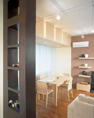
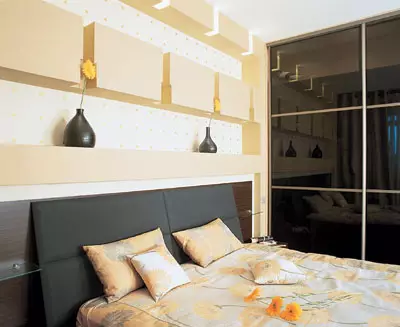
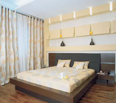
Sometimes the most original design solutions are ordinary design. This project applies, for example, to fitted lighting in the bedroom, kitchen, as well as dining room. In all three zones, the principle is the same: lamps are built into drywall niches. The game of light on the broken edges of the framing gives a fairly simple backlight the original view.
ENSURE ALL CONSTRUCTIONS - Metal frames, stitched with plasterboard. Despite the seeming simplicity, this work was quite time-consuming due to many small details. Avot Mounting lamps turned out to be simple: a drill-screwdriver in the drywall was made by holes for spot halogen sources (in the bedroom) and fluorescent lamps (in the kitchen and living room).
Quite often in similar plasterboard volumes, architects are trying to hide communications and other unsightly elements of the interior. However, in this case, the design of drywall is performed solely decorative role.
Hinged composition with built-in lamps above the dining room, located at the window in the living room, also supports the main color of the zone - in this case, the milk-white.
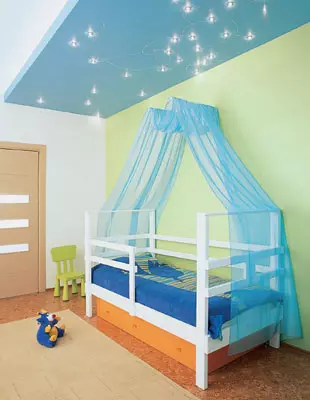
Especially for this apartment was invented the original way of designing the backlight in the bedroom, kitchen and dining room: the lamps are built into narrow plasterboard niches. As for the upper light, the spouses decided to completely abandon the central chandeliers. So in the bedroom and both children's functional ceiling structures made of drywall. Communication part of the ceiling was painted in a blue color and turned into a starry sky. The role of stars is played by built-in halogen light bulbs that form the constellation of the Sagittarius (under this sign of the zodiac was born a small mistress). In addition, the children's play area is additionally highlighted in the nursery.
The parental bedroom is equipped with ceiling light over headboard and two table lamps. The color gamma is played here: due to the warm shade of yellow (textiles and one of the walls), the room always seems to be filled down by the sun.
Sergey and Maria admit that a reasonable selection of light and colors made their apartment comfortable and friendly. Alaconic furniture and nonsense decor allow you to always feel comfortable here.
Overpowering
Architect-designer: Natalia Sobolev
Chief Architect: Natalia Speaking
Watch overpower