
Odessa Apartment with an area of 120 m2 free layout. Classic style in the interior gave way to modern minimalism.
Alexander Netchain- Architect, known for its addiction to the classics. But this time, following the wishes of customers, he turned to a more modern topic. The stylish and elegant Odessa apartment presented on these pages solved in the spirit of minimalism.
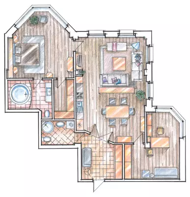
Given the modern nature of the future design, which customers dreamed of, the architect proposed a diagram with the studio planning of the front zone. To the right of it is located the office, the left bedroom, bathroom and dressing room. "Sunny orientation" housing (its large windows come south and west, providing excellent insolation throughout the day) decided to use the most. A successful initial configuration of the apartment and design techniques made it possible to fill with natural light even remote from the window zone. The hosts sought to create the most comfortable conditions corresponding to the quality of European housing. Therefore, the work on arrangement of the apartment included not only general preparatory activities (the creation of waterproofing in "hygienic zones", the fill of the screed, alignment of walls and ceilings, the construction of plasterboard partitions), but also equipment of the heat floors in the entire public area, in the bedroom and In the bathrooms, the installation of new windows with double-glazed windows and air conditioning systems. The latter is particularly relevant in the warm season. Odessa is the city of southern, and since Bo, the straight rays of the sun penetrate the rest of the day in the windows, about maintaining the optimal microclimate they decided to take care immediately.
Can a minimalist interior get ready with aesthetics retro? This apartment fully confirms the possibility and even the success of the neighborhood of strict modern forms with the stylistry of Art Deco. The topic of the 30s of the last century was delicately set several stylized photos of the hostess in the living room and the office. The appropriate makeup, clothing and accessories, as well as the overall aesthetics of photography, including monochrome color gamut "under sepia" gave the elegant photoports. Returning products are not only harmonized in color with the overall setting of rooms, but also create a sophisticated intrigue, referring to the tradition of costumed portraits in Western European painting.
Today, the vintage photos and their skillful stylization are very popular with us and abroad. Many photo artists are fond of black and white photograph, stylizing their pictures for vintage engravings and etching with the image of still lifes and landscapes, architectural works. Color photos that imitate the "caustic" colors of the first color film films look like. Such works are not a smaller interior decoration than more familiar painting and graphics.
The designer concept is distinguished by restraint and rigor, weighted use of parts, wide, free step in volume distribution. When placing an apartment, they decided to adhere to the "Nothing Excellence" rule, and much depended on the exact compliance with the proportions, the selection of objects of the situation. As for the second condition, here the owner has identified the win-win version, preferring Italian furniture of famous brands.
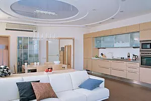
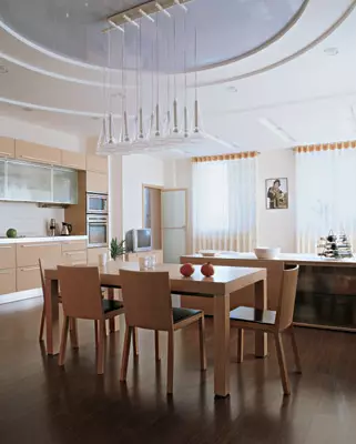
In general, the central zone looks very spacious due to the four windows. This part of the apartment straight rays of the sun are poured BO, the rest of the day. The color scheme is built on a combination of light warm wood, snow-white sofas and pale gray walls at the abundance of glass. It is supplemented by a dark outdoor board that bales the air top.
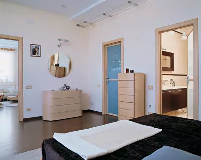
The internal "windows" enhances the impression of the airiness of the room: the door to the hallway, the bedroom and the office are made of matte glass on wooden frames. Moreover, these doors are reminiscent of the drawing of window frames. A similar role is played by the locker in the simpleness between the doors in the office and in the hallway. The motif of the window picks up the composition of kitchen cabinets. It is arranged in the form of a wide frame around a small simpleness above the working surface, decorated with white tiles. On the sides, the kitchen zone limit plasterboard partitions. A certain similarity of another window, oval "ophusus" on the ceiling, marked the location of the dining table. The stretch ceiling with an almost mirror surface and the rates and lamps diverged from it circles visually lifts the space in the center of the room, the erosion of the monotonous plane above the head. The motive of the circle is repeated in the ceiling-relief bathroom. The rounded outlines softened the rigid mesh of straight lines, otherwise uncompromisingly weathered. In addition to the ceiling composition, the zoning function performs a low servant between a dining group and a recreation corner. Over them in small groove-grooves in a plasterboard ceiling, dotted lamps are mounted.
Psychologist's opinion

Candidate of Psychological Sciences
psychologist-consultant Elena Timoshovskaya
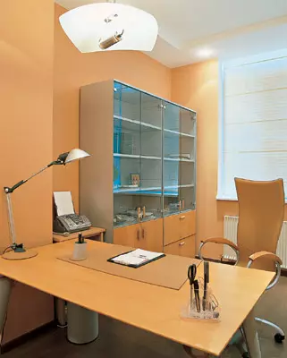
From the living room you can get into a small Cabinet of the M-shaped form. To the right of the entrance - the built-in floor cabinet to the ceiling, a little further, a comfortable double sofa and acto. A writing desk with a computer and a bookcase are hidden around the angle and are highlighted in an independent, brightly lit by sunlight zone.
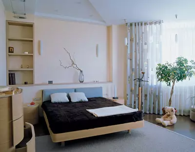
The entrance to the bedroom is located at the Far End of the Lounge Studio. Special charm she gives the Erker. Worth's room the sun comes earlier than in all the rest. "Mini-garden", which is going to arrange a hostess here, will make email notes into a restrained situation. Shallow niche in the headboard is designed to be placed on a narrow shelf with flowers with flowers or hang the picture, the left mini-rack. The composition as a whole creates a strict graphic pattern, supported by minimalist scaves in a niche and a bus system along the wall, behind which the bathroom is located. The light scenario is complemented by three ceiling lamps, mounted above the headboard, and three narrow flashes hanging from the ceiling on the border with the Erker. Vuglu, next to the entrance to the bathroom, there is a door to a large wardrobe room.
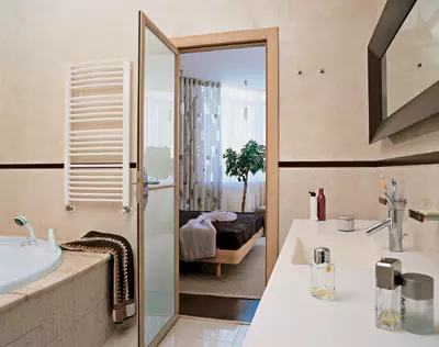
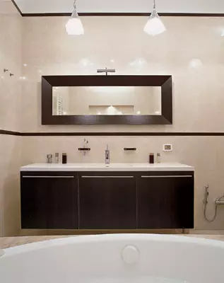
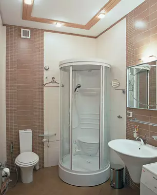
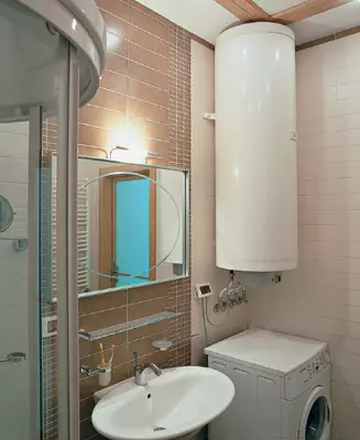
It is noteworthy that both bathrooms, and the guest, and the master, are solved in a single stylist. A second-line drawing, built on a combination of two colors: light beige walls and floors are beautifully contrasted with furniture under the wenge (bathroom of the hosts) and inserts from dark brown tiles (both bathrooms). Moreover, in the bathroom, dark borders with subtle strokes shall with a strict composition of both half the wobbling rooms and the baths versed in the podium. The toilet and the hygienic soul hose are hidden into a small niche behind the washbasin. According to another principle, the decor in the guest bathroom is organized: inserts from dark tiles form wide vertical planes. The washing machine and the cumulative type boiler do not look like a dissonance, rather, they are perceived as part of a functional design.
Stylistic unity, persistent in the design of all interior zones, and convenient layouts allowed to make this apartment equally convenient for a quiet family holiday, and for secular communication in a numerous company of friends.
The editorial board thanks the Santaroz furniture salon and the Ligne Roset salon for helping to take pictures.
The editors warns that in accordance with the Housing Code of the Russian Federation, the coordination of the conducted reorganization and redevelopment is required.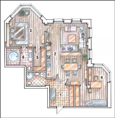
Architect: Alexander Nets
Watch overpower