
One-bedroom apartment with a total area of 66.5 m2 is an example of the embodiment of all house requirements for a modern middle-aged couple.
What should be a house for a modern middle-aged couple? With a comfortable and elegant living room, where you can communicate with close friends for a long time. Sunny bedroom to, beyond in bed, watch your favorite films. Not so much and many requirements. But is it possible to put them in an apartment with a single residential room?
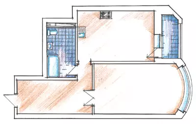
The lack of the previous planning of this small apartment is too straightforward organization of premises (in literal and figurative sense). Directly from the threshold, the door was seen in front of him the door leading to the only living room. Invalible protrusions of straight corners interfered with free movement. Delighted comfort and secrets The little space seemed even less because of its planning. Such a position of things at all satisfied the owners. Therefore, one of the main tasks of the required reorganization should have been the well-thought-out design of the trajectories of the movement and the complication of the internal volumes of the apartment, its transformation from one-room in a two-room one. Turning to the architectural bureau of Masha Stepanova, the customers first of all hoped to find professionals who have experience such as the reorganization of space.
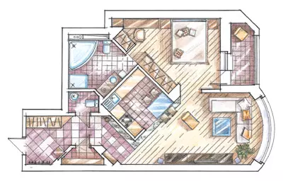
The author of the idea of "transform" Architect Inna Lobova has already had several projects incarnated in his portfolio, where she managed to resolve a similar problem. In the same case, 65m2 should be placed a living room and a bedroom, designate the dining area and organize a functional kitchen. The same need to store things meant the creation of at least a small pantry, and the desire to receive guests of an additional, guest, bathroom, as was customary in the apartments of a larger area.
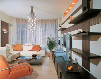
Improving the aspirations of customers helped an interesting planning solution. According to the architect, the kitchen became a composite core of the house. She was decided to arrange in the center of the apartment, at an angle of 45 in relation to the surrounding premises. On a small area, the construction of new partitions broke the orthogonal logic of space may at first glance seem unreasonably complicated. However, such a move solved several problems at once.
Flooring usually require high wear resistance and decorativeness. In the case, it should have emphasized the non-standard location of the kitchen. This was done using a glass insert to the floor on the border of the tile and parquet. Decorative element "Forming" angle of the room. The device of such a detail created some technical difficulty, but the architect managed to find performers to implement the idea. At the initial stage of repair, when pouring a screed, for the future glass insertion was left in the floor, limited by contour with thick wooden slats. It was filled with natural stone. Wooden supports for the glass leaf were covered with silver paint under metal, as in the apartment there are quite a lot of metal structures. The luminous cord was laid down the insertion along the edge of the insertion (the switch from it was bred on the wall). According to the architect, the glass floor should not be an angular seam. The only one is between glass canvas coincides with the border of the opening in the kitchen wall. Accessory in the form of a shape of the seagull, organically fit into this "resort" theme, the mistress of the house picked up.
Forward the queue of the living room before from the entrance door hide behind the bend of the corridor. This unusual bending appeared due to the organization in the hallway of a small protruding storeroom. The boundaries of the corridor designated the angle of the kitchen wall, cut into the space between the hallway and the living room. The latter, not even being hidden outside the door, is now not available to the look of the incoming one.
Did the main room decreased due to such a kitchen location? Not at all, as the premises are not divided by a partition or door. But adjacent to the kitchen bathroom acquired new dimensions. It is now included in her bedroom, which appeared on the place of the previous kitchen. A new planning solution helped find a place for the guest bathroom-he separated from the bathroom with a new partition. To enter the bathroom from the hallway, it was necessary to make the opening in the bearing wall. Naturally, all these changes are reflected in the project documentation filed on approval, and in accordance with them, a resolution was obtained.
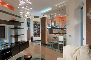
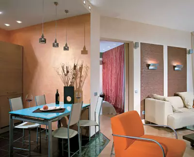
Rational planning of the apartment eats a simple and functional approach to the style solution of space. The compound of natural materials and metal elements emphasized the expressiveness of simple geometric shapes. The color gamut rooms, at the request of the married couple, was to become warm. The architect made a bet on the noble combination of the shades of the natural tree used in furniture and decoration of the apartment (wenge and bleached oak). But in itself it would look too traditional and neutral. Therefore, an orange kitchen was arranged in the center of the apartment, from where bright color accents were separated from all the premises.
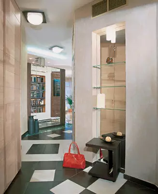
The direction of movement from the entrance door is indicated by the pattern of floor tiles - it marks the turns of the broken line of the corridor. Large squares of black and brown and light beige tiles on the ceiling are invas the lamps with round light lamp lamps on dark square bases.
Opposite the cabinet with sliding doors of white oak there is a mirror niche with glass shelves, equipped in the wall of the pantry. This is the first "cheating", because the mirror coming from the floor itself, as if dematerializes the watertime of the wall, prompting to change the direction of movement. Here, even the drawing of the tile "guess" such a maneuver, leaving the floor with a wide beam from a mirror niche. Over the turn, the other wall of the pantry is also decorated with a niche. There is a small library. The surface between the bookshelves inside the niche is painted in the oath-terracotta color, which seems muffled here. The walls of the pantry are erected from foam blocks, but thanks to the decorative finish, the utility room has become a decoration of the hallway.
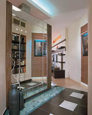
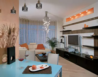
The design of the input zone is a successful find of the architect. The room is decorated with a large mirror made by the project author's sketch. It is fixed on the partition from foam blocks, behind which the kitchen is located. The intriguing reflection in the mirror (the library in the niche, the wall of the living room) seems to make the entrance to another room, really not existing. Also in the mirror reflects the inset of bamboo wallpaper - it forms an interesting combination with a decorative belt, arranged directly under it on the floor. We are talking about the deepening, which is covered with pebbles of different sizes and closed with glass. Toned in a warm brown bamboo serves as a spectacular background for the painting, highlighted on her brake. Bamboo wallpaper was pasted into this and two other shallow niches, and the width of the recesses left between the sheets of plasterboard at the initial stage of repair, was calculated strictly in the size of the roll. The framing of the large mirror with a tree and the manufacture of wooden shelves for the library performed the Master of Anton Koltunov. The embossed wooden frame of the mirror was specifically selected for the color of bamboo wallpaper. Similarly, decorated the wall of the living room.
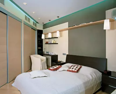
Quite often, with a lack of free area in the rooms, the output door is out of the position. But very unusual admission to hide the doorway to another room behind the sliding doors of a large cabinet in the bedroom, as Inna Lobov suggested. During the construction of partitions of the future, the wardrobe was arranged between his left and right segments. One of the sliding doors most of the wardrobe actually opens in a short corridor leading from a bedroom to the bathroom. To visually expand this intermediate "section", the passage to the bathroom was decorated with a mirror.
At the entrance to the living room, the diagonal direction in which parquet is laid, again denotes the movement to the center of the apartment. Punching material for parquet floor chose the maple, its light warm shade is perfectly combined with a common flavor of the living room, where there is an orange gleam. The limits of the kitchen zone are marked with decorative techniques, in particular the design of the ceiling. After all, as mentioned above, the partition bordering with the corridor is not communicated to the ceiling itself. After their level here, its level is lowered, after all, the "air" between it and the wall remains. Weather is deliberately technically described. Its square in cross section is perceived as a metal pillar that supports the ceiling. The effect of the steam is supported and the fluorescent backlight of the eaves. Even more air give round dotted lamps on the ceiling, which are actually directed to the cabinets and the working area of the kitchen with a Corian countertop.
In general, the lighting in this apartment plays a very important role, it is enough to calculate how many different illumination options are used in the design of space. Where the kitchen ceiling passes to the main height of the ceiling living room, square spotlights give planes ease and repeat the light chord over the library. Three small lamps are descended from above on thin wire and denote the dining area. A compact folding table in the case of arrival of guests is easy to enlarge.
The chandelier from a plurality of flexible swirling elements emphasizes the recreation area over the square of the coffee table. He took a seat next to the corner sofa, opposite which the wall was equipped with a home theater. A peculiar rizalitis is laid out of foam blocks, speaking to the depth of one foam block, followed by a contrast trim tree under the color of the bamboo on the light plaster. On his background, they are located in a row of deep cabbage containers and shelves from Wenge, and in the center - wide plasma panel and equipment. In order for the sunlight to not interfere with watching TV, the blinds from a thin bamboo natural color and tulle in the tone of the walls hung on the windows.
One of the complex places of repair was the requirement of customers to arrange a channel air conditioning with a forced substitution of fresh air. To achieve sufficient circulation, it was necessary to place two internal fan blocks, the channels from which would be separated by all rooms. If for small volumes of the ducts there was a place in partitions and a slightly reduced ceiling, then the size of bulky main blocks meant a significant decrease in the latter. The exit from the created position was the idea to place blocks on the brackets with elastic gaskets under the storage facility, one in the storeroom, the other on the mezzanine over the entrance to the bathroom. About their location they say only small ventilation grilles in the wall of the corridor and above the closet in the bedroom. Listening to the breakdowns access to the block in the dressing room is carried out from the bathroom.
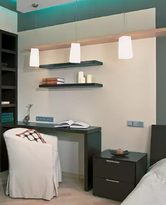
Orange niche backlit, left at the top of this rizalita, like a bright chair opposite it, as well as other accessories in the living room answered the challenge, thrown by the color of the kitchen walls an ensemble of rooms. If the sliding door between the living room and the bedroom is not closed, it can be seen that in the interior of the bedroom there is no less way the colors accent. Already at the entrance to this room, the deep brown wall of the walls in the headboard is drawn. The color of the curtains on the window were picked up according to the tile of the tile decor in the bathroom. In general, the coloristic solution of the interior of the bedroom is designed for a calm relaxation, since the construction of space in itself is very dynamically. To the left of the doorway with a sharp diagonal of the entire length of the wall stretched out a large closet, and in the corner itself there is a "working corner". The wall itself is something like a multi-layer scenery. On her "main" layer and the ceiling are covered with light planes. They, in turn, serve as a background for dark details and shelves. Spotlights and cornice backlight of the suspended ceiling, the edge of which does not reach the wall, pay attention to this feature. On both sides of the head of the bed, the lamps are descended from above: three on the one hand and one on the other. Locating a large bed in the center of the room, the architect tried to fulfill another desire of the owners of the apartment. Now, moving the door between the living room and the bedroom, they can, without getting out of bed, watch TV (although there are six meter to it, the big screen allows not to think about the distance).
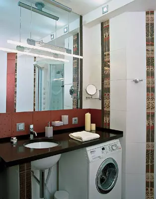
The door leading to the bathroom is disguised as one of the cabinet sash. Successfully beating the wrong form of the room, it was installed in it a large corner bath, a shower cabin and a toilet. Vertical stripes made of colorful decorative tiles attached to the room aspiration swell, despite the ceiling lowered along the edges (such a feature is due to the technical necessity to hide ventilation channels). As you can see, complicating the daily route of the owners, the architect created the illusion of long and fascinating, full of pleasant surprises of the journey in a small, in essence, apartment. Each detail, once interested in this trip, then reminds of the path already traveled and promises a fascinating continuation of history.
The editors warns that in accordance with the Housing Code of the Russian Federation, the coordination of the conducted reorganization and redevelopment is required.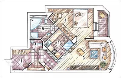
Head of Design Bureau: Maria Stepanova
Architect: Inna Lobova
Watch overpower