
Three-room (118 m2) Transformer apartment: everything is subordinate to geometry, and the impression of dynamism is made up due to the "game" with forms and lines.
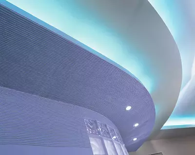
There are direct corners of the stepped partition. A two-tier cable ceiling additionally focuses on the luminous cylinder of the bathroom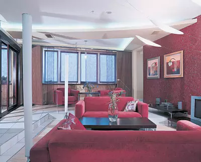
"All around-geometry. The spirit of geometric and mathematical order will be the ruler of architectural destinies," said Le Corbusier at the beginning of the XXVEK. The caviar, which you see on these pages confirms his words. It seems that someone here plays geometric shapes and volumes. Cylinders, cones and cubes alternate "a strict disorder", as Alice would say. But this is only at first glance, they actually obey the designed plan of the creator of this abstract geometry.
This interior is primarily interesting as the result of creative mixing like those who contradict each other receptions, colors and shapes. Jeanne Kirichek and Vyacheslav Ezhov Each of his project is preceded by a test that clarifies the style and color priorities of the owners of the house. This technique is used far from all designers, although it is very useful for establishing mutual understanding and interaction with customers. The study makes it possible to understand not only that a person likes a purely visually, but in what atmosphere it will be nice to live. Testing to the respondent is taken away with the interior illustrations, furniture and decor items that they like. Then designers using them only by one known method (own know-how), analyze the information received. In the case, they came to the conclusion that the interior was needed, far from conservatism. On the contrary, it should become an ultramodern, non-standard, and most importantly, very dynamic, alive. Hence the game with a composition, geometric shapes and lines. The authors of the project characterize the style in which this apartment is made as non-constructiveness. All shapes and elements of space are associated with the details of the designer or parts of some mechanism, everything is subordinate to the strict geometry.
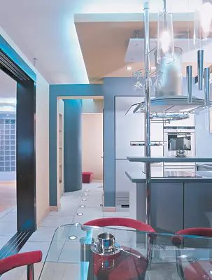
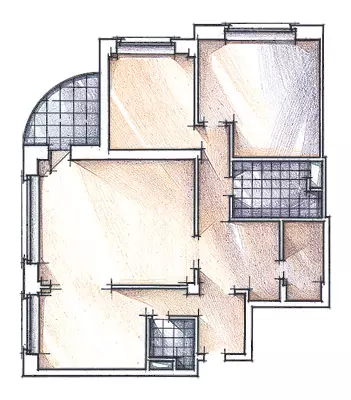
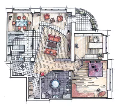
The redevelopment project was based on the main requirement of customers: so that the whole apartment was formed (unless the purely private premises like a bathroom, a cabinet and bedrooms) was a single space. At the same time, the kitchen had to be separated. That is, it is so that it is part of the general, but at the same time had clear boundaries and did not merge in any way with the living room. Pretty paradoxically. But the desire of the client is the law. Iono led to an unusual planning solution.
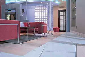
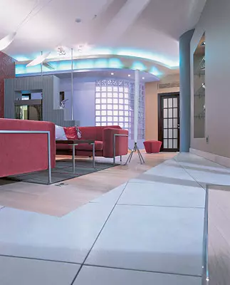
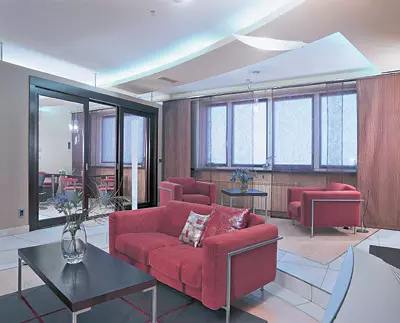
In principle, the premises are delimited: the living room is separated by partitions from the kitchen, corridor and hallway. Educated even a small corridor, which is parallel to the living room, from the hallway to the kitchen. On this separation ends, the union begins. The fact is that new partitions do not reach the ceiling and it binds the premises with its plastic.
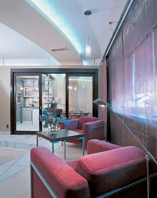
The partition between the living room and the kitchen with the corridor is also subordinated to the idea of "uniting, separating". The designer's designer managed to achieve the designer, applying the glass, and two in different ways. A niche with glass shelves is equipped between the corridor and the living room, and the passage to the kitchen is fenced off by sliding glass doors. The deaf portion of the wall occupies hardly the fourth part of the total length of the partition. Thus, there is no visual border: everything that happens on the other side is visible from the living room. But you can only go where sliding doors open. By the way, they only partially freed the opening, because one of the flaps is fixed.
Thanks to this layout, the interior transformer turned out, which is a single space, then a combination of isolated zones. The impression of dynamism, variability develops due to the professional "game" of designers with individual elements. Horizontal and vertical membership of the total volume, alternation of various materials and textures, active use of color - all this becomes instruments in achieving the goal: create an expressive and original image.
Among the techniques that strongly affect the perception of the interior, it is worth noting the zoning of the living room, as well as the interpordability of items in it. The fact is that the furniture composition in front of the TV is oriented not parallel to the walls of the room, but slightly at an angle and shifted relative to the main axis of the apartment. Such furniture accommodation is due to not immediately striking, but fundamentally important for the interior of the podium height in one step. It is deployed to the wall at an acute angle, and relative to its edge just the sofas and the coffee table. However, the spectacular planning solution is explained and purely practical considerations: in front of the window it was necessary to raise the floor, since it was made by the builders unjustifiably high and the feeling that were in the semi-basement room arose.
In the outlines of the podium, we first encounter a lectal line. It is then repeatedly repeated in various elements of the interior. For example, in several places duplicated the line of the boundary between the parquet and tiles. The same line is projected on the ceiling, transforming into a long, slightly curved strip of the strip design, behind which the split system is hidden. The ceiling curve does not end opposite the place where the podium turns, rich living room, but continues further, crosses the partition and passes above the kitchen. By the way, it supports the idea of the unity of the interior. And if it looks at the ceiling from the far corner of the apartment, then it is really a ceiling of one large room. In the kitchen, the edge of the glass dining table, made to order, exactly repeats the bending of the ceiling composition. Also, she fills a bar counter.
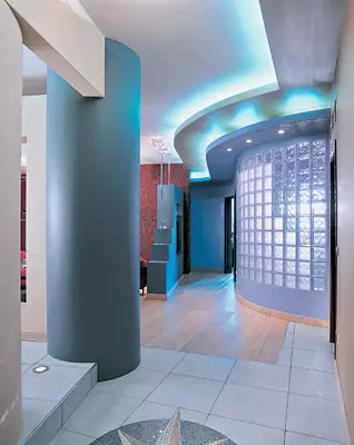
The role of lectal lines, in general, is secondary, they shall themselves the main orthogonal theme. The same reception is used in a game with three-dimensional forms, cubic and rounded. So, entering the apartment, we immediately see two large cylindrical volumes. This is a column, visually separating the hallway from the hall and the living room, and rounded the wall of the bathroom. Remove contrasts the stepped partition with aquarium, as if folded from large children's cubes. In addition to aesthetic, it also carries the semantic load: almost hides the entrance to the bathroom from views from a single guest area. "Almost," because the aquarium is still transparent, and if the door to the bathroom is open, it seems that the water fills the room and fish are floating.
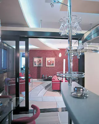
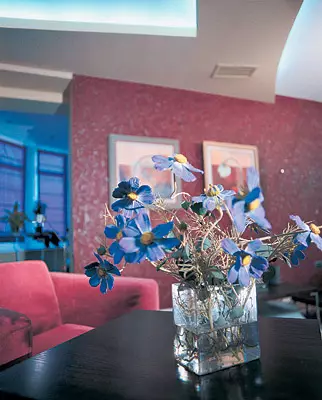
Bright palette, bold color combinations also develop the dynamics of the interior. After all, it was impossible to paint all this clear geometry into monotonous and white and pale beige shades! However, without the original wall decoration, they simply did not take place, this is one of the individual creative techniques of the authors of the project. In all rooms, gray and burgundy color are dominated. But everywhere they are used in different ways and are served in different combinations - somewhere with beige, somewhere with Lilane and Umbra. This is explained by simply beauty combinations. At the same time, the owners testing revealed exactly such color preferences (it is not excluding that the reason was then the fashion for these shades in clothing). The hallway is painted in a beige, the wall of the bathroom is awesome. Before the beauty of this shade, neither customers or designers could not resist. Abiges applied due to its good compatibility with lilac and the comfort of perception. A smooth transition from burgundy walls to lilac is provided by brown and saturated gray tones applied on the border.
In the design process, there was no discussion on how to design the walls. Here we needed only water-emulsion paint. This material is quite popular in the interior decoration, which is due to its technical and operational properties. Water-level paints consist of the smallest particle parts, evenly distributed in water. When evaporation of moisture, these particles form a very durable and elastic film. Paints have a number of benefits: they are bred by water, so they are non-toxic; The ceiling and walls with such a coating skip the water and air pairs ("breathe"); The resulting surfaces can be washed. These compositions are stronger than adhesive, but weaker oil. They are used instead of oily indoors, if they do not want to use Olif and there are no special requirements for the operation of surfaces. The time of easy drying of paint at a temperature of 18-22c is the most 30 minutes, full of - 1.5-2 hours. When adding a pigment, you can get a coating of any color. You can read more about interior and facade paints in our magazine No. 4 for 1999. .
Shades were chosen for a long time and painstakingly. It is known that in the bank, the paint has not exactly the color that will acquire on the surface in the dry state. Therefore, before deciding with the shade, each time the sample was painted a small segment of the wall, waited when it dries, and sometimes mixed a few tones to finally get the desired result. So, for example, it was with a wall separating the living room from the corridor and the kitchen. Her beige color is slightly different from a beige entrance hall, less gives to the yellowness. This effect was sought specifically that the partition was not lost against the background of neighboring walls. By observing the authors, of all the paints used in the apartment, the same shade on the plane and in the bank had only a lilac, produced in the United States, had to "fight" with the rest.
But this riot of paints seemed insufficient designers. So in some places it was decided to use textured plaster. Waters were covered with the entire walls, alone, alone, only fragments (for example, the upper part of the wall or niche). Textured surfaces are especially advantageous in the neighborhood with smoothly plastered and painted.
The relief of textural walls is not repeated. Somewhere there are vertical bands, somewhere waves, and somewhere deliberately uneven tubercles and smears. Sometimes it seems that this is not a textural plaster, but sculpture and bas-reliefs. The burgundy wall of the living room was decided even more to diversify: on the convex parts of the relief, the colors of a silver shade were painted, which flashes with bright light. The work was carried out with a brush, since it was necessary not just in chaotic order to paint plaster strokes, but also "hang" silver drops on them. If you are able to enrich the enrichment of the color and do without drops, you can use a dense foam roller.
In the piggy bank of ideas
Contrasting in one interior of contrasts, such as black and white, concrete and glass, etc.- Always winning reception. True, supporters of such a radical approach are few among customers and among architects. Much more common options for organic compounds through additional intermediate forms. The inclusion in the contrast duo is at least one element gives some more natural and psychologically comfortable solutions.
As a sufficiently visual illustration, you can use not quite the usual way to finish surfaces in this apartment. The public system is reduced by such unsecast things as the vertical and horizontal plane. The semicircular wall is squeezed on top of two levels of steel structures. But if they are separated between them with backlight and color, the lower, the lilac level is decorated in the same way as the wall adjacent to it. Parallel grooves of textured plaster move from a horizontal plane to vertical. The valid light of the built-in bulbs is erased by the border between them. Lilac wall rushes up due to the apparent continuation in the cornice. Introduction to the game of planes and their textures made it possible to find another way of fighting low ceilings and confirm the thesis on the preferabilities of compromise solutions.
In such an unusual interior, traditional curtains with Faldami and Lambrequins would be inappropriate. Therefore, the windows are closed with vertical panels in Japanese style. Panels are made of translucent nonwoven canvas. It is made on the basis of phlizelin (one hundred percent polyamide), which is used in sewing, pave between parts of clothing, for example, in collars or welds. For strength to it, a special strengthening impregnation has been added.
The lighting, too, could not be generally accepted, only imagine in the midst of this "kingdom of geometry" beaten horns chandeliers! No, light sources are chosen in accordance with the overall interior concept. They are emphasized geometric. Over the rectangle of the coffee table "take off" three ellipsoid from matte glass. Lamps are attached with almost invisible thin strings to the ceiling and wall. Over the other tables from the ceiling, lamps are descended from metal and glass in the form of truncated cones and cylinders. The kitchen ceiling is littered in small squares and circle-built-in lamps. Sources of light are thoughtfully distributed over various functional zones. Depending on the location, their stylistics is slightly changing, from the deliberate point to delicate neutrality.
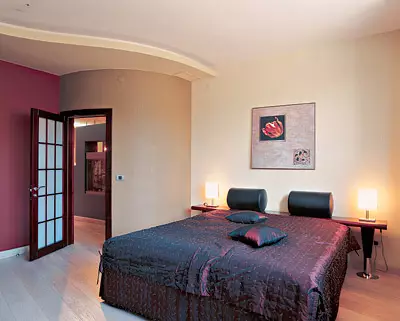
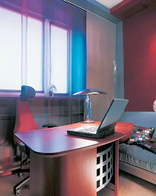
The overall interior style is felt in the isolated premises of the bedroom and the office. It will later dominate the same game with geometric shapes. The square shape of the room is emphasized with a suspended ceiling, lowered around the perimeter, the lamp is a cylinder with a hemisphere on it. The outlines of the table invas the curvilinear theme started by a bar counter in the kitchen. The color palette is also the former: a burgundy wall with wavy lines of textural plaster is adjacent to smooth gray surfaces. Acresco is covered with the same material from which sofas covers are made. Headrest at the same time burgundy, and the chair itself is gray.
The bedroom is fraught calmly. But here the same motifs are traced: the semicircular wall at the entrance, the rectangular shapes of the wardrobe and headboard, the curved line of the suspended ceiling. Of particular interest is made to custom bed. Its design does not imply neither the backs, no shelves, no bedside tables. Smooth "Lena" without any fences. However, to the wall, to which the bed is adjacent, a long shelf under the red tree on the cone-shaped metal legs is attached. On it, cylindrical rollers, covered with black leather. The bed and shelf are compositely complemented by each other and at the same time constructively independent: you can simply be sleeping space.
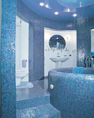
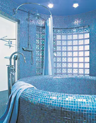
In the composition of the bathroom dominates the topic of the circle. From the entrance door in both sides, the stairs leading to the podium, which surrounds the main element of the interior bath, having the type of font. According to the design, it is also different from the usual solid bath. In the case, a metal frame was used, which was welded in the form of a future bowl of sheal iron. A grid is fixed on top of it, a layer of waterproof concrete is applied to it, and then the surface is lined with mosaic, the same as on the floor, flashing lilac shades. All pipes and plums were mounted in a bath before concreting. The shower cabin decided not to put, because it would break the circular bypass. Therefore, the soul design is quite simple: a rod with a curtain hanging on a circular metal cornice, and a drain, built directly into the podium.
Between the guest bathroom and the only carrier column builders left very narrow opening. In fact, this is a place for the door - 80cm. APO project of architects The corridor comes from the hallway to the kitchen was scheduled. According to the valid standards, it must have at least 120 cm wide. In order to cope with this narrow place, the corridor was made divergent, putting the wall with a large opening and glass shelves along the column axis. In addition, the light bulbs were built into the floor, the light of which visually expands the space. For the interior, it became an additional interesting element, very resembling the take-off strip for a small airplane.
The plan is perfectly seen how architects have turned the initially rectangular room in the similarity of a circular arbor. Partitions and walls involved in the creation of a circular composition, as well as a round beam under the ceiling are lined with a mosaic. Niches are just painted white paint. Against the background of Radia-lilac flicker, they do not attract a look, as well as white plumbing. In general, the bathroom seems to accumulate a set of rainbow sparkles. They overflow in a mosaic on the walls, the floor and font. At the built-in bulbs, the nozzles are sparkling in the form of ice floes, throwing bizarre glare on the glossy stretch ceiling. Achast of the rounded wall, behind which the corridor is located, is laid out with glass blocks, partly matte, and partly transparent. Mosaic architects used not only for glare. In a block of room, a large tile would have to be cut and stacked with pieces, and it would not look so impressive.
But it is precisely effective, brightness and non-standard, the basic principles of this project. The interior lives its, joyful and non-pie, life lines and the interaction of geometric shapes, underlined with contrasting color, create a continuously changing image. And in general, it turns out a protest against ordness and monotony.
The editors warns that in accordance with the Housing Code of the Russian Federation, the coordination of the conducted reorganization and redevelopment is required.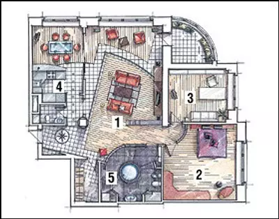
Designer: Jeanne Kirichek
Designer: Vyacheslav Ezhov
Watch overpower