
The image of the residential premises depends not only on the method of arrangement of furniture, but also from lighting. Light as an integral part of the interior.
M. Zaslavsky, Wawgganov.
Photo: Kdubovets.
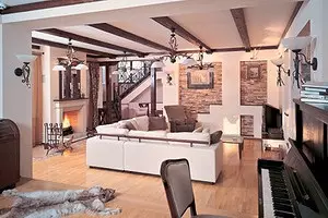
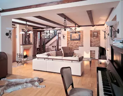
Sunlight from the window, ceiling chandeliers and wall scaves, open fire fireplace - together or spit- help the hostess at home Create the desired atmosphere in the living room
Photo: Vvasiliev, A. Babaev.
To the blue evening light "inseparable" red sofa, it must be highlighted with a warm light of a yellow lamp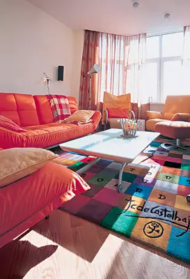
Photo: V.Neples.
Warm orange gamma living room unequivocally indicates the active life position of the inhabitants of the house. Vehicle interior is well discussing future plans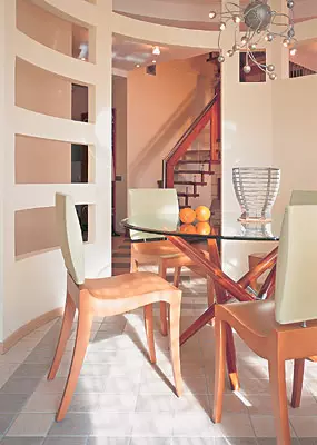
Photo: V.Neples.
Strict lines, lightweight color gamut, elegant furniture. But the atmosphere of the interior does not have to a long feast. This is a breakfast area - morning, beginning of the day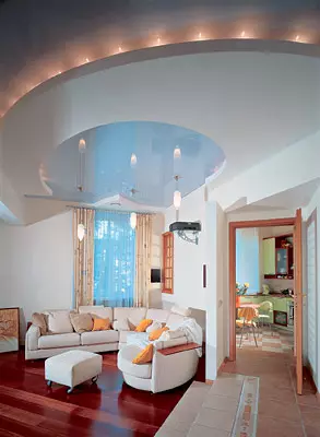
Photo: V.Nepledov
The illusion of weightlessness, the activity of a large semicircular sofa is created due to the contrast of the light tone of its upholstery and the dark tone of the floor. A cold "mirror" ceiling visually increases the height of the room. The separation of the guest and passing zones is carried out with the help of various sexual textures.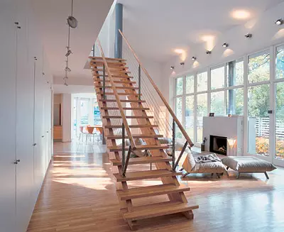
Photo: K. Manko.
The room and the garden separated by a glass partition are essentially one. The fireplace is well located, near the evening the inhabitants of the house are going. The visual emphasis is shifted to the garden. Hospital, the view from the window does not deserve attention. This photo, probably, was made at the stage when the gardener has not completed his work yet.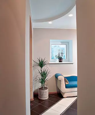
White upholstery color creates a feeling of weightless furniture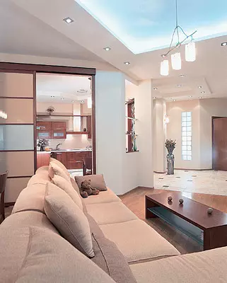
Photo: V.Neples.
In this interior there are several different lighting scenarios. The stained glass lamp at the entrance creates the illusion that the door leads to the sunny street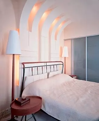
Photo: A. Kamachechkin.
Soft scattered light, interesting pairing walls and ceiling. However, lamps in the wall above the headboard are more decorative. Functional is the lateral lighting in the form of two floor lamps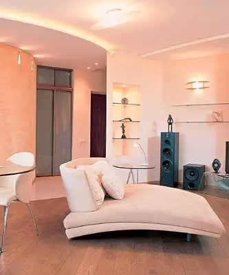
Photo: M.Stepanov.
The infinite variety of shades of yellow and brown, the roundness of the interior forms unambiguously reproduces the image of the desert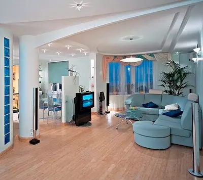
Photo: G.Shablovsky.
Interior in the spirit of modern constructivism: "House- machine for housing"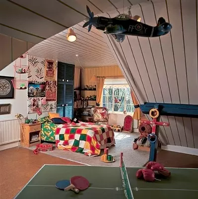
The interior of the children's room often does not correspond to the architectural style of the rest of the housing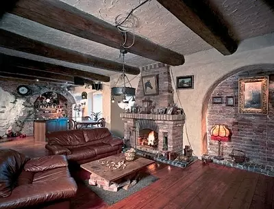
Photo: G.Shablovsky.
Light and color solution of the interior, which can be conditionally called "Bourgeois House"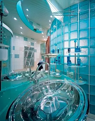
Photo: V.Neples.
The blue "cosmic" interior of the bathroom, something resembling scenes from fantastic movies, creates the impression of non-residential premises. Such uncomfortable lighting is designed not to allow thoroughly and for a long time to settle.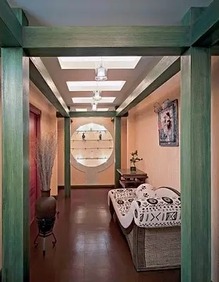
Photo: Z.Razutdinov.
An unusually elegant solution of the corridor. Powerful green beams are not a supporting structure, this is a decorative element that gives an inexpressive passable room the status of an independent architectural object. The wall light at the end of the corridor visually increases the width of the passage
If the color is not illuminated, it does not exist.N. P. Krymov
The image of the residential premises depends not only on the method of arrangement of furniture, but also from lighting. Recall the theater with its light veins and point shots of the light gun. Directed article Light is considered as an integral part of the interior.
Sun and sky
We will be consistent and begin to "dance from the stove", more precisely, from the Sun, which illuminates our life during the day. A canonomic scale is small, cold and rather dull shine. Scientists call it a red dwarf star of fifth magnitude. BEE OF NEWS ONLY The thermonuclear reactor works, but the reaction products, fortunately, are absorbed in the body of the star itself. Over the limits of the fiery ball, light electromagnetic wave radiation is broken, which is formed in a thin (500-1000 km) surface layer of the sun, heated "just" to 6000c.This temperature determines the spectral composition of the radiation (a set of wavelengths), a life on the third of the sun planets originated on the Sun. There is nothing surprising that our vision is best adapted precisely to the solar spectrum. We see the light just in the range of the waves that are most intensively emitted by the native star. In addition, nature gave us a feeling of color by arranging the sight of a person so that waves of different lengths (or radiation frequencies) we see painted in different ways.
Due to the scattering of the shortwave (blue) component in the earth's atmosphere, sunlight is represented by a stream of two sources. The first is a point source of white-yellow light, which is served by the Disk of the Sun. The second - extended source of blue-blue light, which serves the dome of the sky. The colors of the sun and the sky at the same time depend on the time and day, the purity of the atmosphere, the geographical latitude of the terrain, heights above sea level, etc. Is the existence of these two light sources, apparently, and the explanation lies, why blue and blue colors are considered cold, and yellow and red - warm. The surface of the objects, the rays of the sun, shines in its white-yellow-red rays, and the shadow coolness, where the straight rays do not penetrate, highlights the blue-blue sky.
Colorful temperature
Light sources are characterized by a variety of parameters. One of them is a color temperature. The color temperature of one or another lamp temperature is the temperature of the so-called absolutely black body, at which this body has the same color as this lamp.
Instead of describing how many blue or other rays in the body spectrum preheated, for example, up to 1000c, it is said that its color temperature is 1000c. When heated to "white cagid", that is, up to temperatures more than 2000 ° C, all bodies shine with white light, but in different ways. Landpasone from 2000 to 3300C is emitted warm white light, from 3200 to 5000c-cold, at a temperature of more than 5000c white light is called daily. When color temperatures less than 2000 ° C in the spectrum lacks a blue component, and the lamp shines slightly yellowish light.
The warm light of the evening sun (2000-25 million) is a tungsten spiral of a conventional incandescent lamp. High temperatures are developing on the helix of halogen lamps- 2900-3300С. Luminous lamps burn with light bright afternoon sun. Their radiation is not associated with heating, this is the glow of vapors of metals in an electric discharge, which is converted to visible light by phosphor. The luminescence of the phosphora is "cold", related to the northern lights, the light of fireflies and peeling.
Luminescent lamps, like incandescent lamps, are characterized by color temperature, the value of which in this case reaches 6500C. But it is necessary to make aware that this value is considerable conditional. Lisput of fluorescent lamps, regardless of their type, there is always an excess of blue or green rays. Ito needs to be taken into account when planning the lighting interior solution.
Bright sunlight is subconsciously associated with production activities and is more appropriate in the factory or in the office. Luminescent lamps are rarely used in the interior of the interior, and even then only in special cases (for example, for plants lighting).
Solid color
If the subject does not reflect the light, but only absorbs, then it is black, if it reflects the whole spectrum, then it is white. Color item absorbs part of the spectrum, and its color is determined by the wavelength of the reflected light. In other words, the subject is not covered, it does not possess such a characteristic as a color.For example, we take a ripe tomato, reflecting only the red rays and absorbing everyone else. If it is illuminated by blue, it will not reflect anything and remain black! That is, the color of items depends on the color characteristics of the illuminator, and sometimes radically. It was this property of the objective color that I had in mind the Russian artist N.P. Krymov, whose statement we used as an epigraph.
Physiological aspect of color perception
The technical aspects of light as a physical phenomenon were considered above, they are strictly defined and measured. But is it worth saying that we are transmitted by words, what exactly is the red different from the green, without showing the finger, it is impossible? In other words, the color is the subjective feeling of a person, and not at all the nature of nature. It can even be argued that in nature there are no colors at all. There are electromagnetic waves of different lengths. But the eyes of a person is arranged in such a way that the nerve endings of different types are responsible for the perception of waves: some react to light in the "red" wavelength range, others, in "green", third in "blue". People called the light in the area of short waves purple, and in the region of long wave-red. Between them, as we know, the distance from the hunter to Pheasant. The sphysiological mechanism of formation of vision of science is still not all clear. But undoubtedly one: the color is a feeling, and it is subjective.
As is known, ultraviolet (UV) and infrared (IR) Areas are invisible to the human eye. We only note that the border of visibility is individual for each person. Some predominantly young people see intense UV radiation as a weak glow of bluish color. Such people leaf white paper seems slightly yellowish if the paper bleach used does not reflect the UV component of the spectrum.
With a brush ability to see in this range weakens. As a result, purple and blue paints disappear in the aging masters of painting.
On the one hand, all the nuances of the color-"personal matter of everyone". For example, it has long been known that women are more susceptible to color than men. The author of these rows is deeply convinced that blue is not independent color, but a kind of blue, and do not need to condemn it for it. Solid Party, according to scientists, there is a biological congenital color preferences. It has been established that babies, regardless of race and place of residence, red, orange and yellow colors equally prefer green, blue and purple. Teenagers choose blue, green and less frequently red, yellow, orange.
Currently it is believed that the physiological response of a person on a particular color is sufficiently defined. The effect of color can be described as follows:
- Red - exciting, warming, active, energetic, increases blood pressure, speeds up the respiratory rate.
- Orange- toning; acts in the same direction as red, but weaker; Accelerates heart rhythm.
- Yellow (the brightest spectrum) is a tonic, physiologically optimal, the least tiring; Stimulates eyesight.
- Green (the most familiar for organs of vision) is physiologically optimal; Reduces blood pressure, soothes, for a long time increases engine-muscular performance.
- Blue-soothing; Reduces muscular tension and blood pressure, soothes the pulse and slows down the respiratory rhythm.
- The blue-soothing effect goes into the oppressive; It helps to slow down the functions of human physiological systems.
- Purple - connects the effect of red and blue colors; Produces an inhibitory effect on the nervous system.
The whole world is illusion
In addition to the psychophysical aspect of impact, the light also has a property to "deceive" a person when evaluating the size and mass of the subject, as well as the distance to it. Of the two identical objects painted in different colors, the light seems larger than the dark. This rule is sometimes formulated otherwise: "White dress is full of me!"The illusion of a decrease in size is also traced in a row: achromatic (white, gray or black) - monochrome (monochrome) - polychrome (multicolor). Way the time the dark subject is harder to be harder. Of the two light items easier seems to be the one that the color is colder. With different saturation, it seems the objects of saturated colors.
Architectural style and luminous type of dwelling
The most comfortable person feels in an environment that to a certain extent repeats his own qualities. When designing housing, the color preferences of all households should be taken into account.
The classic light layout involves the distribution of illumination levels, built in the image of natural lighting: a relatively dark lower zone, the middle of the middle of the middle and the brightest upper part, resembling the sky.
Among the many types of dwellings, which offer theorists from design, we do not pretend to complete theoretics, we allocate only three: the natural and natural "home-garden", "house of bourgeois" and a functional-constructivist "house-machine for housing". These examples are given To illustrate the fact that the light and color housing solution cannot be selected randomly, it must be linked to the overall architectural concept.
"House-garden". The winterier of the home of the first type dominates the spirit of naturalness, it is supposed to use natural materials and natural colors. For the floor plane, earth paints, stone, clay, gravel, sand are selected. Blue and green tones, causing associations with water or grass, rarely apply for the base. The carrying elements of the design and roof are fed in dark (black and brown) tones of the trunks and branches of trees, and the walls and ceiling can be solved in a light green gamut of foliage and a soft gray-blue cloud sky. Such a house is a continuation of the garden and is distributed, for example, in Japan. "House of Bourgeois". This scheme is all subordinate to the creation of comfort and comfort. The living is a lot of items and details, the interior has rest and fun. As a rule, the decoration of housing of this type emphasizes the well-being and welfare of the owner. Here the space is sacrificed to the things, the things of these are predominantly massive, durable, with lots of gilding, varnish, crystal. Conditionally, this is the interior of the urban apartment of the bourgeois. There is no specific style here, or rather, you can choose any architectural style, from classicism to modern, or prefer to mix styles. The furniture is mostly dark, heavy. The lighting is neuropric, the tone is warm, let's say half scratch.
"House-machine for housing". Writing a scheme that binds to the ideas of constructivism, the house is considered as a "housing machine". This style, the ideological principles of which were laid by Lekurbysier, took shape in the 20s of Chveck. "Functional dwelling" - the opposite of the "House of Bourgeois". Housing paints are light and clean. Winteriere light furniture, large windows, white walls. Color spots that can become paintings, colored sculptures or furniture, are designed to emphasize the whiteness of the walls, the purity of the lines.
Something about directed light
All this tremendous mass of information on the physico-technical, psycho-physiological and magical properties of light can be used in the design of human habitat. The design of the design of the housing is always facing the task of searching for a compromise between the functionality of the room and its aesthetics. Below we present some rules that seem to help us, help avoid mistakes and make the interior more comfortable. Much depends on whether you consider that you live on a flooded light arena, or, on the contrary, you think that the world is immersed in darkness, but only the fact that is highlighted by the lantern. The answer to this question and can serve as a key to the decision. Lighting is common and local. Returning to the choice of lamps - this will determine whether you will use mainly wall-mounted bras, floor lamp or prefer the overall chandelier. In principle, no one forbids planning several light scenarios for one room. One of the latest achievements of lighting and current tires. Their design allows on one rail, fixed on the wall or ceiling, arrange a plurality of movable halogen lamps, the light of which can be sent to the desired side.The color of the light source is due not only to the characteristics of the lamp, but also the color of the lampshar. The warm yellow light of the floor ladder will be able to emphasize the brightness of the carpet pattern or the sofa made in the brown range, but at the same time it is able to distort the cold celestial-blue tone of the satin coat. Moreover, it is difficult to predict the result of the interaction of colors of the illuminator and the subject. The output can be found only experimentally. If possible, check the carpet samples, curtains or furniture upholstery in a compatibility store with a lighting device before purchasing it.
The exemption of blue in the light emphasizes the contours of the objects, reveals a white face of a tile, but we recommend using this technique with caution. Blue is appropriate in the bathroom and toilet, if you like the atmosphere of sterility and glitter nickel-plated parts. But build the lighting so that your reflection in the mirror is formed by a lamp that does not have a blue component. Otherwise you will always be unhappy with yourself. Excess blue is categorically contraindicated in the kitchen and in the dining room. A bluish dancer on food products will certainly do not improve the appetite, and the sinusiness of the interlocutor to the sincere conversation is unlikely to post.
Using the right choice of the lighting system, you can visually correct the proportions of the room. For example, longitudinal lighting of one of the walls visually increases the short room, and the brightly lit ceiling seems higher. To reduce the height of the ceiling, apply the lighting of the walls with ceiling lights directed to the walls. Wall lighting at the end of the corridor will make it wider. The wall with windows should be arranged in bright colors so that the simpleness does not contrast with the window. The ceiling must also be light, slightly bluish, is an extended source of reflected scattered light.
The choice of furniture color can be equalized to the interior composition. For example, if necessary, you can visually reduce the size of a huge closet, choosing a dark and unsaturated tone for it.
For a cabinet or bedroom, general lighting is not necessary. There is enough desktop lamp, a beam or ceiling lamp, which, highlighting the necessary object, will leave the surrounding space in the twilight. A quiet light gamma is commonly used, multiple muffled lights, milky white matte lamps, and the cabinet, which involves privacy, is traditionally performed in dark colors. The workplace, of course, should be equipped competently from the point of view of the convenience of lighting. The table must be provided with a rather bright lamp of directional light, and to reduce contrast, additional sources of scattered light will serve, which can be placed on the wall.
The dressing table, in front of the mirror of which the Makeup sacrament is performed, it is better to equip lamps with different color temperatures - cold daily and warm evening. This will help to correctly pick up cosmetics before the upcoming way out. Gostny relevant bright overall lighting, here will be by the way the share of red. Red mobilizes, creates a solemn atmosphere.
For the children's best suited the brightest room in the apartment, the more natural light, the better. Do not impose your favorite color gamut to the child. Color and lighting solutions of the interior actively affect the development, state, well-being of a growing person. As for color preferences, the children choose bright clean paint or their contrast combinations, such as combinations of red and green, yellow and purple, blue and orange. Color spots are created using toys or bright furniture, and for coloring walls, experts recommend light warm tones.
And finally, the last. People often experience an irresistible desire to change the situation, cross the wallpaper, repaint the kitchen, but this pleasure is not cheap, it requires strength and time. Waying the reinstalling lighting may be no less efficient, but more affordable.
Instead of imprisonment
As a council, we offer carefully treat your designer's candidacy or architect. His task is not at all in the realization of his ideas about what a modern apartment should be. He must be a good psychologist, must understand the character, the addiction and habits of customers. Adalth - look at the apartment with the eyes of people whom he will leave to live in the interior invented by him. Residential interior is always eclectic. It is always something that looks good from pages of magazines, convenient to everyday life. Heat and comfort is sometimes difficult to combine with a weatheted style, but after all, the interior is for a person, and not vice versa.
The editors thanks the architect Sergei Churakova and the artist Sergei Bessarab for help in the preparation of the material.