Graphite, pink, purple and even burgundy - tell what shades will help change the space.

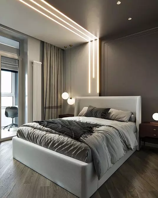
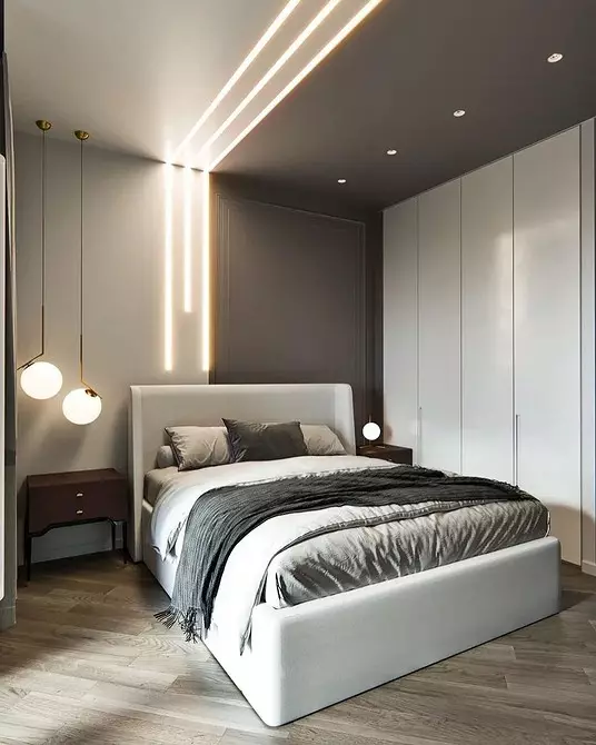
The beige interior is universal so much that it is often boring. To dilute a little neutral palette, you can turn on brighter and active colors. For this purpose, it is great as similar in warmth and opposite cold shades.
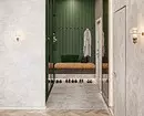
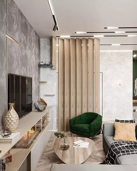
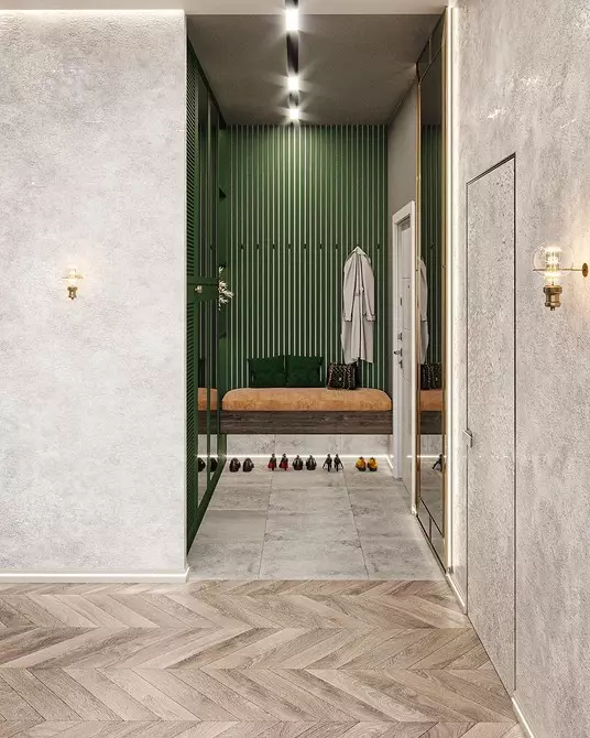
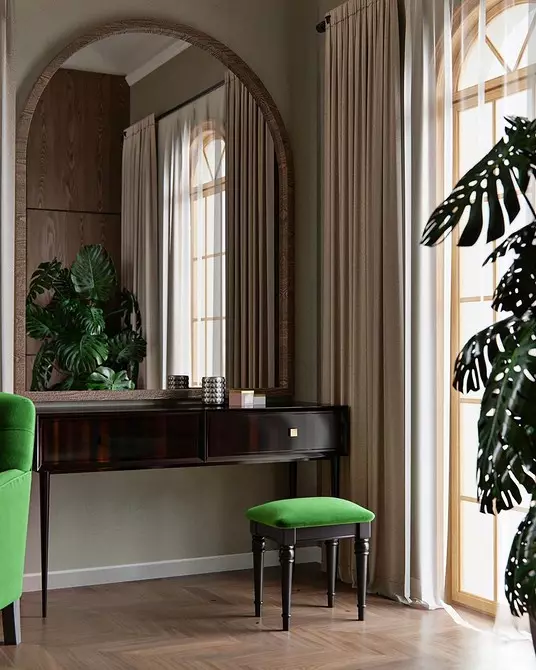
1 green
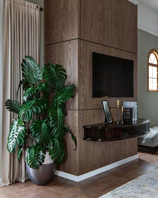
A dark or light green shade will decorate a beige interior, adds to him natural notes. And beige, and green - the colors are warm, and therefore the interior will be cozy and comfortable. You can reinforce the accent tone with large bedroom plants with an abundance of leaves.


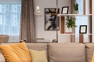
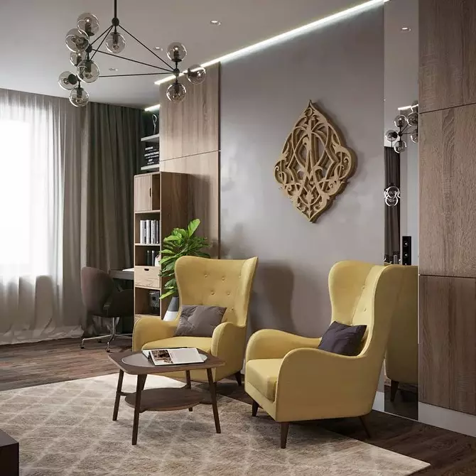
2 yellow
A bright sunny color is perfect for the interior, where little sun and a beige base looks dim and dull due to the features of lighting. You can start with small: add textiles or furniture in this shade. A beige-yellow interior looks as sunny and warm, it is the perfect combination for the cold season.

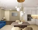
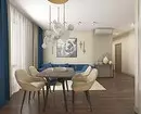
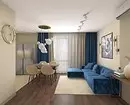
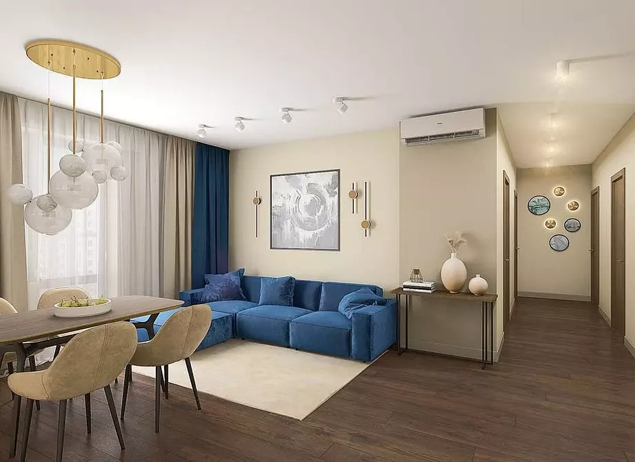
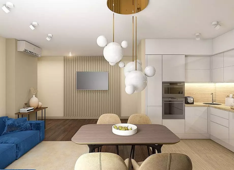
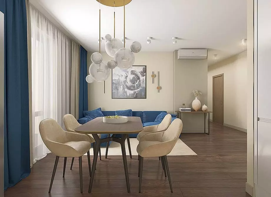
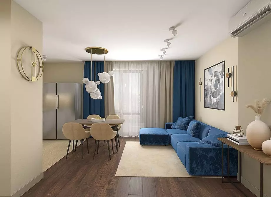
3 blue
A rich deep blue can be a central emphasis among the objects of the beige palette. It is cold and complex color that is not suitable for everyone. But if you are able to make friends with him, it will help visually expand a small room, as it has a "removing" effect. Do not be afraid to create too cold interior - thanks to the combination with warm beige such an effect will be avoided.

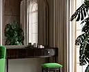
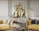
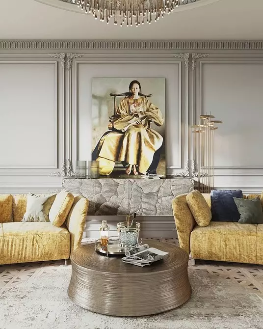
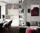
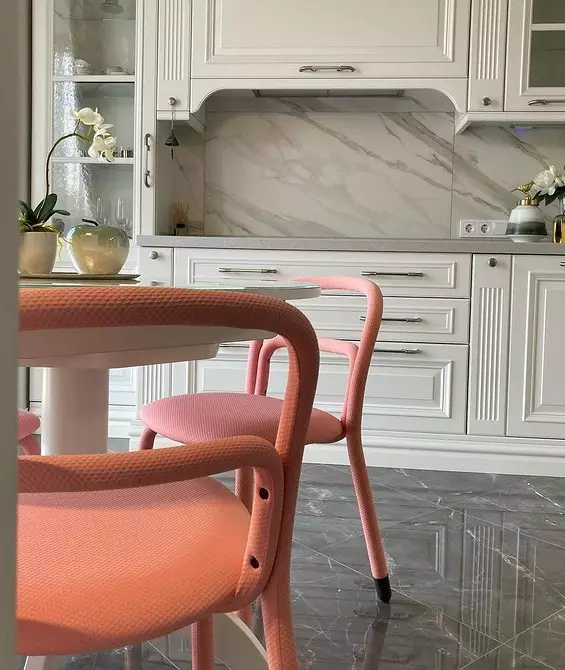
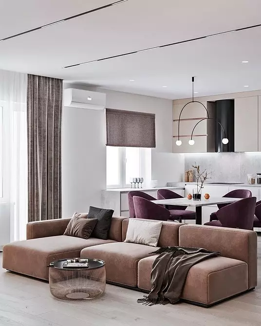
4 pink
In combination with beige, it looks good and light gently pink, and powdered, and deep rich pink-red colors. The latter add the interior of drama, make it bright, unusual, in a sense expensive. While light shades of pink are configured to air and weightlessness, and due to heat create a cozy and romantic space.

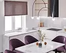
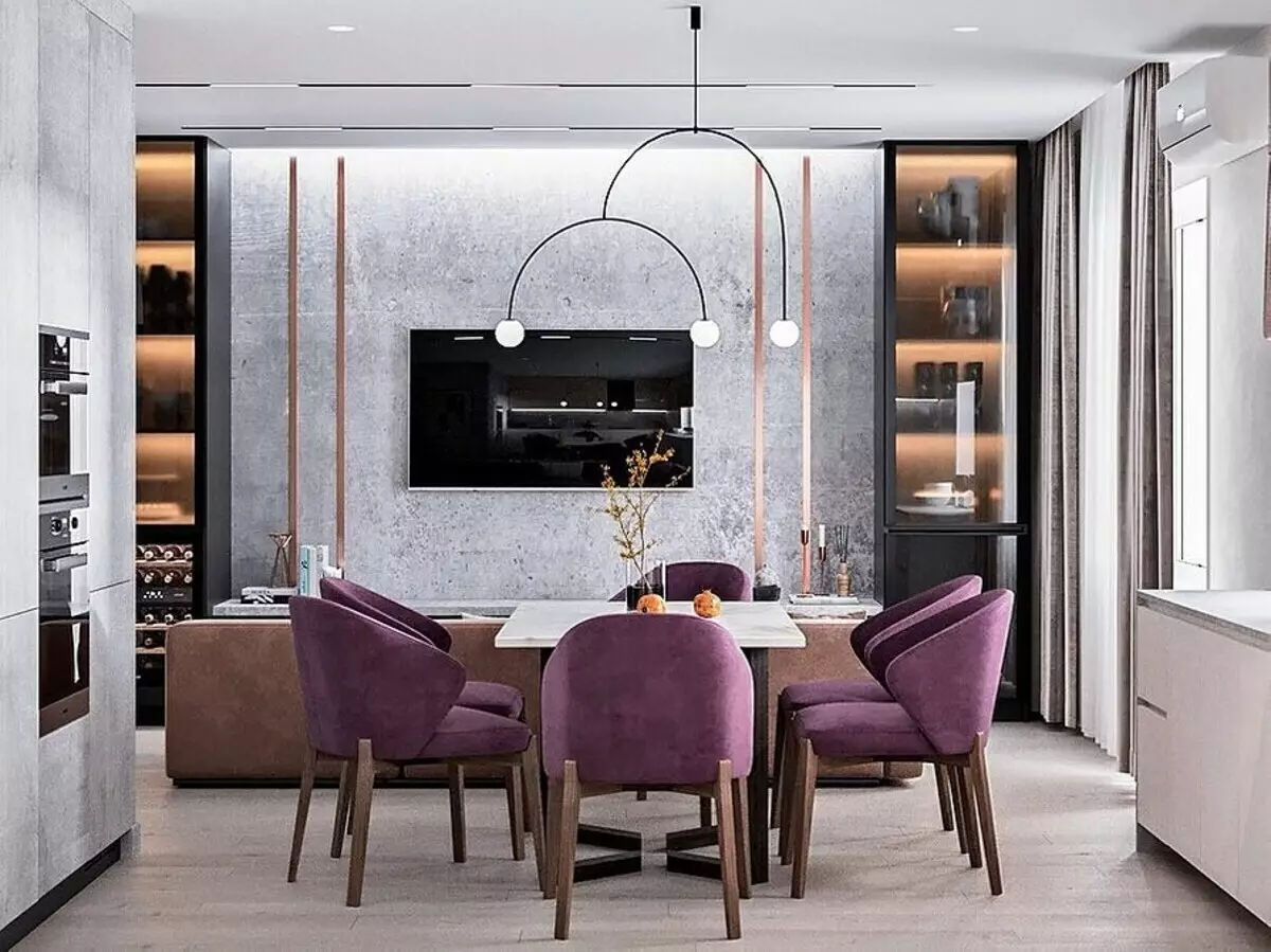
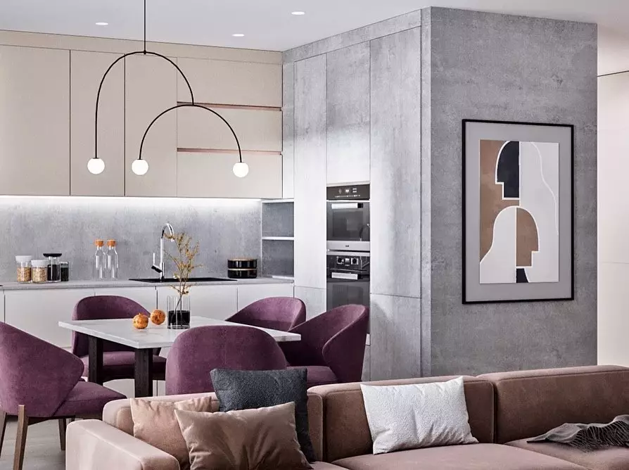
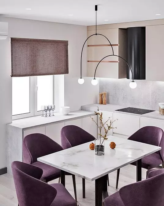
5 purple
Purple - pretty heavy to perceive shade, so it is infrequently used in the design. But in the neutral beige interior you can include different shades, including this complex color. Beige perfectly muffles the excessive brightness of purple, together they look harmonious and not the Pestro.


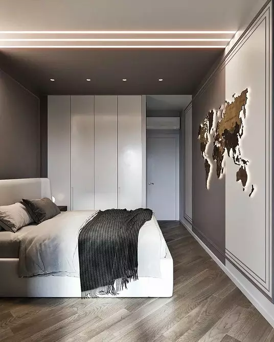
6 graphite
The interior of the missing contrast will help the saturated and dark graphite tint. In combination with beige, it will not look too dark, as well as create the necessary dynamics. You can make a dark color one of the accent walls, creating an art space on it with a variety of wall decor.

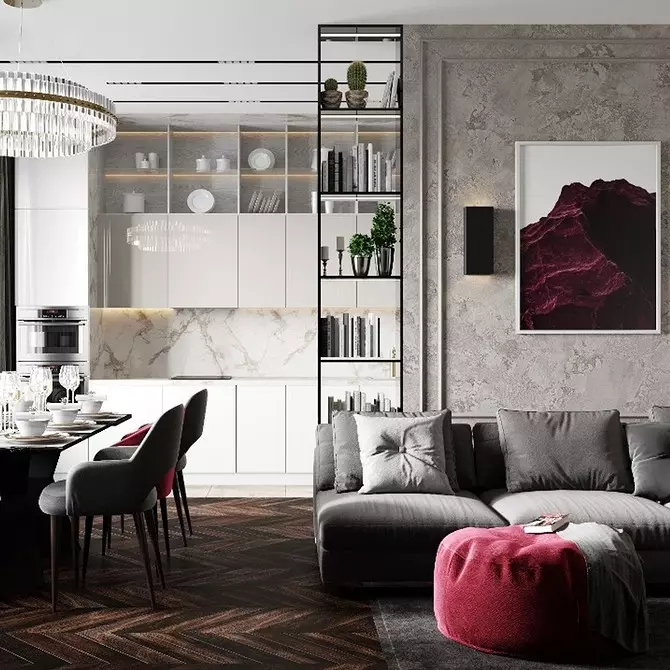
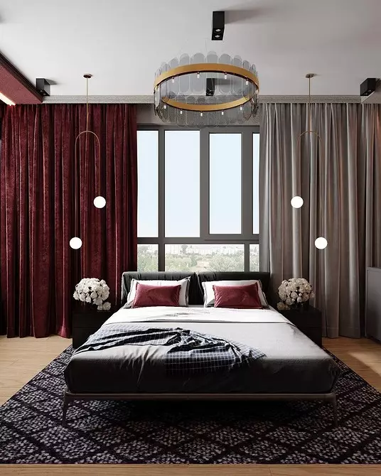
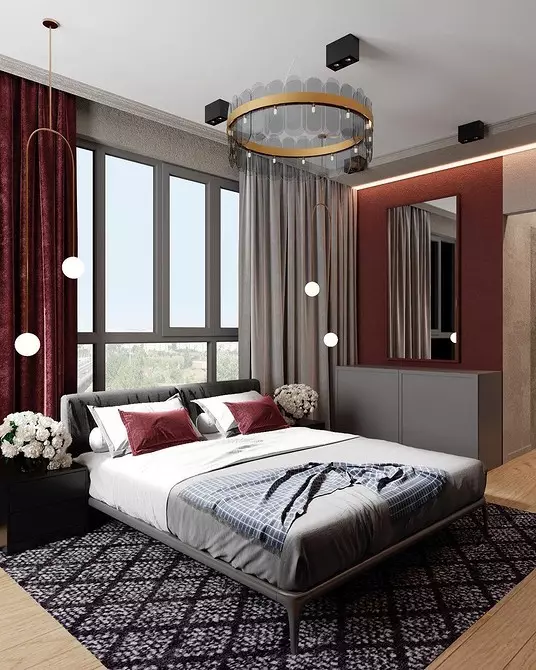
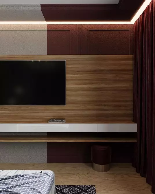
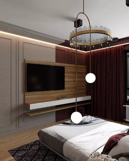
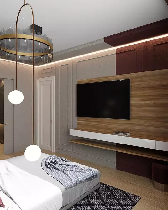
7 burgundy
Burgundy is active, so it may seem too dark and contrast. However, the beige base can gently muffle the brightness of burgundy. She does it better than a white palette. Beige and burgundy tones look multifaceted together, and white and burgundy - too Pestro.


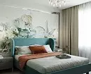
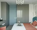
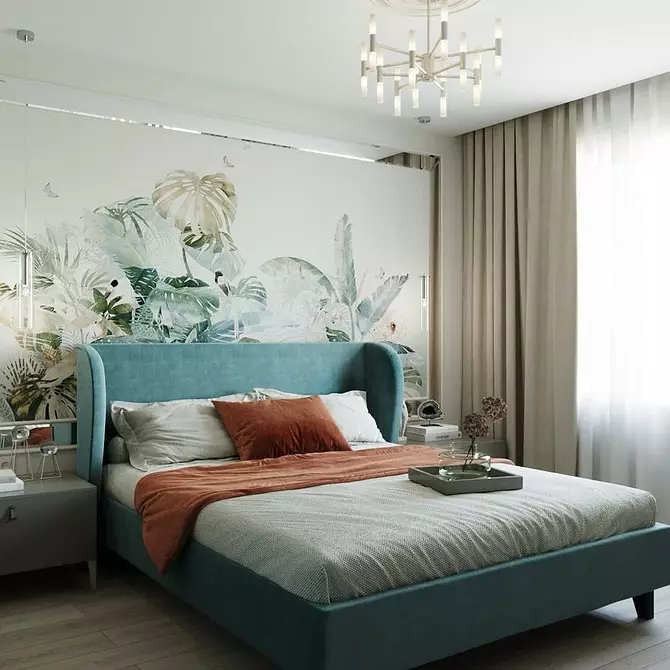
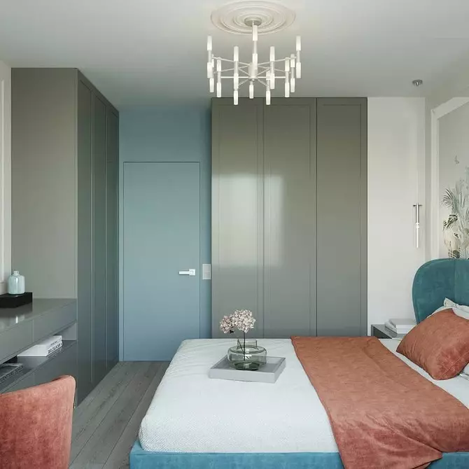
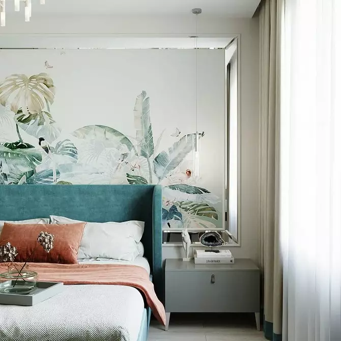
8 blue
Beige is perfectly combined with a blue palette. These shades are opposite to warm-cold, such colors tend to harmoniously complement each other. A beige-blue interior looks relaxed and calm. It does not need additional colors accents. In blue color you can choose textiles: bed linen, bedspreads, curtains.