We disassemble the template errors in the use of white, with which almost everyone faced.
Once reading? Watch the video!
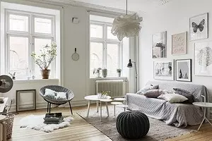
1 Do not take into account the role of natural lighting
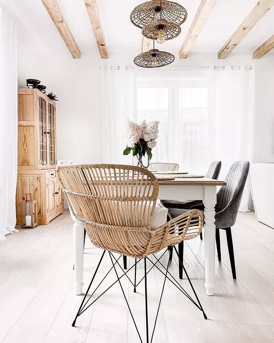
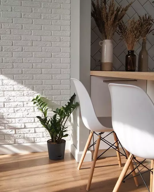
White color formally refers to cold colors. But its temperature depends on the impurities of blue, green, yellow and red. Therefore, choosing paint for walls or upholstery for the sofa, it is important to focus on the illumination of the room.
If the windows are large and overlook the sun, use a cold shade of white and complement it with bright tones of the same temperature. And if the lighting is not enough, it is better to choose a warm white color.
To properly choose the tone of the paint, look at the color formula. It looks like NCS S XXXX-Y / G / R / B. Here NCS S is a national standard color system. Xxxx - four digits. The first first mean the percentage of darkness, the following are the percentage of saturation. And letters at the end: y - yellow, G - green, R - red, b - blue. Yellow and red will give a warm shade of white, and blue and green - cold.


2 Leave white because "so it should be"
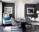
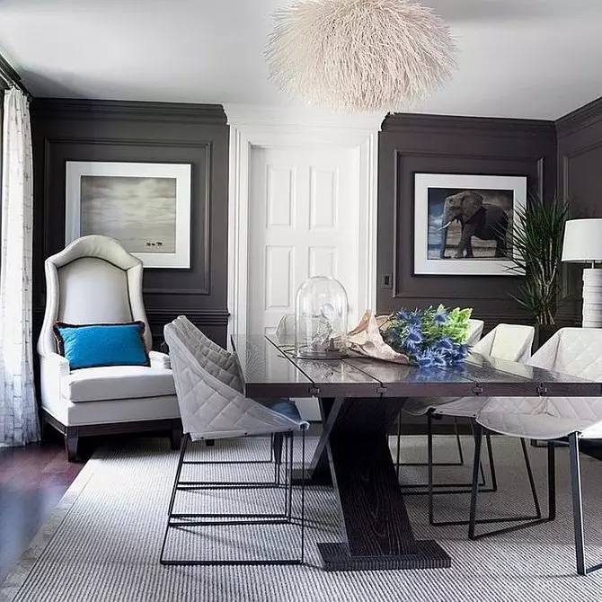
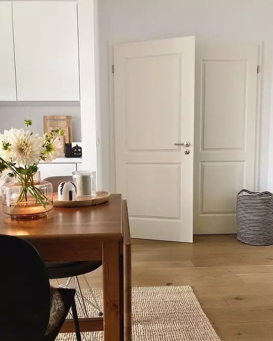
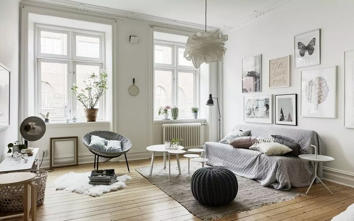
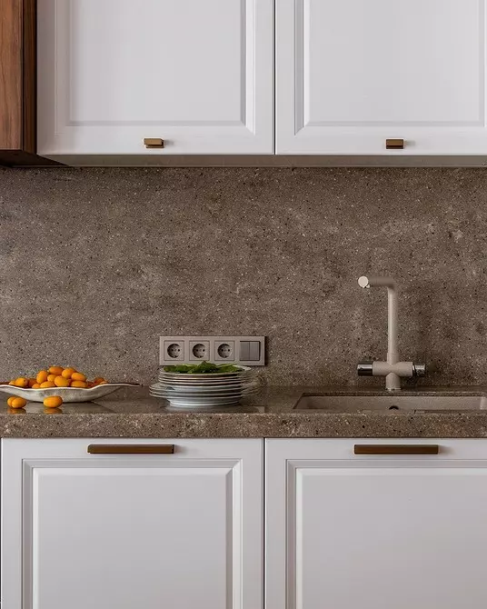
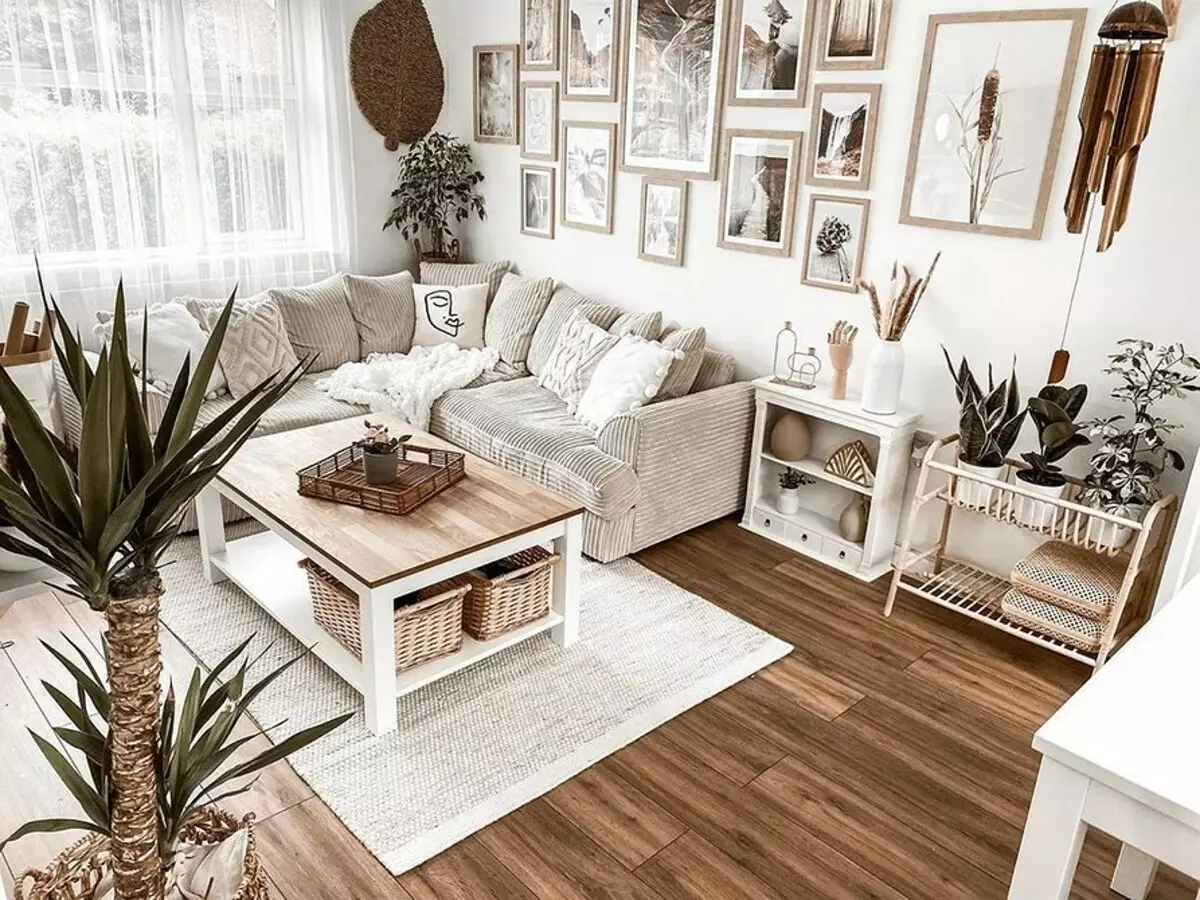
In the interior there are standards that have developed for a long time. White ceiling, white window sill, window and window slopes. Switches and radiators are also most often white. In general, this is a classic reception. But if you refuse it, you can win more.
- The ceiling, which, at least partially painted in the color of the wall, seems higher.
- A bright window frame or slightly make the interior more interesting and attract attention to the window and landscape behind him.
- Switches or radiators selected in the color of the wall will not look at a white patch and make the interior harmonious.


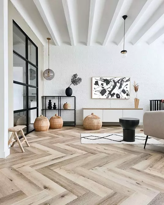
3 mix matte and glossy white
If you decide to make a monochrome interior or use white as a background, immediately determine the finish of the surfaces: matte or glossy. It is not recommended to mix them. The reason is that matte and glossy surfaces react differently to light. The gloss reflects it, and therefore it seems to us brighter, and the matte textures absorb the light and seem muffled.


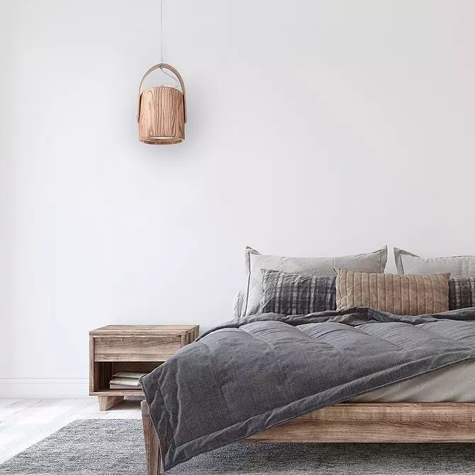
4 Choose white in the hope that it will not come out of fashion
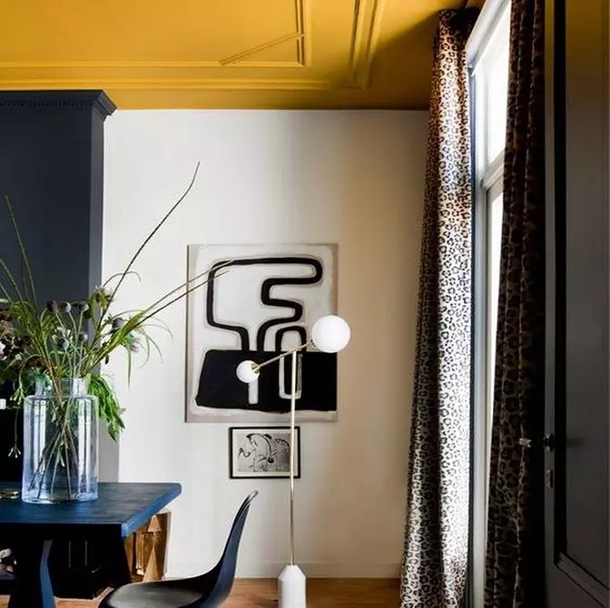
This is really a versatile color that will not cease to be relevant, but still at the heart of the individual interior should be lying away the owner's tones.
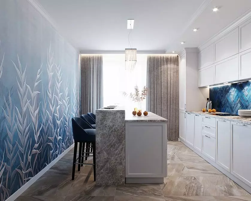
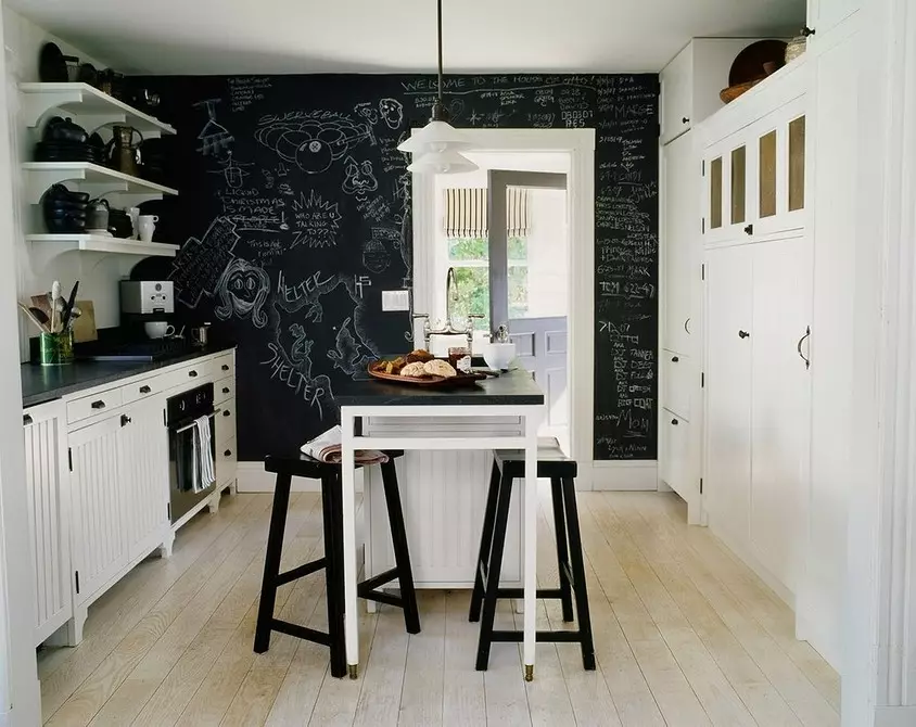
Create a durable and stylish design can be based on any color, from black to pink. It is important to choose a tone saturation and successful contrasts. For example, you can safely paint the wall in a small kitchen into a black color, if it pleases you, and reprove it with a light wooden floor and furniture. Black exactly will not come out of fashion, and if he pleases you more, use it.


5 Recall that white will automatically make the interior stylish
One choice of color does not guarantee that the interior will be stylish. You need to work on the texture, pick up the lighting, choose furniture and decor in the desired style direction, competently combine objects from different styles and eras if you have. Work on the stylish interior is not limited to the choice of color. Although definitely, it is easier to choose all the content, and this is the most obvious and simple choice that you can do.