With marble finish, smooth color transitions or wooden panels - select the options for placing the bathroom in pastel and restrained shades.

The calm bright base in the bathroom makes the interior universal. You can add bright accents, choose interesting combinations of shades, add an unusual wall finishing - on the neutral surface these items will look much more interesting. In our article, we collected stylish projects that confirm.
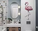
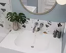
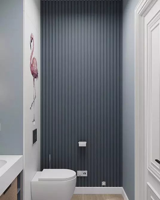
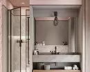
1 with a delicate flamingo accent
The restrained bathroom should not be necessarily monophonic and deprived of any accents, otherwise the design will be flat and faceless. To create a neutral interior, try to choose a few light tones from a cold color palette to create a base and one more rich - for an accent.
In this project, the database was created using light blue tones, and the depth of the space was given using one accent dark blue wall. At the same time, an important role was played not only the color, but also texture of the surface.
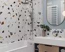
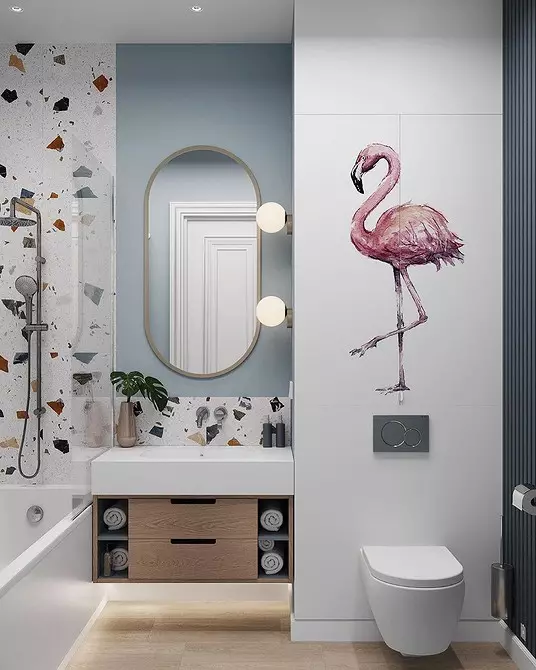
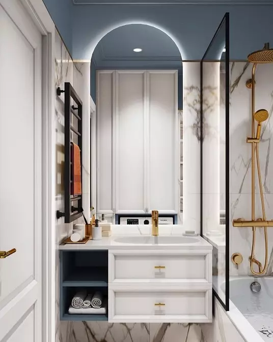
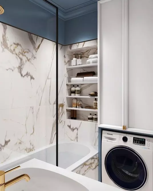
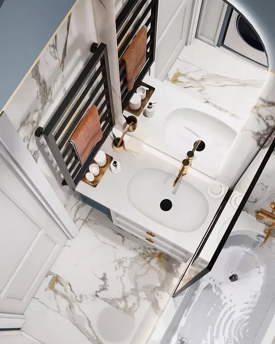
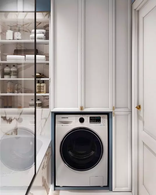
2 with marble finish
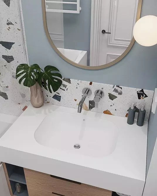
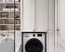
If the bathroom is small, about 3.5 square meters. m, then fill it with bright colors so that it looks harmonious, it is quite difficult. Therefore, in this interior, the preference was given to a bright tender base and used as an accent tile with a marble pattern. The latter adds gloss and gloss and brings the style of design to the classic.
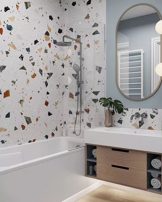
A slightly muted blue was added only on the ceiling and the top of the wall. This technique allowed to make the ceilings visually higher than they really are. It also contributes to a high cabinet over a washing machine with elongated vertical lines.

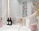
3 with smooth color transition
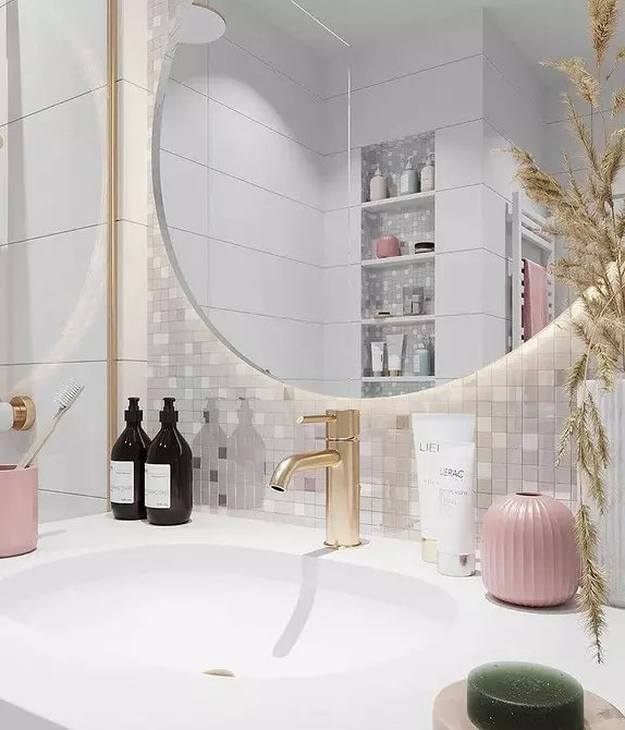
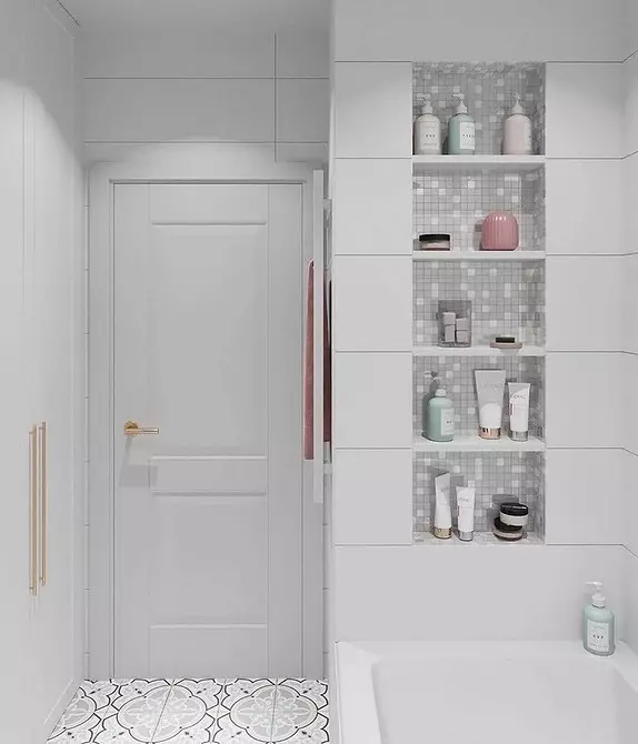
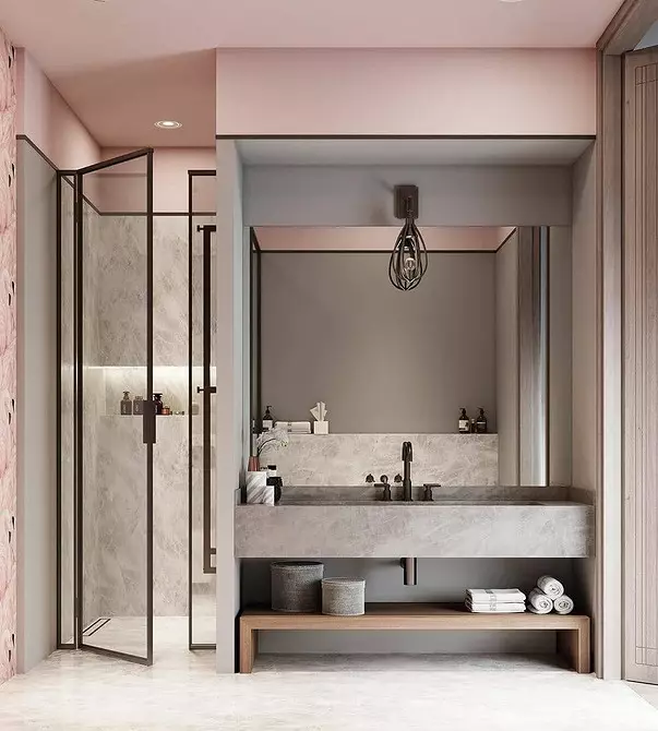
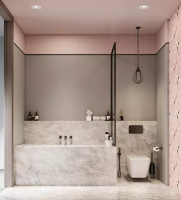
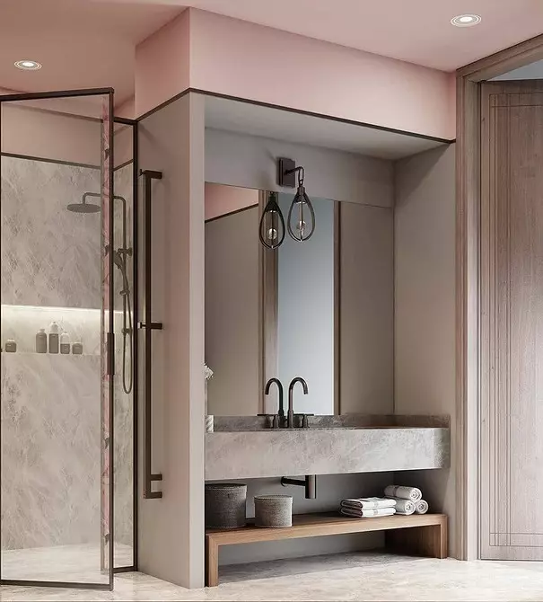
When creating a non-launch of a bathroom, do not limit yourself only with white and beige color. The duet of gray and pink can become an excellent gentle base, which you will not get bored for many more years. Since both colors are cold, they will look good with artificial lighting and do not overload space.
If you select two of the same tone saturation, then they can be used in a proportion of 50/50. If one color is slightly darker or rich, then select it as an accent.
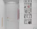
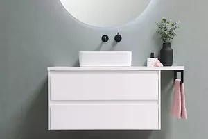
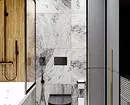
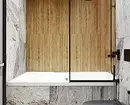
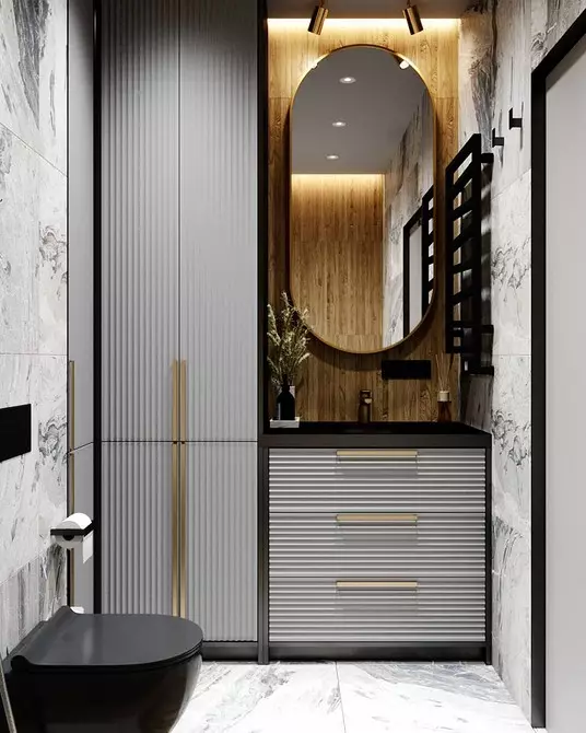
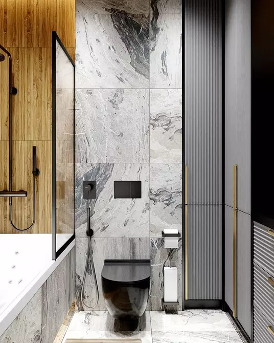
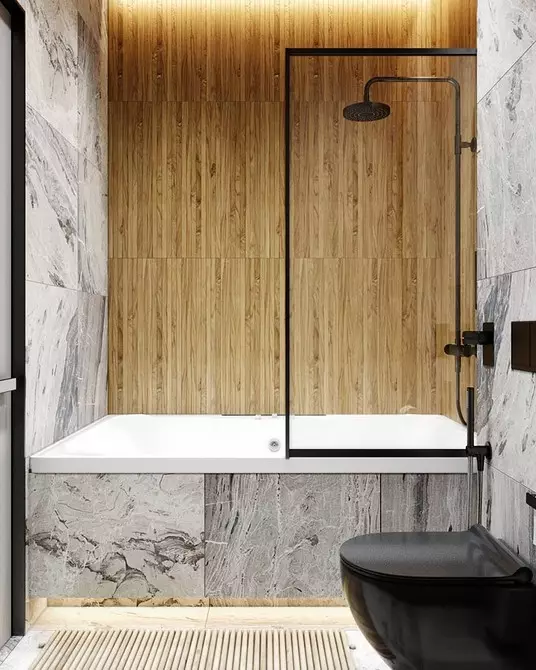
4 with wooden accents
This interior was performed in shades of light and gray, adding some black matte accents. Toilet bowl, shower, heated towel rail, edges of furniture, jamb of doors - all this adds depth and outlines the space.
And in order to soften the use of black in a light non-launch interior, the walls were separated by wooden panels. They add heat to cold color palette and do not seem unnecessary and not allocated due to the invoice.

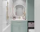
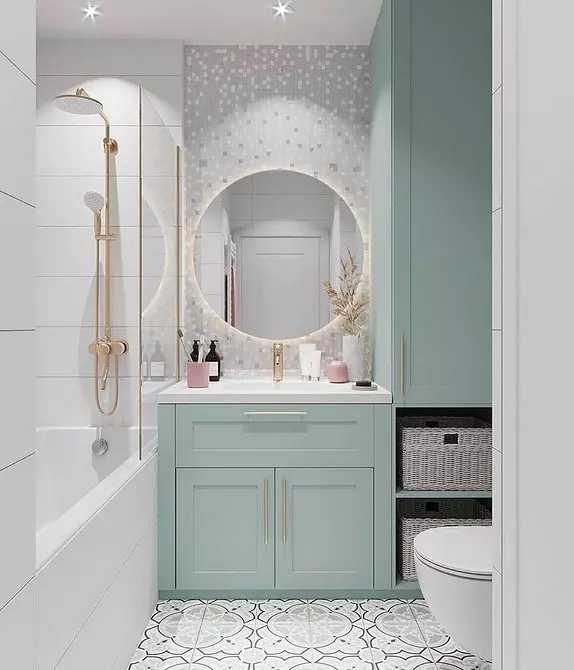
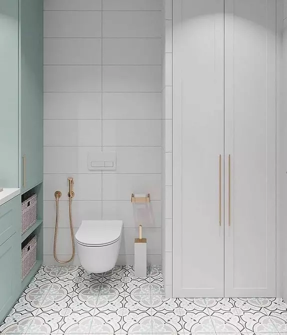
5 with mint enclosures
In the neutral interior, you can also add colors, and not necessarily bright. For example, in this project, tender tones were used as accents: mint tubes and wardrobe, pink accessories and golden plumbing. The interior has become visually more expensive and original.
The neutral interior is easy to change if necessary. Furniture can be repainted or sticking a film on it, and replace accessories to brighter. And if you choose a new color combination correctly, then gold metal elements will be all relevant.