
We collect a selection of five different shades for walls that look original and meet modern trends, but do not become obsolete in the season.

Each season in fashion includes new shades, but in the interior design you always want to choose a stylish but durable solution. Therefore, Flugger, together with the Eilersen furniture manufacturer, and the Danish Artist's Museum created a palette of 20 shades - "Time Colors". The peculiarity of this palette is that it meets modern designer trends, but it will not get out of many years, because it does not cause irritation and fatigue, as often happens with bright fashionable shades.
These paints work well on the scale of the whole house and create a feeling of harmony and style in the interior.
1 Distant Sunlight for warm and cozy space
Many people want to add to the interior of the heat and the sun, especially if, outside the window, gray and dark days or windows overlook the north side. Also in the room may simply lack natural lighting, for example, because of a close-standing high-rise building.
In this case, a warm light shade is suitable for the main color of the wall. But the usual in such cases, beige, after all, it was already morally outdated and out of the top of the trend. Try to choose paint with a slope toward the solar yellow, but not too saturated. It is suitable, for example, a warm and golden shade of Distant Sunlight from the "Colors of Time" palette from Flugger.
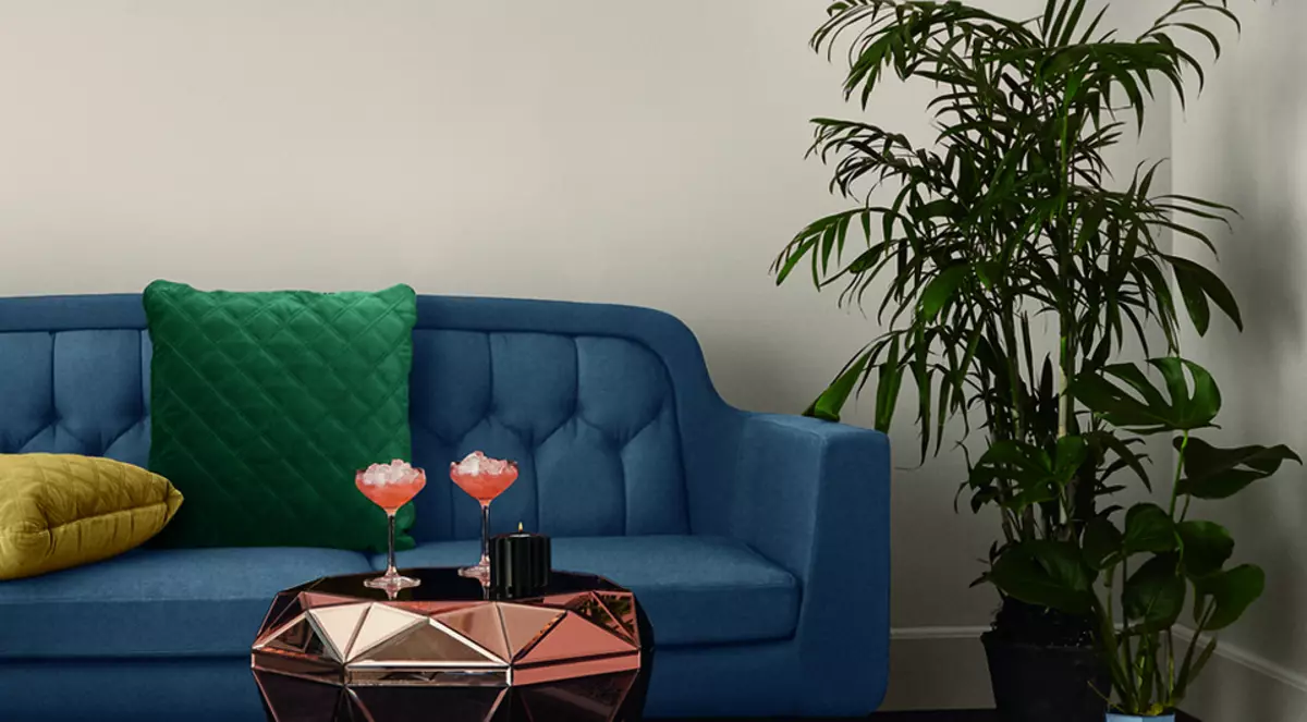
2 Museum Green for a quiet and cool interior
If you want to move away from the familiar bright palette of white and beige, but do not overload the interior too dark tones, try neutral green tones with a bias in blue. An example is the color of Museum Green from Flugger. This tone will be well combined with a floor and wood furniture, hauling their natural warm shade.
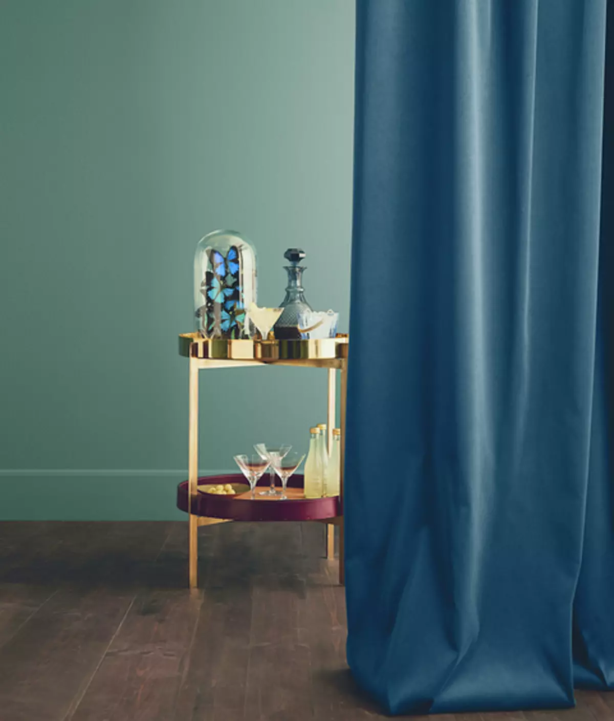
It also becomes interesting to echo with a saturated blue color, which can be entered into the interior using textiles, such as curtains. And to give the space of elegance and high costs, you can add a golden decor.
3 Angels Breath for femininity without pink
If you need to create a soft and feminine interior, it is not necessary to use the shades of pink and lilac. Pay attention to the Angels Breath paint from the Time Colors palette from Flugger.
Angels Breath can be used as a soft and enveloping base for the interior, placing elegant furniture and an interesting decor on its background. The color was conceived by Flugger designers as a deep and durable, which is suitable to the modern interior, but does not get out of one or two seasons. With such walls you can use both the basic furniture of non-launch muffled shades, and experiment with more complex and deep tones. Both the other solution will be elegant and harmonious.
4 Green Secret for the feeling of proximity to nature
If you like nature and would like to issue an interior in natural colors, pay attention to the green tones close to the shades of meadow herbs. In this case, you may like the color of Green Secret from Flugger. He is sufficiently muted and not bored, does not pull all the attention. But at the same time saturated enough to create an interesting and fresh contrast with white. Try complement the walls with high white plinths and white doors. This approach will make the space visually spacious, and the ceilings are higher.
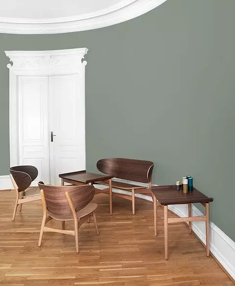
Against the background of Green Secret you can also use wooden concise furniture to approach the trends of the environment in the interior. Another advantage of this green tone is universal enough to use it to create a color base of the apartment and create a feeling of a single space.
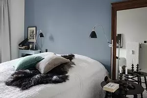
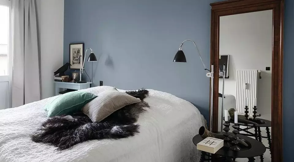
5 Dove Feather for Bright and Cool Room
If you like blue in the interior and you want to add it to the bedroom, it is better to stay on a light deep tone, for example, Dove Feather from Flugger. It looks good with natural and artificial lighting, does not narrow the space visually.
If still afraid to get tired of this color, try using it for a contrasting wall behind the headboard, and the rest of the walls for the balance is painted in white.
Bonus: Color Selection Tips
In the Flugger catalog you can find 3,000 colors, and in the "Time Colors" panels - 20. Therefore, the choice of the desired shade may not be easy. If you are learning the directory on the Internet and see photos of the interiors, take into account several points.
- A color rendition may differ on different screens, so the picture that you liked on the tablet screen will look different on the laptop screen.
- The same color will look different in daylight from the window and in the evening lighting chandelier. Also, the temperature of the light plays a large role in perception: with different light bulbs, the color will look different.
- In the photo it is difficult to understand the difference between glossy and matte paint. The first makes the color of the wall brighter and light due to the brilliance, the second is more muted and deep.
- From the color of the floors, the ceiling, furniture and textiles will also depend on how you perceive the color of the wall cover.
Therefore, it is very important to choose a few shades that you like, get their samples and make the walls on the wall. After 6 o'clock, they will dry and give you to see how one or another paint will look in a particular room.