Anna Evdokimova, Olga Tsurikova and Natalia Wires shared their techniques in working with color and recommendations, how to make bright colors in the interior.

We asked the authors of bright interiors published from us, to share how they create color projects and what to pay attention to in working with paints. All designers surveyed by us are unanimous - experiments with color exactly should not be afraid. And they gave advice to which you can listen.
1 Enter color in detail
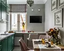
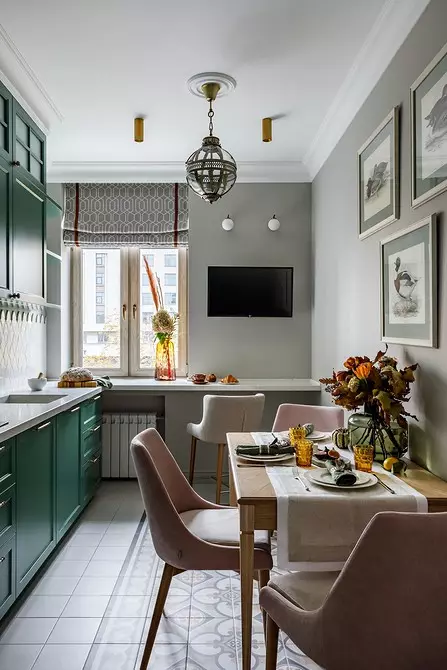
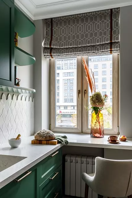
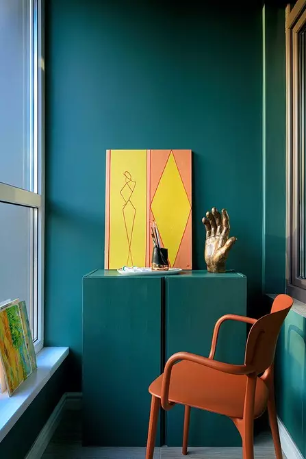
"The color can be introduced into the interior wide strokes: paint all the walls or one in a bright color, install juicy shades furniture, and you can work with the items," says Anna Evdokimova. - Put the color pillow or plaid on the sofa, add a color to decor objects: vases, candles, figurines, lamps, hang curtains with bright edge.
Introducing the color point, you can try on different shades to your perception of this color and the combination with the rest of the colors and the interior atmosphere. In addition, the details will help add to the dynamics interior. You can change the situation in mood and seasonality. "
2 Select the emotion you want to express color
"Color is an emotion," said Olga Tsurikova. And it recommends that I want to express what emotion at the very beginning of work, using paints.

Designer Olga Tsurikova:
It may be joy, cheerfulness or peace, calm. Color affects our mood. Yellow - cheerful, invigorating. Blue and blue shades personify calm and purity, red - readiness for action, determination. For example, when choosing a color in the bedroom, it is better to prefer calm, relaxing, deep shades of green, ohlogen, wine, and in the bathroom you can use bright, invigorating shades of yellow, orange.
3 Make Colored Accents on Neutral Background
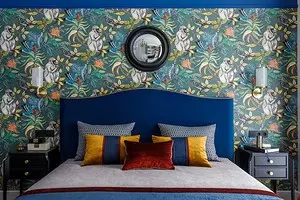
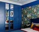
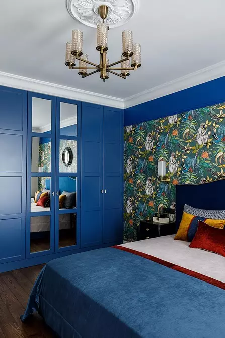
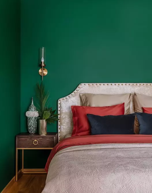
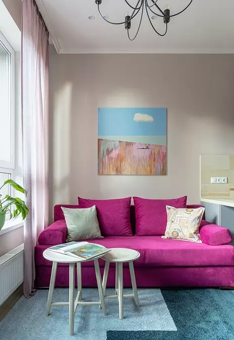
Olga Tsurikova believes that bright and deep color in the room should be used as an emphasis: "It is necessary to observe the balance, the proportion so that the room is harmonious. Highlight the wall or furniture in one color, and by this color, pick up color-companions. There are basic colors (gray, beige shades), on which most bright colors will look good. On the example of the bedroom from this project: to a fairly bright blue, used in the headboard, in the design of the wall and the cabinet for harmony and the balance is added beige. "
Anna Evdokimova also believes that bright colors can become accents on a neutral background: "Color is one of our helpers in creating an atmosphere in the house. Use neutral, calm shades and make your interior background for more vivid accents. Accents can be the objects of the situation and even your own life, boiling, burly, filled with events. "
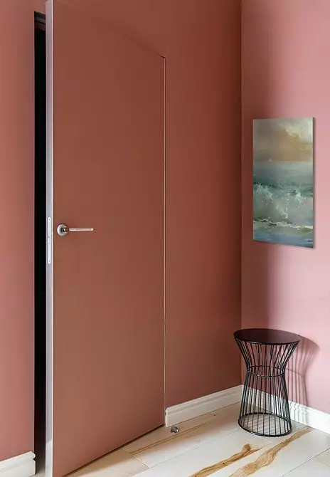
4 But do not be afraid to make bright walls
"If you look at a bright picture, and you like it, do not be afraid to do something similar in your home," says Natalia Western. - To begin with, you can paint the walls in a bright color, because the paint is easy to change. And then add contrasts or nuances in detail. "
"We used to use neutral colors - white, beige, light gray - on the walls as a background," says Anna Evdokimova. And consider these colors universal. But do not build a framework in this matter. You can use any color that you like. And anyone: light or dark. "

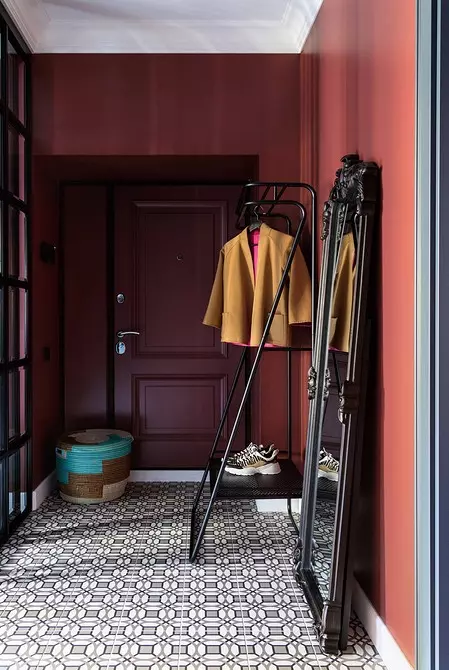
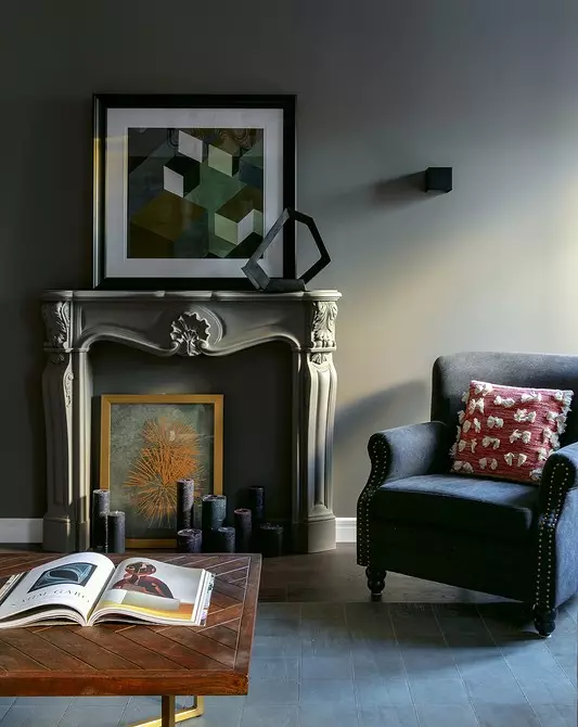
5 Do not refuse dark and deep colors.
Such a Council gives Natalia Wires. And recommends using dark colors in small rooms - in counterweight stereotypes.

Architect Designer Natalia Westerns:
You should not be afraid of dark colors, they do not make space less, rather, on the contrary, they fill the interior and make it more complex and interesting. In our work, we often make darker and bright just small rooms: bathrooms and halls. In the hallway, no one time to get tired of the color, and the bathroom becomes more chamber.
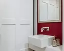
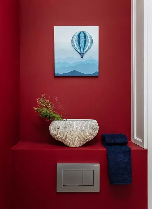
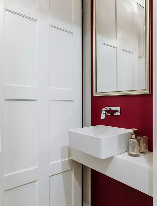
Little bathroom in the apartment
6 Enter the color with a light-up
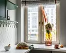
Olga Tsurikova believes that it is impossible to forget about the natural lighting of rooms when choosing paints for the interior."Do not neglect when planning and choosing color by the sides of the world, pay attention to how much daylight enters the room. If it is the northern side, then warm shades will be preferable if southern - can use a combination of cold colors. Also with artificial lighting: use neutral light. And for highlighting and sconium, you can take warm (yellow) light to create a comfort atmosphere, "says Olga.
7 Use the color to hide the items in the interior.
Anna Evdokimova gives an unexpected advice who calls the game of hide and seek.

Designer Anna Evdokimova:
You can not only single out the object and make it an emphasis in the interior. Color is able to hide what we want. Want to visually reduce the number of doors - install them in a hidden box and paint the color of the walls. Want to visually facilitate a small space and hide the overall furniture - paint furniture in the same shade, in which the wall is painted. And the furniture is dissolved in space.

8 "Collect" colors in the interior on art objects
Anna Evdokimova recommends introducing art to the interior to balance the color palette or add a bright shade thus.
"Growing interest in man-made decor and interior arts (scenic work, graphics, photography, sculpture) entailed the discovery of galleries, - Anna. - It made it possible to buy and integrate artwork in your home. In addition to positive emotions, a picturesque picture can carry a practical function. If the furniture in your room is furnished in your room, and at first glance, these items seem to be incompatible, the picture will be able to combine them in color in a single composition. Also, the picture can add a new color to the interior, diluting the intensity and simplicity of one-photographic space. "
9 Inspire what you see around
Such a council gives Olga Tsurikova: "Our main source of inspiration and strength is the world in which we live. Looks around: how many paints can be seen in nature, what a stunning crimson can be sunset or diversity of the shades of the sea, the colors of the summer or autumn forest can be, these are all ready-made palettes for your interiors. Inspire! "