
We show how to combine colors and patterns on two main elements of the kitchen interior so that the space looks amazing.

1 Pattern and basic color headsets
The terrazzo pattern on the tile does not leave fashion for several seasons. It will be relevant in 2021. Therefore, to create a bright accent in the kitchen, you can choose such a tile for apron.
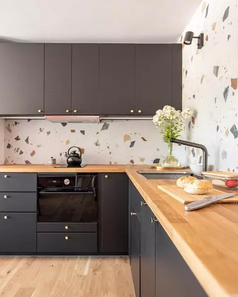
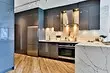
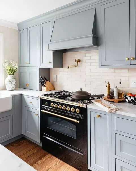
A basic combination, with which it is difficult to make a mistake - choose a single window headset. For example, dark colors, as in this interior.
2 color in color
The win-win design option is to choose the apron in the same color as the kitchen facades. Especially impressive it will look with a colored headcard, not white, and not gray - basic shades may look boring.
To dilute the complete monochrome, the countertop can be made by different color and material. For example, here apron is a painted tree, and the table top is stone.
3 Apron in the color of the upper cabinets
You can visually facilitate the design of the kitchen, if you choose the color of the apron to the upper modules of the kitchen headset. At the same time, the lower module should differ in color so that the space looks harmoniously, and not merged into one color spot.
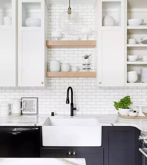
Pick the win-win columns. For example, White will be profitable to look almost with any shade.
4 Basic color Apron with bright headcase
An unusual color headset can be mitigated using a basic shade apron. But professionals pick up the color pairs so that it looks like a special effect.
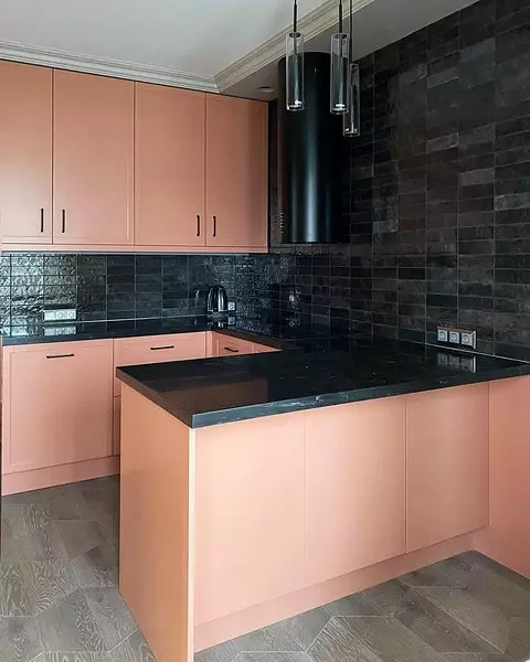
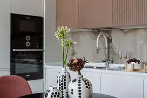
For example, a combination of shades of pink (closer to peach) and black makes the interior in a good dramatic and interesting. Even more attention is attracted to the fact that the tile on the apron with a pronounced texture and inhomogeneous shade.
5 Combination of two pastel shades
Gentle and quite basic combination, which seems simple only at first glance. In fact, pastel shades also need to combine correctly so that it does not look too boring and monotonous.
For example, in this project, the headset is decorated in muted blue color. And despite the muffledness, it is still a color accent, which attracts attention. The light beige apron in such a combination acts as an addition and delicately supports a bluish tint.
6 Combination of noble material and color
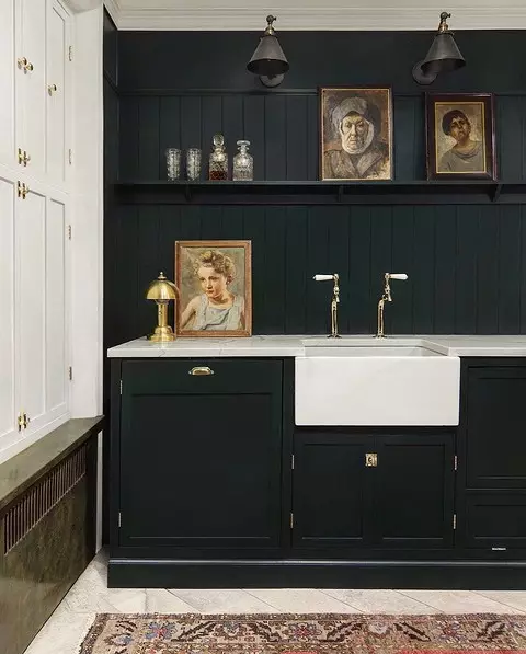
"Noble" materials can be called a stone or natural tree, and the same characteristic is given deep colors: blue, emerald, wine.
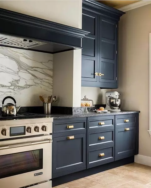
For example, this gorgeous cuisine is decorated in a deep blue shade. On the apron used a stone with a marble pattern. Such a combination makes the space visually expensive and luxurious.
7 tree and bright apron
The kitchen set can be decorated and under the tree, it is not necessary to put the natural material in the chapter. But to make the space brighter, it is worth completing such facades with the corresponding apron.
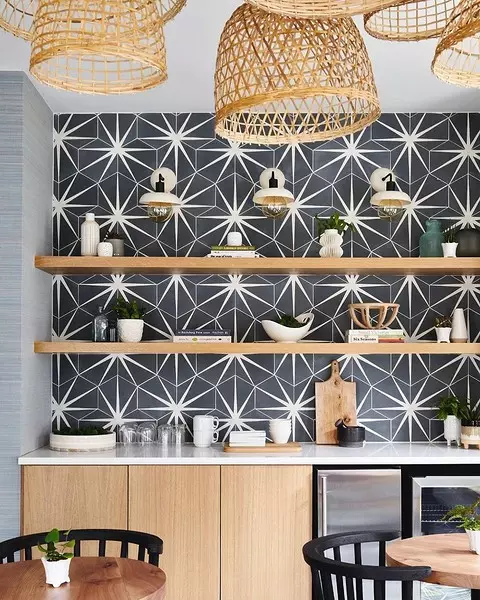
For example, in this interior for apron, the baseball tiles were chosen - black with white - but an unusual drawing in which the finish is folded, attracts attention.
8 Color headset, which is partially repeated in apron
If you have the facades of the basic shade, and do something very bright on the apron do not want to look for a tile, in the design of which the hint of cabinets will be present.
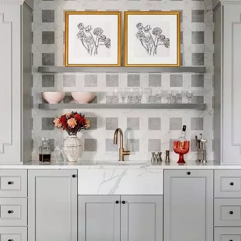
Look at this example. Gray from the facades of the kitchen partially "passes" and on the apron. But due to brighter inclusions it does not look boring and monotonous.