Are the shades only for cold and warm? How to combine the colors of different temperature spectrum? We answer these questions and tell how to avoid mistakes.


1 Consider the features of a specific shade
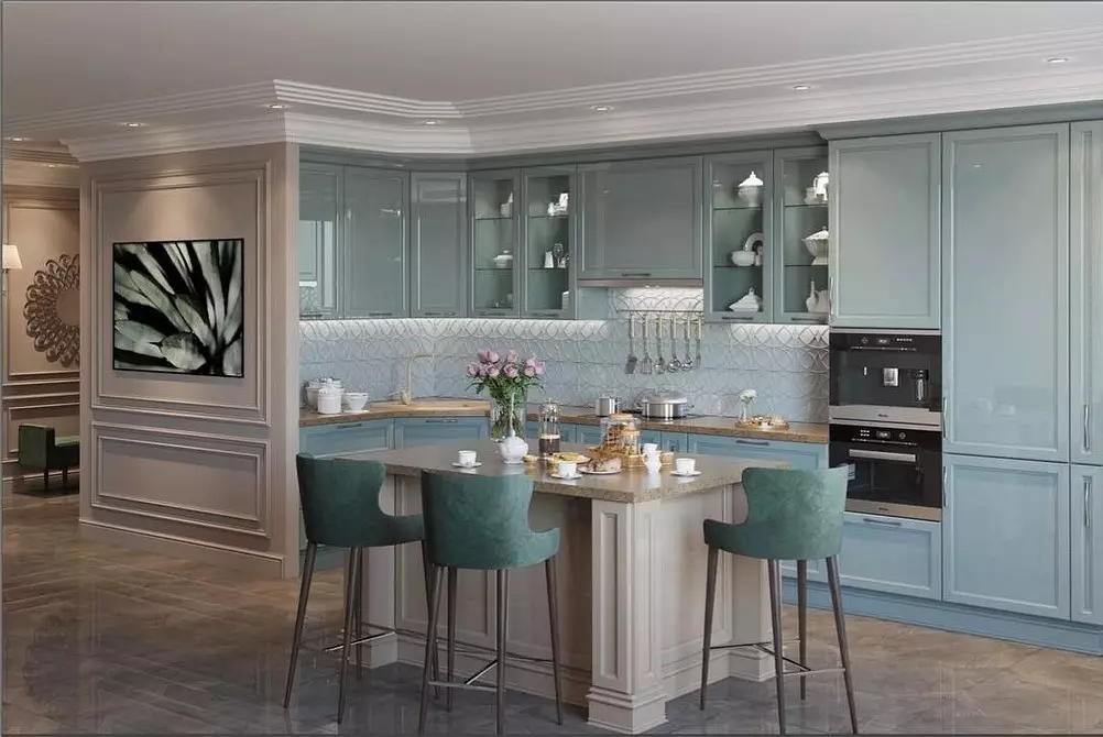
In school in drawing lessons, teach colors on warm and cold. Red, yellow, orange - warm, and blue, green, purple - cold. In fact, everything is a little more difficult. One color always has tens of tones differing in temperature. For example, the berry red with an admixture of violet tone is noticeably cooler than that red, which is closer to orange. And the shade of Tiffany or the sea wave is cozy as usual blue or blue. Green can also be warm if there is an admixture of yellow, or cold when blue tone is added.
Therefore, you should not immediately check the shade if it refers to the color that is considered cold. It is possible that in your interior with proper lighting it will look quite warm.

2 Redee the destination of the room
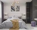
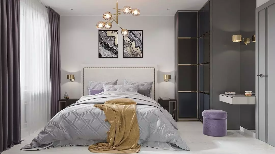
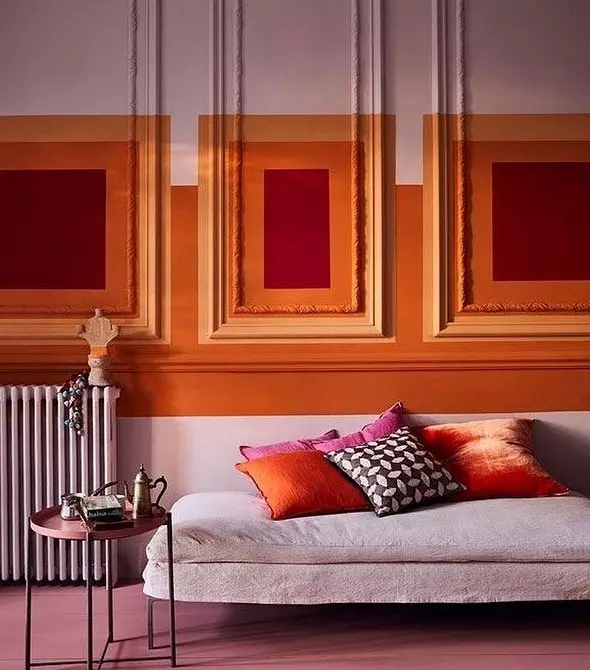
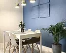
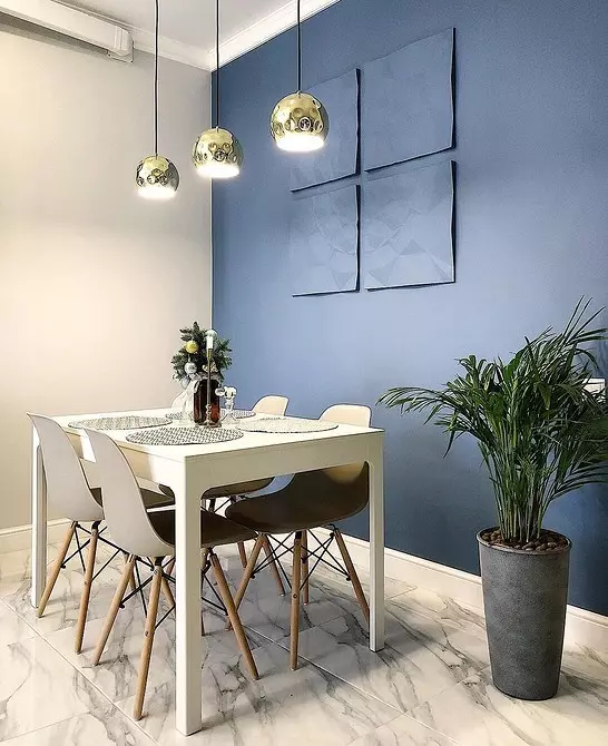
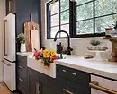
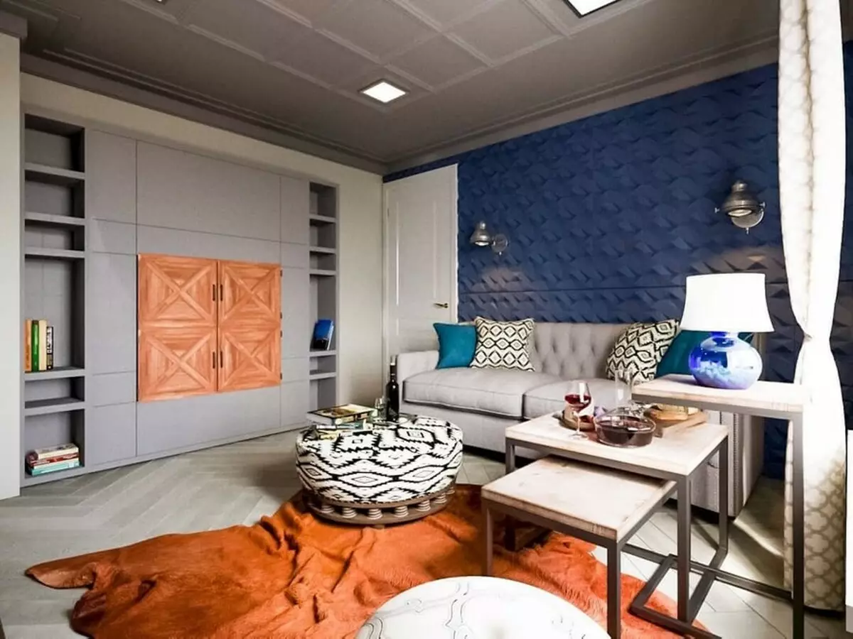
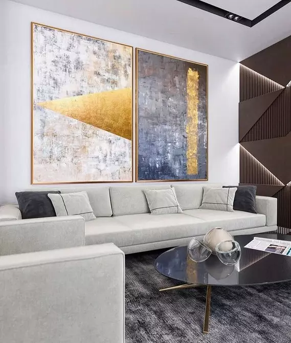
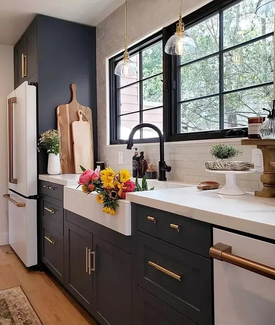
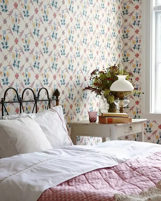
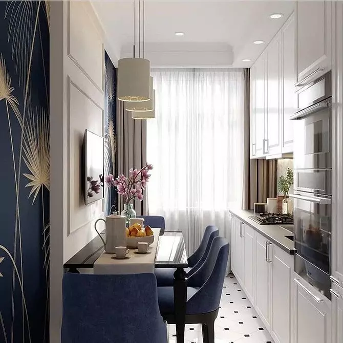
Each room has its own functionality, which means its suitable colors for design. For example, for a kitchen or a cabinet, you can use blue, green, gray tones. These colors help to cheer up and concentrate. The living room, dining room, nursery or bedroom is better to arrange in warm colors - they relax and raise the mood.
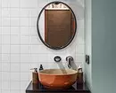
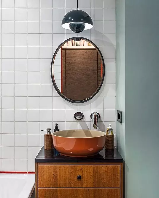
In rooms in which there is no natural light - in the corridor or bathroom, warm tones will also look better, especially if you do not have the ability to use several different light sources. With good multistage lighting, however, you can try to arrange a hallway and a bathroom in cold colors.


3 Rely on your preferences
Try to analyze what colors you are closer in everyday life. To do this, open the wardrobe and calculate what shades in it more. If there is no obvious skew to one side or another, then in the interior you can select the tone of any temperature spectrum. If there is a clear tendency to one or another range, boldly use it in the interior design. It is very important at this stage not to start persuading yourself, for example, noticing a beautiful blue wall in the design of a beloved cafe. If you want to experiment with the colors of the gamma unusual for you, use them as small accents.


4 Combine shades
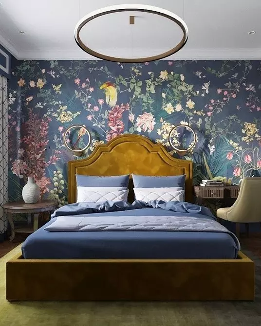
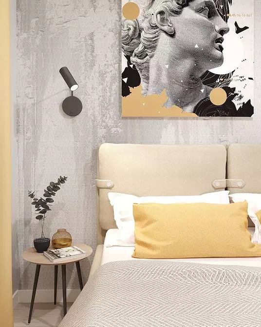
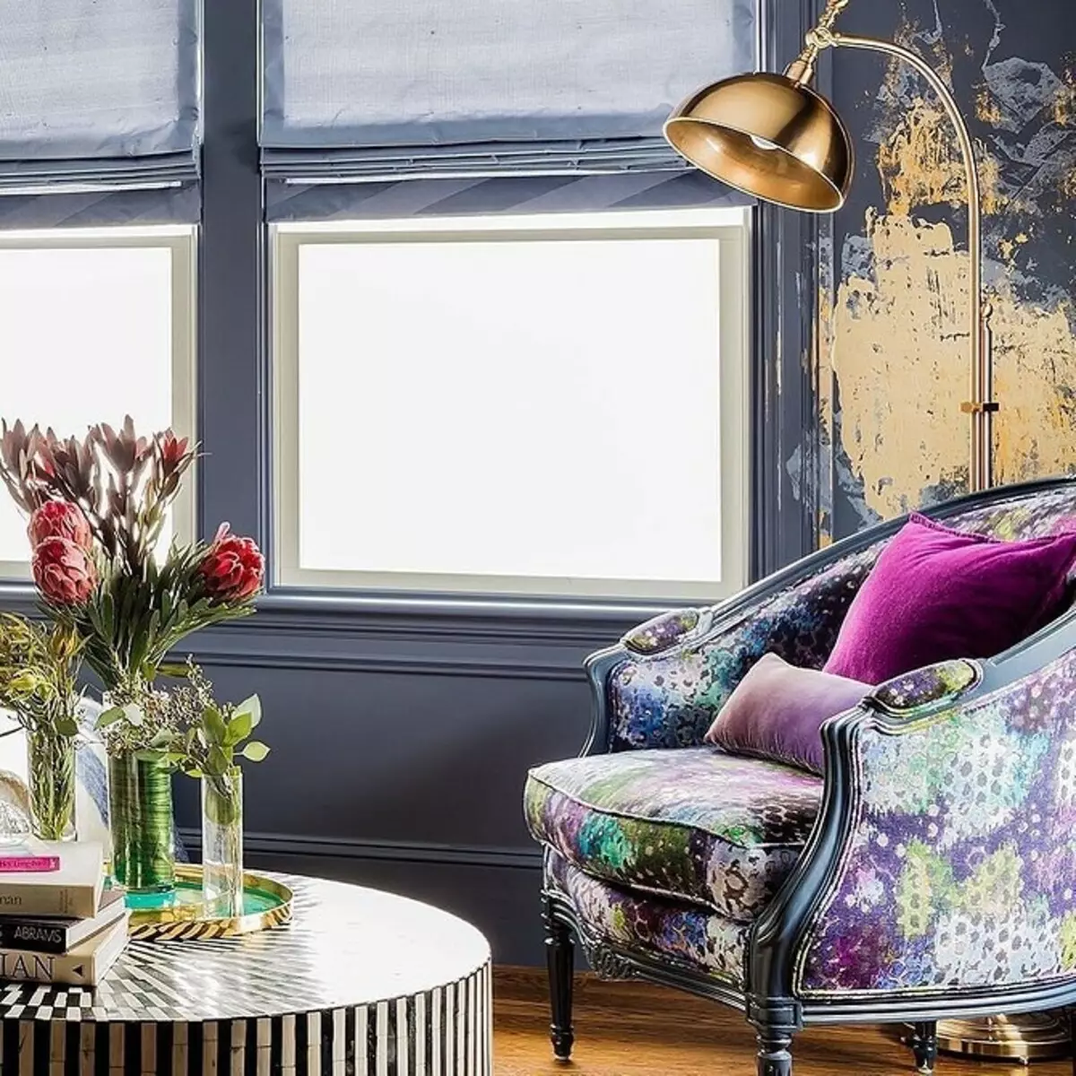
Even if you really like only one of the temperature palettes, always slightly dilute it with opposite shades. Cold colors make notes freshness in a warm interior and vice versa. Without such contrasts, the room can be visually stuffy or overlooking. Also, these transitions are added depth and versatility room.


5 Corrective space with color
Saturated warm shades will make a large room visually slightly more compact and tangible more cozy. Cold tones, on the contrary, add a little room to a small room.
It is important not to confuse the temperature of the light shades. For example, for a low ceiling, you will most likely choose white paint. But white also has tens of tones, among which there are warm, obtained by adding beige. They will not add a ceiling height. But the white, slightly gone to the blue, will make it visually above.