We tell how to use yellow in the interior, with what to combine and in what rooms it will be appropriate.

Solar color is associated with warmth and sufficiency, but with all his vitality he is not as simple as it seems at first. The interior design in yellow colors requires a large artistic clock: it is important not only to choose the right tone, but also insert it into the situation using supporting colors.
All about how to enter yellow in the interior
Ideas- Basic color
- In accessories
- In furniture
- For an accent wall
In which rooms to use
The best combinations
How to use yellow in the interior?
1. Like base
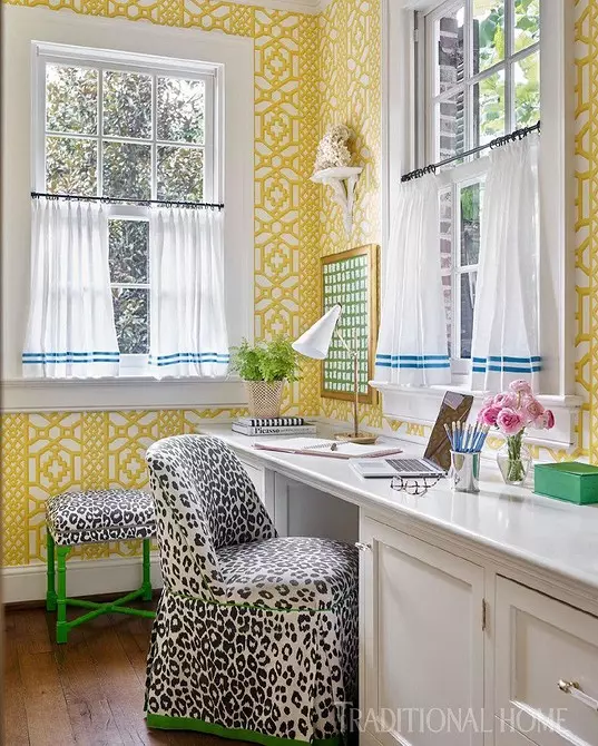
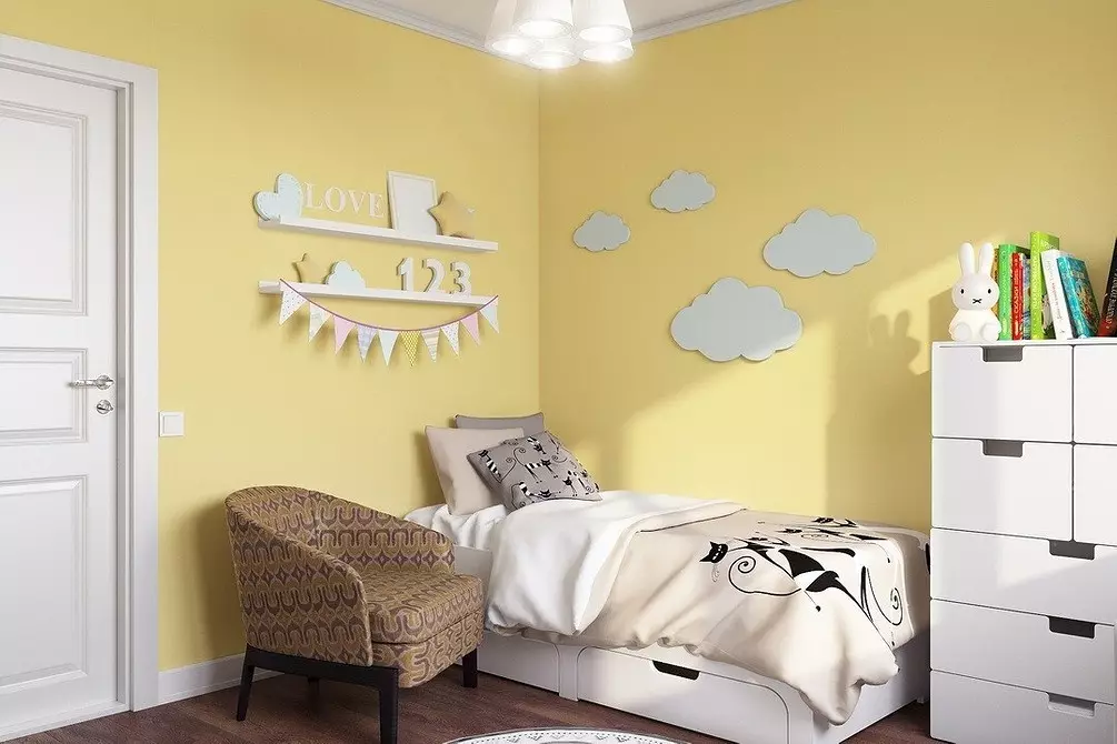
It is experimentally proven that the solar color stimulates mental activity, but we have enough enthusiasm and the drive and at work, and I want to relax at home. Therefore, the decoration of the walls and the ceiling in bright colors is required not only artistic, but also an architectural and planning justification. Basic yellow will make a darkened north room warmer and cozy, and soft translucent apricot, vanilla and banana shades will create a backlight effect.

Motivating design of the working area in yellow tones.
In the southern rooms, it is better to give preference to cool light colors, especially lemon, light mustard and linous. And if you want to arrange a burst of paints, limit the accent wall on a neutral light or cold background, otherwise the room will seem roasting and stuffy.
Fresh pastel wall finish tones serve as a winning background for flower printing furniture.
Screaming yellow walls can be slightly cool with a relief white ornament.
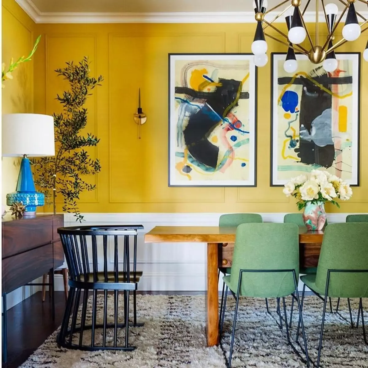
The interiors with the basic yellow look more nobly, if instead of one color pick up several gentle pastel shades with a difference in two or three tones for finishing perpendicular walls or under gradient color. Smooth color transitions visually expand space, and the gradient layout lifts low ceilings.
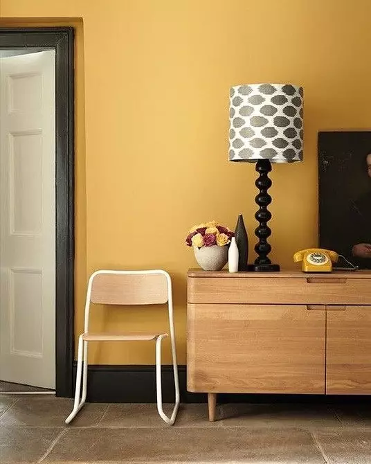
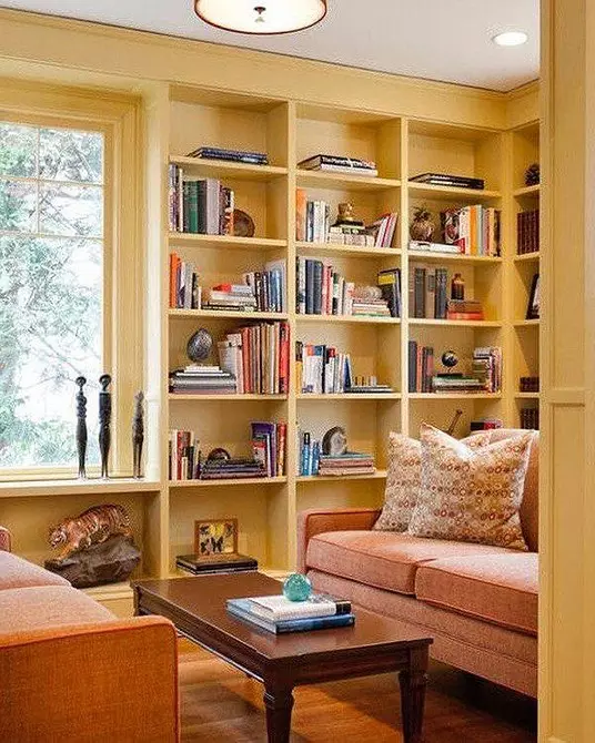
In modern urban interiors, light light tones and muted natural shades with warm brown notes are dominated - banana, vanilla, mustard, sand, pear, shaffle.

A gentle living room in apricot and beige tones glows with warmth and care.
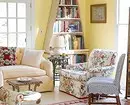
In classic and palace styles, deep complex tones are more quoted - imperial and ceylon yellow, amber, honey, fawn, grab, silly, as well as the colors of old gold and buffalo skin.

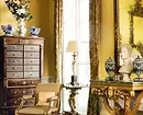
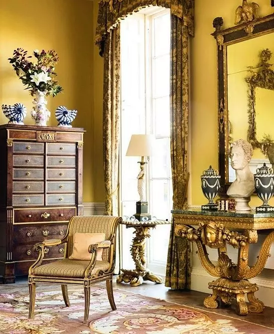
Ceylon yellow and bronze in the interior of the Parade hall draw a picture of self-sufficient greatness.
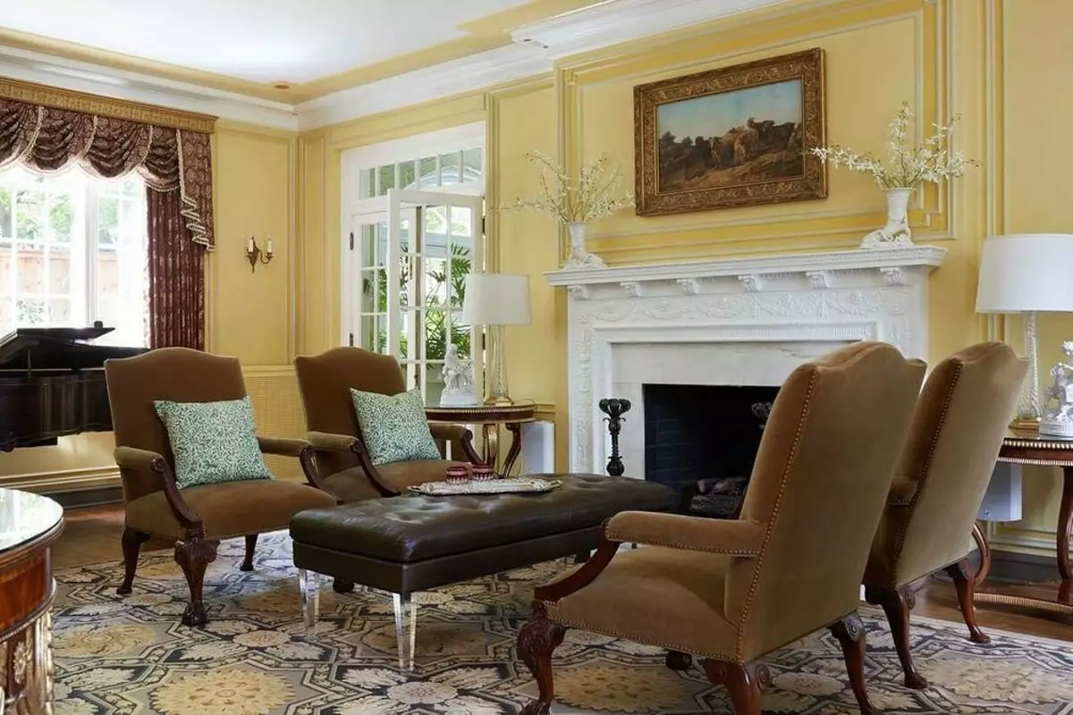
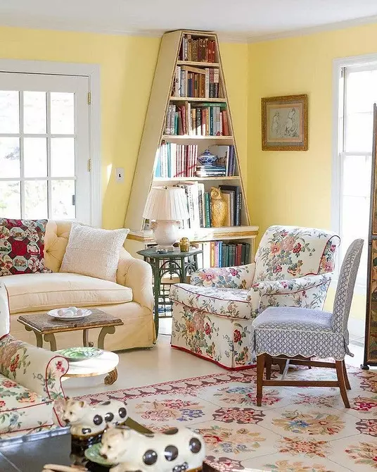
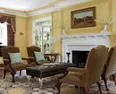
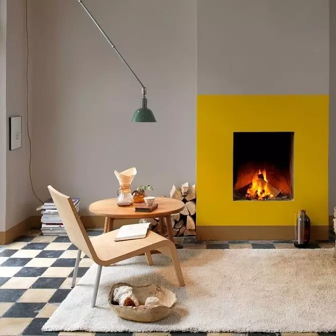
Respectable Living room in Neoclassic style: Light yellow walls focus on the soft corner and the fireplace zone.
2. In decor elements
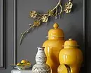
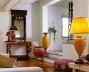
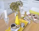
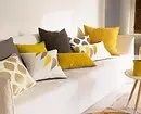
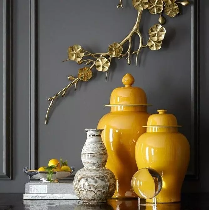
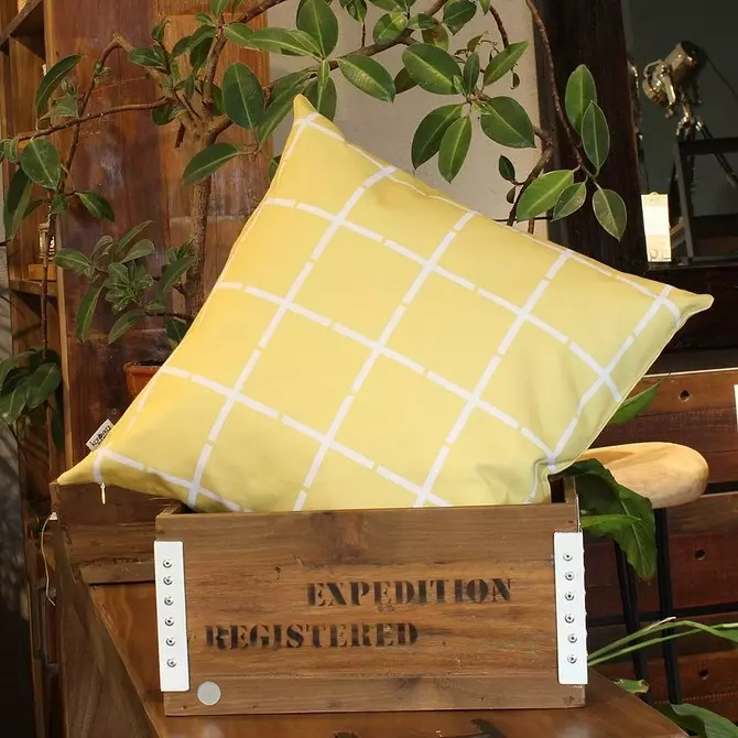
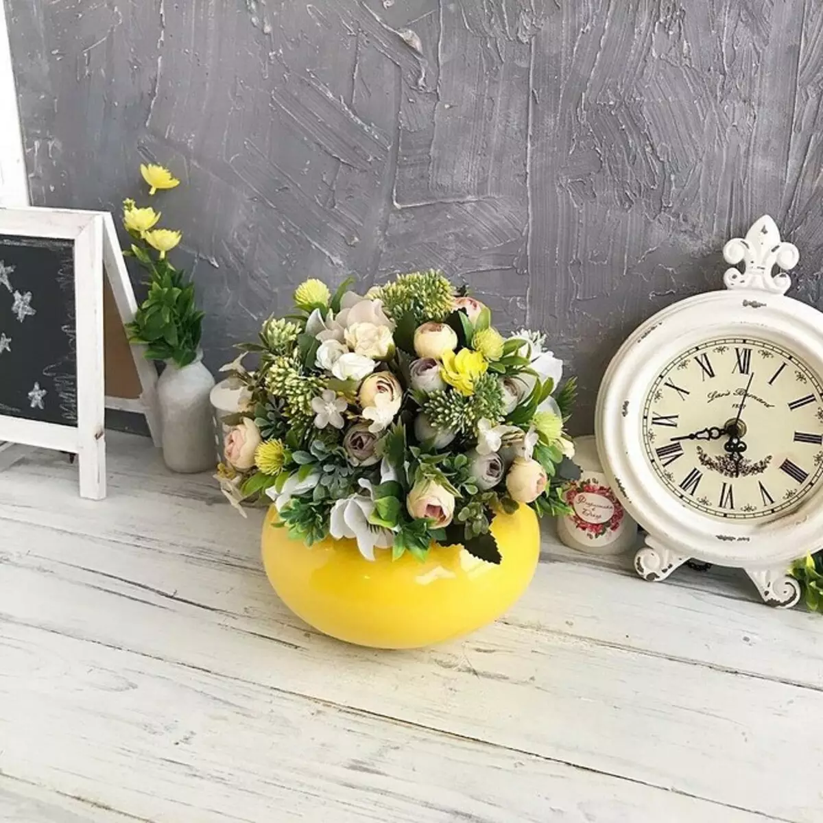
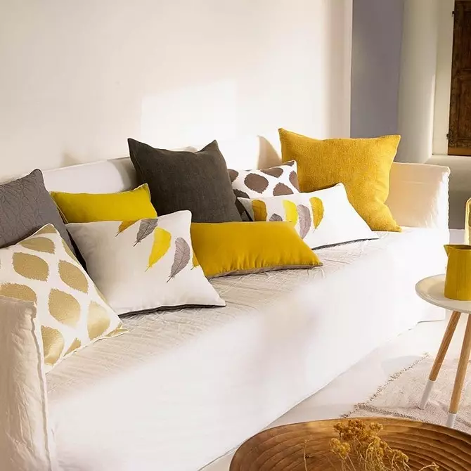
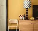
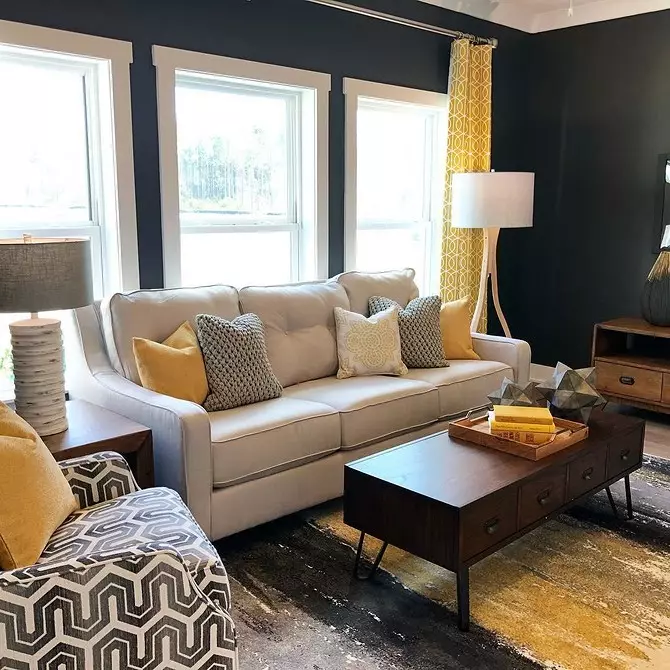
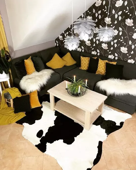
Do not be afraid to use this shade when designing a house or apartment. Sunlight harmonizes with various shades. But if you are not yet configured to serious experiments with color, start with bright accessories. The role of color spots can be covered and upholstery materials, curtains, rugs, plaffones, decorative pillows, baffs, banquets, posters, vases and other decor elements.


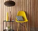
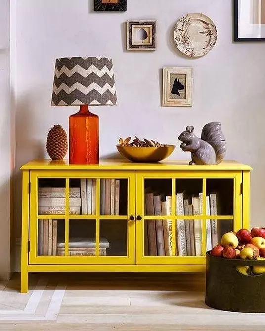
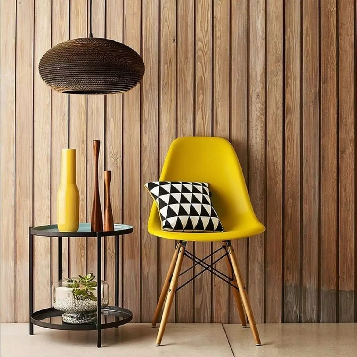
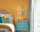
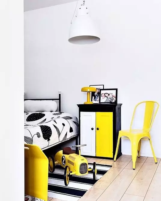
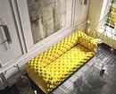
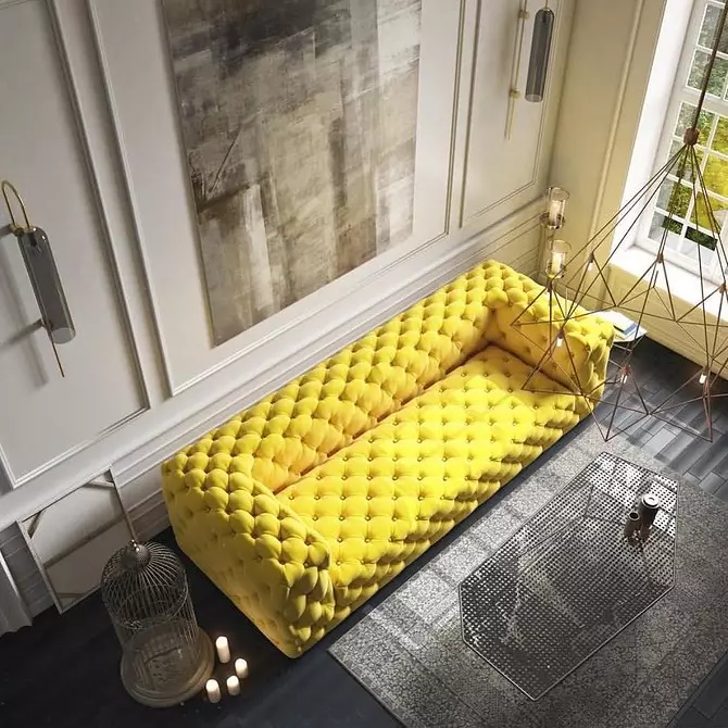
3. In furniture
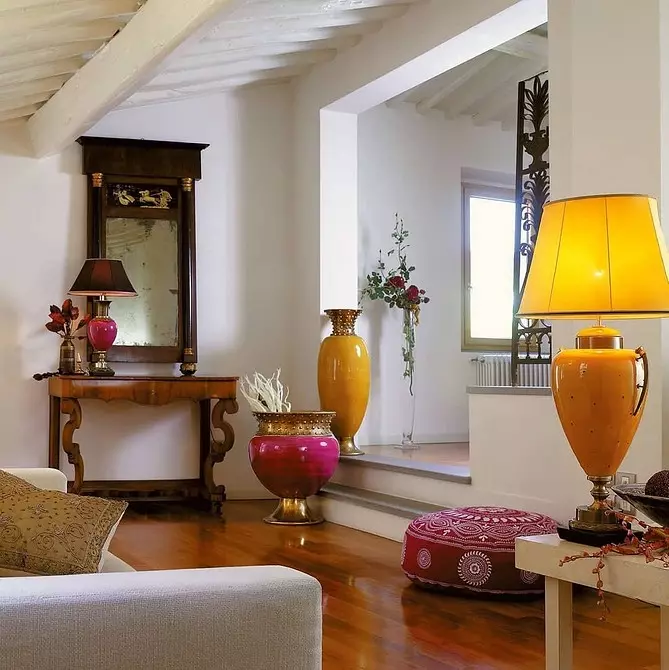
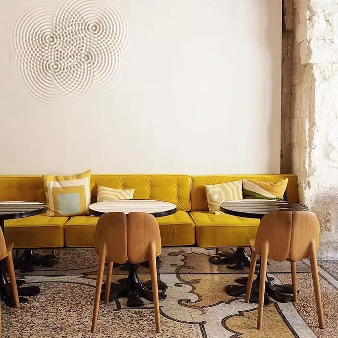
Want more positive and yellowness? There is nothing easier. Give the wrinkle to the interior will help a colorful sofa lemon or mustard colors in the living room, a neat coffee table or a cozy chair with a bright poster in the recreation area.
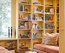
Again the Scandinavian interior will help racks and open cabinets, whose sliding facades or inner walls are painted in yellow. Another deft reception in the spirit of modern eclecticism is to paint vintage chairs and dressers in some extreme shade.

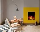
4. For an accent wall
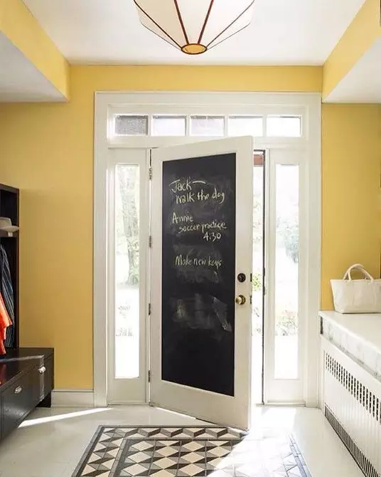
Also, the emphasis walls are not bad, highlighted not only in color, but also in texture. Or bright doors. Thoughtful and correctly chosen accents will make the house unusual and interesting.

In which rooms
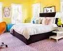
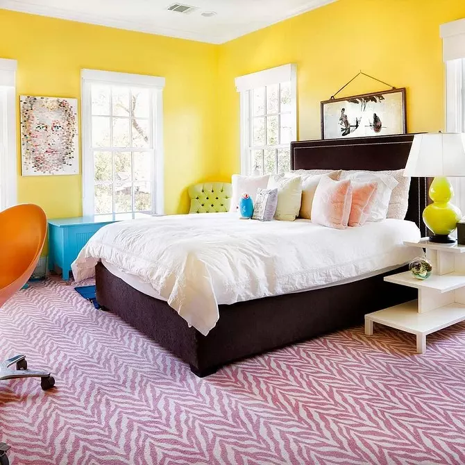
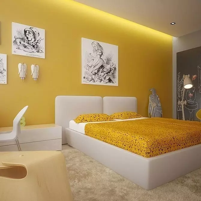
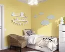
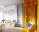
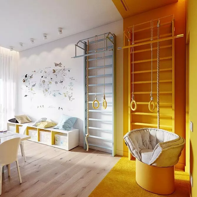
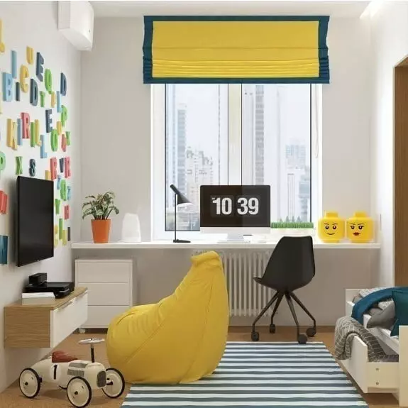
Bright yellow walls in the children's collapse of a timid baby, and in the kitchen and in the bathroom - will help to wake up in the morning.In children
By the way, picking up a color for the children's room, you should not immediately refuse a bright shade on the grounds that it can be too active for a child. According to psychologists, sun shades improve attention and help concentrate on learning. But at the same time, of course, do not forget that it is necessary to approach the choice of radiant gamma carefully, we work with calm shades, choosing mustard or olive.

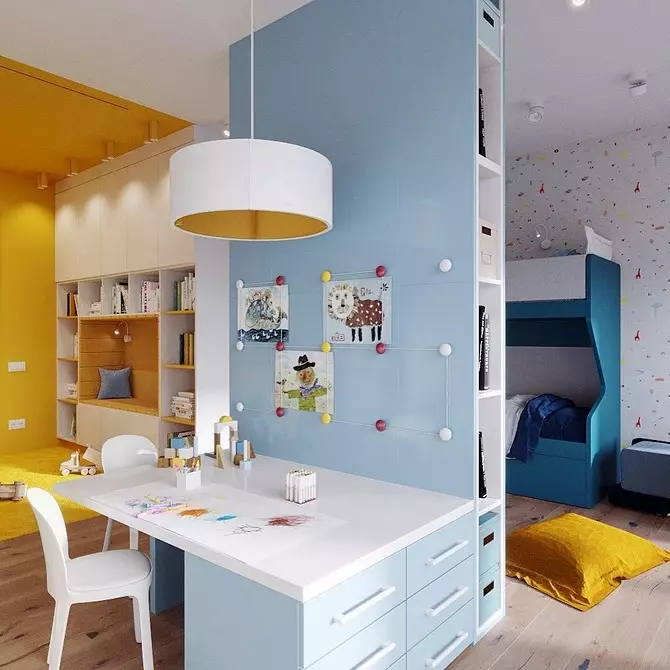
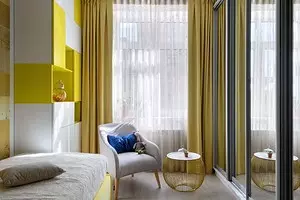
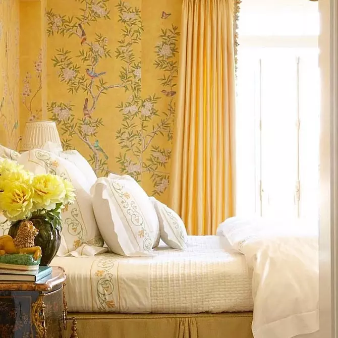
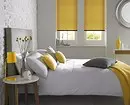
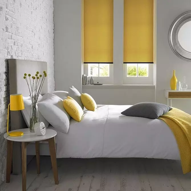
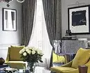
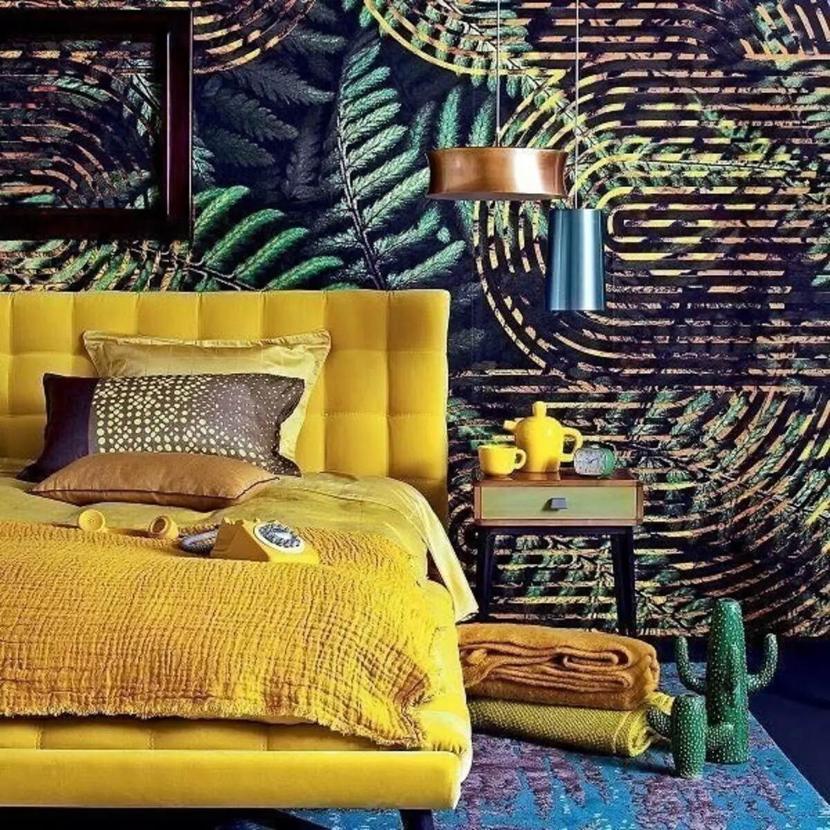
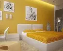
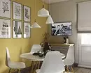
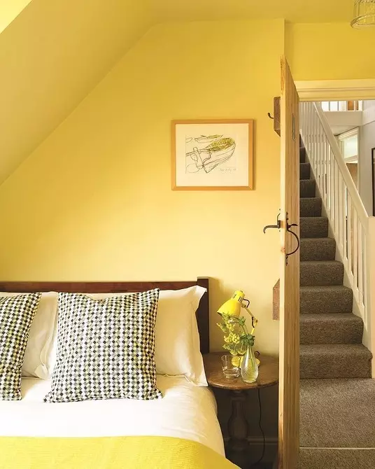
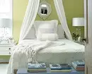
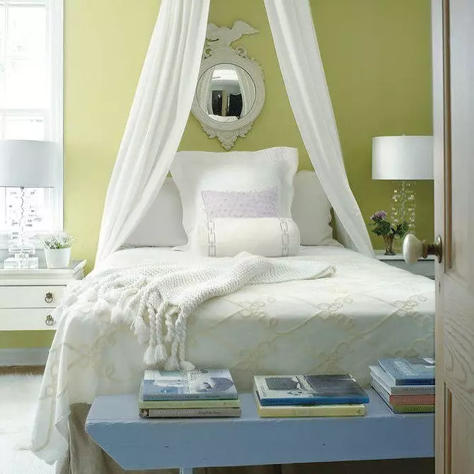
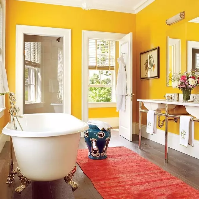
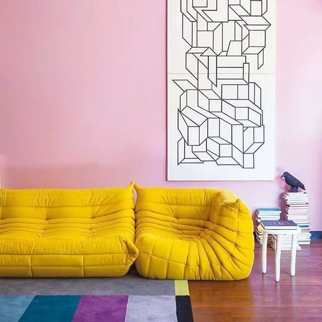
In the living room and bedroom
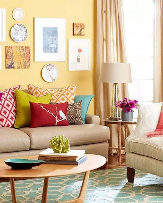
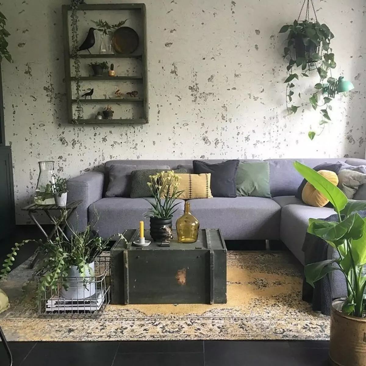
When placing the living room and bedroom, it is important to build a color balance, consonant with worldview and lifestyle of the owners. For a relaxing holiday in the family circle, pacified combinations with gray, green, beige and brown, addressed to the image of the Earth, warmed by spring rays. Combinations with white are more dynamic, usually the choice of active and sociability are stopped on them.
All shades of yellow and gray on the strains of the decorative panel.
The emphasis wall of the lime color with a horizontal gradient of the head of the bed: soothes in the evening and burn in the morning.
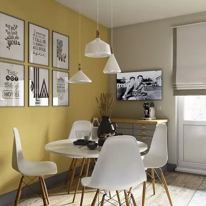
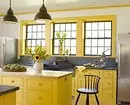
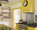
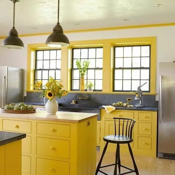
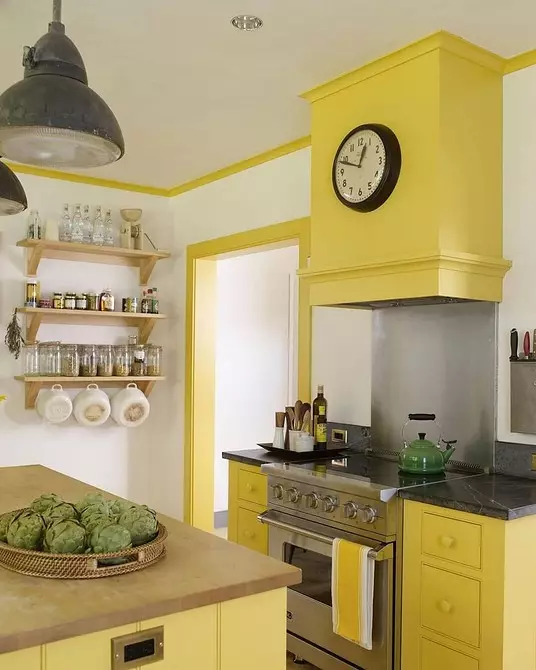
In the kitchen
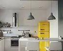
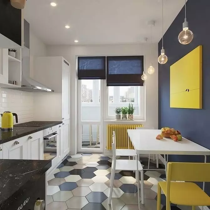
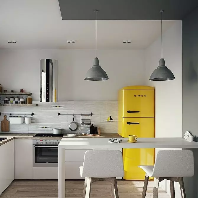
Active color improves appetite, so that it is often used precisely for the design of the kitchen and dining room. Optimally, if the proportion of this shade is not more than 20-30%. Sunny shade looks good on a small kitchen. Especially good bright shades, such as canary or lemon. If you want something special, but the bright facades are confused, you can add an emphasis with a room, putting a yellow refrigerator.
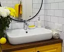
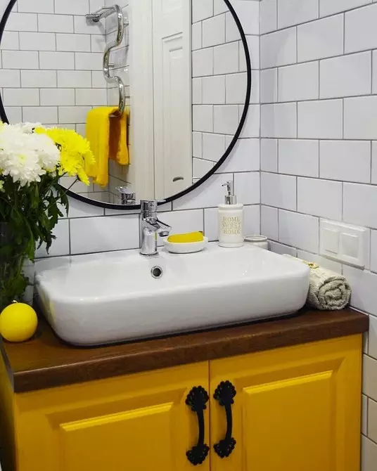
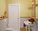
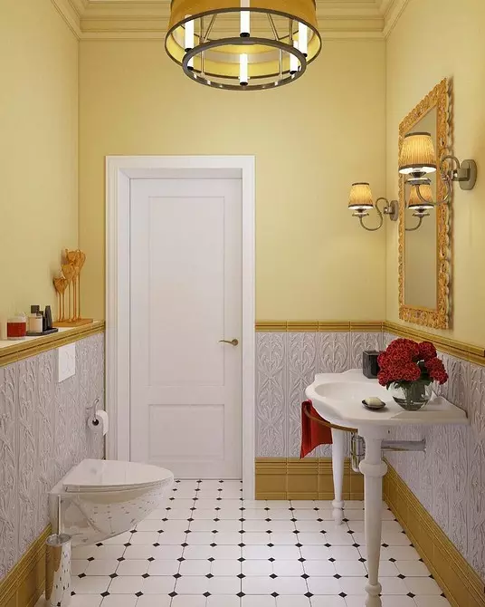
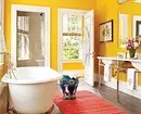
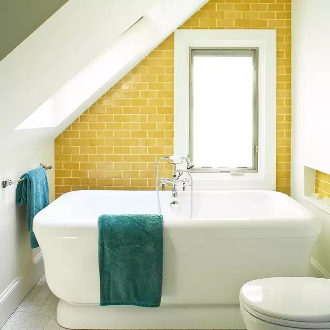
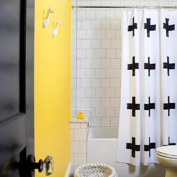
In bathroom
Perfectly diversified yellow tint bathroom, which traditionally make white or muted pastel tones. Such a situation is charged with a positive, I immediately want to smile.
The best combination of colors in the interior with yellow
Yellow is included in the triad linear independent colors, by mixing which all the wealth of the paints of the world will receive. Designers are actively using the advantage of a wide range of compatibility, creating colorful cheerful interiors.

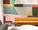
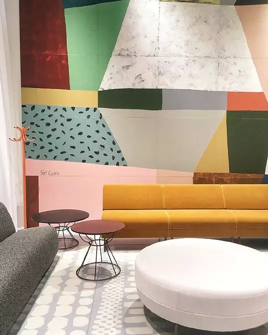
An exciting rumble of the wall textures and the ornament ornament in the design of the lounge zone.
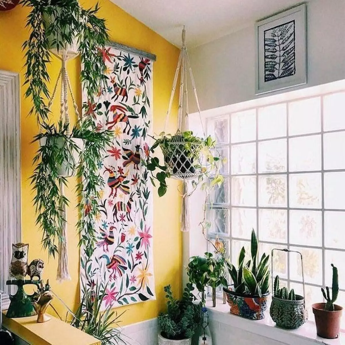
Live plants and wall panels will help to "talk" a yellow accent wall.
With basic flowers
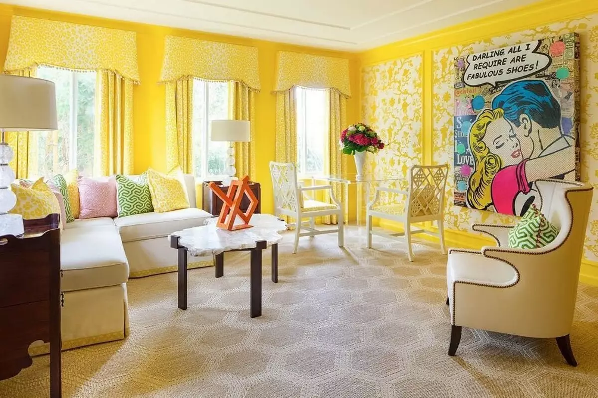
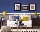
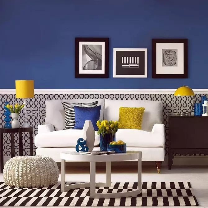
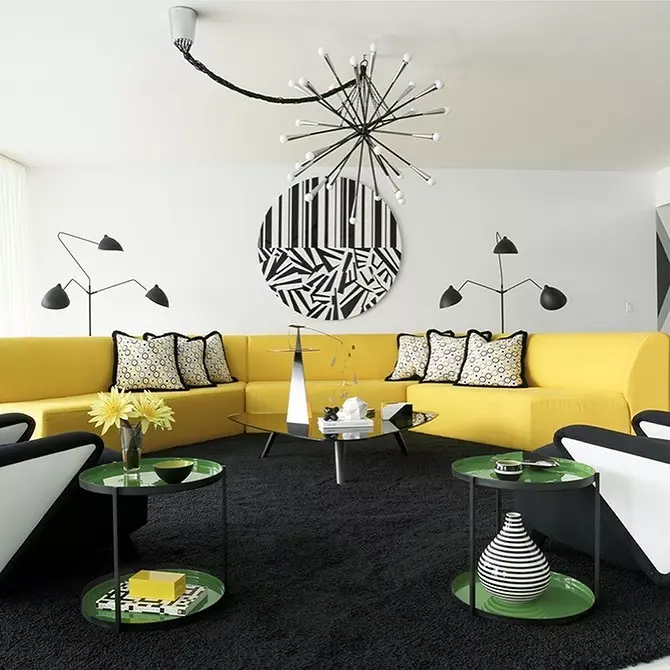
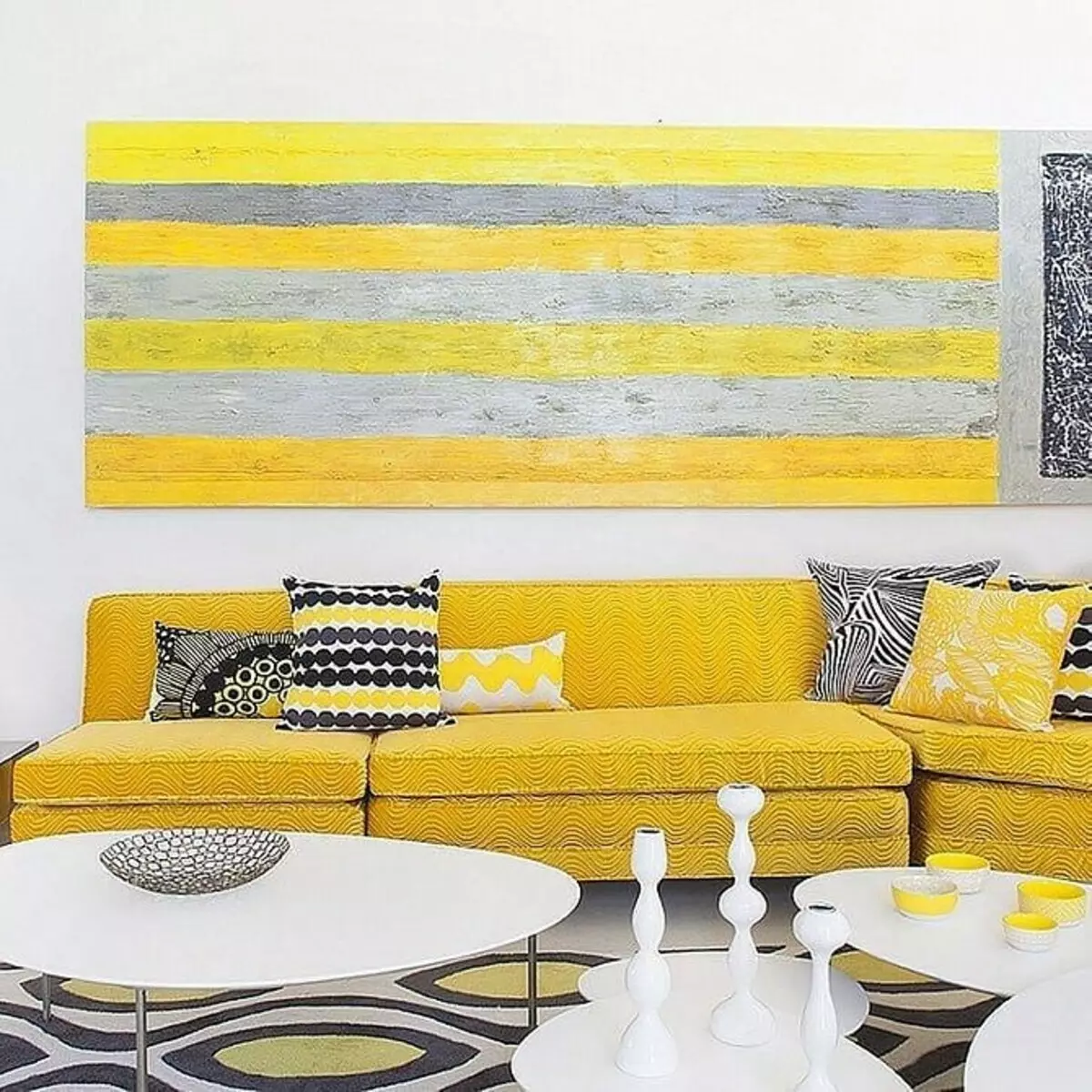
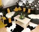
In styles of contemporary, high-tech and minimalism come across curious combinations of bright yellow with white, black and gray in different proportions. Extravagant duet of black and gold produces a strong impression in the context of modern, Ar Deco and Neurokko, but in other interiors it looks too pretentious.
Sparkling golden shades are well idle on the veiled molds of modern. Stucco, carving, openwork forging, bulk drapery and curved furniture lines form picturesque overflows. But gold should not be a lot!
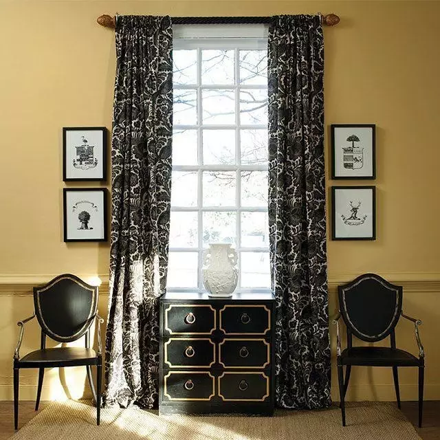
The witchcraft charm is modern: the walls of the sand shade emphasizes the mystical depth of black.
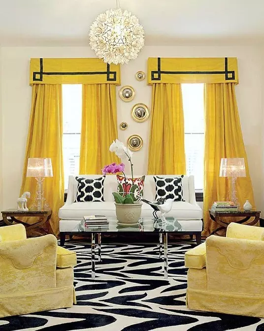
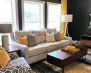
Yellow curtains make a revival in black and white interior.
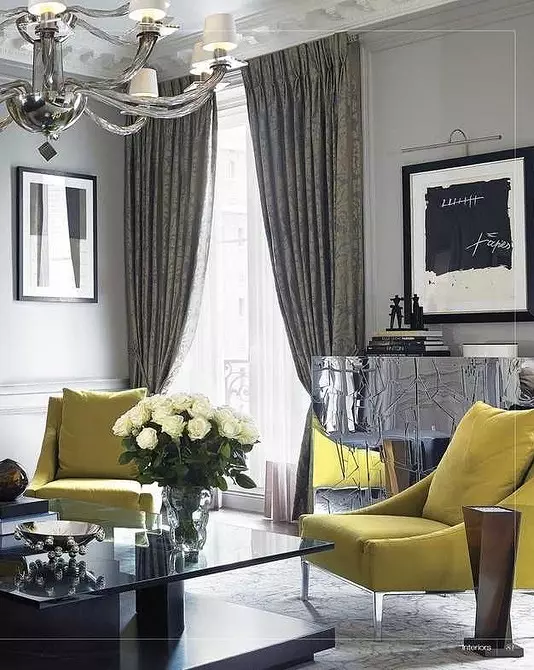
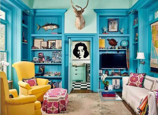
Drinking shades of yellow and gray refresh the situation in the living room.
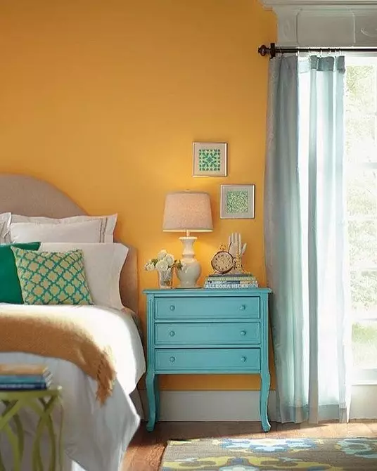
With cold shades
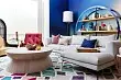
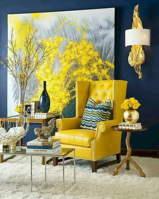
Active shades can be muffled with partner colors. Pay attention to the restrained cold tones - blue, blue, green, turquoise, lilac, salad. The high-contrast combinations of dark blue and purple with bright yellow may seem too pappy, so they are diluted with neutral colors. As part of Pop Art and Bocho styles to mitigate sharp contrasts, additional bright notes are introduced, but do not try to do this trick in the classic living room!


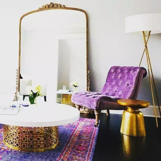
The moderate presence of gold in the living room enjoys harsh tones.
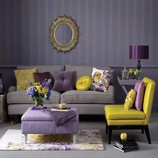
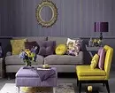
The basic purple with a gray spraying could seem gloomy if it were not for a selection of decorative pillows in golden tones.
With warm colors
Combinations are also allowed with warm colors, but instead of pure red and orange, more complex shades are selected - raspberry, terracotta, burgundy. The effect of the counterweight is achieved due to the difference in the temperature and intensity of colors - light shades of yellow and vice versa are closed under thick dark tones.
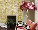
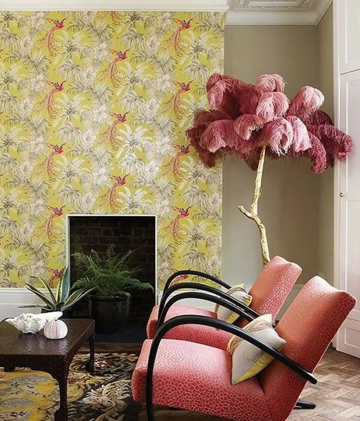
The excellent combination of caramel shades in the design of the Lounge Zone: Chairs and a bouquet of decorative feathers are playing out the ornament of the accent wall.
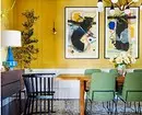
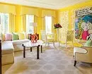
Youth living room in Pop Art: madness of paints, in which there is a system.
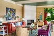
Table of color combinations
| Soft combinations | Dynamic combinations |
|---|---|
| With gray | With white |
| With herbal | With black |
| With mint, etc. | With violet, etc. |
Yellow color requires delicate circulation and sometimes there is a capricious. If it turns out to agree with him, you are extremely lucky - the desired shade will become a real interior decoration.