Wenge, Walnut, Oak, Olha - We have prepared a crib stuffed with furniture names, so that you need to choose the right one.

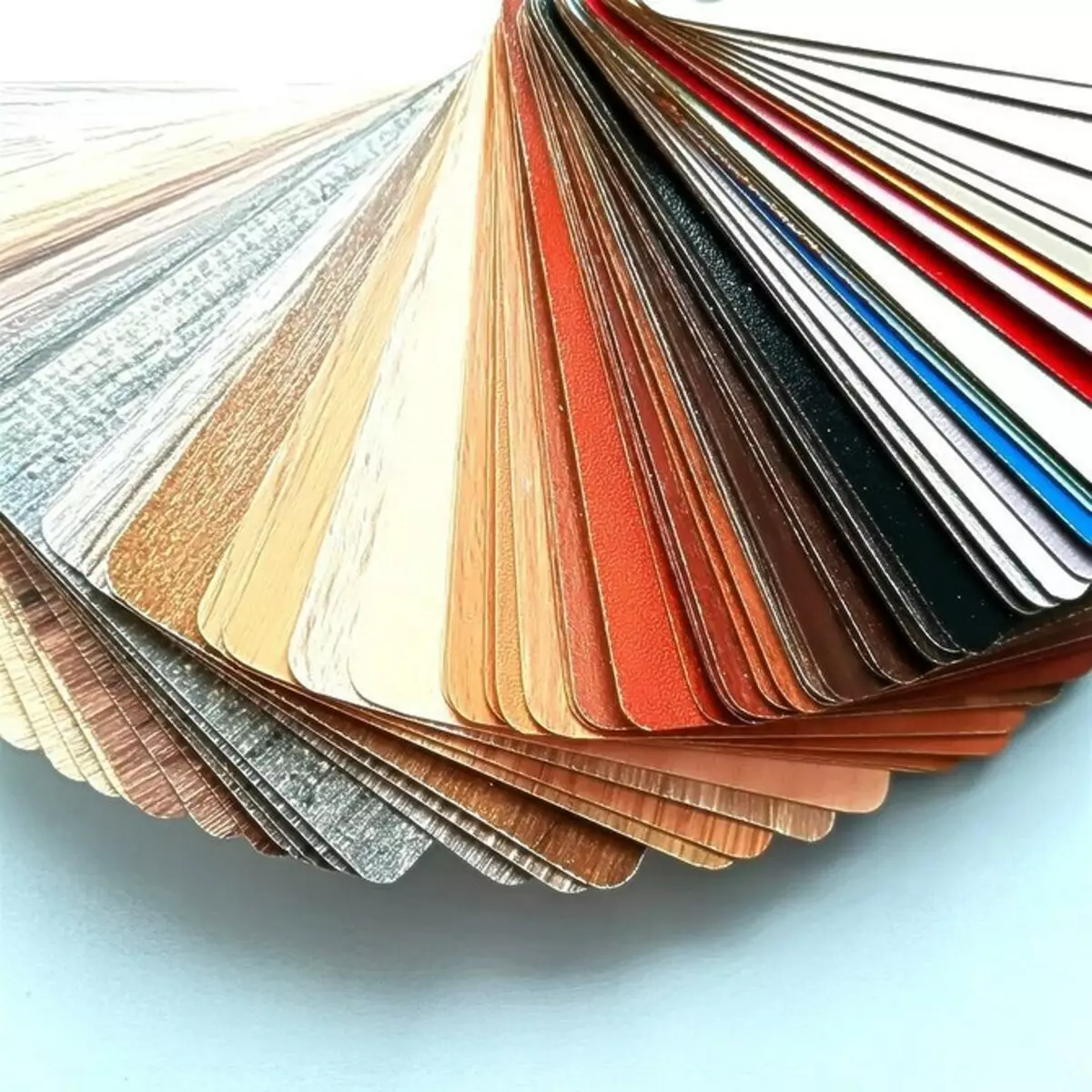
The article list the popular colors of LDSP, wood, MDF and tell me how one or another palette is suitable for what cases. It depends on how harmonious there will be a living space. The correct colors can be visually correcting even unsuccessful layout. The article show the most win-win furniture colors with photos, titles and descriptions.
What colors of furniture allocate
LightDark
Intermediate
Tips for choosing and successful combinations of colors
Note! In different directories, they can slightly differ from those described in the article.
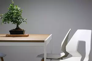
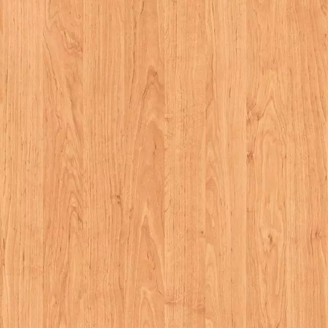
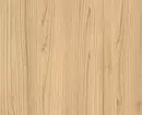
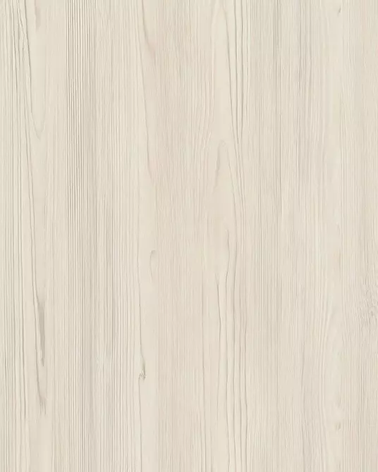
Light shades
With their help, even a small, narrow room with small windows is filled with light, it seems more spacious. Designers recommend to furnish in pastel colors, kitchen, classic and minimalistic interiors.
Chipboard with sulfur, cold-beige, pearl, snow-white lamination - a find for high-style style. Especially if the facades from this material are complemented by chrome fittings. Furnishing with such a palette: dairy, beige, creamy, yellow, - emphasizes homemade comfort, romanticism and vintage styles Provence, Shebbi-Chic, Scandinavian. We list the six most popular names.
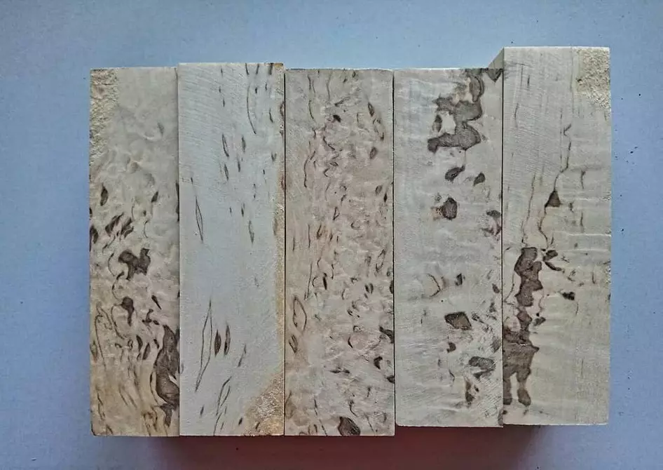
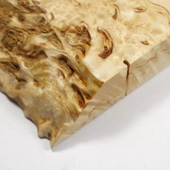
Karelian birch
Furniture of gentle golden color with darker splashes in the form of smooth lines and nodes. Sometimes the drawing is associated with marble.

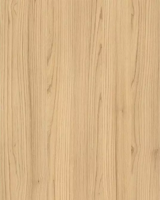
Light ash
Cream gray-beige shade with a smooth texture. In some variations, it resembles coffee with milk. Often in apartments are halted laminate of such a color.

Acacia
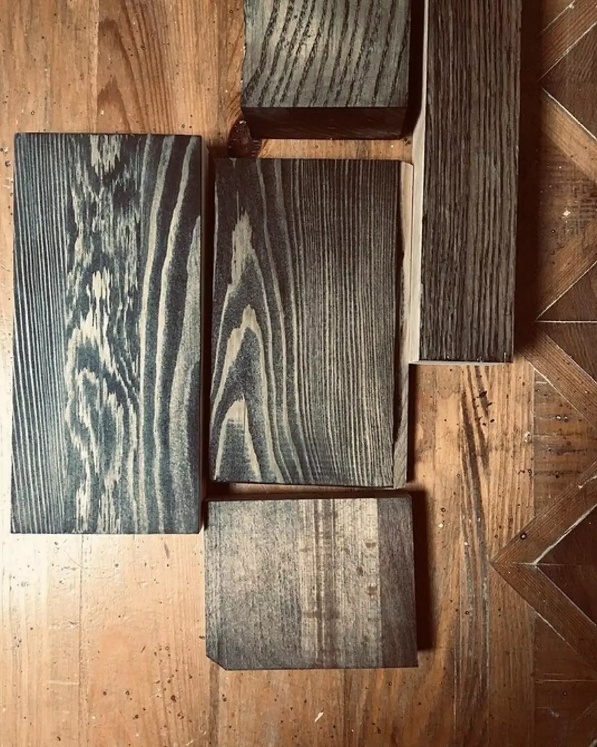
So called gray, yellowish or greenish wooden and chipboard material. Dark veins are highlighted on the surface.
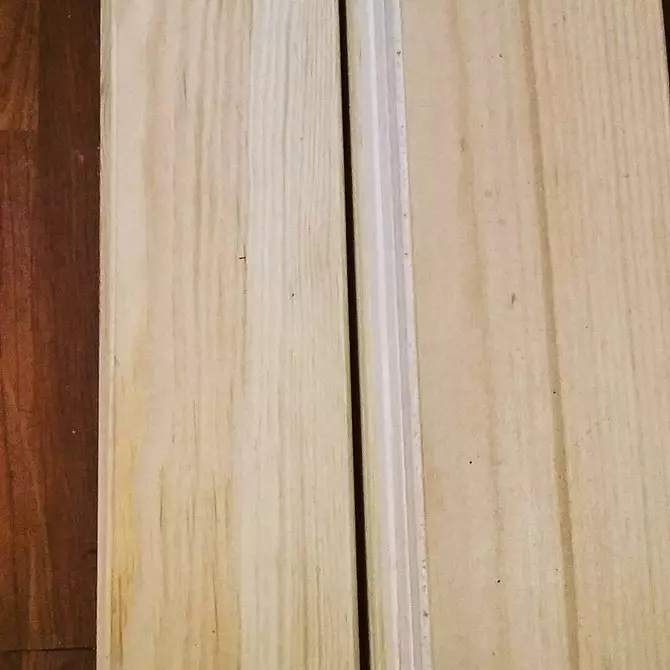
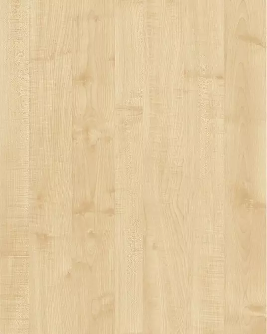
Pine
White-pink or amber texture with brown divorces.

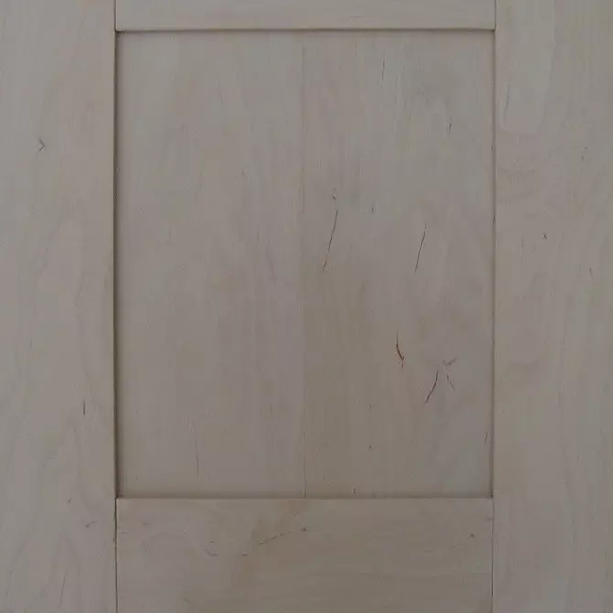
Light beech
Beige-pink surface with beautiful streaks.


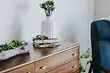
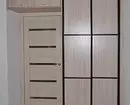
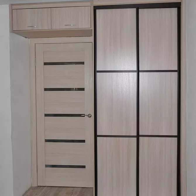
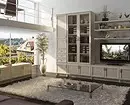
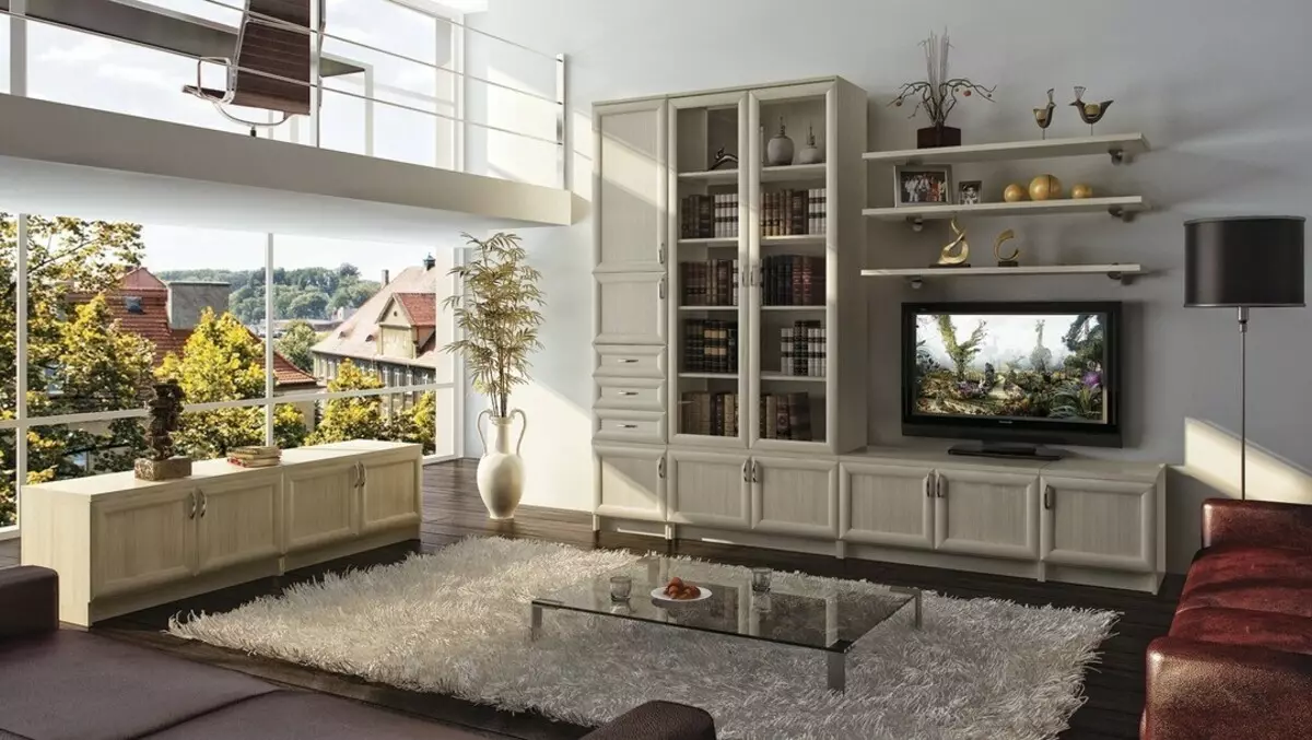
Milk oak
Surface with matte beige or pearl color and unique wood pattern.
In addition to the listed shades, there are alder - a gentle pink tone with a silky shine, an apple tree, Maple Tanzau, a spruce and a pear.


Alder
Apple tree
Maple Tanzau.
Dark Furniture Colors and Names
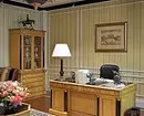
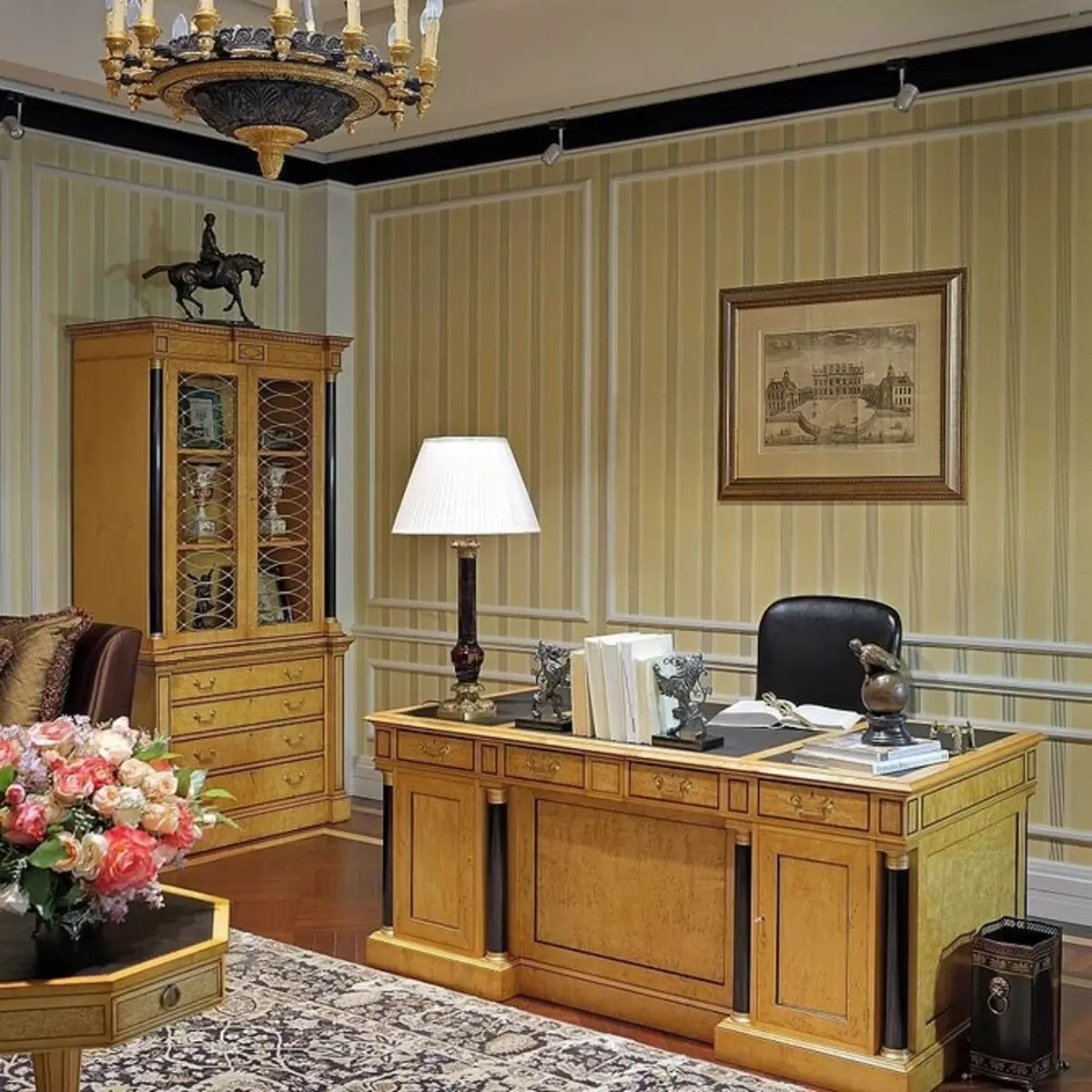
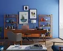
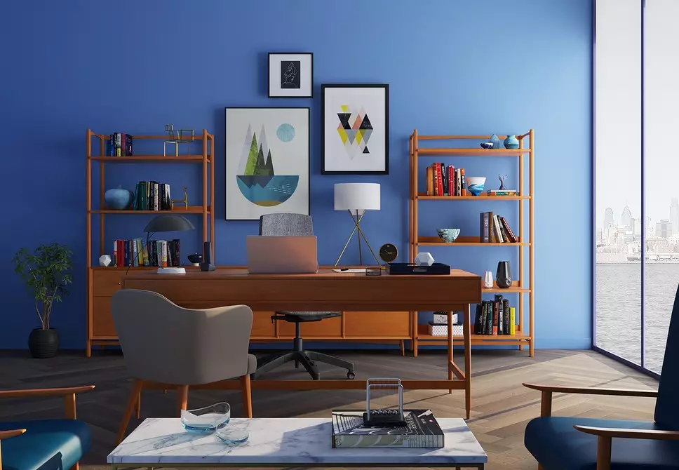
A saturated, deep palette is used in creating almost all interiors: classic, high-tech, modern, chalet, rustic. True, unlike pastel environment, it can eat space. This does not mean that there should be nothing black or graphite in small rooms.
Such elements are quite appropriate, but they need to be reduced to a minimum or in part in the furniture. For example, the upper part of the facades is light, and the bottom is dark. But in general, such design is appropriate only in spacious apartments with large windows. Especially if the cabinets, tables and other items are massive.
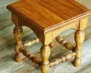
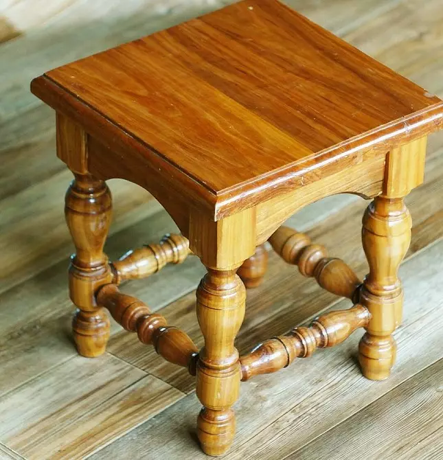
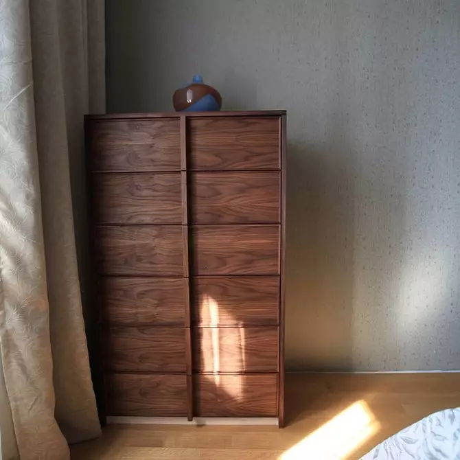
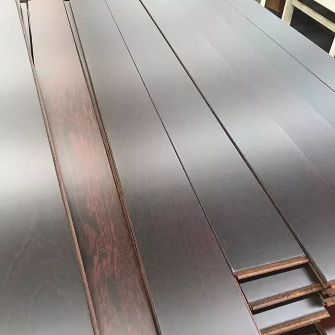
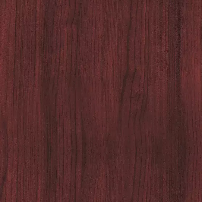
Nut
The most popular, most often dark brown color with an inhomogeneous pattern. Sometimes walnut can have a reddish sampling, be greenish-gray. The texture also changes - from winding strips to points and strokes.

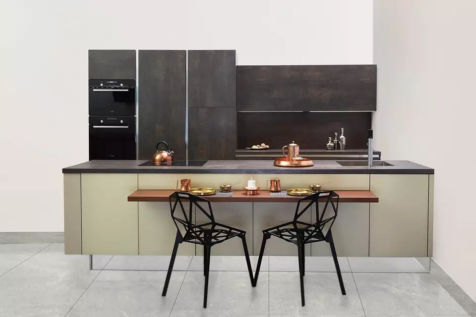
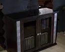
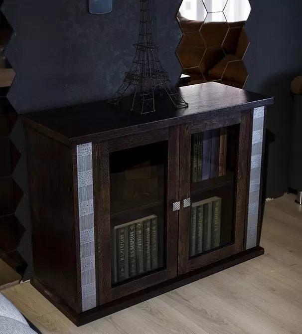
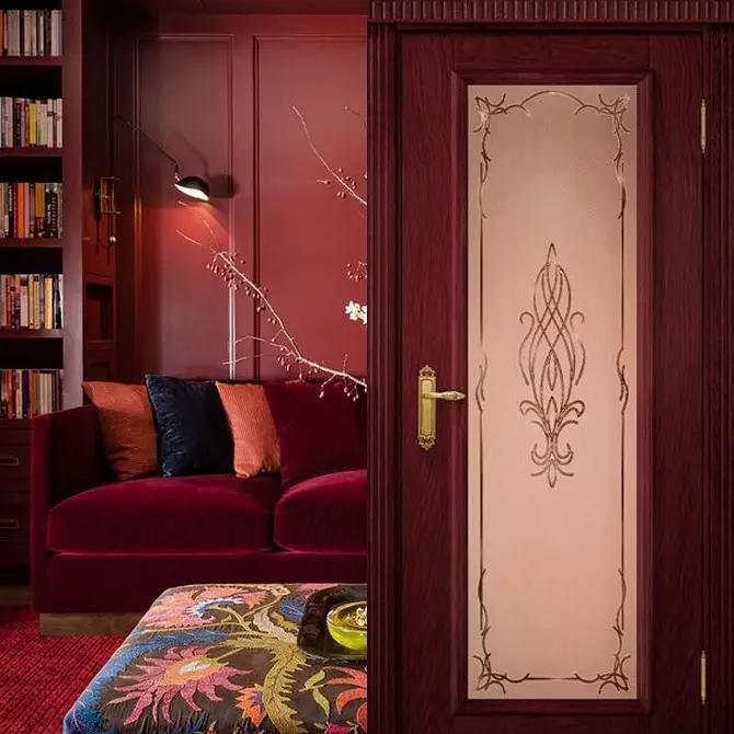
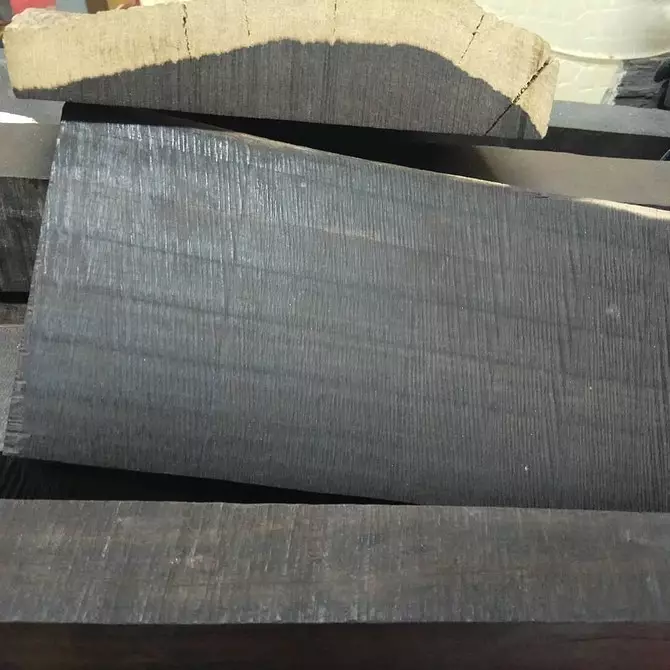
Wenge
Such a surface can be iscin-black, with a purple tint, chocolate with golden residences, burgundy. Live tree has a richer palette than laminated material, but it costs more. Wenge, like a nut, dominates in the interior due to saturation. Therefore, the main background should be neutral or with small bright splashes.

The Red tree
Mahagii, Paduk, Sandal, Berry Tis - All breeds Red-brown slice with varying degrees of saturation and texture. If it is wood, not imitation, the surface with time darkens.

Ebony
General name for several breeds. Natural material or lamination with such an effect happens dark brown, black, reddish, with beige stripes.

Then we show another palette of chipboard colors for furniture with names and photos.
Transitional shades
Intermediate tones - a compromise for small apartments. If you do not want to make interior white or beige, and dark things too clutter space, look for something average. Almost all suitable shades will be warm, with varying degrees of saturation. They fill the apartment with light. Furnishing with such a color looks not so cumbersome as Ebony or Mahagony. Here are these colors:
- Cherry (reddish-red)
- Alder (beige-redhead).
- Oak Rustyl (moderately brown).


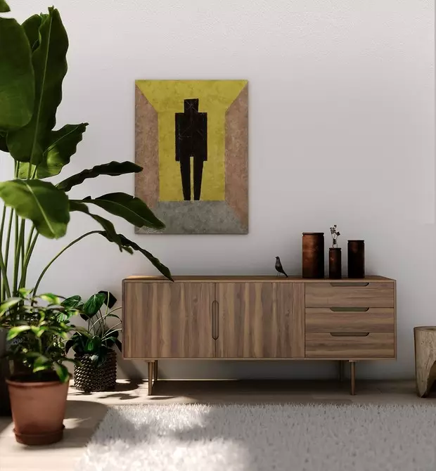
We listed all the main colors of wood and imitation for it. If we talk about the chipboard and MDF with lamination, then there is even more scatter. In addition to the listed natural shades, there are green, gray, purple, with the effect of steel, concrete and titanium. Some colors of LDSP for furniture with names in the photo.


Iris
Callipso.
Ice Canyon

Coral

Cream
Tips for choosing a color and the best combinations
In well-lit, spacious rooms with large windows can no doubt to put dark things of any size. If the room is less than 17 meters, it makes sense to think about the mixed version. For example, black and white facades where white is large. Or finding reddish brown things. They will add comfort to the homely atmosphere.
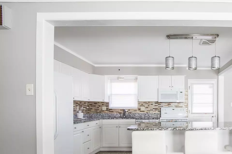
Little living rooms, bedrooms and kitchens Designers advise to furnish only in pastel colors. Against the backdrop of peach, dairy, blue walls, a light beech cabinet or ash will look almost air.
It is easiest to combine the finish with them, add bright details to the design. In other cases, this should be done carefully not to overload the space. If you want to create a strict design, look for inspiration in the cold palette. In warm, when the sun is not enough in the housing.
The interior can be divided into two parts. The first includes floor, ceiling, walls, window sills, plinths. The second consists of furniture and decor. The background and furnishings must be perfectly approaching each other in color, as they are harder to replace them. With the decoration of housing is also important not to overdo it, but problems with this are easier and faster.
Observe the balance of colors
- The neutrality is the main plan, the more massive and more noticeable is the situation. And vice versa.
- In typical apartments and modern houses without high ceilings (above 3 meters), columns and large areas, it is necessary to emphasize that do not attract coverage without coupling patterns. So you accurately avoid agarly.
- When choosing a dark tree or chipboard, a light finish should take at least 60-70%.
There is an easy way to understand the neutral background in the room. Imagine that it is empty. Does it fit equally successfully sofa with velvet upholstery on bent legs and a simple chair? If so, everything turned out.
We select successful combinations
- White. This is the most win-win. It looks good with most shades of varying degrees of saturation: gentle blue, lilac, brown, red, yellow.
- The black. Classic combination - with white. The softer color scheme is obtained with pastel gray, beige, blue. Patterns on the wallpaper and the floor should be unshakful. Dark walls with black furniture must be complemented by light curtains, pillows, frames.
- Wenge. Creamy, vanilla, turquoise, orange, peach wallpapers and decor are suitable for brown tones of this wood. To iscin-black and purple - pink. To all - olive, herbal-green, small splashes of blue.
- Nut. Classic tandem - with snow-white or sandy walls. If the furniture is warm underground, the room is relevant warm and bright shades of brown, red, blue, yellow, bottle-green, burgundy. Cold walnut can be combined with salad, blue splashes.
- The Red tree. Designers advise to use it with pastel, warm palette to create a cozy interior. More original combinations are obtained with green, purple. Brown is the best color-companion for mahogany. If you need to focus on something, add a small beige item.
- Grey. The combination with light green, yellow on the walls, floor or in textiles, will revive such a room. A brown, purple, blue, red in small quantities, pink, burgundy, white is also suitable.
Birch, beech and milk oak look beautifully and with light, and with a dark background. If you want to create comfort in the house, add coffee tones to them, a bit blue or red. Gray will help in the arrangement of a cold, ascetic room. Greens will give freshness, and blue and burgundy - dynamism. Intermediate cherry, alder and oak look equally well with a bright and restrained background.