Red, yellow or green? We tell how to choose a bright sofa and not spoil the interior.

The bright sofa in the interior of any room is spectacular and beloved by designers. And repeat it is very simple: the main thing is to know only a few rules. We share them.
Listed the main tips in the video
How to enter a bright sofa in the interior
What to considerActual shades
Principles of color combinations Sofa and main design
Fashionable textures of upholstered furniture
What to consider
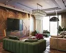
In fact, despite the popularity, a bright sofa is not quite a universal solution. For example, in classic stylistics or country, this contrast will not be appropriate, but in more modern apartments - quite. This includes the Scandinavian style, Loft, modern and even sometimes neoclassic. In minimalism, the reception is very rare, the same applies to Eco. Such decorations contrasting furniture takes place in the eclectic.
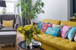
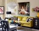
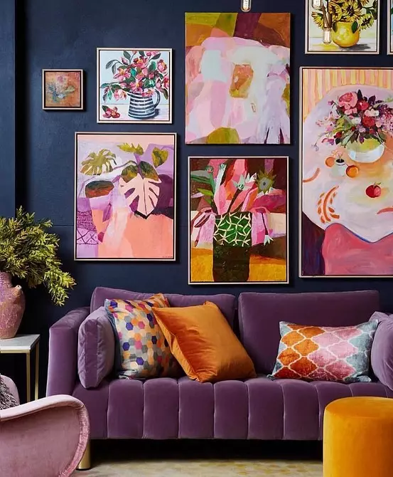
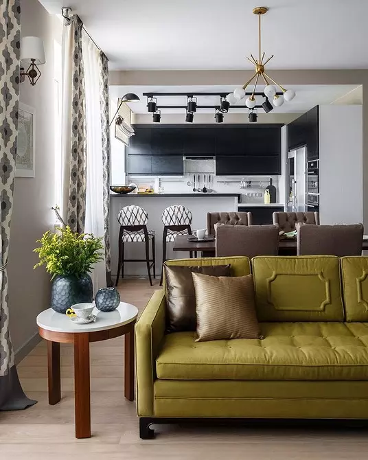
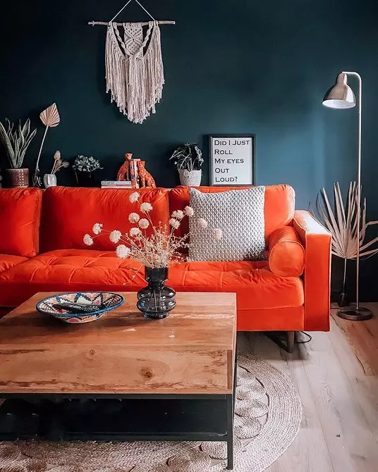
The second point is the implementation of the idea. Sofu can be supported in the design or use as a single accent. There are no strict rules, but the projects are most often involved in the following principle: if there are a lot of colors (more than three) or a Blanket-blocking unit is used, the sofa shade is duplicated in other elements.
- The easiest way to do this with the help of decor: paintings above the sofa, carpet, VAZ in this zone. Pay attention to the carpet: usually designers choose multi-colored models where the desired kolker is presented to a lesser extent. This technique looks not so naive and what is called "in the forehead".
- The variant of the combination with the curtains looks good in traditional designs.
- It is interesting to look like a solution with small details, for example, with book covers placed in the rack nearby, or flowers.


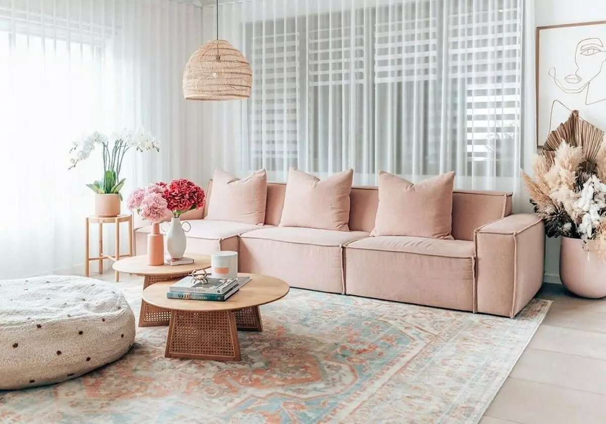
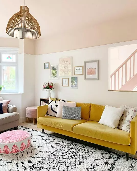
If the entire interior is made in the basic colors, the color spot to duplicate is not necessary - this concept just works independently. For example, in the lounge with light furniture, the bright sofa will become the main accent. This is suitable for any neutral gamma: beige, dairy, gray and muted pastel shades that are used as the basis.
In designer projects, one-photon furniture is found much more precisely pressed. If you still like the idea with a print, choose less active patterns: geometry and abstraction. It is better to avoid floristics and various finish combinations when different tissues are connected. For example, combine armrests and a back, pillows and base.

Actual shades
Not all saturated bright colors will look modern in the interior. The main trend today, about which we are constantly saying - not clean, but complex tones. Those who can not be exactly said what kind of paint.
If you take into account the microtrends, for example, popular in 2021, then designers allocate several colors.
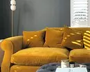
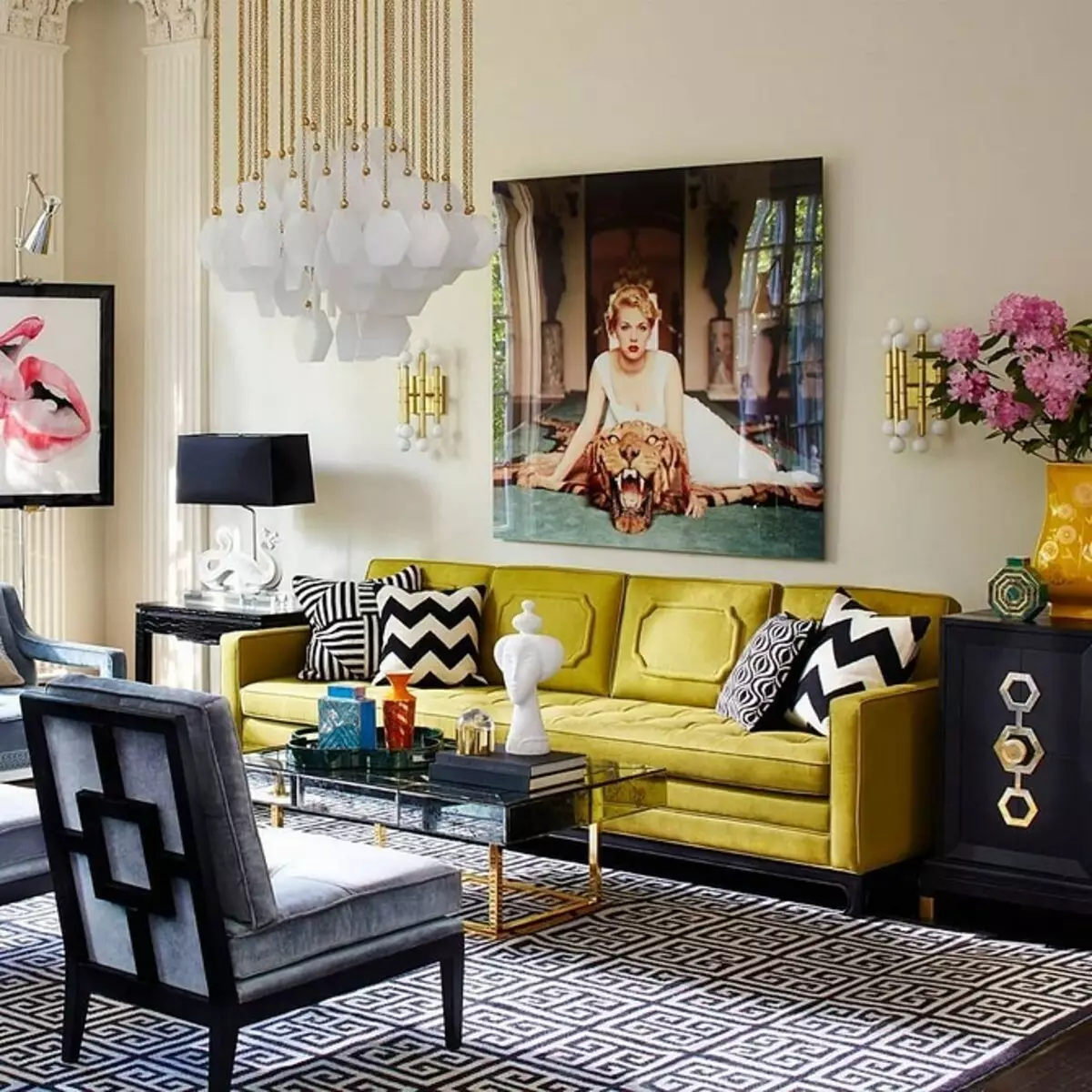
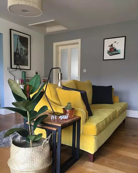
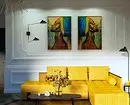
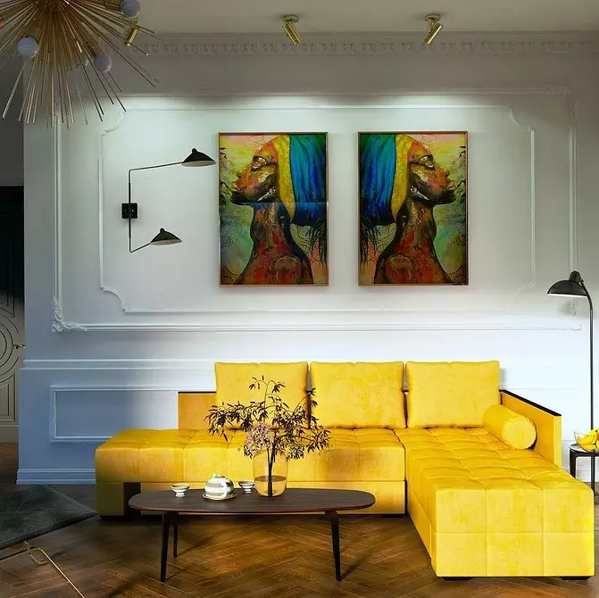
- First of all, this is yellow - the choice of Pantone. His combination with gray is the most fashionable this season.
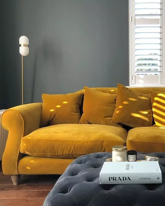
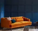
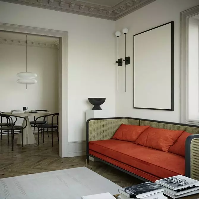
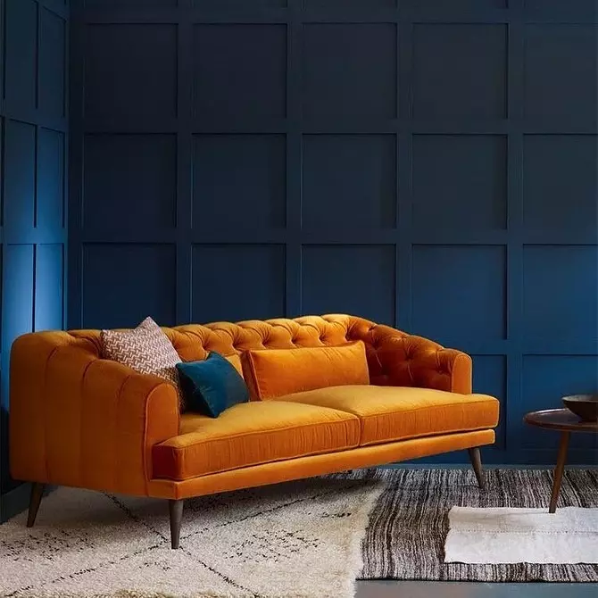
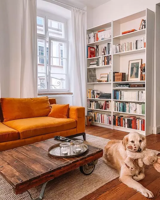
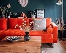
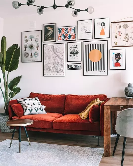
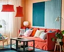
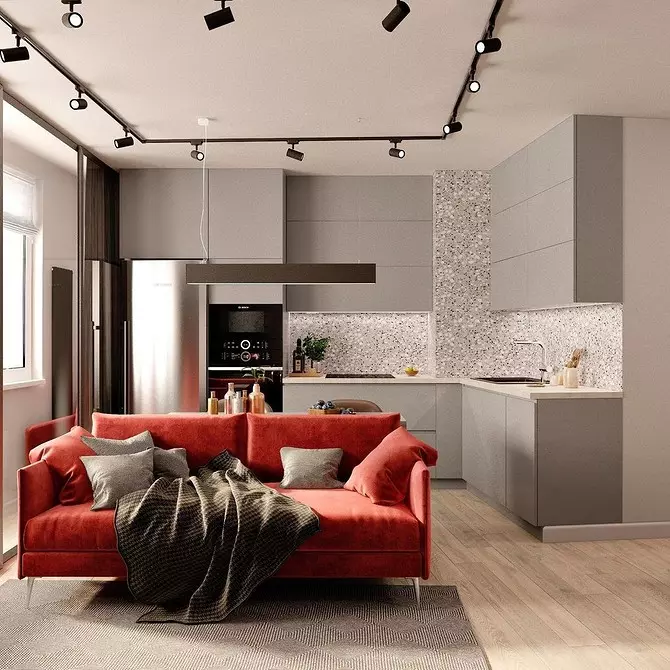
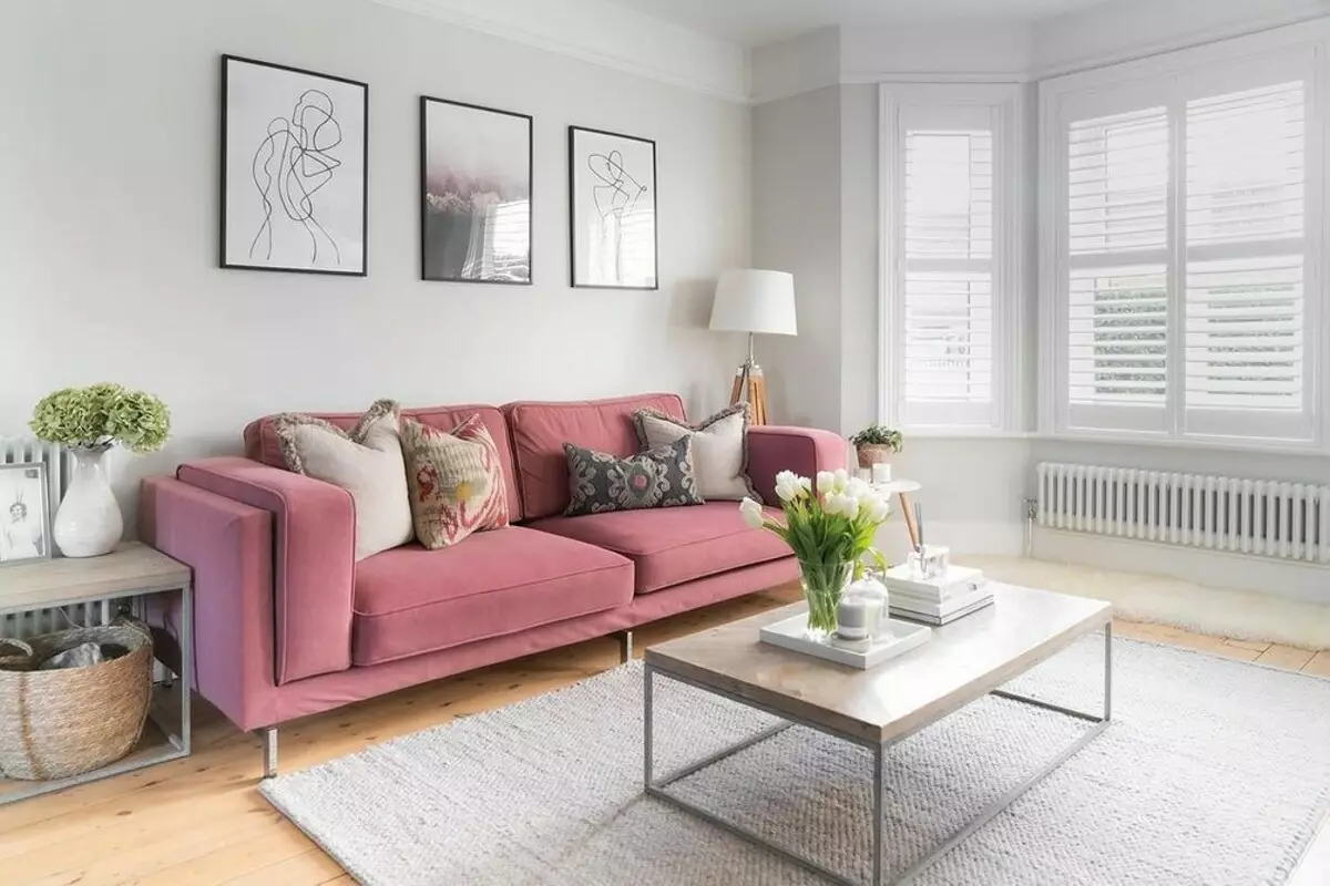
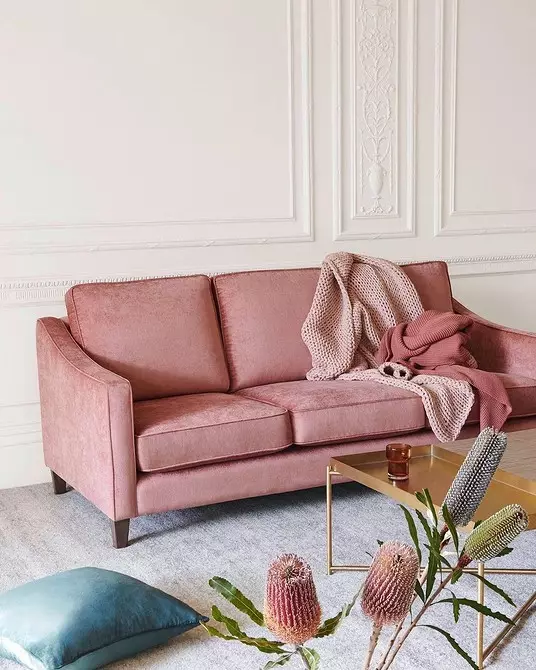
- Numerous warm variations of red - another noticeable trend. These include terracotta, scarlet, ocher, bordeaux, and so on. Close options from the yellow-orange palette: copper, brick, caramel, mustard.
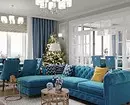
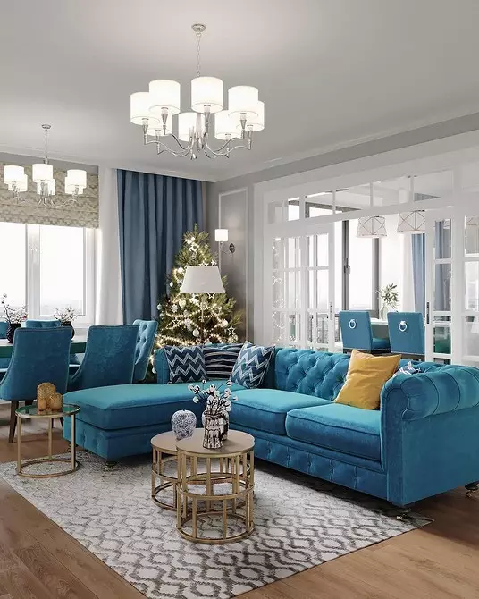
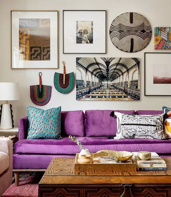
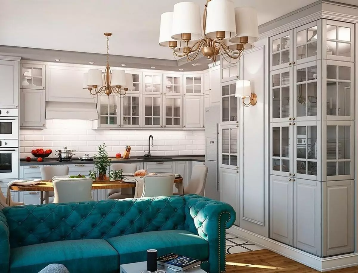
- Turquoise sofa - classic. Designers especially fell in love with such a solution in neoclassical interiors and modern decorations with an elevated note.
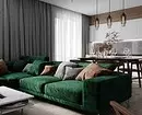
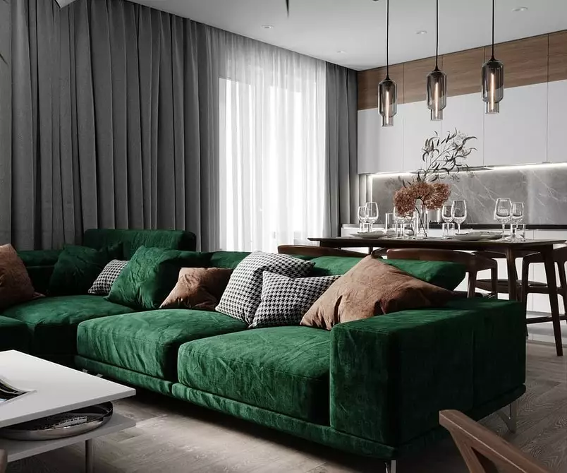
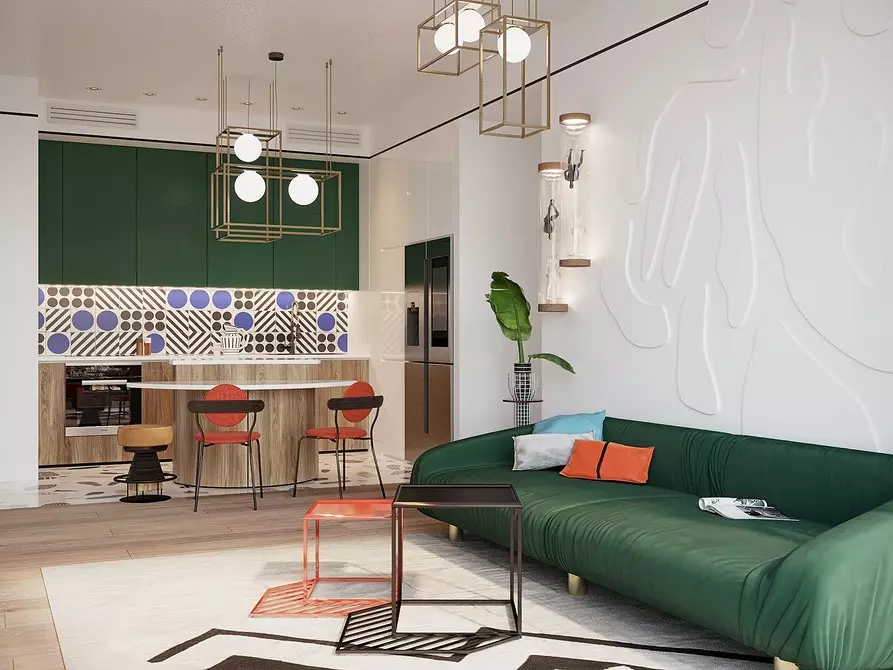
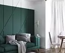
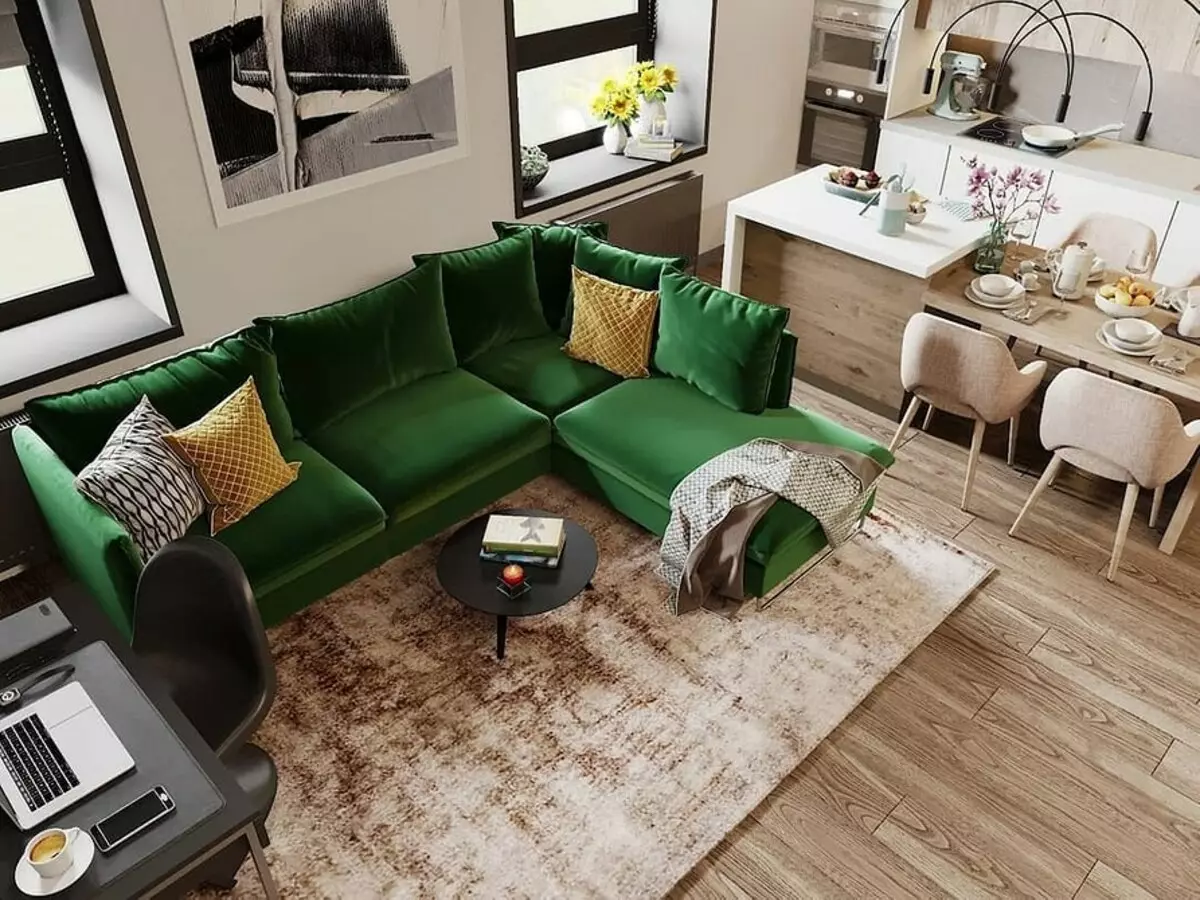
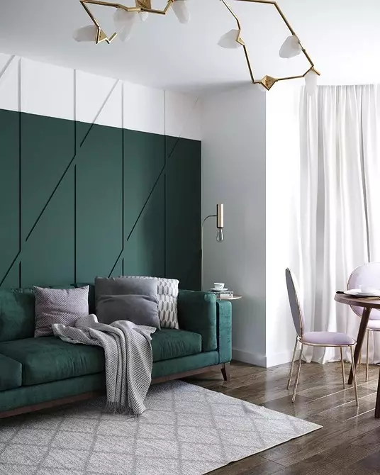
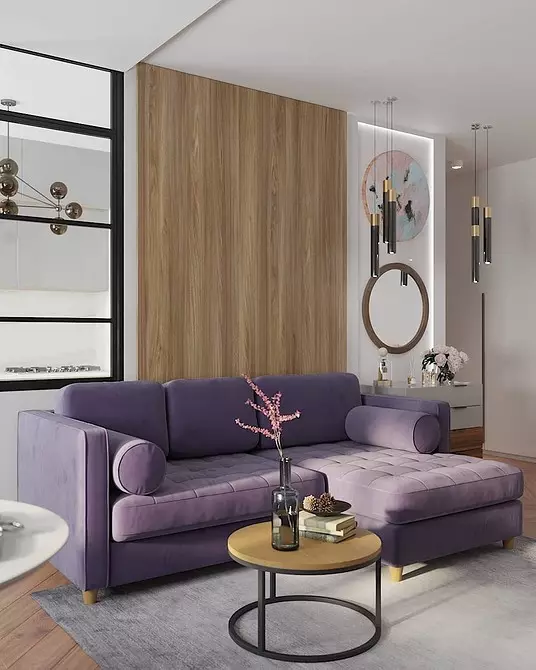
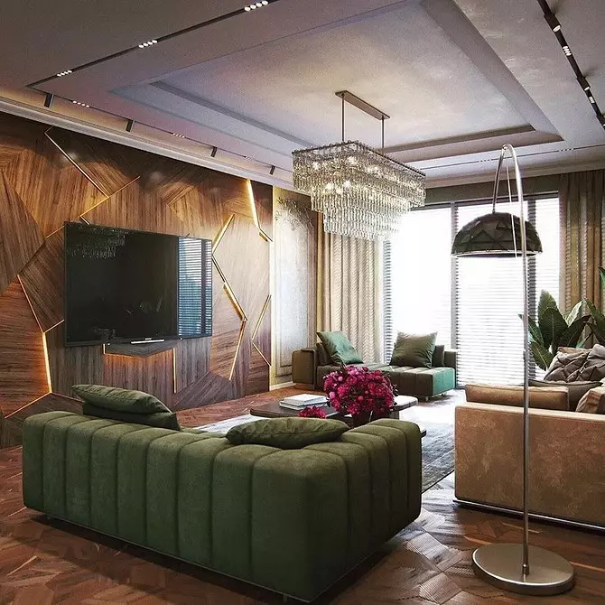
- Bottle can be considered as an alternative to turquoise. Close to it emerald and herbaceous shades also look beautiful.


Principles of a combination of a bright sofa in the interior of the living room and another room
Not only trends affect the choice of upholstery. If, for example, you have already made repairs and have now thought about buying a sofa, it is better to repel from the main design. Here are the rules of color. The most simple method is the game of opposites. You enter into the design contrasting sofa. It is possible to see what color can be in a circle of Ytten: these are two beams located opposite each other. We will analyze on the example.
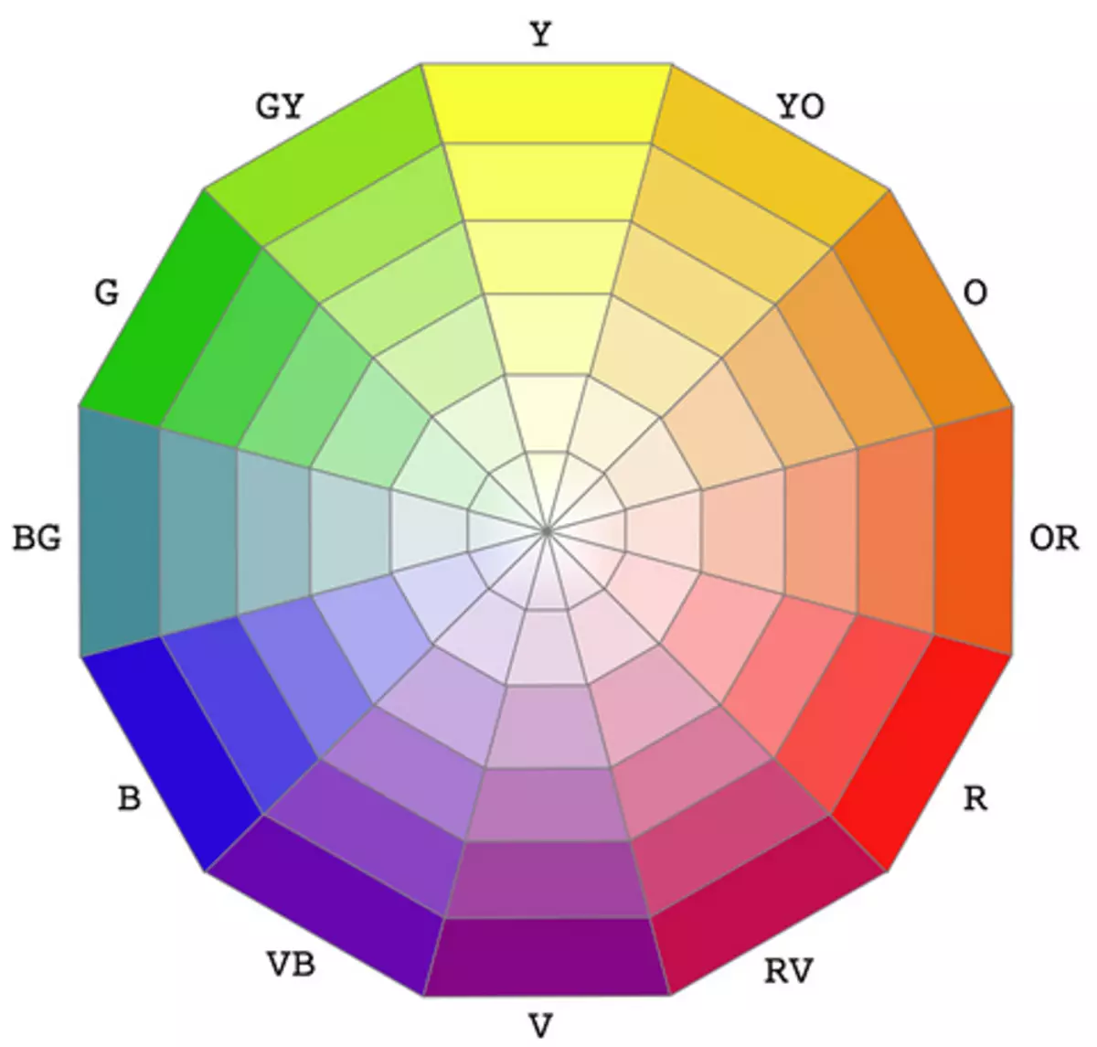
Suppose the space is decorated in the beige gamma. Beige lies on the orange ray of the circle. Opposite the orange ray lies blue. Accordingly, the blue (or turquoise) sofa will be organically fit into the beige living room.
The saturation of the shade you can adjust yourself: it is suitable and light and medium-sized, and dark.
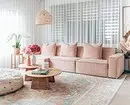
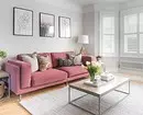
In addition, beige, especially approximate to white, is considered the maximum neutral base. So it is possible to pick it up with any upholstery: it looks pretty and tender options in pink, and bright - in yellow.
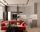
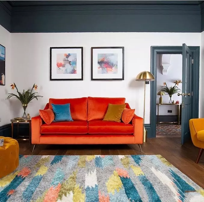
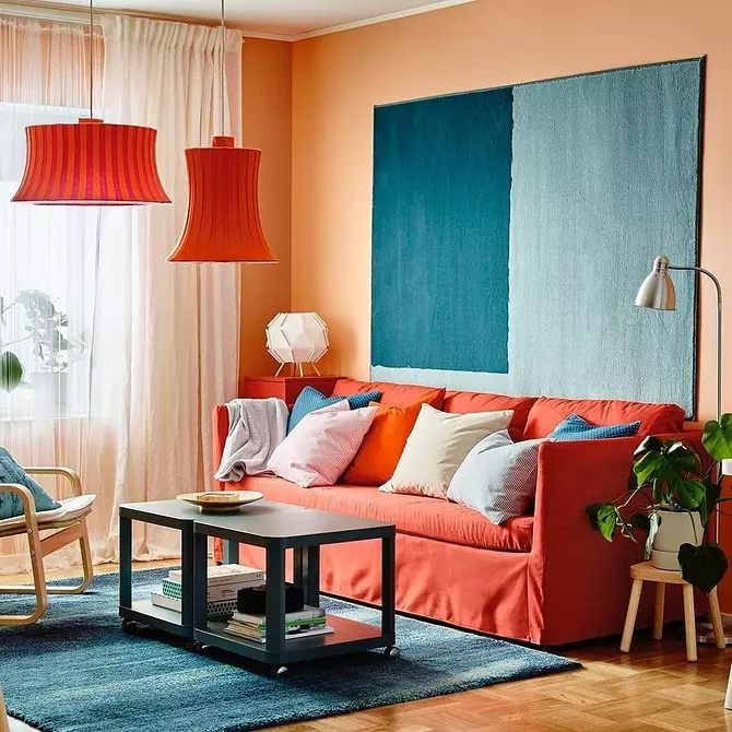
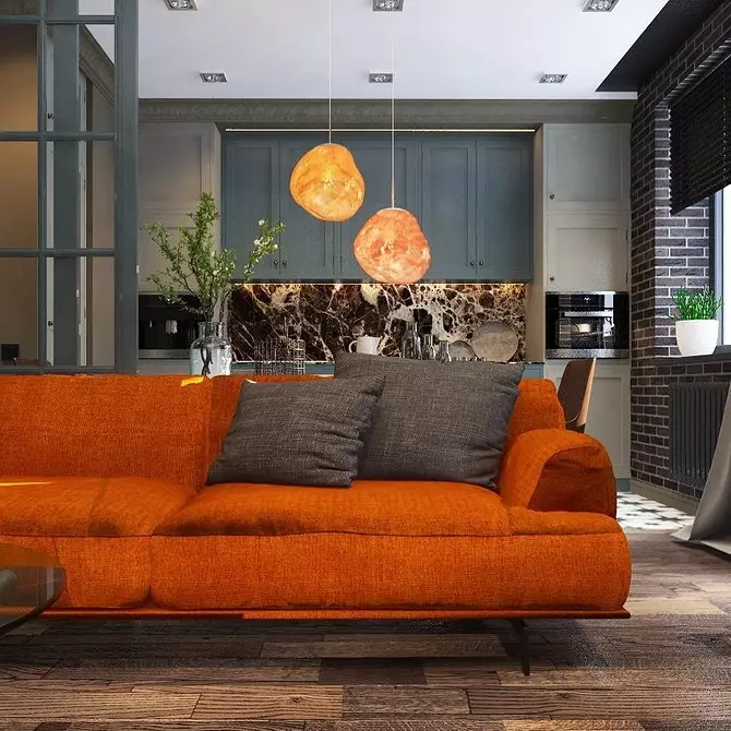
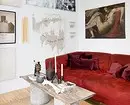
When the paints are mainly several, you can choose a contrasting upholstery for one of them, for example, additional (it takes 30% of the interior). In the gallery in the photo above, the designer picked up an orange sofa to the iscin-gray wall decoration under the ceiling.
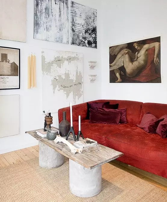
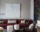
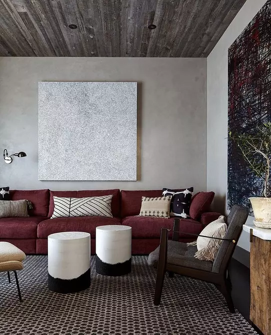
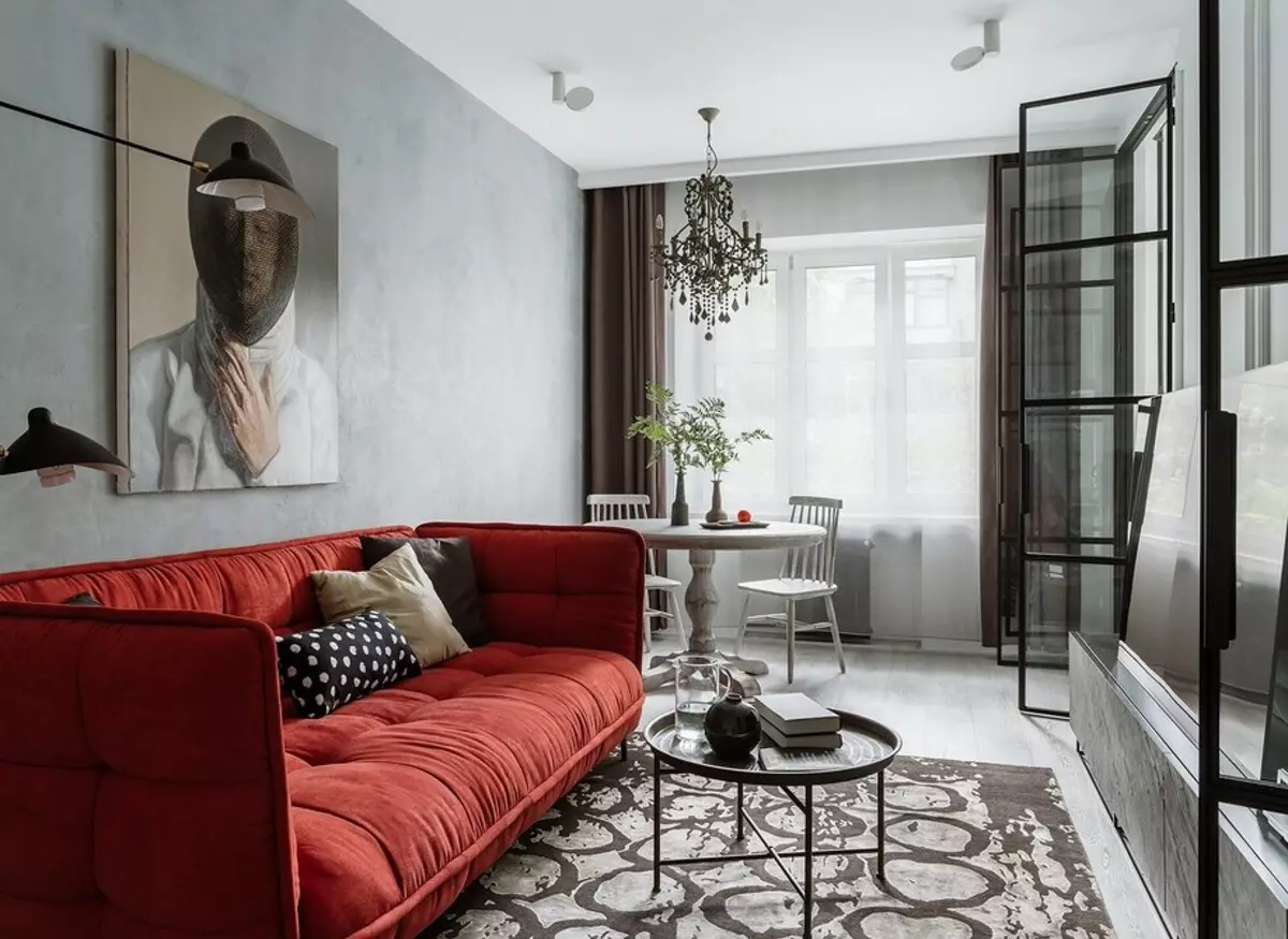
A classic addition to agromates, and this is gray, black and white, are red and its shades. If you do not want too strong contrast, choose the shade of red, which is brightly close to the main tone. When white is used as a base, the lowered red is suitable, gray is harmonized with a fitted roller, and black - from Bordeaux.
Separately, it is worth saying about the presence of textures in the interior. Marble is a neutral element in contrast to the dark tree. The first is well combined with any paints, especially if the stone is black and white. With the tree, paints are organically looking, which are found in nature.


Fashionable textures of upholstered furniture
The texture of sofa also affects the choice of the shade. For example, natural fabrics, such as flax or cotton, look great in a calm natural range. The last trend is unpainted materials, such items are used in ecosyl and scand.
With saturated tones of experiments no less. One of the most popular textures for turquoise, powdered pink and other deep colors - velor. It looks noble and royally. Such models will fit in the premises, decorated in neoclassic or in a modern style.

The letter is a hot trend of the coming seasons. Usually such a texture is used in bright range, but if you are ready to experiment, why not try and options brighter.
Carefully with skin, especially in a saturated palette. In this case, the form of furniture is very important. Choose simple models, without coupling items. And the classics is better to look in a less colorful performance.