
Photos and pictures on the wall are a simple, but spectacular version of the personalized wall decor. To enjoy this design not only to you, but also to other people with taste, check if you are not going to allow these errors when creating a home gallery.

1 Using the same framework
Although this option seems stylish and harmonious, in fact, he may be boring and idle. You can give your collection of speakers if you use several types of frames with overhanging motifs, or give preference to the framework of different sizes.
The wall looks stylish but boring
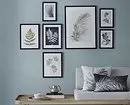
More interesting option
2 frames of the same size
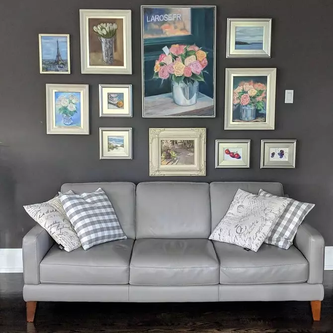
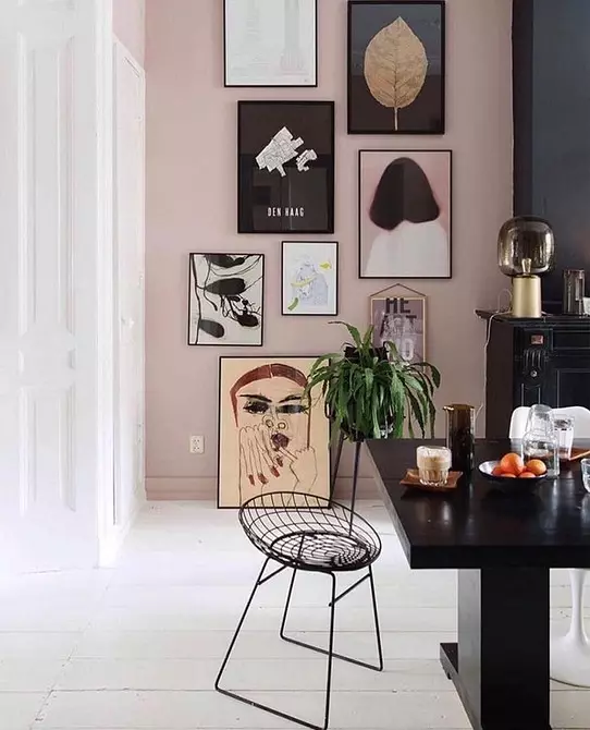
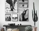
In continuation of the previous paragraph, we will offer to combine a small framework with large, for example, a few frames of 8 per 10 cm with one large poster.
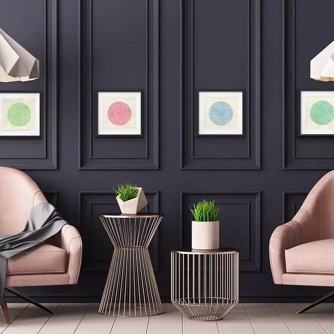
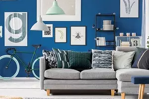
Options for placing photos of different sizes
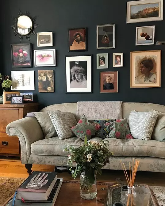
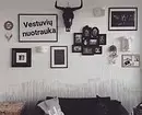
3 Exposure of only one type of objects
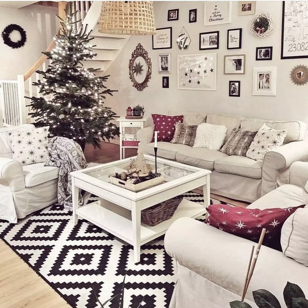
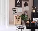
Do not limit yourself with one type of exhibits. Combine photos and pictures, masks and art objects, children's drawings, mirrors and sheets from herbarium to make a live and interesting mini gallery.
Unsuccessful approach
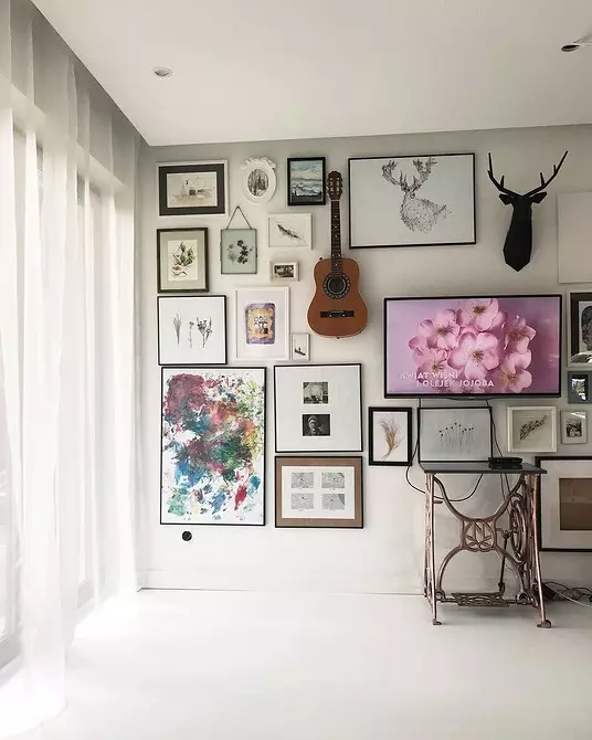
Creative solution: the guitar on the wall plays the role of an art object
4 unsuccessful distance between objects
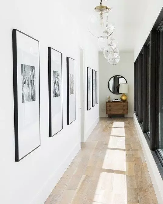
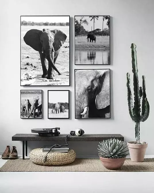
7 centimeters are considered an acceptable interval between objects, and this interval must be repeated everywhere in your collection. If you post the framework close to each other, the space will be lit. and people will not be interested in considering paintings. If the gap between the frames is too large, the pictures "drown" on your wall, and attention will be lost.
Unfortunately a long distance between objects, they look disparate
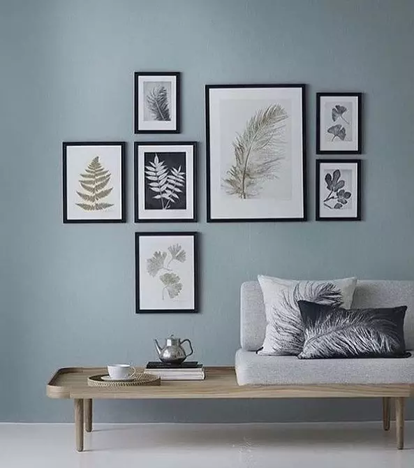
A good example of the location of photos, around which there are air

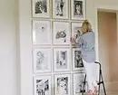
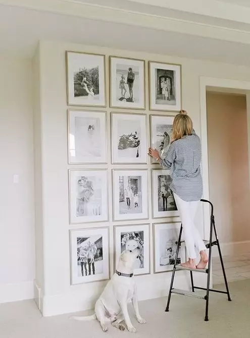
5 lack of a preliminary plan and draft
Before taking care of the nails, it is not bad to draw a plan for your composition. Then it is necessary to glue separate sheets of the desired size with a scotch on the wall to see how it all looks. Instead of leaflets, you can use greasy tape. You can leave this composition for several days to make sure that you do not want to fix anything.Do not forget that the indentation between furniture (for example, a sofa) and the beginning of the composition should be at least 30 centimeters.
6 frames, unlimited interior style
Heavy classic frames in a lightweight modern interior without support by other accessories are inappropriate. Do not let the home gallery spoil the harmony of your interior.
7 Attempts to enter the entire composition in a square or rectangle
The composition in the form of a square demonstrates the timidity and non-professionalism of the decorator. Asymmetric compositions in the form of polygons look more original.
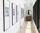
A good option for the corridor, but in the living room it can quickly get bored
Option of asymmetric composition
8 lit. interior
That's why the preliminary plan of the composition is needed, and even the "outside" look - so that at one point it is not to be in the room in which it is uncomfortable.
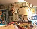
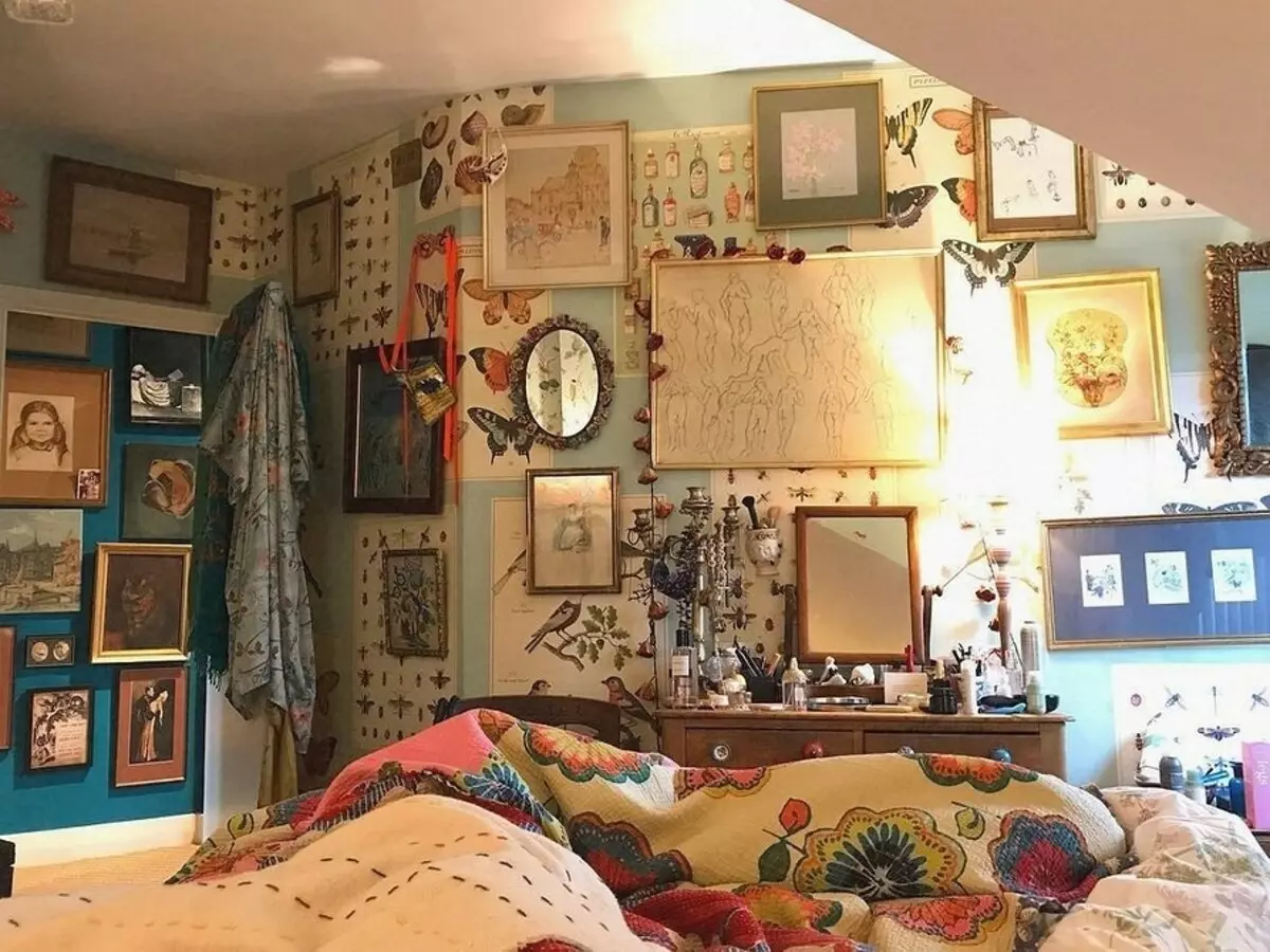
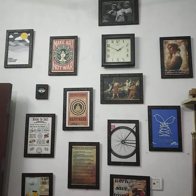
Too many frames!
Weight option in which there are enough objects
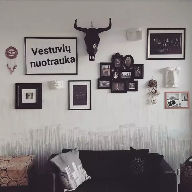
9 Feeling that something is missing
And one more reason to make a preliminary plan before hanging anything on the wall. Place something one thing, in a month to buy something else and live in incomplete plan for years - torment.
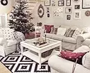
This wall so I want to add a couple of frames
Completed composition
Finally, we suggest watch a video, how to make a panel for photos with your own hands.