
Three-bedroom apartment with a total area of 97 m2: Budget Scandinavian urbanism for a young student of the capital's university
1-2. Depending on the illumination, the appearance of colored walls in the interiors changes: with artificial light, cold, even coffee tones are dominated, and in the rays of the sun surface, as if the warm color of the fuchsia is emitted. By the way, there is no purely white in the color of the walls: the so-called egg shell tone has a barely noticeable cast. Warm reflexes from parquet board affect color perception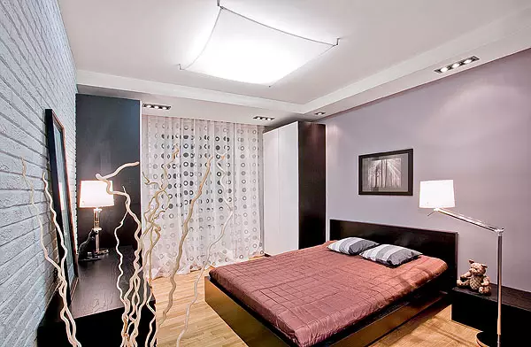
3-4. In order not to overload the input zone with cabinet furniture, two wardrobes are located in the neighboring areas: one by the entrance to the studio, second the "tambour" in the bedroom. The cabinets coupe of the Pax series (IKEA) with strict forms were perfectly fit into the overall setting, and the black glass of sliding doors visually deepened space. As on a high-quality photograph, the presence of black items helped create an optimal balance of light and dark in the interiors.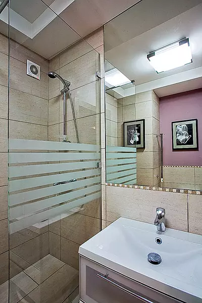
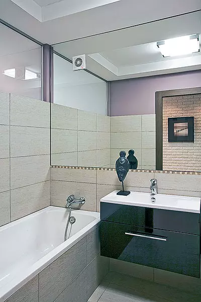
5-6. In the bathroom and bathroom over the washbasin attached a large rectangular mirror; Plumbing has strict orthogonal forms. With the planning similarity, the difference in the plumbing set is one: the bathroom is equipped with a spacious shower compartment, the bathroom has a font. Upper part of a wall separating the bathroom and bedroom, a small "window" is arranged from matte glass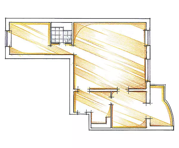
The modern design, which meets the spirit of time, does not always require large cash costs and sophisticated decorator techniques. The main thing is to keep a sense of measure and remember that a good interior must "play" the owner of the housing. After all, it is a person, and not an objective environment is the main acting person in the interior performance.
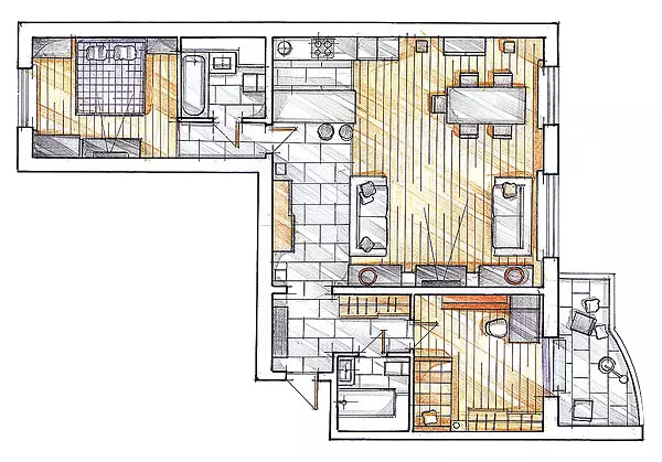
This interior was designed with the calculation that the young owner of the housing will later create a family. The apartment was divided into three parts. In Centralral, it was decided to arrange a studio, and in two rooms located on both sides, the master and guest bedrooms (the second in the future will become children). In addition, there are two bathrooms (one by one next to each of the bedrooms) and a small entrance hall. Such is a fairly simple structure of the apartment, in terms of rectangles consisting of a square.
Game shades
Modern Scandinavian urbanism - what could be more suitable for a young student of the capital university, which actively masters the future specialty, appreciates communication with friends and an active lifestyle? Comfortable, spacious and open interior, outwardly simple and discreet, and deprived of the black and white range and deprived of the inappropriate pathos, meets the nature of the hostess. It was important to take into account the modest budget. After all, the youth apartment does not need expensive and coupling decisions, since in his youth tastes change quickly, but the functionality and interchangeability of objects are valued. Therefore, we decided to use high-quality, but budgetary finishing materials, and in the selection of furniture to focus on IKEA products (Sweden). The last circumstance supported by the finish helped to create the impression of the whole apartment.
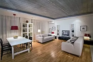
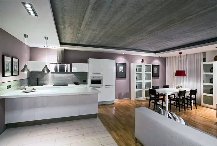
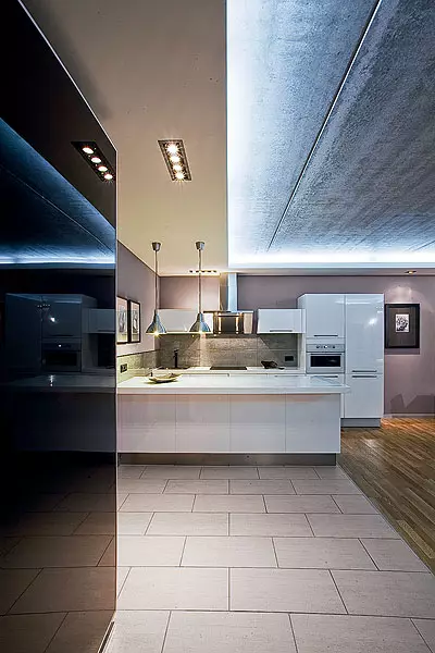
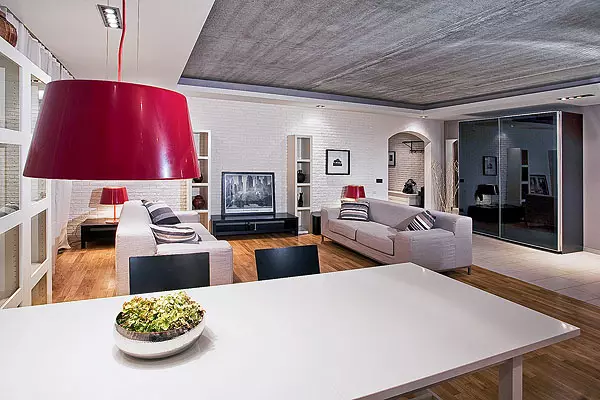
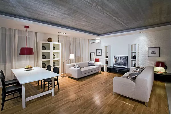
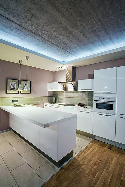
Composite decisions contribute to ease and positive mood. The hallway and studio are not divided by the door. The kitchen with the "peninsula", which also performs the function of the bar counter (height - 86cm, Svet Tabletops - 45 cm, the total size is 4,22,4 m), is located directly opposite the front door. Once in the apartment, you can immediately feel the homely atmosphere, but without overloaded by life. The snow-white facades of kitchen furniture and the "peninsula", the same color sofas in the home theater zone, glare black glass of the cabinet door when entering the studio, the brutal ceiling concrete create an atmosphere of the loft. The wall next to the rest area is completely finished under the brick, on top of which the "whitewash" is applied (the same reception is used in both private rooms). Vugl, the most distant from the entrance to the studio, placed a dining group and black chairs. Two windows provide excellent natural lighting, which also meets the aesthetics of the loft.
Brutal charm
The abundance of straight lines and angles soften the warm light yellow color of the oak parquet board, wooden interior doors, two painted in a complex pinkish-lilac wall tone, gentle translucent curtains on the windows and the only curve-arc-shaped completion of the arch connecting the hallway and the studio. Multiple expressive accents serve lamps with red lampsharis (one above the dining table, two more chests) and black and white photos in a wide closet on the walls.
For contemplation and rhythm
Of all the art objects that are able to give the interior individuality, the palm of the championship according to the degree of popularity and availability should be given photos, and not color, but black and white. By the way, the achromatic technique is capable not only to cause associations with fashionable today retro, which is not necessarily not necessarily, but also bring the shade of refined restraint inherent in artistic chart. Vehi apartment black and white photo decorate the walls of all rooms. Even the guest bathroom and the bathroom is not an exception: images are reflected in the mirrors above the washbasins, since the originals are located opposite the entrance doors in the simpleness of the "Tambourov".
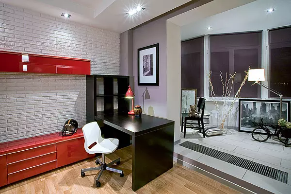
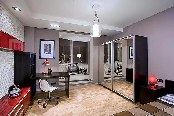
In the garden stylist with the front rooms, both isolated rooms are furnished. The one is located next to the hallway, performs both a bedroom and office feature (in the future, it will serve for children). The loggia attached to the room, receiving the appropriate permission. This made it possible to increase its area almost 1/3 and improve the insolation. Before the room there is a small "tambour": one of its walls have a two-door wardrobe, in contrast, input to the bathroom. There are actually three zones. Immediately outside the door, a bedside table and a wardrobe with mirror doors, in a contrary, a low chest of drawers with a TV. Next, in the corner, is a workplace consisting of a book rack and a written table. The center of the room from the ceiling is hanging a translucent "cup" of the suspended ceiling. On the attached loggia there is a recreation area. Lamps here are built into the ceiling. To equip the loggia of a warm floor system, it was necessary to raise the level of the main floor at 12 cm and make a low step. The heating radiator was replaced with a convector mounted to the floor, the windows were covered with a roller.
Tell the author of the project
The apartment is located in a 16-storey monolithic concrete house-new building. The arrester of the arrangement was dismantled extra partitions, including the currently existing studio into two separate rooms. After that, the area of the main premises was 55m2. The door and sub-blocks between the loggia and the bedroom dismantled, having received the appropriate permission. The result was formed by a 1,6m width, which combined both premises. New walls were erected from plaster, NBSP /> ceiling structures - from drywall.
The rectangular "window" with a size of 1.70,6m between the bedroom and the bathroom brought some intrigue to the interior. It is made of matte glass, the surface of which from the bedroom side glossy, creating the game glare and reinforcing the illusion of the present "window", and from the opposite-rough. The appearance of a shower compartment instead of the cabin in the guest bathroom seems to me more justified aesthetically: strict straight lines and glass without plastic edging give the interior more solid and modern appearance. Photographs of natural and urban landscapes used in the decoration of the walls of almost all premises attached a composite completion of each zone, emphasized the rhythmic organization of Misaneszen. Photos I chose myself ordered through the Internet with my American acquaintances posters, which, from my point of view, are optimally suitable for this interior.
Architect Matvey Ovsepyan.
The second room (the door to it is located next to the kitchen) is a completely traditional bedroom. The headboard is a wide double bed adjacent to the wall, by contra-compact dresser, on both sides of the window-compact black and white cabinets for clothing. The plane luminaire is melted under the ceiling "sail" is supplemented with built-in ceiling backlight, the same as in the bedroom. The volume of the guest bathroom and the bathroom seems to be inscribed in the rectangles of bedrooms, the appearance of these premises is harmonized with the overall aesthetics of the apartment.
All solutions presented are the optimal balance of convenience and aesthetics. However, the scenario proposed by the architect is quite flexible: you can move the furniture and even easily replace individual details of the situation, without going beyond the selected stylistics. Such a perspective strengthens the feeling of ease inherent in the interior.
The editors warns that in accordance with the Housing Code of the Russian Federation, the coordination of the conducted reorganization and redevelopment is required.
Architect: Matvey Ovsepyan
Watch overpower