
The apartment is 50 m2 in the house built in the middle of the last century - the organization of a solid and harmonious "Japanese" space.

Repair with redevelopment - the problem is not only complicated, but also fascinating. If, of course, approach her creative. Unfortunately, a stereotype has developed: the more impressive area of the dwelling, the more interesting the result will be. Holders of small apartments, as a rule, are configured in advance to "neutral" and "discreet" design. The story of this "doubles" such an opinion completely refutes.
Aesthetic tasks
A long-time client and a good friend of the architect Svetlana Litvin acquired an apartment with an area of 50m2 in the house built in the middle of the last century. The customer wanted the dwelling to be comfortable, spacious, looked modern and stylish. Connoisseur of Japanese language and culture, he certainly tied his dreams and aesthetic addictions precisely with this eastern country. The opinions of the architect and the owner coincided. Apacks Svetlana Litvin Customer knew a long time ago, he completely and certainly trusted her taste and the ability to organize one-piece and harmonious space. The "Japanese theme" made it possible to express interesting accents, although the authors of the project moved away from the literal following the national aesthetics. But with her help, they managed to achieve not only physical, but also psychological comfort in the apartment, inform the details calligraphic deposit, and separate zones of the interior of the transformation.Redevelopment
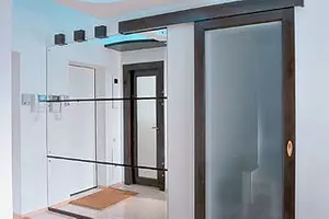
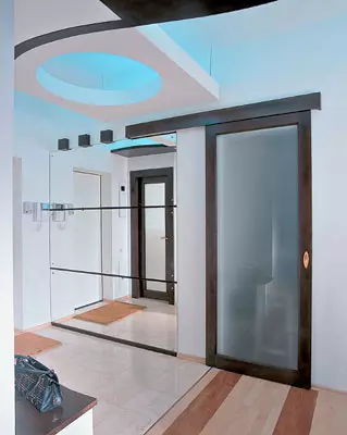
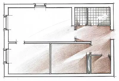
Rectangular in terms of the apartment was originally divided by partitions into small rooms. The lack of illumination of the input zone was added to the crucible impression, that is, the corridor and part of the kitchen. Separate bathroom with such a limited area also looked not quite justified. All this created prerequisites for redevelopment. However, the ventilation boxes retain their original size and location (one - between the kitchen and the bathroom, the second one by the mirror in the living room). Between the living room and the dressing room on the spot the new brick partition was erected.
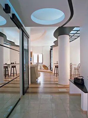
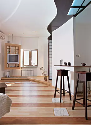
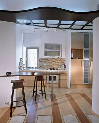
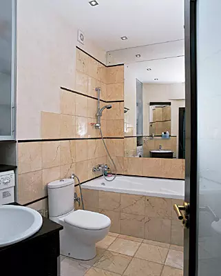
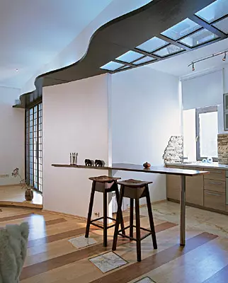
In the center of the apartment was formed a single space of the living-kitchen. In this case, the size of the kitchen increased due to the combination of the bathroom. The corridor disappeared, thanks to which it was possible to add to the area of the bathroom about 2,5m2, and now even a large hot tub, and a locker and a washing machine was located in a niche near the sink. The smooth scope of the partition creates the impression of the flow of the input zone to the guest. On the plan, this planning reception is clearly visible, the beginning of an unusual architectural composition, which is based on a great arc motive. The arc permeates the front area down to the window at the far end of the living room, it cuts off the corner of the bathroom, continues in the outline of the suspended ceiling design from the kitchen side, smoothly goes into the bar rack and the wall, cutting the angle of the bedroom, and further- in the podium in front of the window. The rounded line is duplicated by the outdoor cutting circuit and relief on the ceiling of the living room. The smoothness of the motion is given as if indirectly, nowhere becomes obsessive, but urgently softening strict geometry.
Until now, we talked about the constructive changes in the apartment. But it was they who allowed to create a structure for which new scenery was so effectively and organically "easily".
About the benefits of carrier beams
The main problem after redevelopment was a reinforced concrete rift width of 20 cm, stretched across the entire apartment above the previous boundary of the living room to the inlet door. A heavy design relied on a rectangular column and descended from the ceiling by as much as 70cm. Similar "decorations", unfortunately, are not amenable to disguise in conventional ways. After all, if the beam performs insignificant, it can be hidden behind the suspended ceiling or with a stepped composition of drywall. But in this case, there could be a speech about such a decision: at a three-meter height of the room, a stepped scenery would have looked at least strangely.Svetlana Litvin managed to completely neutralize the undesirable effect. Moreover, unrelacted, it would seem that the lack pushed it to the creation of a completely original composition. Light wooden design with backlit closes the beam and smoothly redirects your eyes deep into the interior. Its wave-like outlines give a calm open space a certain dynamics. But there is no stiffness to Abris Waves in the interior a motive of unbasic, sliding movement. In order not to destroy the image, the tetrahedral of the carrier column was sewn into a cylindrical "case". For this, the drywall was used to be appropriately appropriate, and then processed to the perfectly smooth surface, as well as walls.
In the piggy bank of ideas
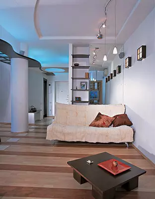
Surprisingly, the ceiling composition with its significant length (almost 10m) does not seem completely monotonous. It turned out mainly because in each part of the interior it is solved in its own way. Let's say, in the hallway it is common to the entire ceiling area and painted under the color of the walls, and the "light lamp" cut in it removes the impression of gravity. "Wave" here is indicated only with a light circuit. Over the kitchen, it expands and includes another "lantern", this time with matte glass and binding. Near the bedroom sinusoid becomes almost inconspicuous and merges with the composition of the doors. To soften the impression of the end-to-end movement into the departures, the ceiling decor was equalized by the transverse stripes of laminated flooring.
How to "win" residential space
In addition to redevelopment, which was mentioned above, the increase in free space was achieved by several more ways. First of all, a thoughtful location of places for storage of things. In total, there are two of them in the apartment: a small room in the lobby, hidden behind the sliding partition, and a wardrobe with a backlight in the bedroom, which occupies the entire longitudinal wall. This is quite enough for a young couple, which currently lives here. The absence of separate cabinets, chests and shelves on the walls, as it should not be better consistent with the image of a spacious and modern home. In addition, it was possible to equip the storage system in the decorative podium by the window, but this idea turned out to be redundant. As a result, an increase in the level of gender at the far end of the living room for 15cm remains purely artistic reception, designed to emphasize the entrance to the bedroom. The podium is arranged an unusual "garden of stones", next to which can be placed different compositions from room plants and floor decorative ceramics. The podium is kept on a metal frame of channels, shelted twenty millionth plywood.Visually interiors are expanded by large mirrors. Walking the hallway is reflected not only the opposite wall, but also a kitchen. A mirror consensus is provided in front of the window. It doubles the depth of the room and enhances the effect of natural lighting. Thanks to the reflective planes, a small bathroom turned into a spacious room.
Ode tree
Wooden details and designs in this apartment are not just scenery and furniture items. They emphasize the rationality of planning solutions and help to express expressive "calligraphic" accents, forcing me to recall the Japanese aesthetics.
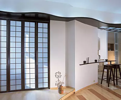
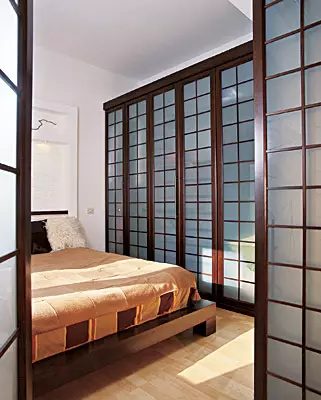
Attention is drawn to the abundance of a tree in the bedroom interior. Let's start with the fact that a folding door is leading, reminding Japanese screen. At first, Svetlana Litvin thought to arrange a sliding partition here, but Dmitry Miroshnichenko offered a folding option. This solution is convenient because the large cloth with an active regular pattern can easily "disappear", shrink to a minimum and change the appearance of the surrounding space.
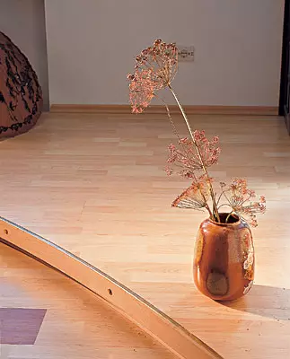
An important role in decorating the interior, along with form and color, the texture plays. It is especially important to remember this if the forms are strict, and the colors are restrained. Plum interiors textured additions attract special attention to themselves. That is why in every zone of this apartment there are careless, but sophisticated "little things" who are interested to look at, without fear that they are given. Start, for example, it is "panel" above the bed. Gostny-squares from litter meters on the floor, asking additional dotted rhythm. In the kitchen, finishing a corner with a sink with a decorative artificial stone. Two "mini-gardens" look original - on the podium in the living room and on the kitchen windowsill. For the skewers used pebbles, specially brought from the Crimea. No special tricks of the composition did not require: in the podium they made a slight deepening, and in the kitchen just laid stones on the windowsill. Pebbles is not chosen by chance. From the sand abandoned because, in order to comply with the purity, it would have to hide it under the glass, which would deprive the entire object of decorative meaning. Stones are easy to wash. The "garden of stones" can be supplemented with flowers, bonseam or mini sculpture. Interesting option Smelp- small marine sinks.
In the bedroom itself, a comfortable low bed is installed, also made by sketch Svetlana Litvin. It also came up with witty registration of the head: on the wall with the help of drywall, a frame was made, inside which - open brickwork, only painted. The rotation is mounted. This kind of "panel" in the Japanese spirit turned out to be enough to give the image of an elegant completion. As decorative panels are perceived both folding doors - input and closing roomy (60cm deep) wardrobe with a plurality of comfortable shelves and boxes. Note that as much carefully designed by Dmitry Miroshnichenko's design of kitchen furniture and a shopping room in the lobby.
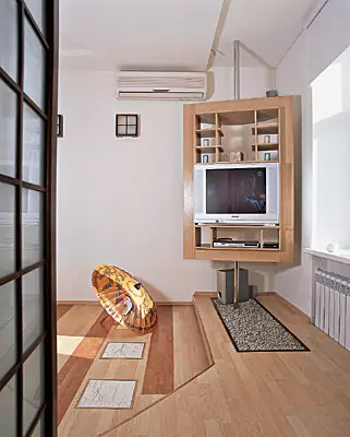
In large apartments today under home theater, it is customary to divert a separate room-cinema hall. There, where the area is more modest, the question often arises: in what zone to install the TV? Some love to sit in front of the screen in the living room on the sofa, others like to watch movies and television shows without getting out of bed. Especially in the morning on weekends. Is it possible to find a compromise?
The rotating stand under the equipment is an option for those who do not want to attach to the hard scenario. The advantage of the design selected by Svetlana Litvin and Dmitry Miroshnichenko, in the fact that it takes a minimum of space and is so "transparent", which can be almost anywhere in the apartment. You can buy a finished stand in the store, but it is not suiced. In the case, all the work was carried out in Dmitry Miroshnichenko's workshop according to the drawings Svetlana Litvin. "Plus" of such a solution - in accurate correspondence design of the product style of the interior. It is not by chance that the color of the veneer is chosen ("oak under patina"): the light tone of the design does not flick the bright lighting of the window zone and at the same time combined with the color of the parquet and kitchen finish. The stand turns on special bearings. To securely secure the design, the chrome-plated steel pipe has been welded to a wide metal plates fixed on the floor and the ceiling with a dowel. Additional shelves can serve as a support for DVDs or souvenirs.
Since the task was not overloaded before the architects, but several unusual functional elements appeared in the interior. First, two "shelves", outlines resembling a swallow wing (bar stand in the living room and a stand for smallest things in the lobby, it is also a seat). These curious items are not only elegant, but also very compact. Secondly, the rotating rack under the equipment. The design is made of MDF plates covered with a whip of a white oak with a patina. The TV Stand is exceptionally convenient, "transparent" and looks like an independent design object. Built-in shelf adjacent to the living room to the mirror, of course, more decorative. However, it makes an element of the game, combining the real and virtual spaces.
"God lives in detail"
When the overall scenario was played, it's time for additional strokes. This appeared a few small details of the tree, for example, three decorative cubes in the hallway, square lamps on the living room. From above and below, small slots are made in them so that the beams of the rays are beautifully played on the walls. The composition's graphiteness emphasizes horizontal toned wood rails, inserted between the planes of the mirrors in the living room, hallway and the bathroom.
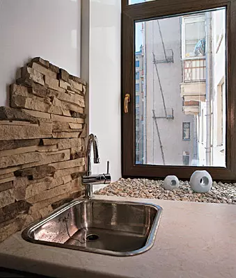
The motive of movement along the border between the kitchen and the living room is accented with original inserts made of lytel arters on the floor. This material is a tile, the upper part of which consists of a marble with a thickness of 3-4mm, and the lower - from 6-7 mm ceramics. Loopers are convenient and easy to install, allows us to apply conventional adhesives. At the same time, it is twice as cheaper all-glass plates, although it is no different from them. Considering that the floor covering in the apartment "floating", the squares of the limkeeramics are attached directly to the base. They are framed by brass frames, which are free to enter the edges of the laminate. In the same way, the base of the podium is the same way. The kitchen veneered a textured artificial stone. Two "mini-garden of stones" introduced an apartment of Eastern contemplation in the overall mood. The internal lining of the entrance door was solved by the second aesthetics: a subtle relief on the surface of the MDF coated with enamel, resembles traces on the sand.
Thus, the 50m2 architects had been turned into a spacious and convenient dwelling with a unique appearance. Golden middle between styling and copyright handwriting here is supposed to accurately and naturally. Therefore, it is very nice in this apartment.
The editors warns that in accordance with the Housing Code of the Russian Federation, the coordination of the conducted reorganization and redevelopment is required.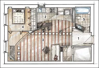
Architect: Leia Ramishvili
Wood works: Dmitry Miroshnichenko
Architect: Svetlana Litvin
Watch overpower