In our selection - rooms with an area of 9 to 13 square meters, in which two zones managed to enter: living room and kitchen. We tell what ideas should be inspired if you want to combine two functions in the same room.

Combining the kitchen and living room - a real way to increase the useful area. But sometimes even after redevelopment, the space is not so big. We understand the secrets of design of a small kitchen-living room.
5 tips for the design of a small kitchen-living room
1. Registration in monochrome2. Using bright accents
3. Prints and images in the finish
4. Prioritization
5. Light designs
1 design in monochrome
This is one of the basic principles of registration of any small space. The secret is that, thanks to the use of one gamma, the boundaries are erased between the planes, and the visual room seems more.
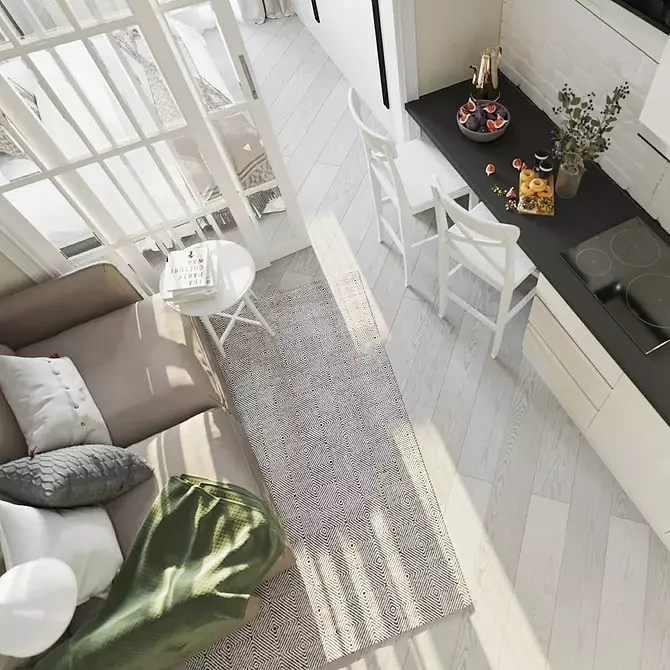
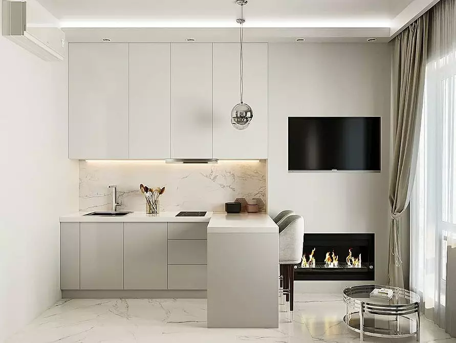
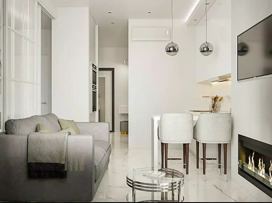
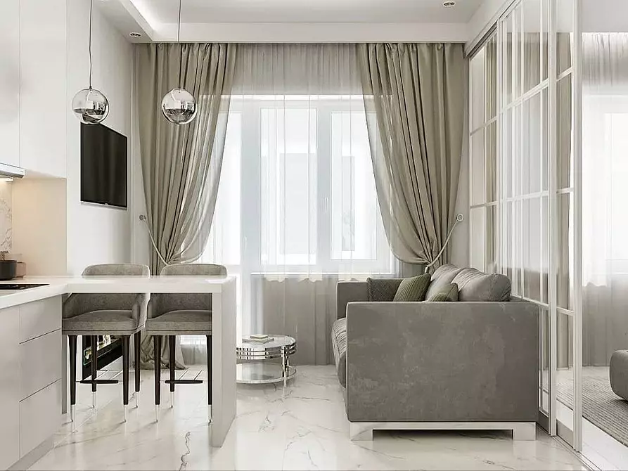
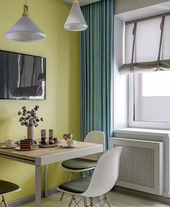
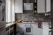
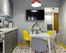
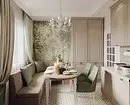
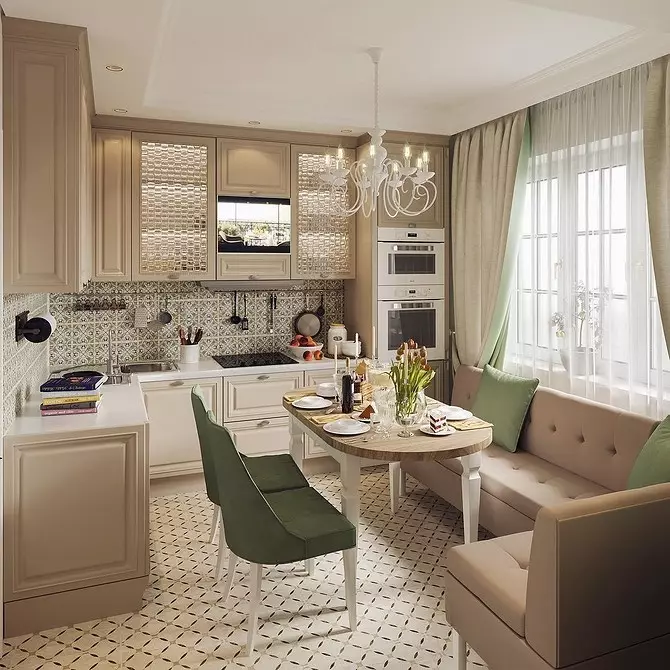
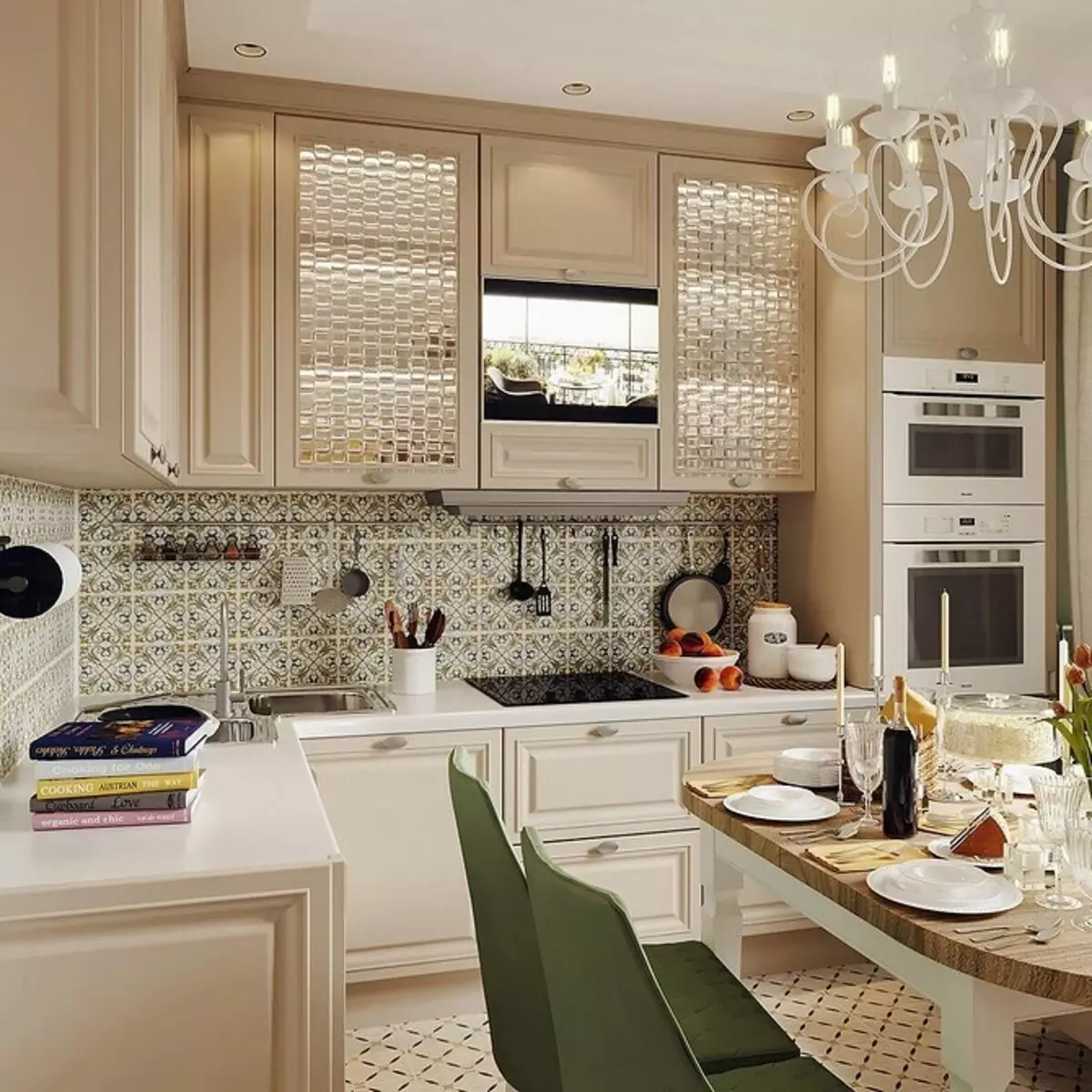
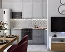
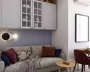
Classical implementation - in bright colors. The photo below shows the design of a small kitchen-living room, designed just in this way. If the windows of your room do not come south, and natural light is not enough, look at this option.
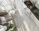
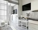
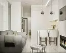
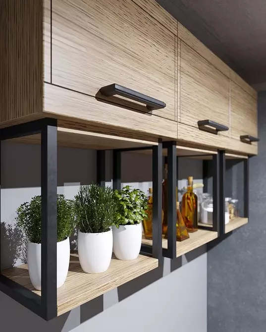
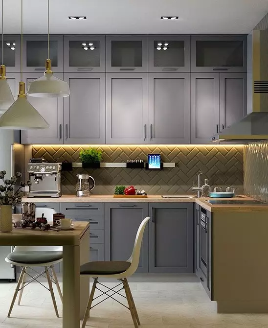
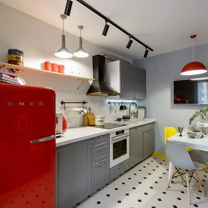
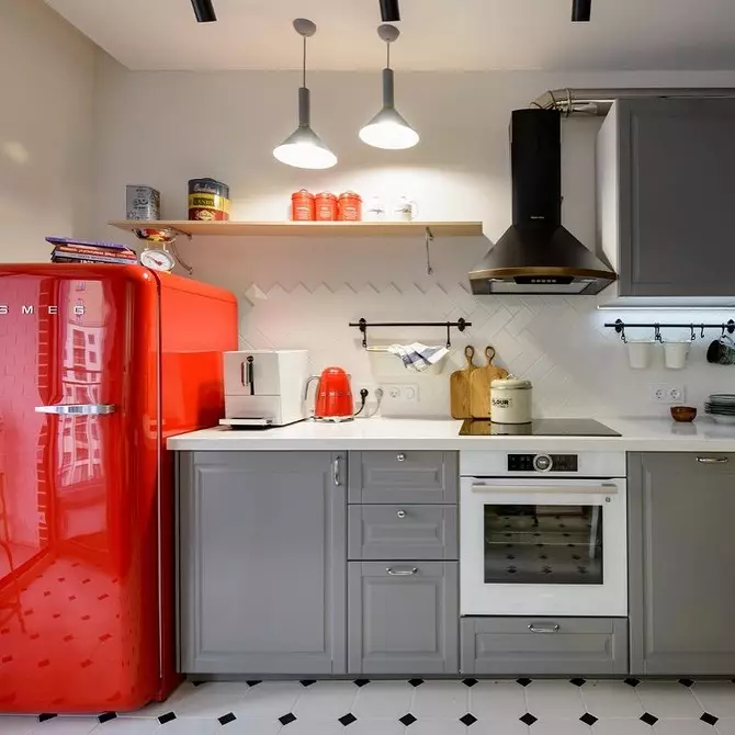
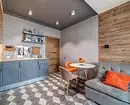
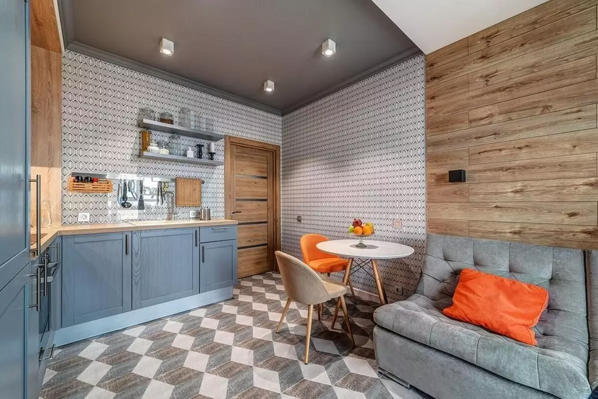
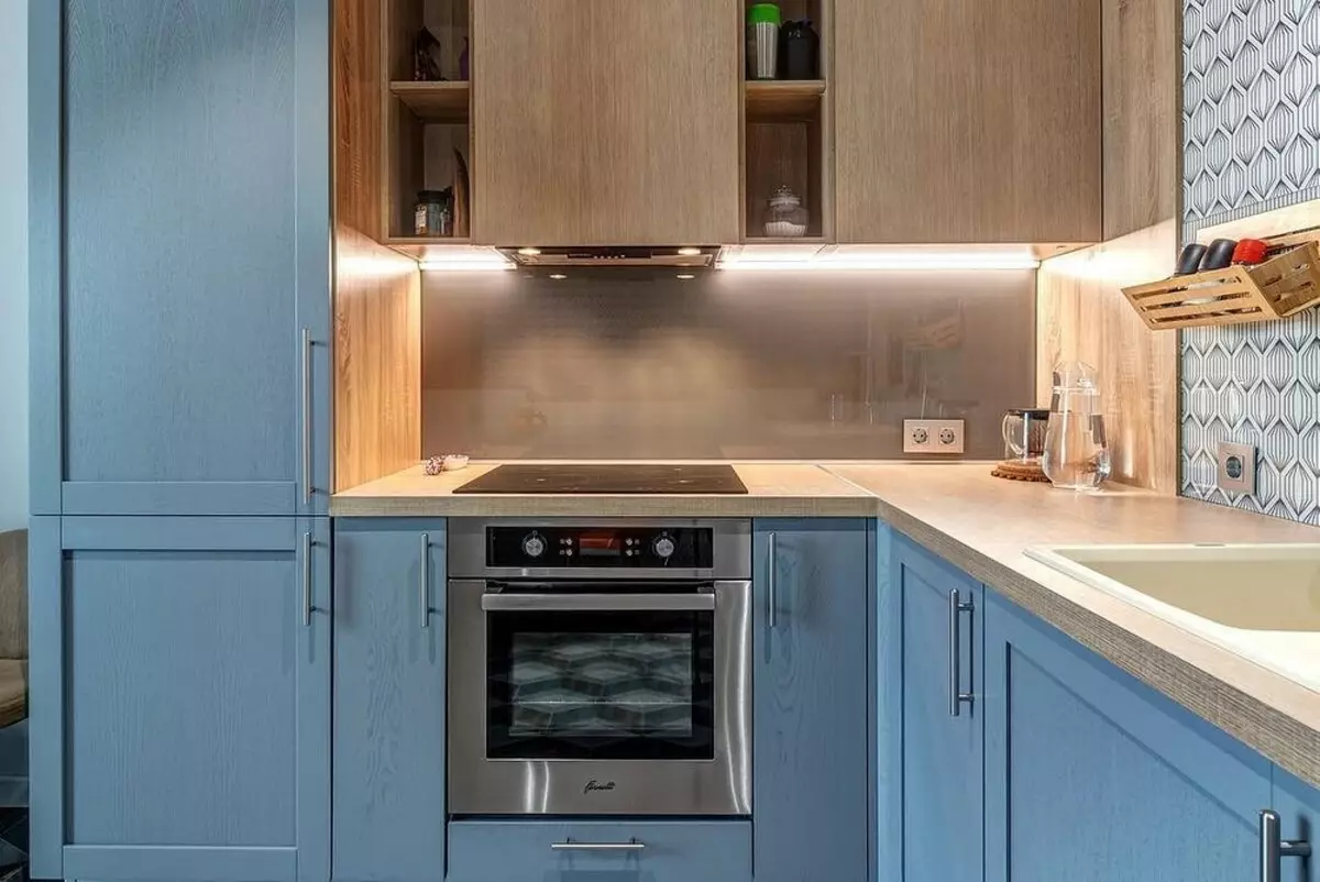
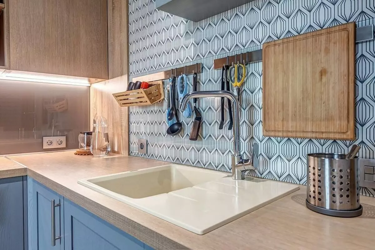
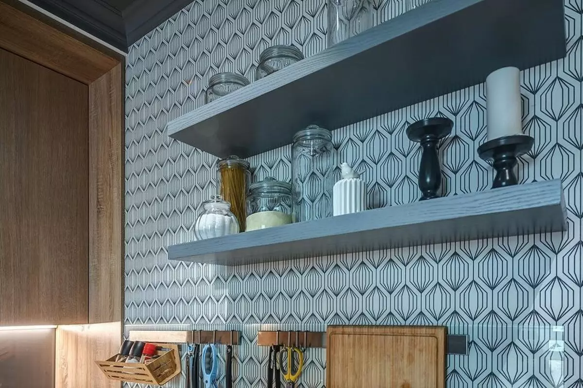
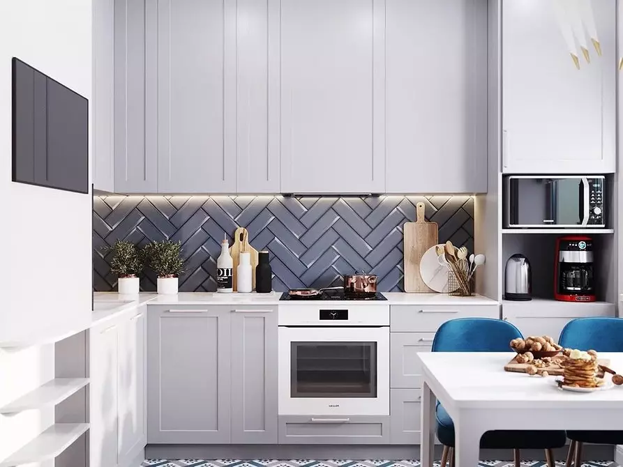
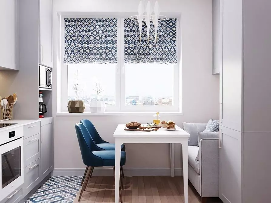
Design khaki for registration
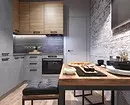
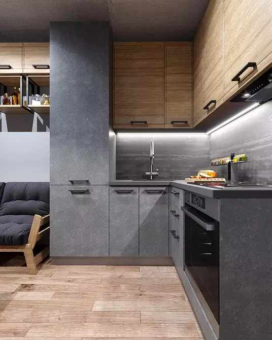
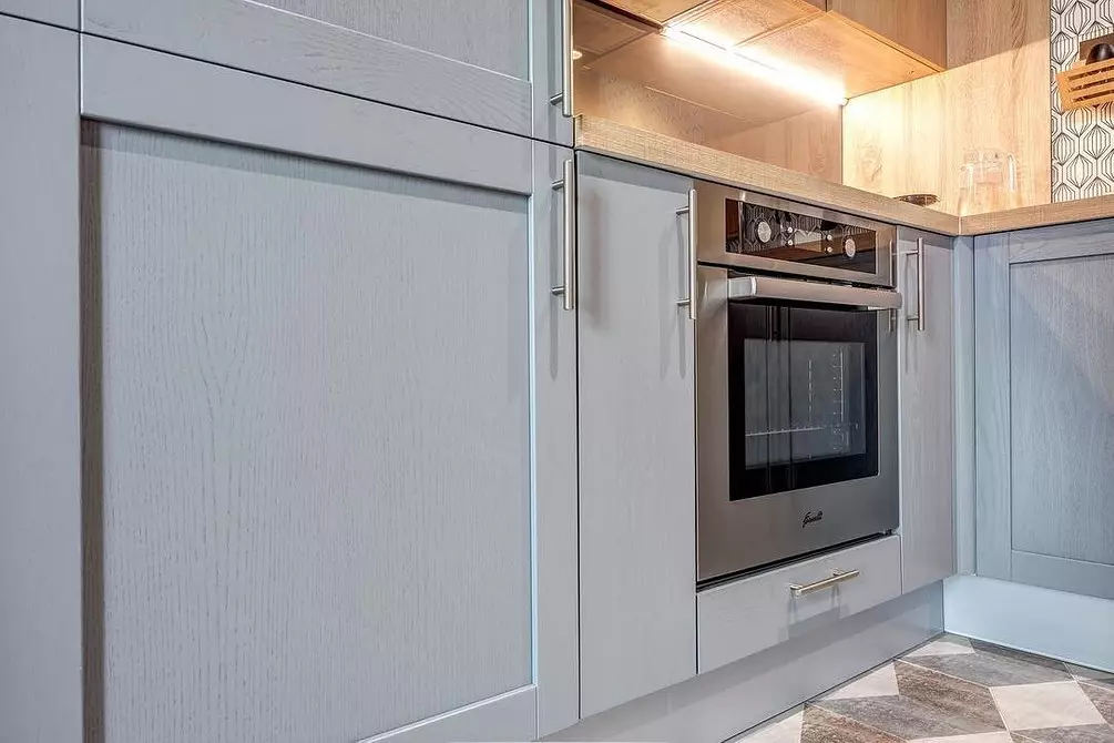
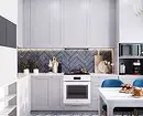
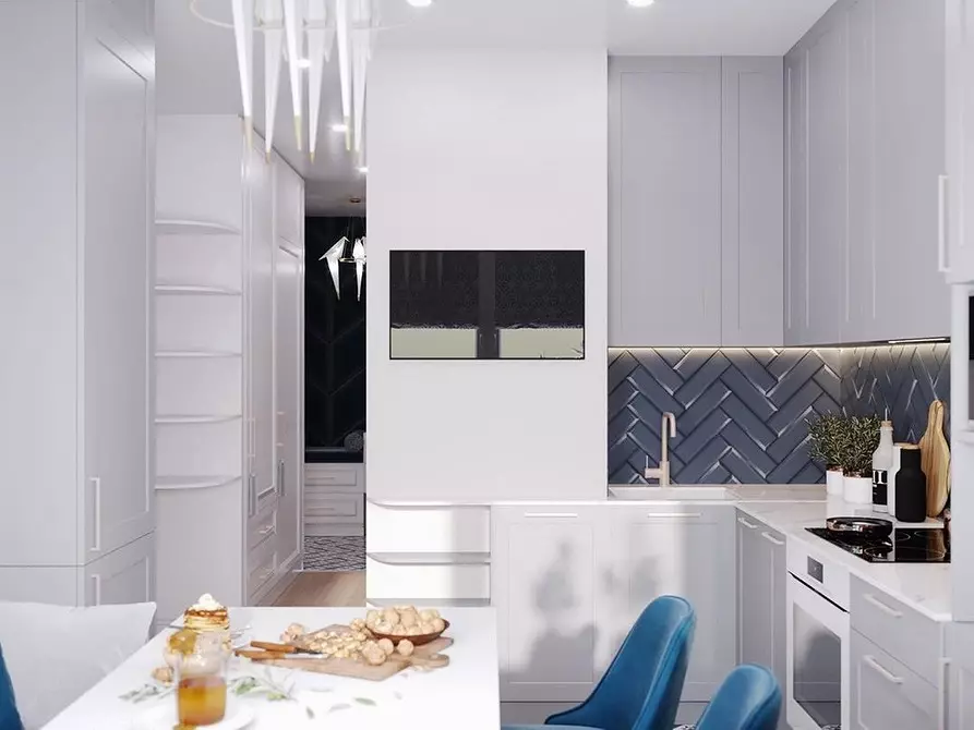
- The designer combines several textures of the same color, so the interior does not seem boring and flat. Smooth walls merging visually with facades, border with an accent stone apron. Probably, porcelain stoneware was used for decoration. It is duplicated on the floor.
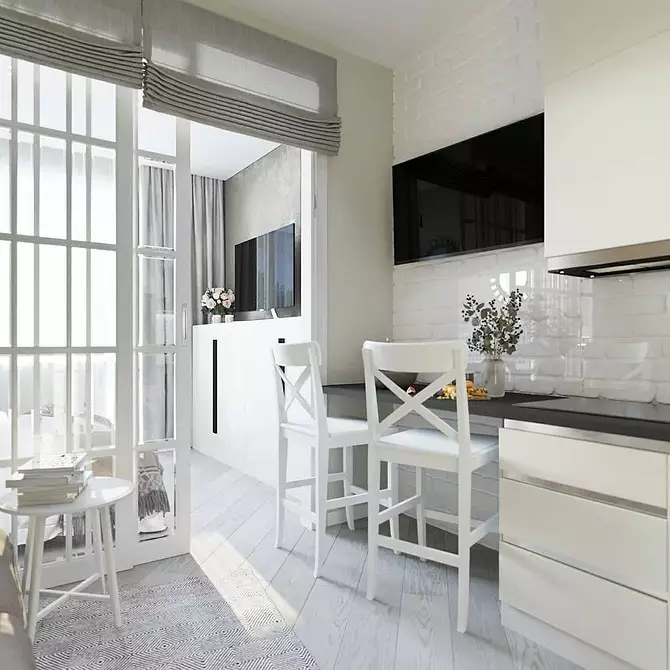
- Instead of a full-fledged dining room group, a bar counter and high chairs are equipped here. Not the most convenient option for a family with a small child. But everything depends on your lifestyle.
- Bar rack gently divides the room in half: on the work area and living room.
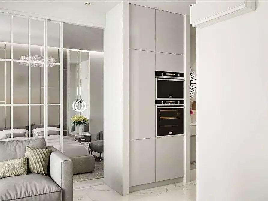
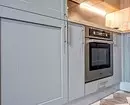
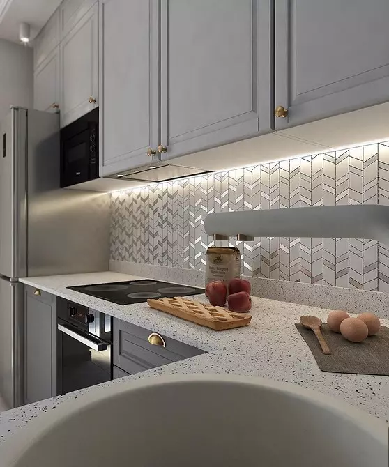
- Pay attention to the mini-format of the cooking panel and the solution for the oven and the refrigerator. They are located opposite the working area - the rule of the work triangle in action.
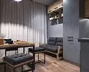
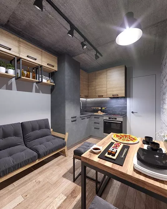
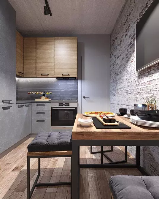
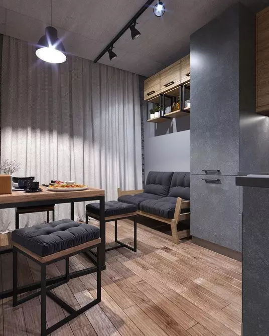
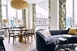
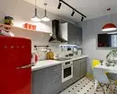
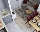
The following project refutes the widespread view that small rooms should be taken exclusively in bright colors. This is a loft with an area of only 9 square meters.
What interesting in the design
- It can not be called absolutely monochrome. However, the principle is observed as the same: the headsets and walls, including the accent brick, are similar by the tone.
- Wood floor and furniture, also coinciding in color and texture, soften concrete and brick. Tree and unobtrusive greens make interior comfortable.
- The correct form of the premises allowed to post the sofa and the dining group on the same level.
- Furniture on the iron frame on thin legs by itself decorative. And at the same time she does not waste the interior.
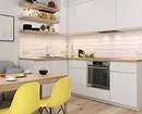
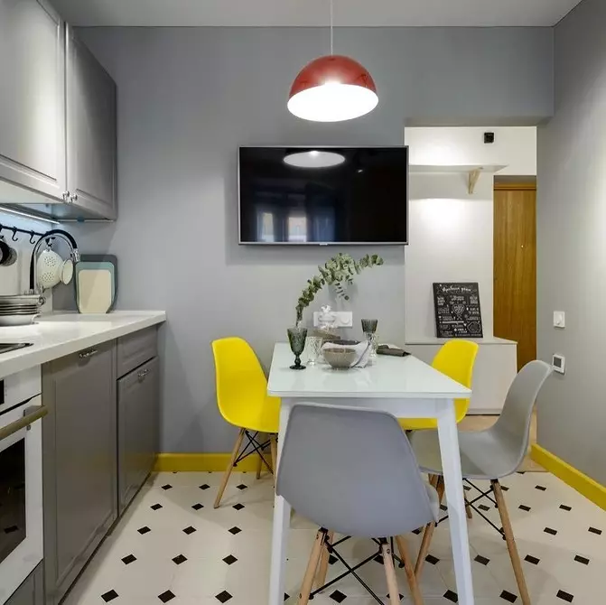
2 Bright colors in the interior of a small kitchen-living room
If you love bright decorations, this principle is for you. Its meaning to use contrasting and saturated color spots.
The simplest solution is a bright accent wall, as in the project below. There are no prints here, and all colors are neighboring in the circle of Ytten. This approach can be posted if you do not have experience in color.
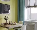
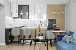
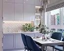
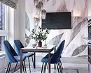
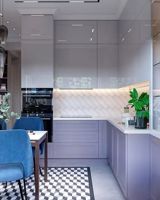
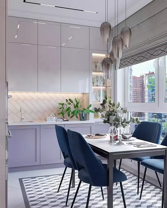
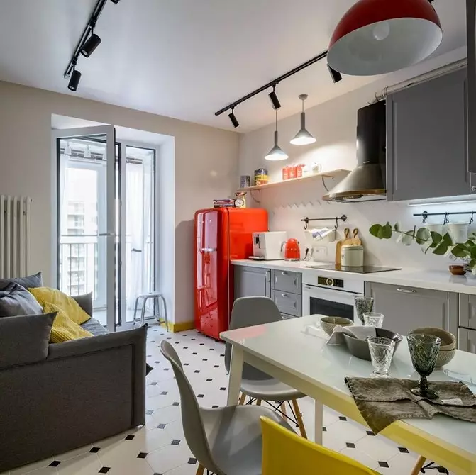
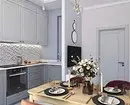
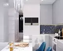
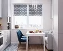
Bright wall - not a prerequisite for creating an accent interior. Moreover, when it comes to the kitchen-living room. Such a color spot can be a headset or sofa. Or even part of the headset, only the bottom or only the top. In this project, the stain is also a dining room group: a blue chairs upholstery performs very actively against the background of lavender facades and a gentle print on the wall.
You can enter the color gradually. Update the chairs or select New Bright Textiles. It is not necessary to maintain them, you can simply leave a saturated bright spot. Designers often use such a reception in the design of small spaces in Scandinavian style.
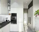
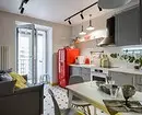
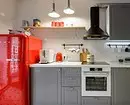
If the base is neutral as possible, you can try to enter and two colors. It is not necessary to use the technique, as in this project, a bright refrigerator is not a solution for everyone. Its analogue can be another major "plane": a sofa, part of the headset or the same wall.
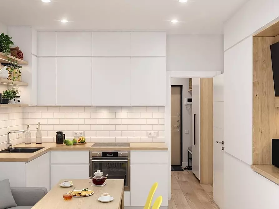
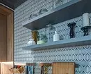
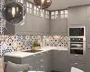
3 Prints and Images
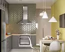
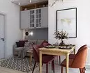
The accents used in the finish can also visually expand the space. First of all, we are talking about prints. And this project is proof.
- Small pattern does not waste space. Especially when it comes to geometry.
- Pay attention to the combination of prints: both are performed in one style and in the same range. Patterns thus selected together always look harmoniously.
- Finishing helps zoning the room. Tree - in the living room zone and small geometry - in the working.
- Bright accents are also traced here: in the headset and point decor.
- Neutralizes colors and prints all the same tree.
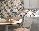
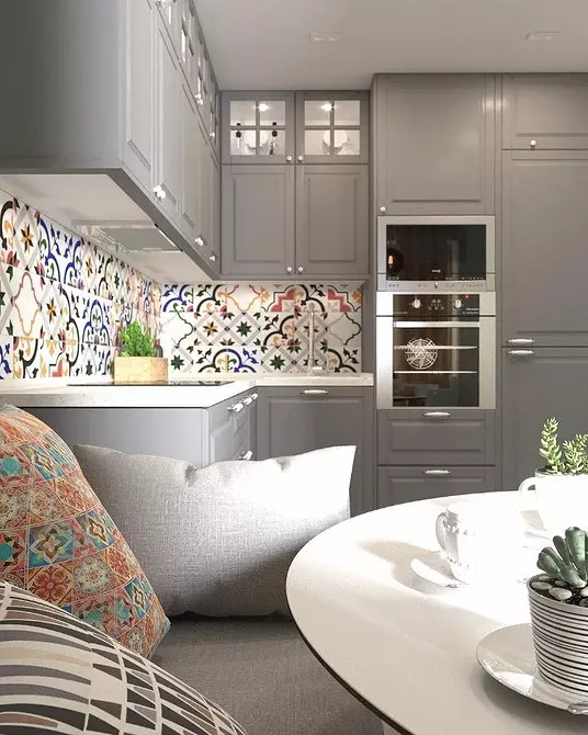
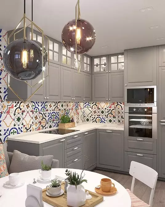
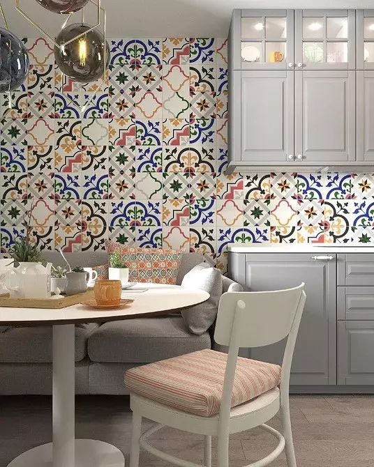
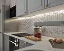
There are no indifferent to patchwork: someone is already tired, and someone is his devotee fan. In this project, the PEVCHORK tile is used in the finishing of the entire wall, and not just the usual apron. At the same time, the rest of the interior is the most neutral: a light tree and gray. All colors muted, but they coincide with those found on the tile. Due to this selectivity, the design does not look overloaded and aliapical.
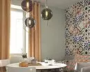
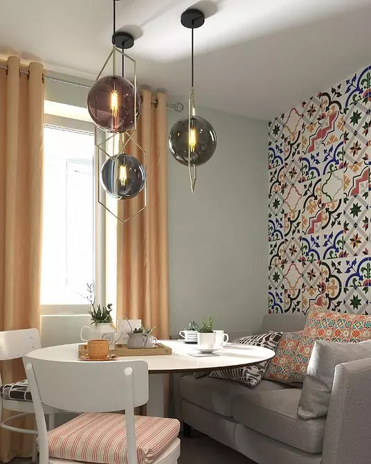
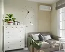
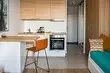
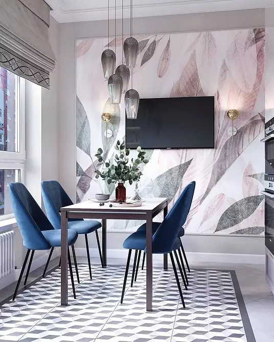
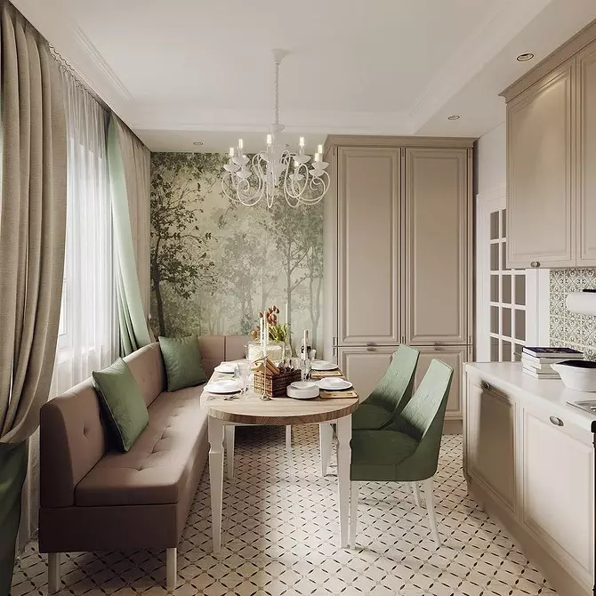
Not only print may be accent, but wallpaper, painting and even fresco. In the photo below, such a small kitchen-living room with an area of only 10 square meters is presented.

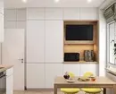
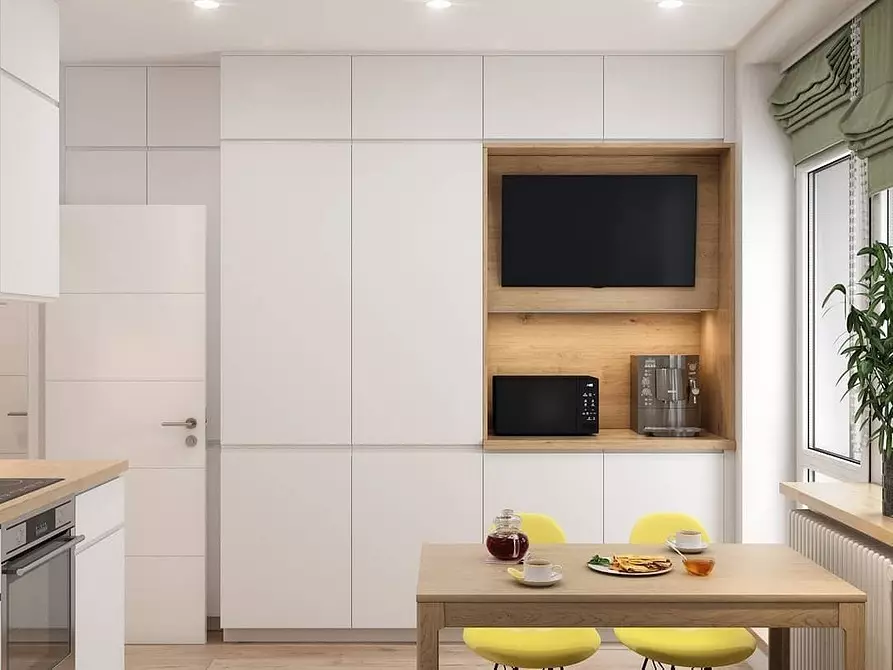
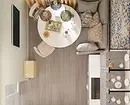
4 Prioritization
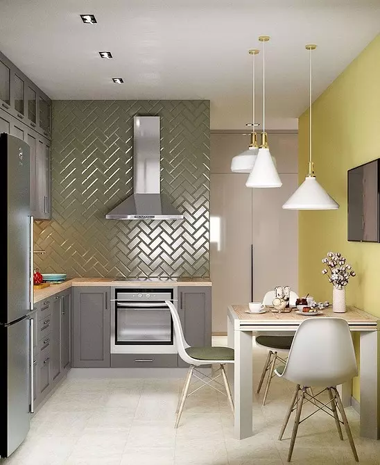
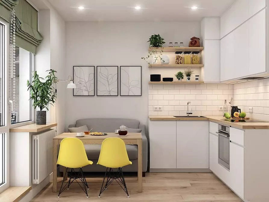
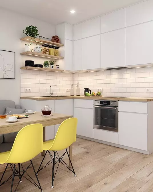
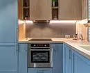
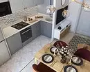
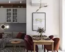
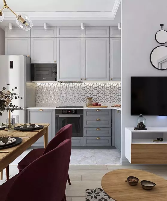
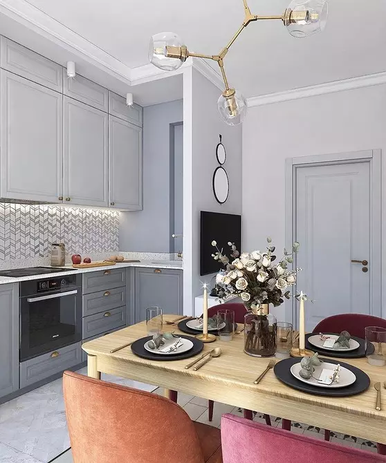
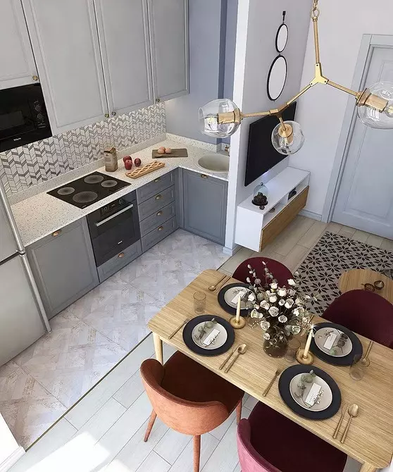
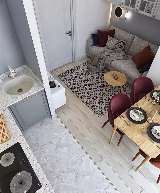
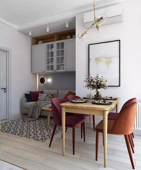
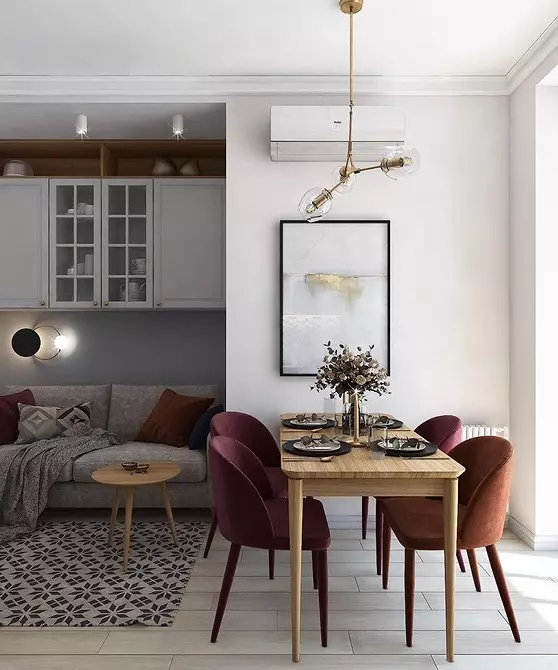
This concerns the layout of the room. In this kitchen, 13.5 square meters. There are three zones: a full-fledged working, dining room for 4 persons and a small sofa.
Such zoning was carried out thanks to the correct form of the room: a proportional rectangle is divided into two parts. Almost half takes the kitchen, and the dining room and living room share the remaining space.
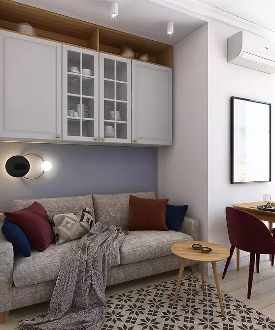
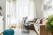
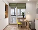
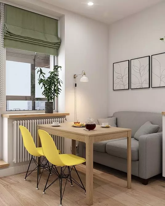
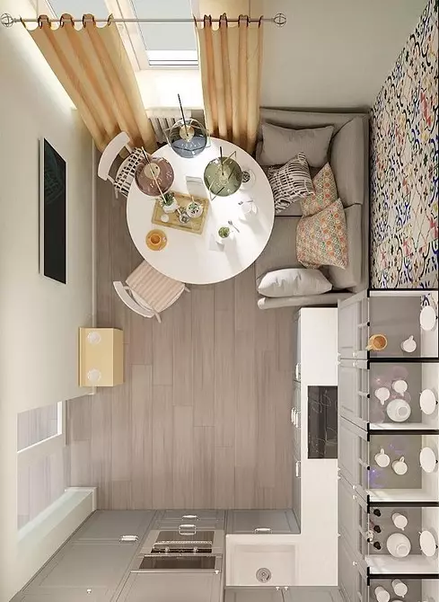
But not always a member and form of premises allow you to fit all three zones. In very small rooms, you can consider the option with the replacement of the chairs with a sofa, as in this room with an area of 9.5 square meters. In this case, the living room will appear without prejudice to the headset and technology.
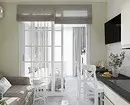
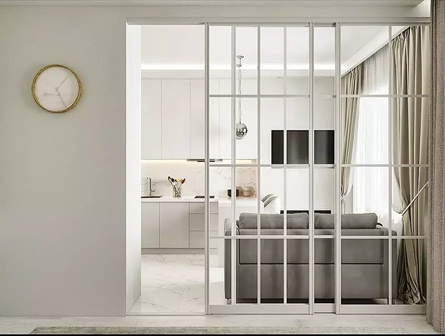
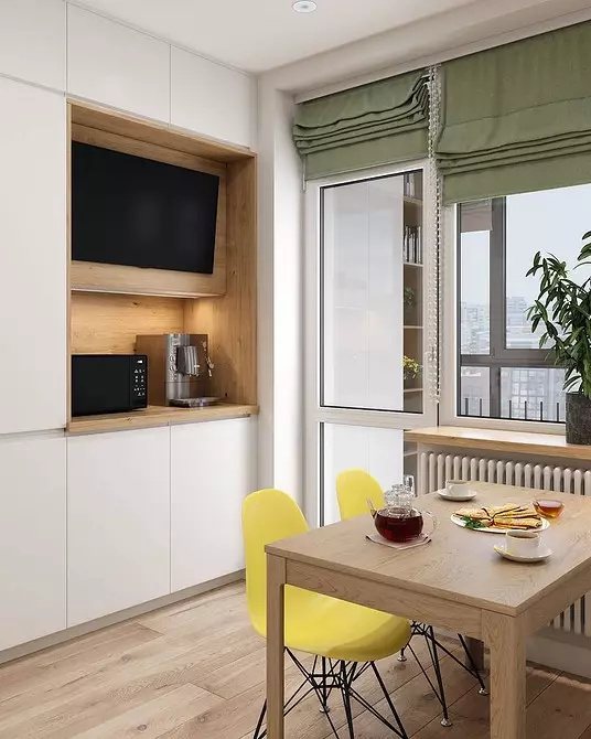
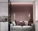
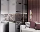
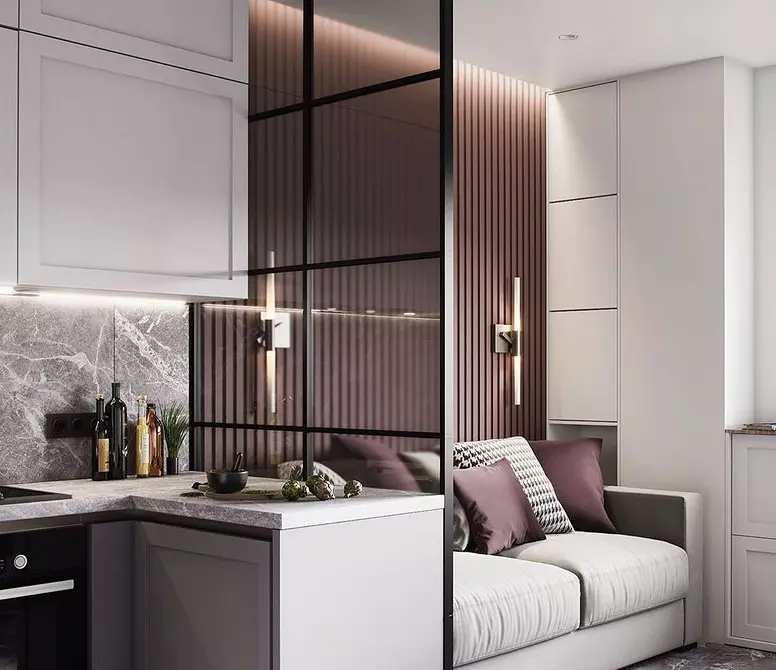
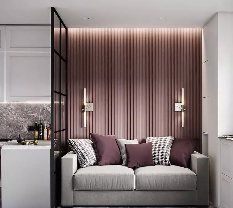
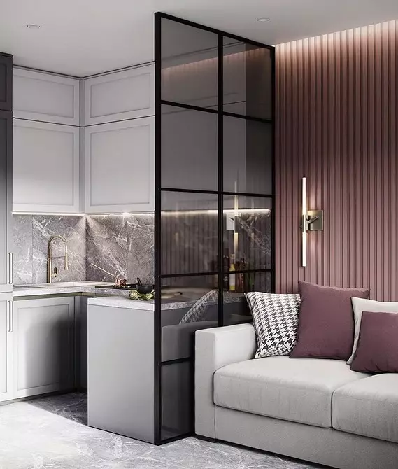
5 Light designs instead of walls
The design of the kitchen of the living room of a small square usually does not imply clear zoning. In the tiny spaces, the separation is relevant with the help of finishes, colors and textures. Often there are options using furniture: a dining room group or bar counter. If this is not enough, you can use translucent designs.
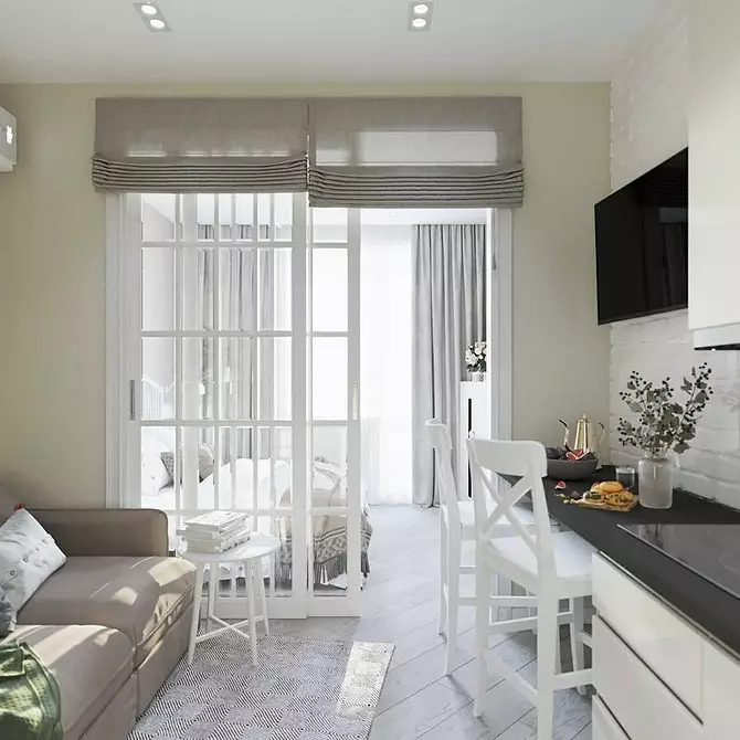
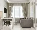
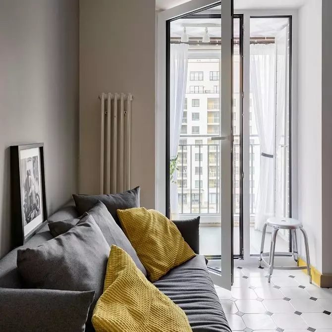
In this project, the glass partition not only visually divides the space, but also protects the sofa from dirt and stains - a working surface is located near it.
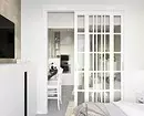
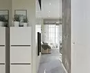
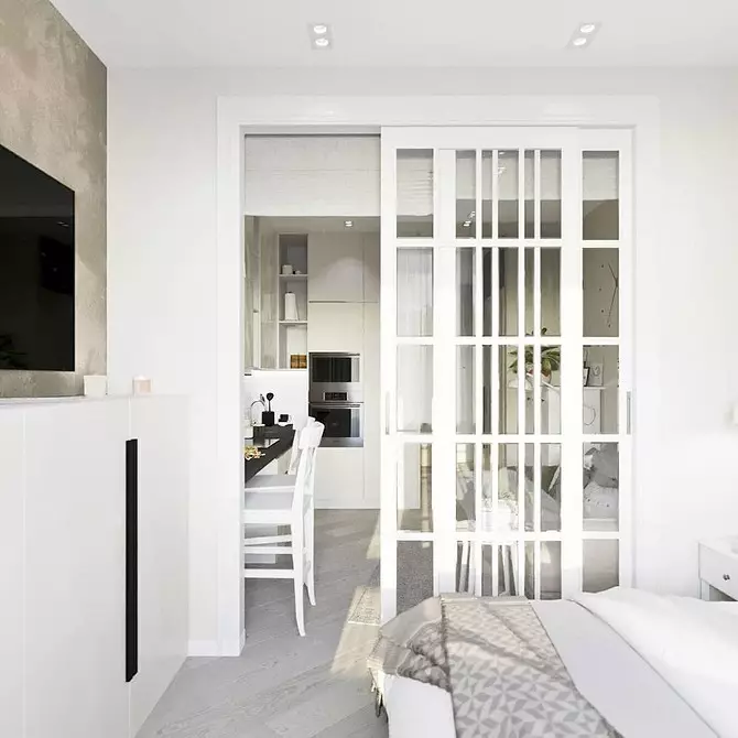
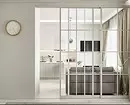
The studios sometimes require functional zoning, including a kitchen-living room from the rest of the space. In this project, the kitchen occupies 11.5 square meters. m. From the bedroom it is separated by a wall that does not look heavy due to wide opening and doors with glass. Pay attention to the door itself: sliding design is selected for saving and convenience.