Learning to create the desired background for the interior, add the right accents and accessories to it, creating your own Scandinavian history.

1 Right Background
The main reason is that in the IKEA store everything looks amazing - the perfectly selected combination of shades for the background. Tints of white and light gray occupy a large area of the store and on their background equally well the accent saturated yellow chair and a laconic dark gray sofa will look. For the same reason, the purchase made under the influence of inspiration during walks along the showroom, can disappoint at home - many of them are not suitable as a background wallpaper in the flower and the neighborhood with other furniture of saturated colors. Therefore, make sure you can provide a suitable background for each purchase.

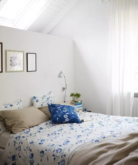
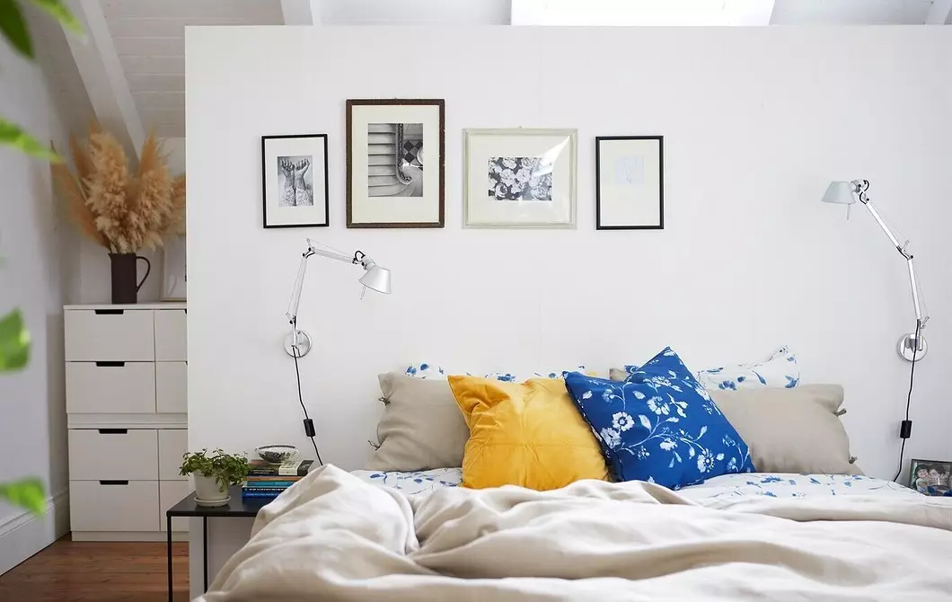
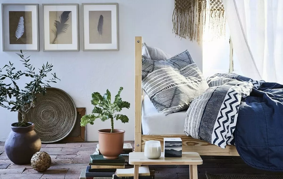
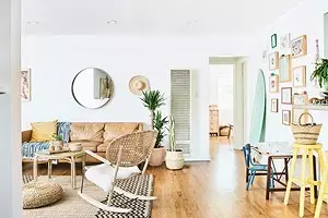
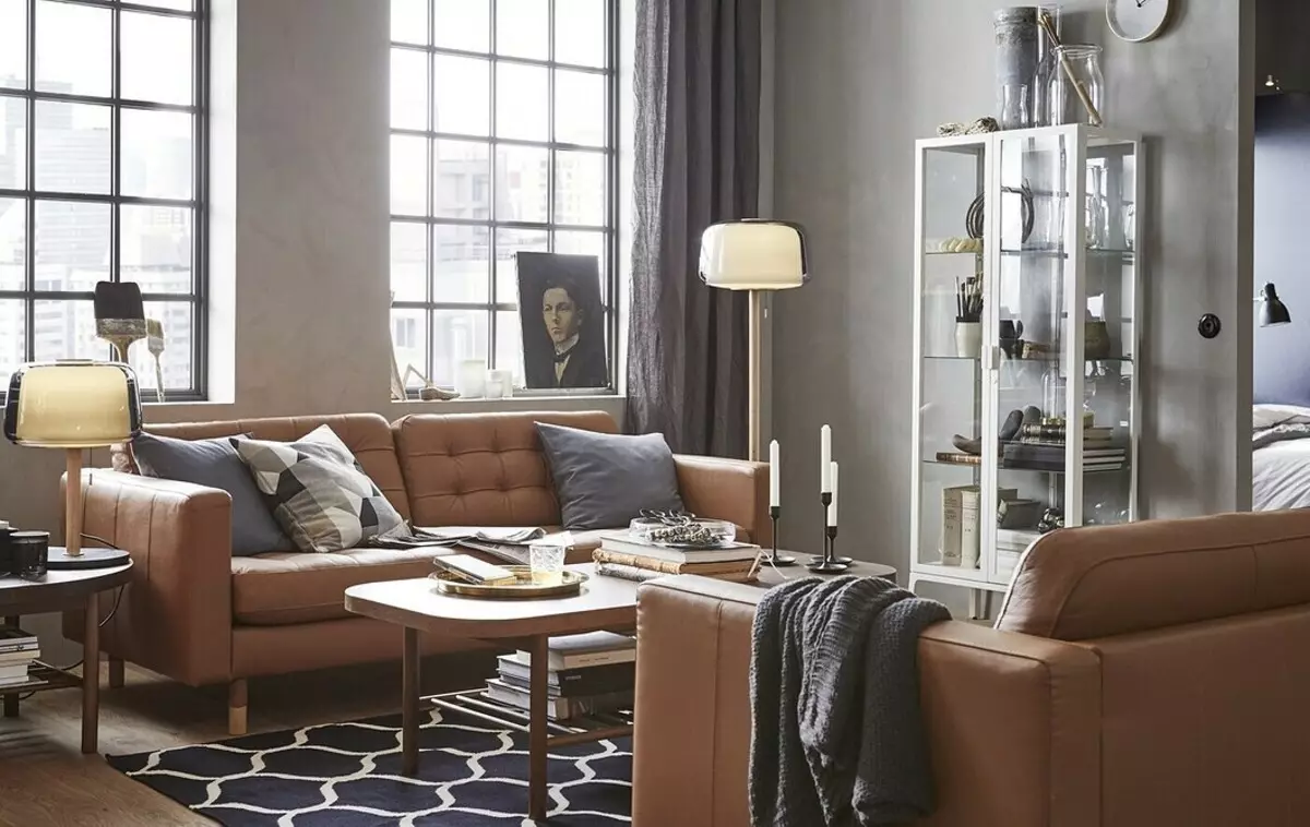
2 Working with textiles
Designers ICEA know that with the help of textiles it is easier and cheaper to create accents in the interior. If you liked a bright patterned rug on the floor of the stand, look back, and you will find three more or four positions with the same tint. It can be plaids, pillows or curtains. It is this rollback that makes the interior so thoughtful and completed.


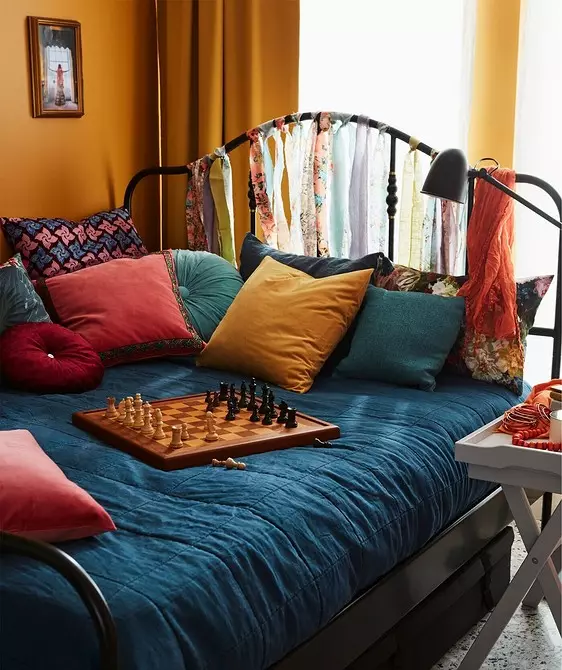

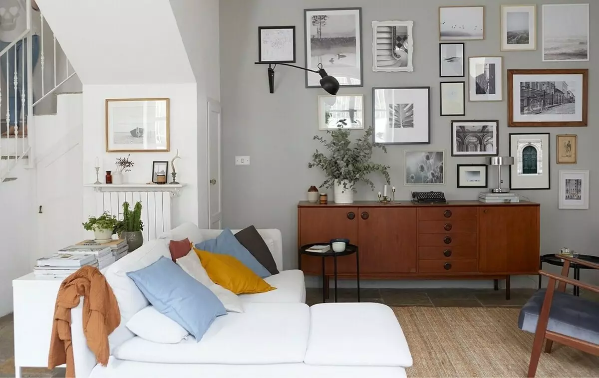
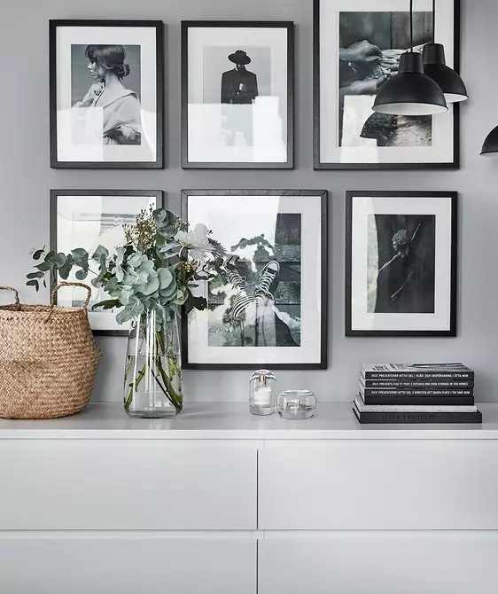
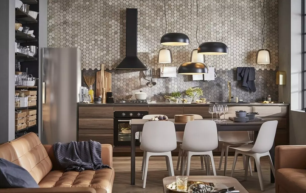
3 graphics and rhythm
The light walls and floors in combination with light-colored light furnishings are very easy to merge into one white canvas. To avoid this, designers use graphic accents: black frames for wall posters, black cutlery and plates, feet of chairs, furniture handles, pillows, drawing on floor tiles. Look at the dark accents on a light background and see what they set the rhythm, alternating, and not just randomly spread the room.


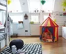
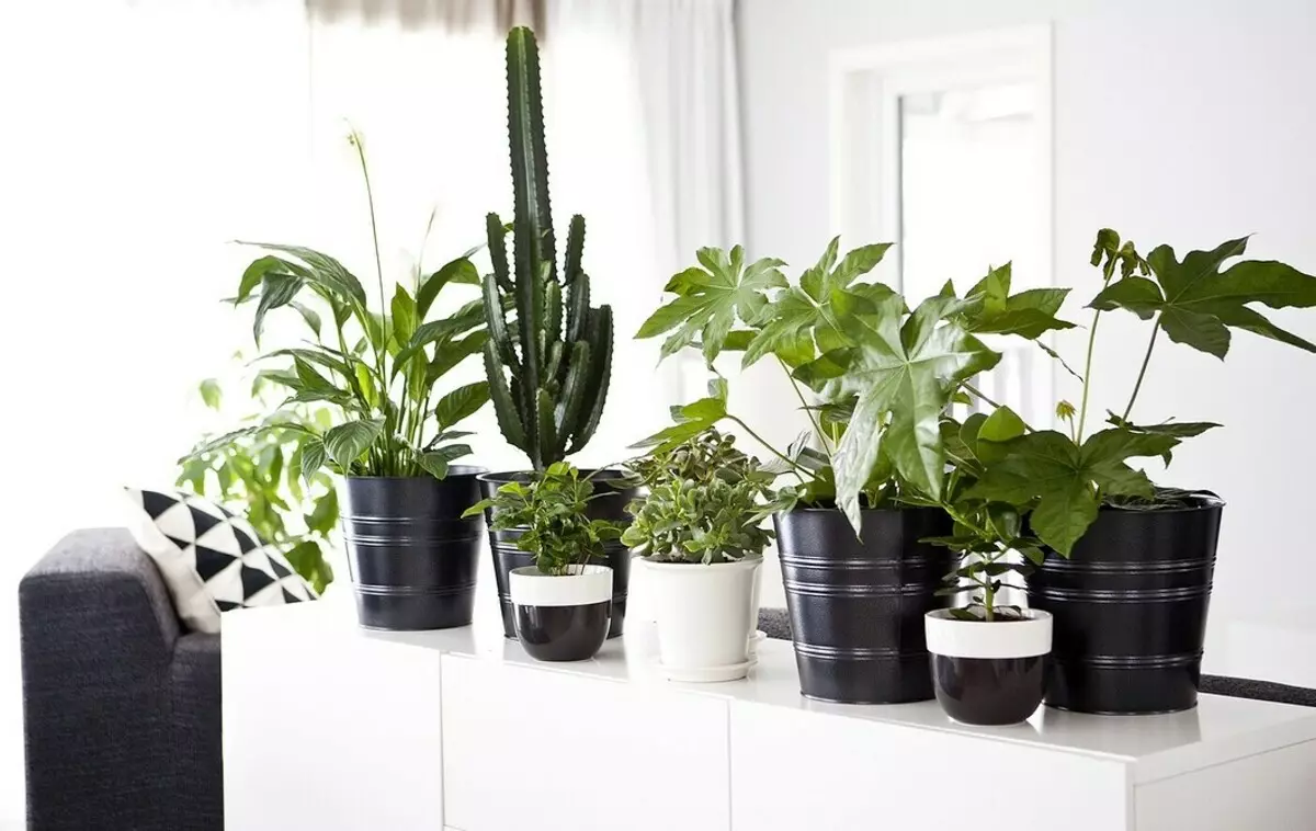
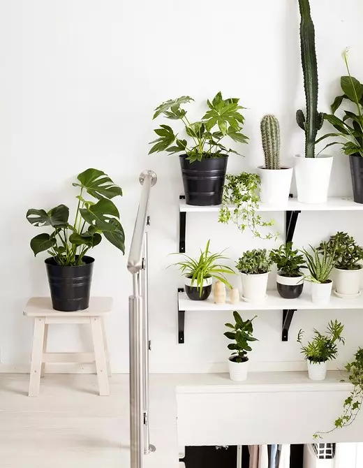
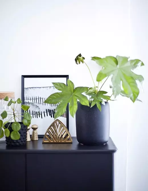
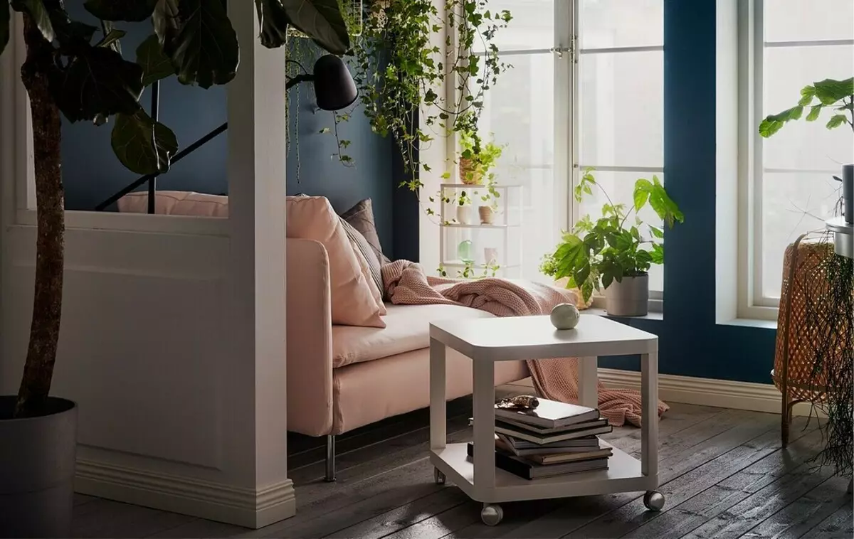
4 plants
A huge number of living plants fell into an assortment of IKEA not by chance: with their help, designers offer to revive restrained and cool shades inherent in the Scandinavian style of the interior. Bright greens makes a variety of a color scheme of the room and distracts from gray cold weather outside the year round. Do not forget to immediately pick up a collection of pots or porridge - they must compose a single composition and have the same shades or texture.


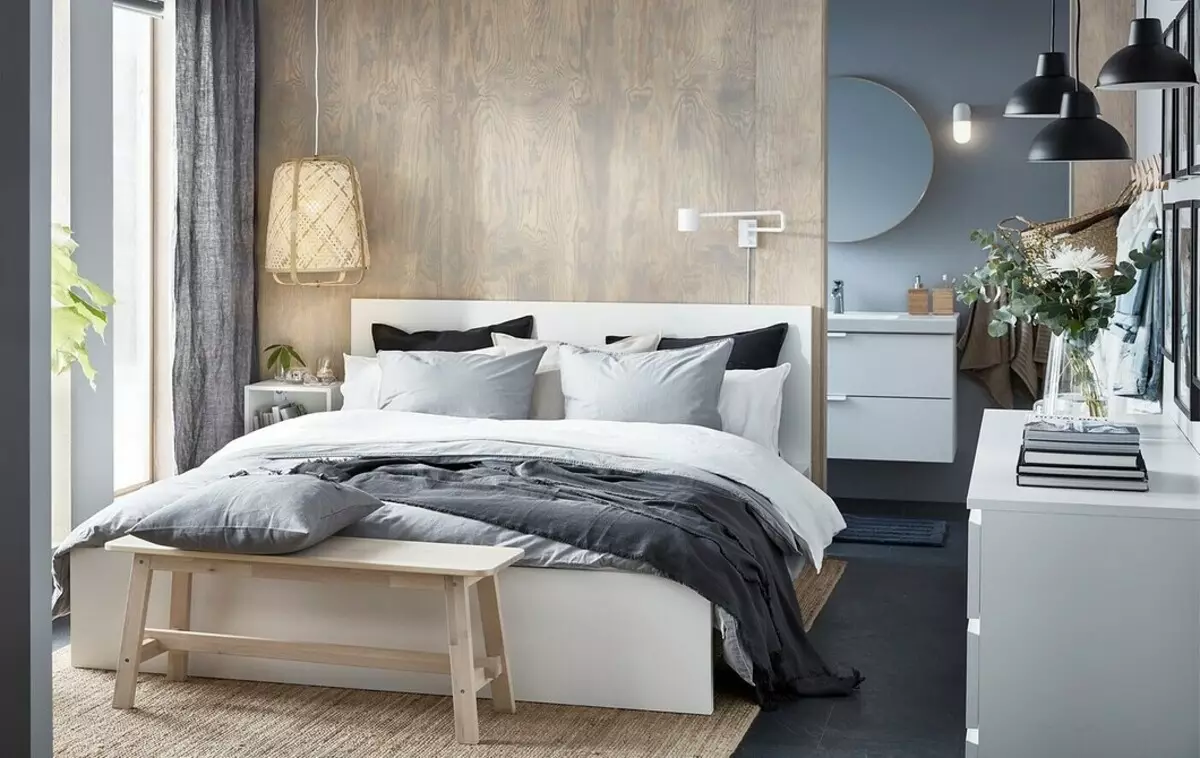
5 Lighting
When you go to the store, first time your eyes react to the abundance of artificial lighting, but quickly get used to and end up you feel comfortable. This reception is no less important for the interior than the proper furniture and well-combined shades. Consider how the work area will be covered, an accent wall, a beautiful composition from posters.

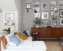
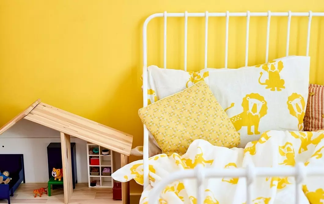
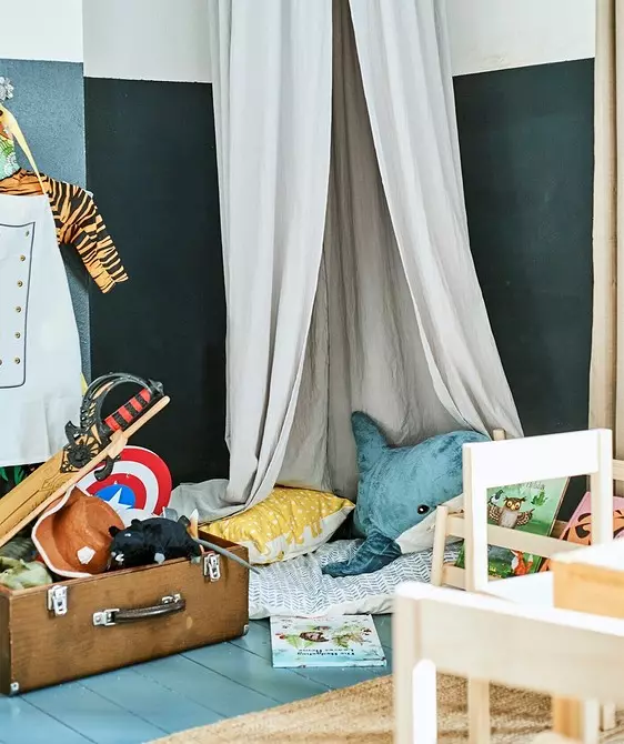
6 Accent walls
Another technique with which IKEA designers do so that the interior falls in love at first sight - accent walls. As a rule, the fitted wallpaper is used or painted the whole wall into a saturated and deep color, often applying geometry: for example, stripes and large triangles. This technique is easy to repeat independently: with the help of a wide painting scotch, select the boundaries of future color sections. Try to pick up shades that are often found in the filling of the room or simply go well with them.


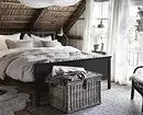
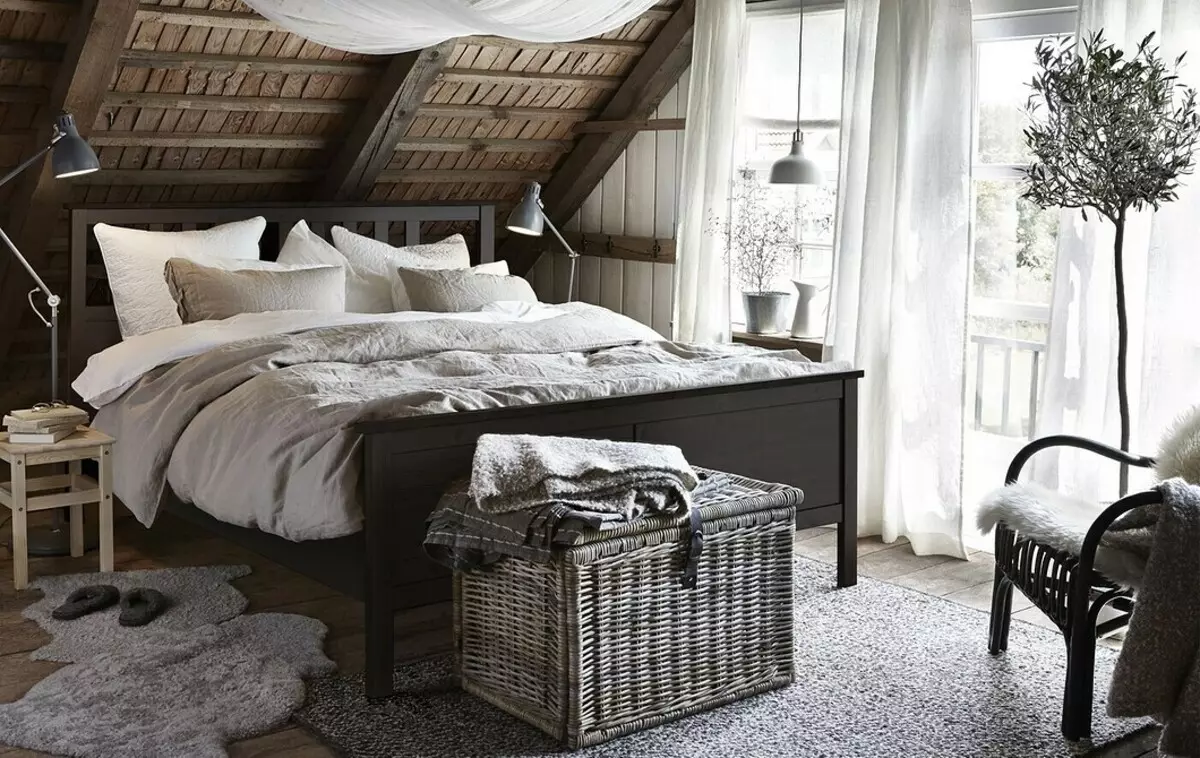
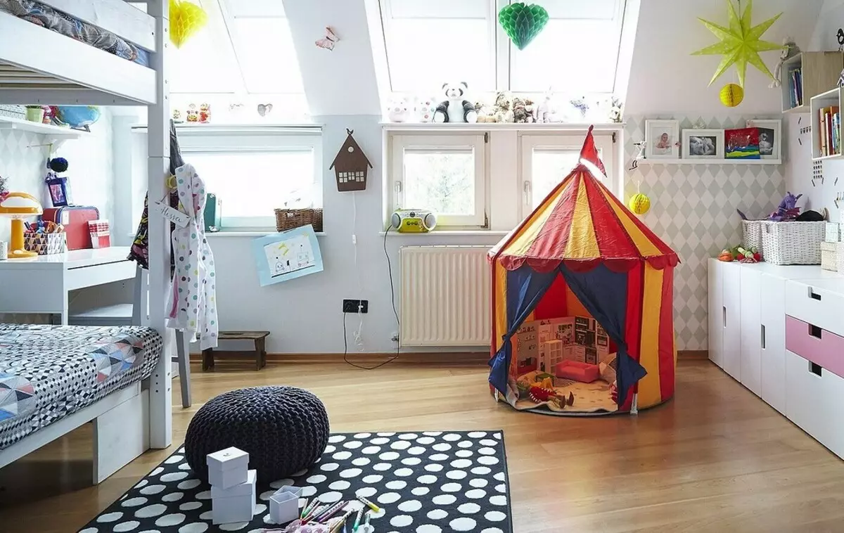
7 Creating a story
When entering the room, you immediately feel that this interior is very alive and cozy. Such a feeling arises due to the complex design reception - the creation of history. Each room is thought out as if she was not collected in a few hours, and a family lived in it, which chose these cozy things for many years. You literally feel that this is a real children's or bedroom, and not just a template selection, like in other stores. It is very difficult to repeat it, but try planning the final result before repair and purchases, inspired by examples from the Internet and analyze what exactly you liked.