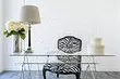
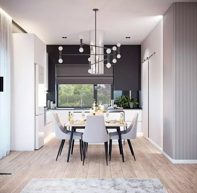
Yellow and purple, brown and orange - tell about these and other color combinations, with which in the interior will not be easy.

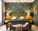
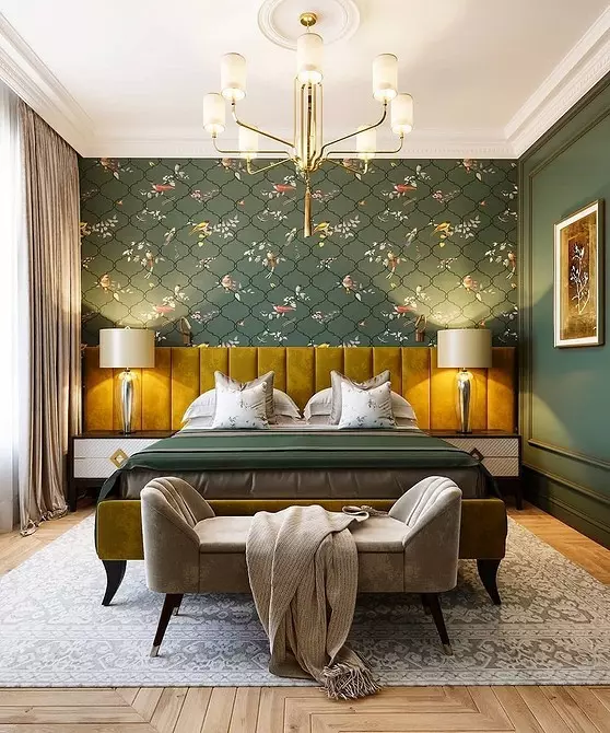
1 Yellow and Purple
These colors lie along different sides of the color circle, therefore relate to contrasting. The stronger the contrast and brighter shades, the harder to perceive the space painted in them. In addition, yellow and purple are rarely found in nature in large quantities, so a person is perceived as something artificial.How to do better
Purple - a rather complicated and dark color, it is better not to use it in the bedroom or in the office. But you can apply in the living room. And as a supplement, select close shades of lilac, cold white and gray tones.
Yellow to enter in the interior significantly easier. Pick the most natural, not neon shade and combine with blue, green, gray or white.
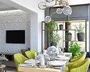
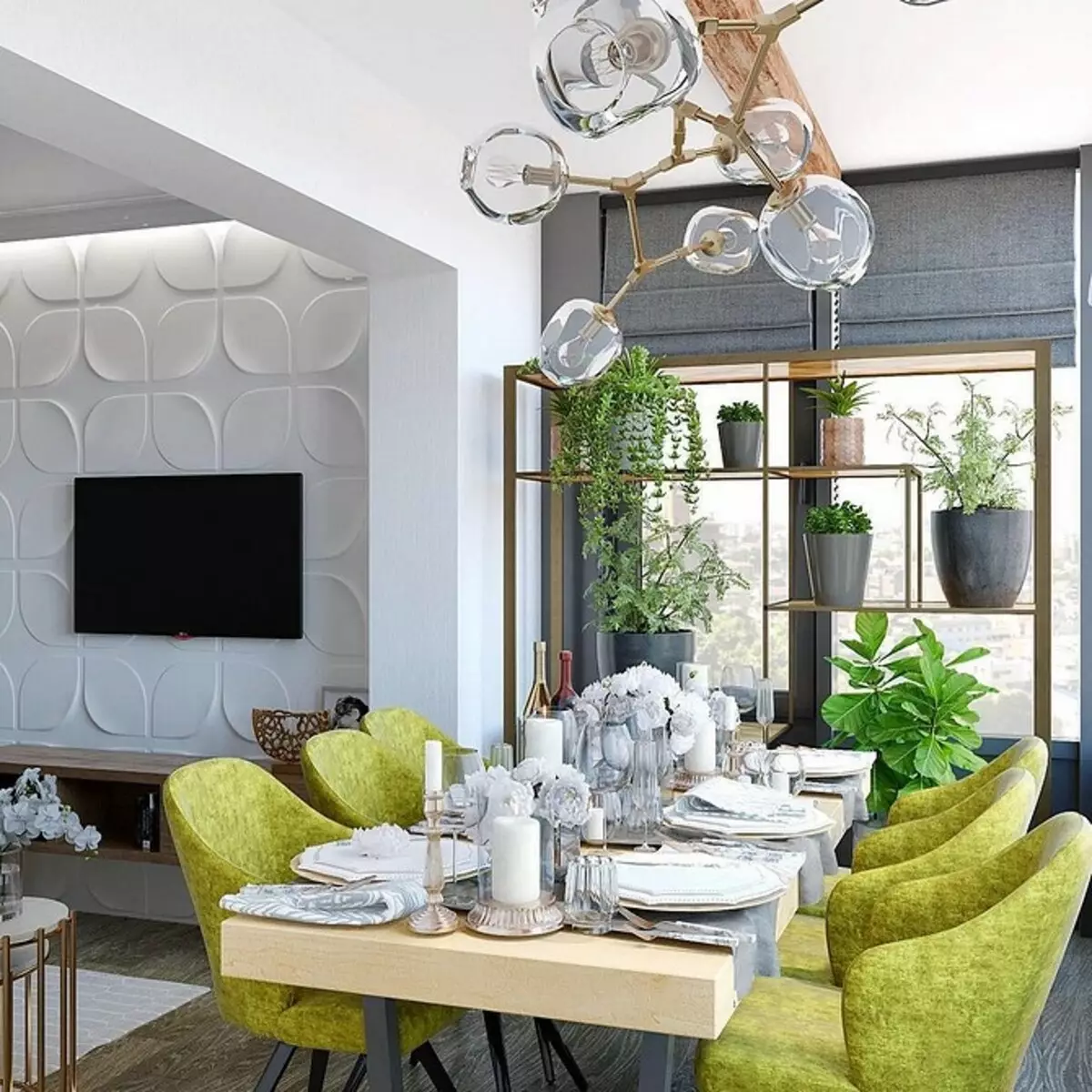
2 Salad and Pink
Salad and pink can be attributed to cold neon shades that are not easy to enter into the interior even separately. And if they are combined, it turns out too overloaded and unpleasant picture. This combination of colors is better not to use at all, even if it comes to small accessories or textiles.How to do better
Pick the muffled green shade for the interior. It is suitable for kitchen, corridor or bathroom. It is best to supplement it with white and add some warm colors accents.
The most successful pink for the interior is muffled ash. It looks very gently, and even can become a color base. Pouder pink perfectly combines with all shades of gray and white.
3 red and black
The combination of a saturated tomato red with black looks great in clothing, but hard and tight in the interior. By themselves, these colors are perfectly combined, but when they occur on the scale of the room, their contrast gives. A great chance to get scenery to the films about vampires instead of a cozy home.How to do better
The classic combination of black with white, on the contrary, looks in the interior elegant and appropriate. It is important to choose the correct proportion to avoid the effect of a chessboard. Let one color take the main position, and the second will become more accent. Most often, white is chosen as a base, and black accents give the space of depth.
Red is almost always used as an emphasis, it should be no more than 30% in space. It combines well with white, gray, muted shades of blue and green.
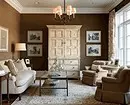
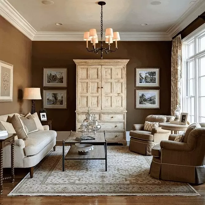
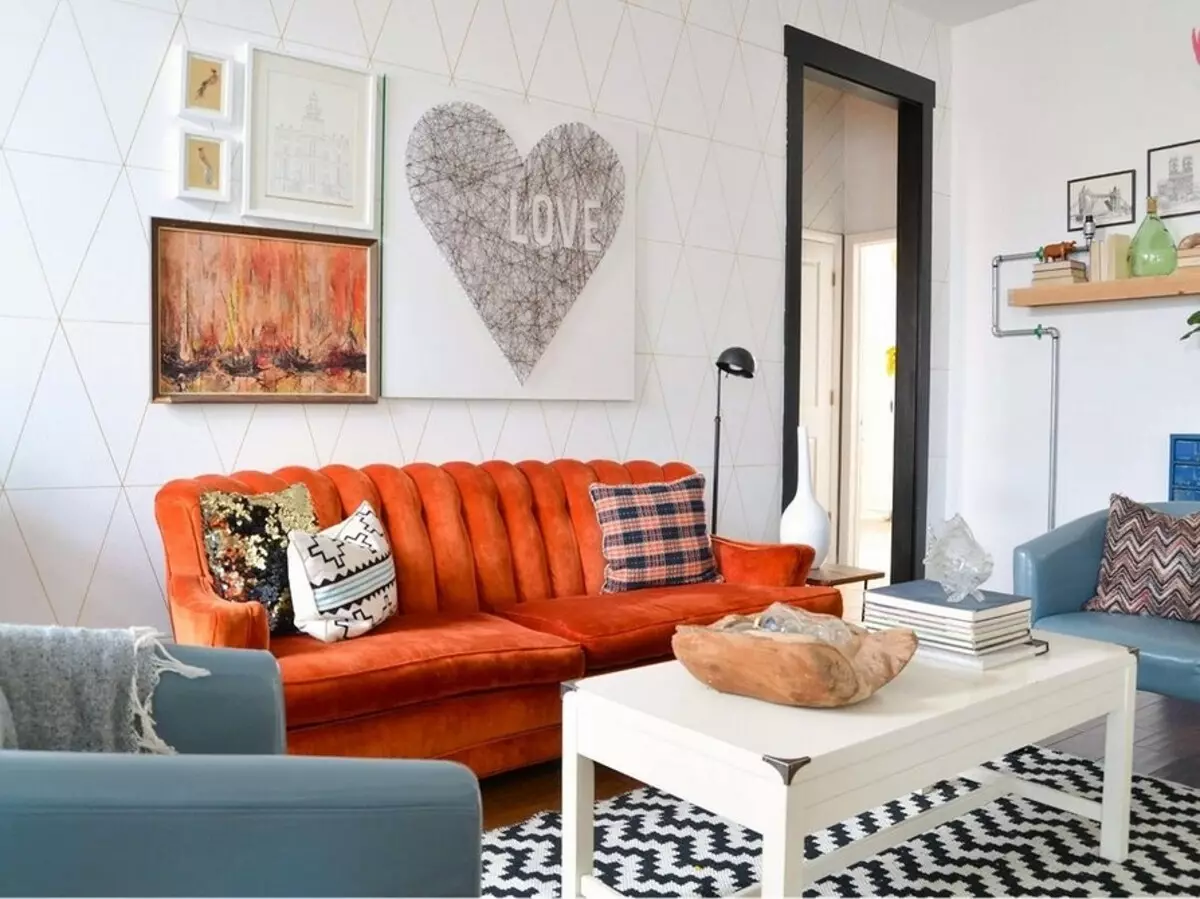
4 brown and orange
Brown color is quite dark, it is rarely introduced into the interior separately, and not in the form of wooden surfaces. If you add a cheerful saturated orange to it, the room will be too loaded with these shades, a feeling of stuffiness and gravity may appear.How to do better
You can enter a brown if you choose a beautiful chocolate tint, for example, for a contrasting wall, it is competent to highlight it and strain with a white ceiling and light floors. You can choose textiles and accessories in such a shade.
Orange is well combined with white, green, blue and other cold shades. Combined with yellow will be very warm and active interior.
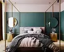
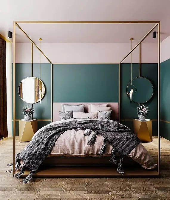
5 Emerald and Blue
Dark rich green and the same blue can be lost and merged with each other in the interior, especially if there is no bright barrier between them. In addition, both colors relate to cold, and can create an uncomfortable feeling in the room.How to do better
Sharpen both colors with contrasting light shades. Well will fit white, pale yellow, light gray. You can also add some warm accents, such as orange.