When the standard colors of the facades have already arrived, time to dare to experiments - choose color doors. But what colors are relevant? And what to draw attention to not to return to the 2000s with their glossy bright kitchens? We tell and show examples that will be easy to inspire.

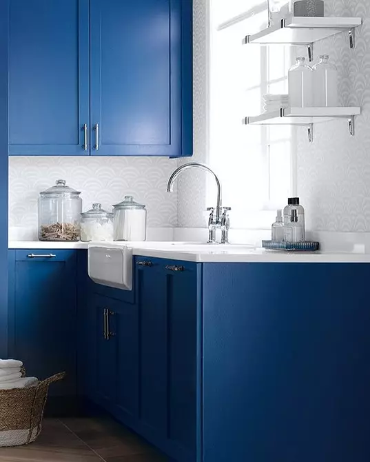
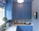
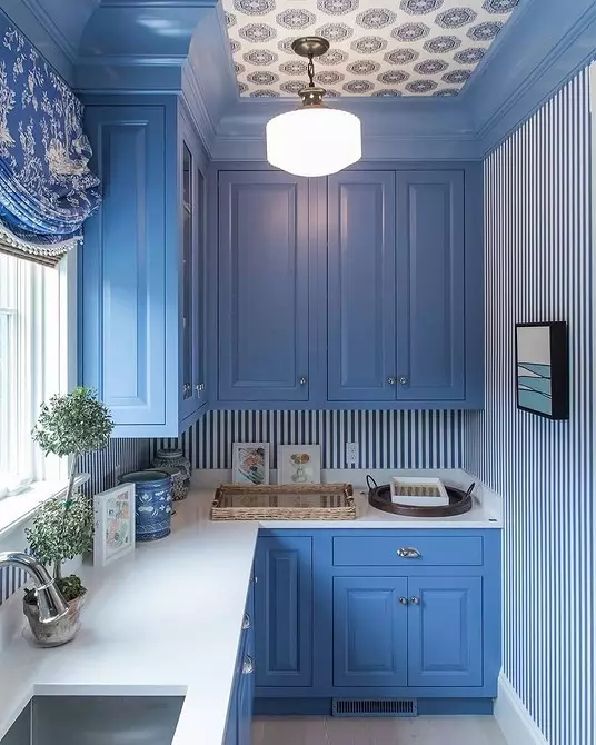
Blue
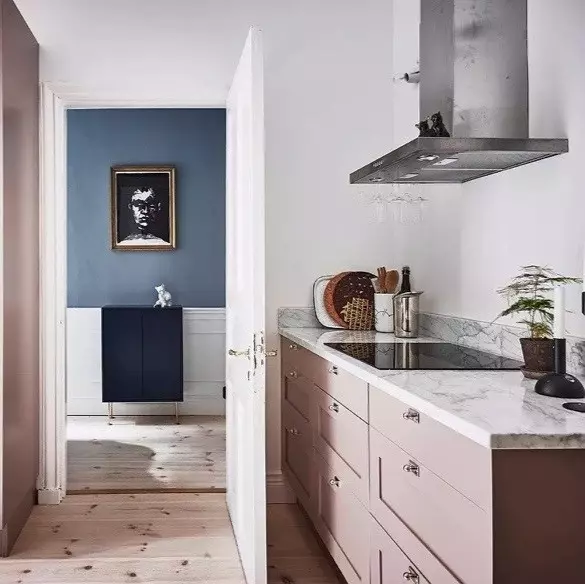
Deep blue - the color that should not be afraid in the interior. Firstly, it is easy enough to combine with a simple trim - for example, paint pastel shades on the wall and porcelain stoneware "under the tree" on the floor. And secondly, it will not reduce the space. Saturated blue recommended even for small rooms to make them visually more. Look, what ideas in the kitchens can be realized.
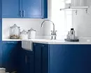
If you like blue, follow multiple rules.
- Warely combination - white + blue.
- Also blue color looks great with gold. Pick up the appropriate accessories and mixer if you want to make the kitchen interior with luxurious.
- Marble apron - another successful idea.
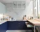
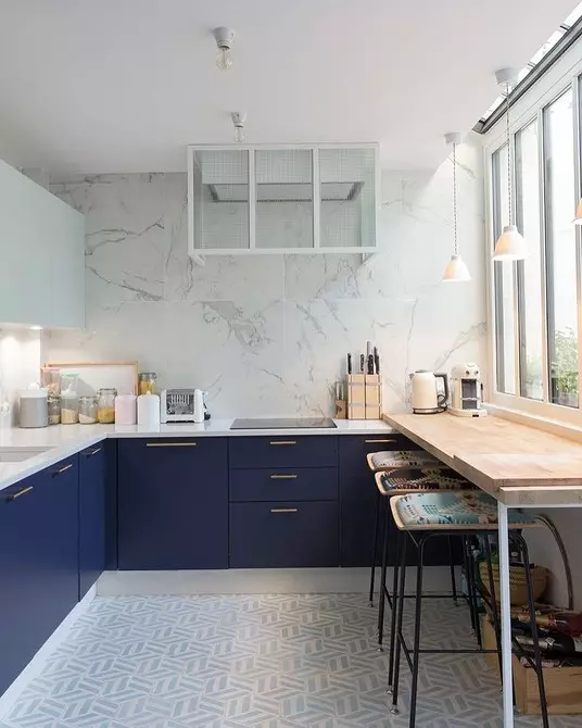
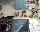
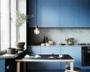
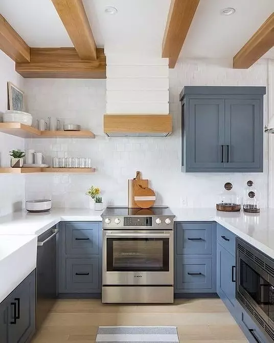
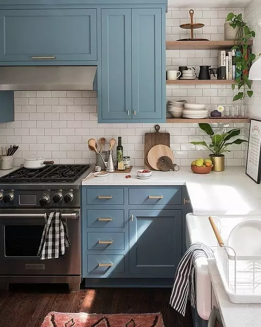
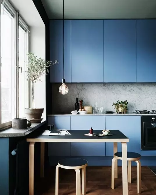
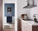
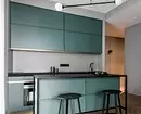
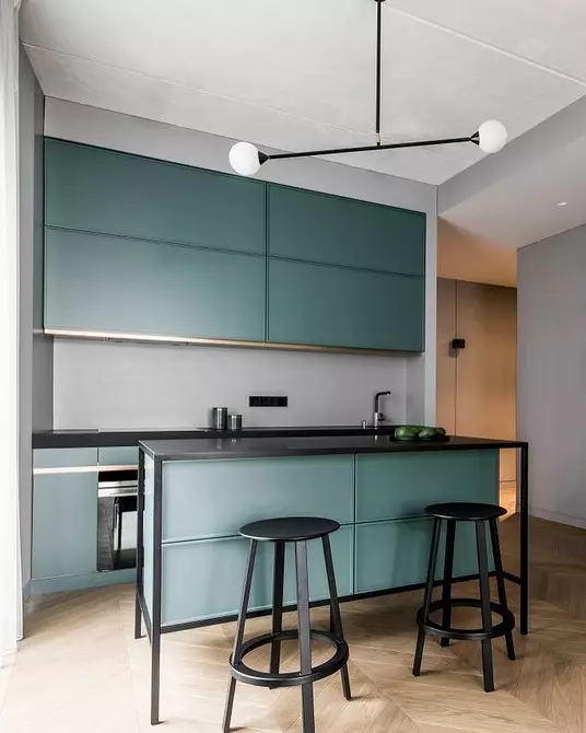
Blue
The shade of blue - blue is also relevant for color facades. Choose cold subtocks and look at the combination of blue with wall and floor trim in your kitchen. Do not mix warm and cold shades if you want to achieve harmony. And the tree and its imitation is always a great solution.
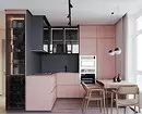
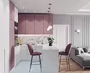
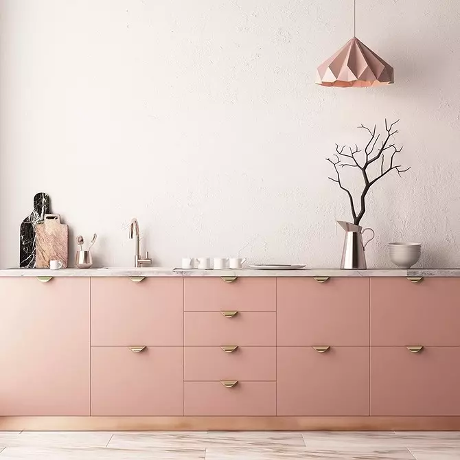
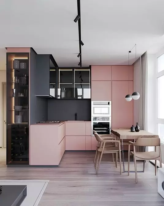
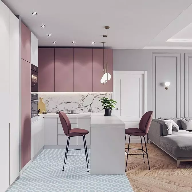
Pink
Fashion for this color in the kitchen came relatively recently. In order not to make a mistake, it is important to choose the correct shade of pink. Powder - what you need.
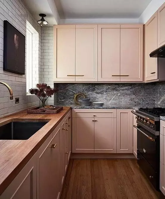
With a more rich color should be careful. It should look correctly - look at the facades at different angle, lighting, at different times of the day, and also correlate with finishing in your kitchen. And only after that make a decision.
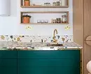
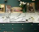
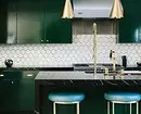
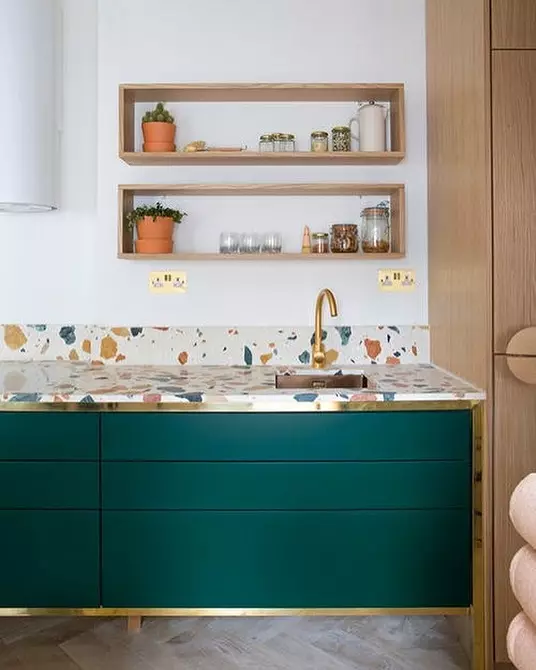
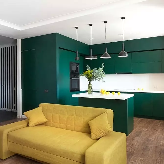
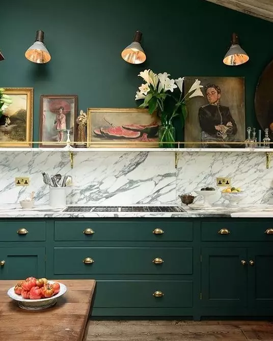
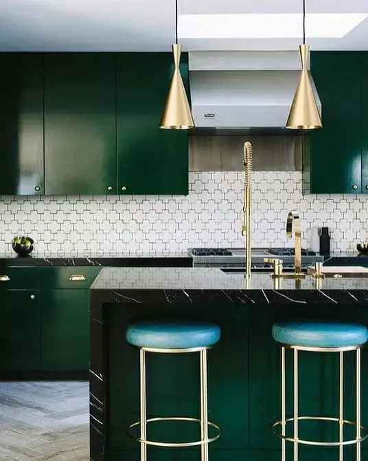
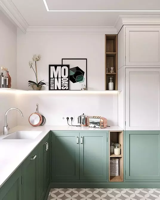
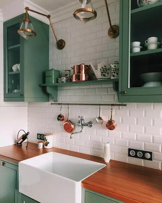
Green
Let's start with examples with deep green color - it is also called emerald. One of those shades that can be used in small rooms without risk make it visually closer. Dark green color is difficult not to love - it looks noble, and it is also successfully combined with all modern trends: a cable tile, a cable, wooden table top, gold fittings, marble surfaces, and even terrazzo pattern.
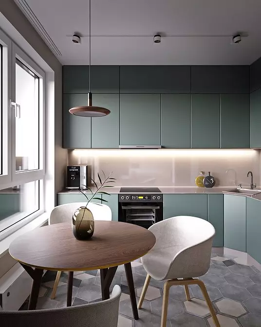
Shades of green
There are no less popular shades of green - from pale pastel tones to herbaceous. The main thing is not to choose screaming and acid facades, which are returned to the beginning of the 2000s. Take a good combination note.
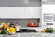
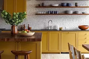
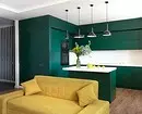
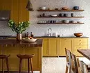
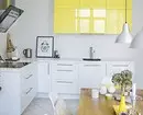
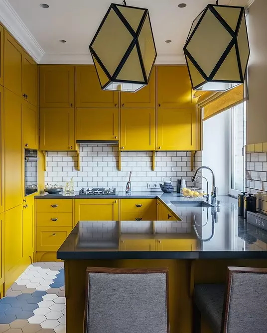
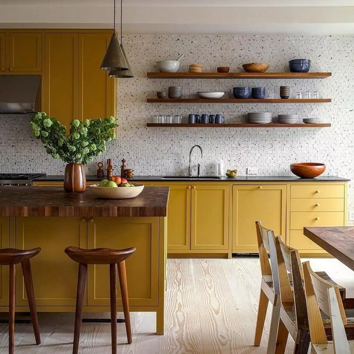
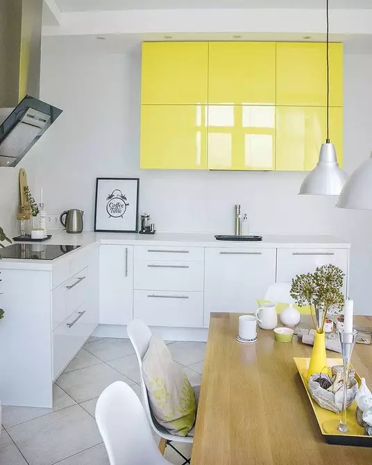
Yellow
A bright cheerful color is included in the interior fashion this year. You can "play" with shades - for example, choose muffled yellow with matte facades. Then the interior creates a feeling of a gas-mall sun. Or take a bright gloss - but it is worth it to be neat so as not to overdo it.
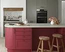
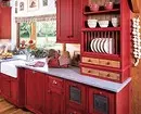
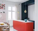
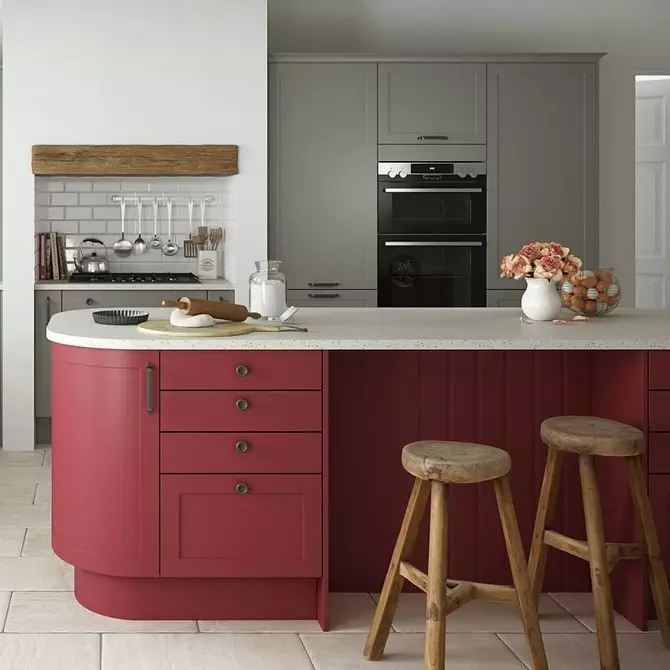
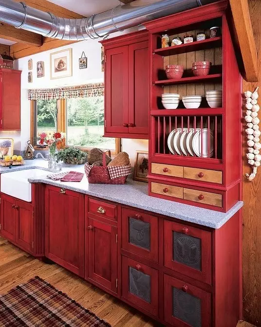
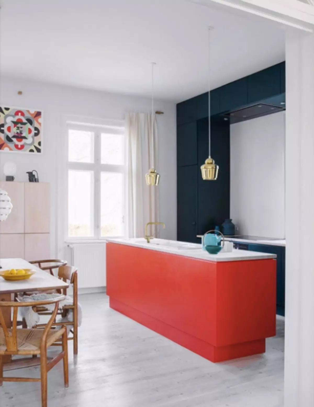
Red
Perhaps the most "dangerous" color for kitchen facades, with which it is easy to make a mistake. We recommend using red dosage - for example, only on the bottom row of the kitchen headset. And also choose a matte finish.

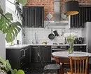
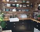
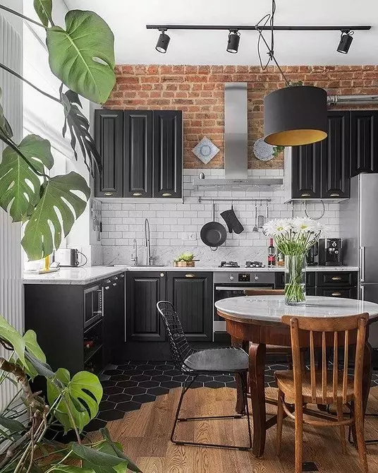
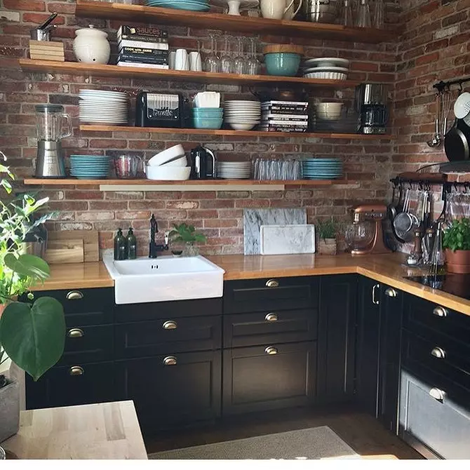
The black
We complete our gallery of beautiful colored heads intelligent black. Many are afraid of black kitchens due to their impracticity - the dust attracts, the fingerprints are visible. Yes, it is: black is pretty brand, even more type than white, contrary to stereotypes. But it looks very noble, especially if you combine it with basic flowers - white, brown.